AI for Senior Care Specialist Professional Website Template
Parse is a senior care AI document processing landing page template built for teams drowning in intake forms, insurance authorizations, and care plans. The modular card grid layout walks visitors through a vivid problem-to-solution arc, backed by a live dashboard screenshot header, animated comparison cards, and a sticky seven-metric comparison table that makes the case before the first scroll ends.
by Rocket studio
Quick summary
Parse is a single-page template designed for AI-powered document processing platforms serving senior care operations. It opens with a full-width dashboard screenshot, flows through a problem-to-solution card grid, and closes with a sticky comparison table. The layout is built to earn trust fast and move operations directors, compliance officers, and billing managers toward a free trial.
Who this template is for
This template speaks directly to the people buried in senior care paperwork. It is built for teams where a single missed checkbox costs money and missed compliance deadlines cost more.
- Operations directors managing large assisted living communities
- Compliance officers at memory care networks preparing for state audits
- Billing managers at home health agencies dealing with denied insurance claims
What problem this template solves
Senior care administrators spend hours each day processing intake forms, Medicaid authorizations, physician orders, and care plans manually. One misfiled document can trigger an audit finding with a dollar penalty attached. This template gives that pain a face and then resolves it section by section.
- Paper-based intake workflows that create backlogs before the morning is over
- Denied prior authorizations caused by missed fields or incorrect data entry
- Audit exposure from misfiled records and incomplete documentation trails
What you get with this template
You get a complete, scroll-driven landing page layout with every section pre-built and ready to adapt. The structure escalates logically from frustration to proof to conversion, so visitors feel understood before they feel sold to.
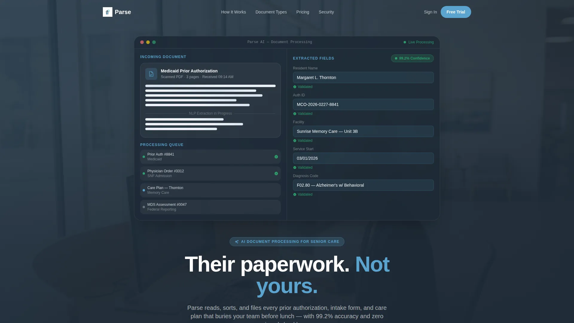
- A full-width product screenshot header showing the AI mid-processing with a confidence score badge
- A modular problem-and-solution card grid with Dynamic Motion flip animations and a persistent comparison strip
- A sticky seven-metric comparison table and two conversion entry points with distinct calls to action
Feature list
This template includes six purpose-built layout features drawn directly from the brief. Each one serves a specific role in moving a skeptical senior care buyer toward action.
Full-Width Dashboard Screenshot Header
The header opens with a pixel-crisp capture of the platform at work. A scanned Medicaid authorization fills the left panel while extracted fields auto-populate a resident profile on the right. A confidence score badge reading 99.2% sits beside the patient name, and subtle document-sorting motion plays across the screen before the visitor reads a single word.
Flip-Card Problem and Solution Grid
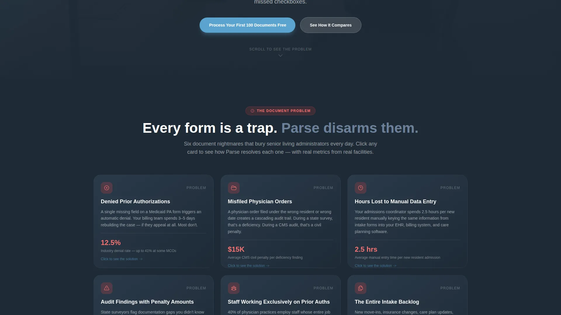
The first card row renders specific document nightmares in slate tones: denied prior authorizations, misfiled physician orders, audit findings with penalty amounts, and manual data entry shown as a ticking time counter. As the visitor scrolls, each card lifts and rotates with Dynamic Motion easing, flipping to show the same scenario resolved by the AI in seconds, complete with real metrics.
Animated Versus Strip
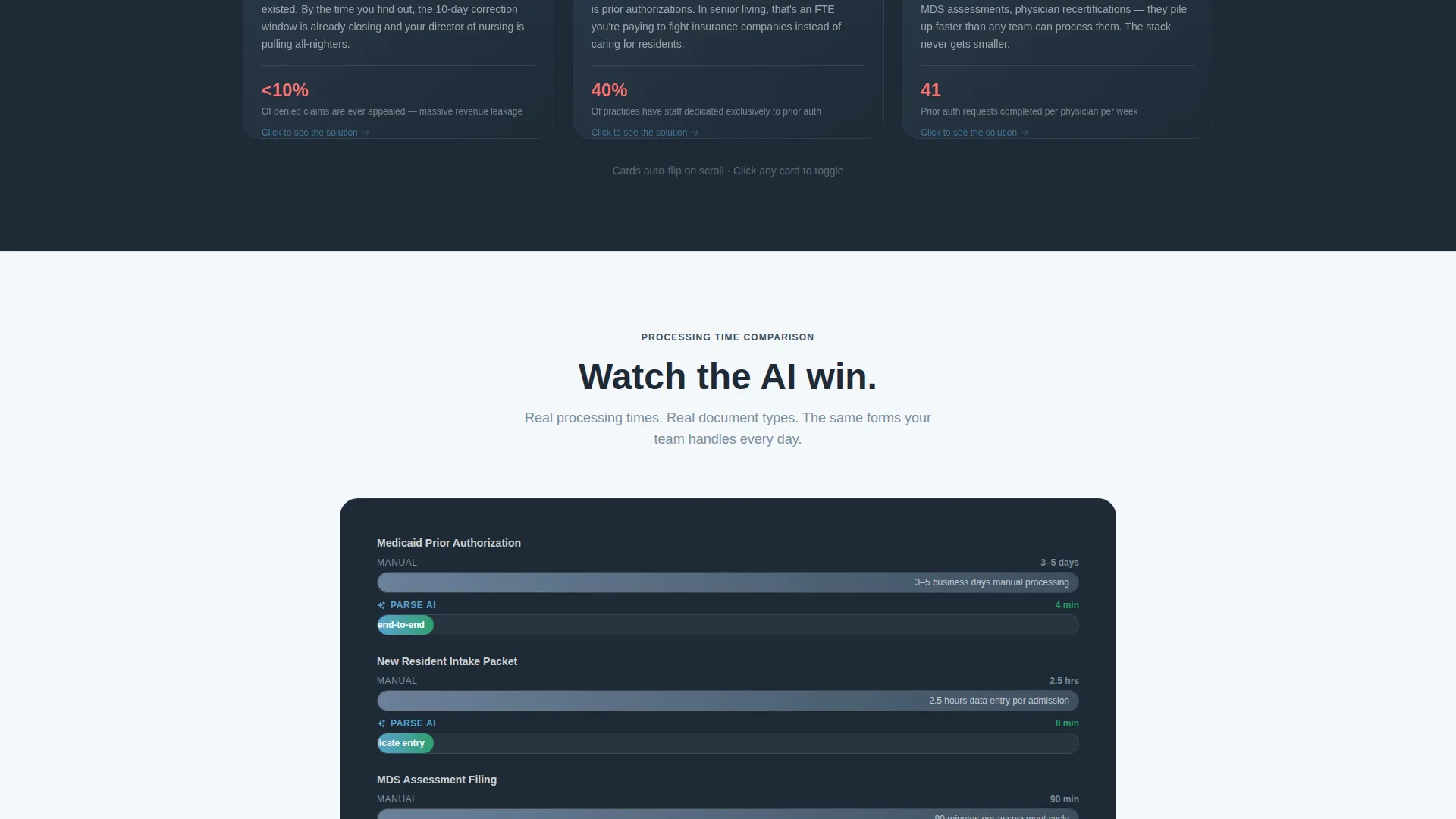
A persistent comparison strip runs between the problem and solution rows. It shows legacy process time racing against AI processing time using animated bar races that the visitor watches play out in real time. The strip reinforces the core value argument without requiring any copy to do the heavy lifting.
Sticky Seven-Metric Comparison Table
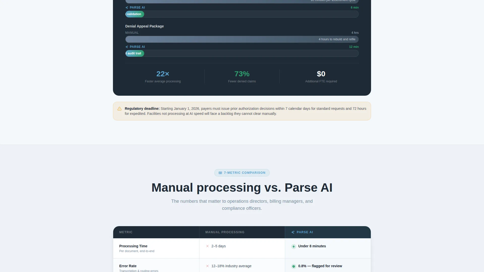
A full comparison table anchors the lower half of the page. It measures Manual Processing against the AI platform across seven metrics: processing time, error rate, staff hours, denial rate, audit readiness, cost per document, and scalability. Each AI column entry animates in as its row enters the viewport.
Primary Free-Trial Call to Action
The call to action "Process Your First 100 Documents Free" appears after the third card row. By that point the visitor has moved through the full problem arc and seen the AI win the versus strip. The placement is intentional and timed to land when proof is freshest.
Secondary Compatibility Form
A lightweight secondary conversion form asks for facility type, bed count, and top three document pain points. In return, it delivers a personalized compatibility report. This gives visitors who are not ready for a free trial a lower-commitment reason to engage and self-qualify.
Page sections overview
| Section | Purpose |
|---|---|
| Dashboard Screenshot Header | Opens with live AI processing visual and headline |
| Problem Card Row | Surfaces specific document pain points in slate tones |
| Dynamic Motion Flip Cards | Animates problem-to-solution transformation per document type |
| Animated Versus Strip | Compares legacy time against AI time with bar race animation |
| Solution Card Row | Shows resolved scenarios with real processing metrics |
| Primary call to action Block | Delivers free-trial offer after third card row |
| Sticky Comparison Table | Benchmarks seven metrics across manual and AI processing |
| Secondary Conversion Form | Collects facility details and returns a compatibility report |
Design & branding system
The Slate and Sky color system gives the page a look that feels like stepping out of a fluorescent-lit filing room into a clear afternoon. Every color choice maps to an emotional purpose: clarity, relief, and confidence.
- Administrative slate (#3D4F5F) and deep charcoal (#1E2A36) ground the problem sections in weight and seriousness
- Open sky blue (#5BA4CF) marks interactive elements, progress indicators, and animated solution states
- Morning cloud white (#F4F7FA) provides the breathing-room background that makes dense information feel approachable
Mobile & speed optimization
The modular card grid structure scales naturally across screen sizes. Dynamic Motion animations are applied with viewport-triggered timing so they do not fire until the relevant section is visible.
- Card flip and bar race animations activate on scroll entry, keeping the experience smooth on smaller screens
- The sticky comparison table collapses cleanly into a readable format at mobile widths
- The secondary form is minimal by design, reducing friction on touch devices with just three input fields
How this template helps you convert
This template is structured as a persuasion sequence, not a features list. Every layout decision earns the next one.
- The dashboard screenshot header shows the product working before the visitor reads anything, building immediate credibility with a buyer who has seen plenty of software promises before.
- The flip-card grid and animated versus strip let the visitor experience the contrast between their current workflow and what the platform offers, making the value concrete rather than abstract.
- The two-stage conversion path captures both ready buyers with the free-trial offer and research-stage visitors with the compatibility report form, broadening the funnel without diluting the primary message.
Other information about this template
This template was built specifically for senior care AI document processing platforms competing in a market where trust is hard to earn and patience is short. A few additional details worth knowing:
- The template style is Card Grid (Modular), which means individual card sections can be reordered or removed to match a shorter or longer content brief
- The theme is Dynamic Motion, meaning animation behavior is built into the layout logic rather than added as a visual decoration
- The creative direction follows a Problem to Solution Arc, a structure well suited to buyers who already know their pain and need proof of resolution before committing
- The header concept is a Product Screenshot, which positions real software output as the opening argument rather than a marketing headline
- The landing page direction is Comparison and Versus, built around a sticky table and animated strip that make the competitive case without relying on written claims alone
Theme
Dynamic Motion
Creative direction
Problem→Solution Arc
Color system
Slate & Sky
Style
Card Grid (Modular)
Direction
Comparison/Versus
Page Sections
Dashboard Screenshot Header with Confidence Badge
Flip-card Problem and Solution Grid
Animated Versus Strip
Sticky Seven-metric Comparison Table
Timed Primary Free-trial Call to Action
Secondary Compatibility Report Form
Related questions
Who is this landing page template designed for?
Can I adapt the card grid for a shorter or simpler page?
What metrics does the sticky comparison table cover?
Is the secondary conversion form difficult to customize?
Does this template address compliance and audit scenarios specifically?



