Pathfind - Powerful RouteOptimization Landing Page Template
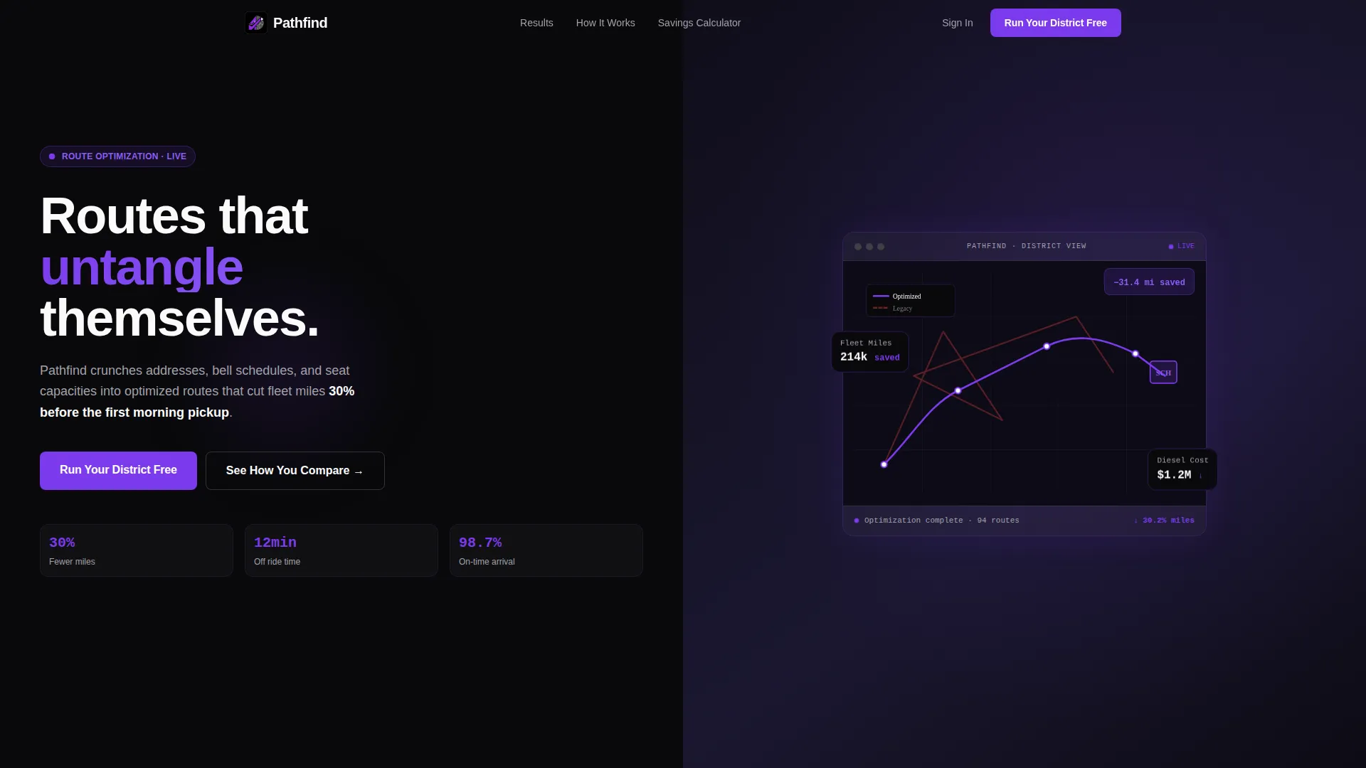
Pathfind is a split-screen landing page template built for education route optimization platforms. It pairs bold violet stat headlines against legacy-system comparison panels to make the case for smarter school bus routing. Designed for transportation directors, operations managers, and charter school founders, it converts visitors by showing exactly what inefficient routing costs them every semester.
by Rocket studio
Quick summary
Pathfind is a high-impact, single-page template for school bus route optimization platforms. It uses a 50/50 split-screen layout to pit hard savings numbers against the messy reality of spreadsheet-based routing. Every scroll reveals a new exhibit in the case for change, guiding transportation directors toward one clear next step.
Who this template is for
This template is built for education technology companies and routing platform teams that serve school districts and private education networks. The visitor profile is practical and data-literate, so the template speaks in metrics, not marketing language.
- Transportation directors managing fleets of 40 to 120 buses at mid-size school districts
- Operations managers at private school networks expanding bus service into new coverage areas
- Charter school founders who have inherited a fleet and are still routing from a spreadsheet
What problem this template solves
Manual school bus routing is slow, expensive, and hard to defend to a school board. Districts lose real money every semester on excess miles, idle time, and late arrivals. This template helps a routing platform communicate that gap clearly and urgently.
- Legacy routing tools leave measurable savings on the table, and visitors often do not realize how much
- The comparison framing closes the mental gap between "this costs money" and "I should change today"
- A sticky savings calculator gives visitors a personalized number before they finish reading
What you get with this template
You get a fully structured, dark-mode landing page built around a Stats-First Impact creative direction. Every layout decision is made to make the cost of inaction feel concrete and immediate.
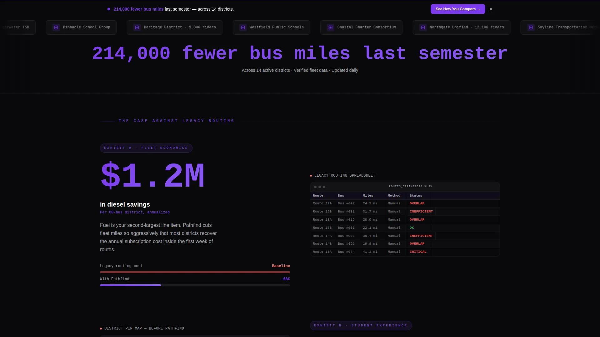
- A Logo Bar header with scrolling district and network logos plus an oversized stat in violet type
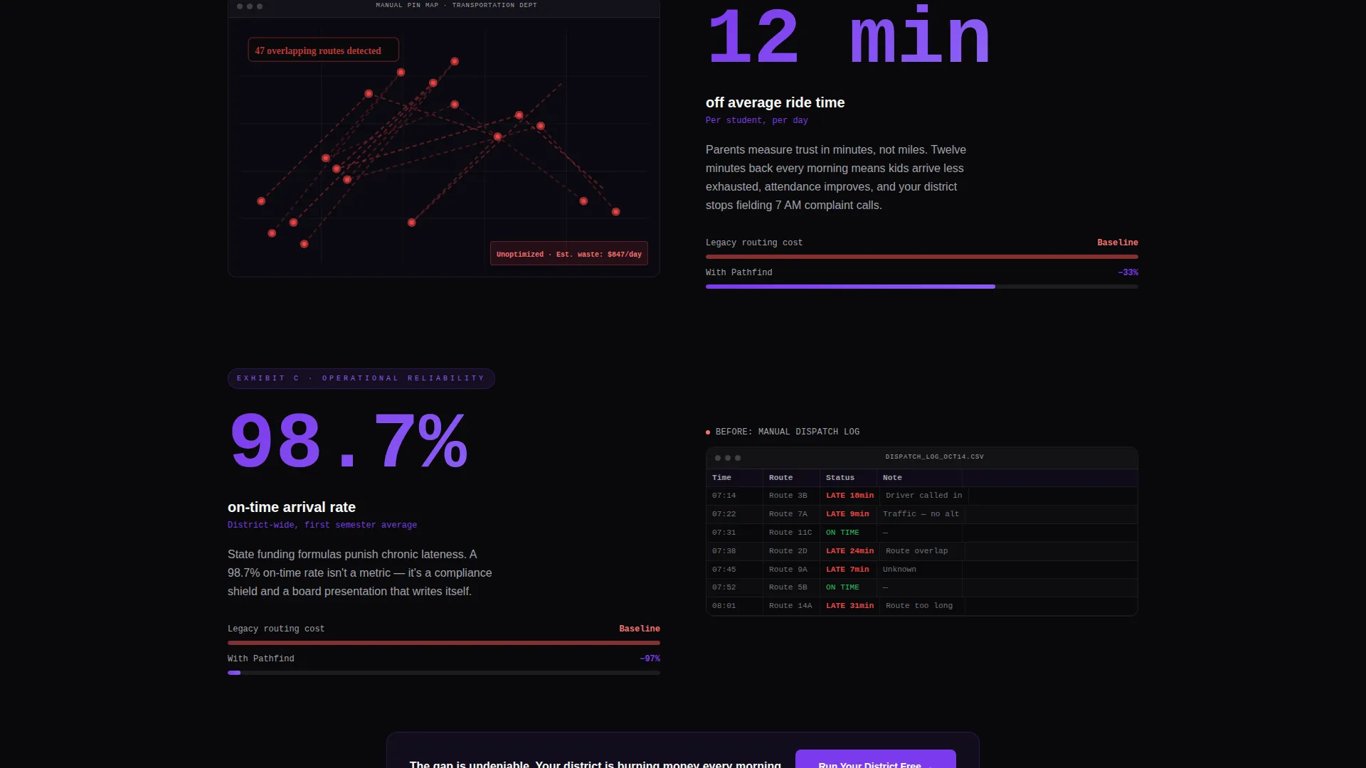
- Three stat-versus-comparison panel pairs that build a prosecutorial argument for switching
- A primary call-to-action block and a sticky secondary calculator banner for two conversion paths
Feature list
This section details the core built-in layout and design components that ship with the Pathfind template.
Scrolling Logo Bar Header
A horizontal strip of school district and transportation network logos scrolls continuously across the top. Below it, a single oversized stat in electric violet type lands before any copy loads. Together they establish credibility and scale within the first three seconds.
Split-Screen Stat Panels
Each of the three main content sections uses a strict 50/50 split. The left panel renders a headline metric in large violet type against void black. The right panel shows a direct comparison image, such as a legacy routing spreadsheet or a manual pin-map. The layout makes the contrast impossible to ignore.
Sticky Savings Calculator Banner
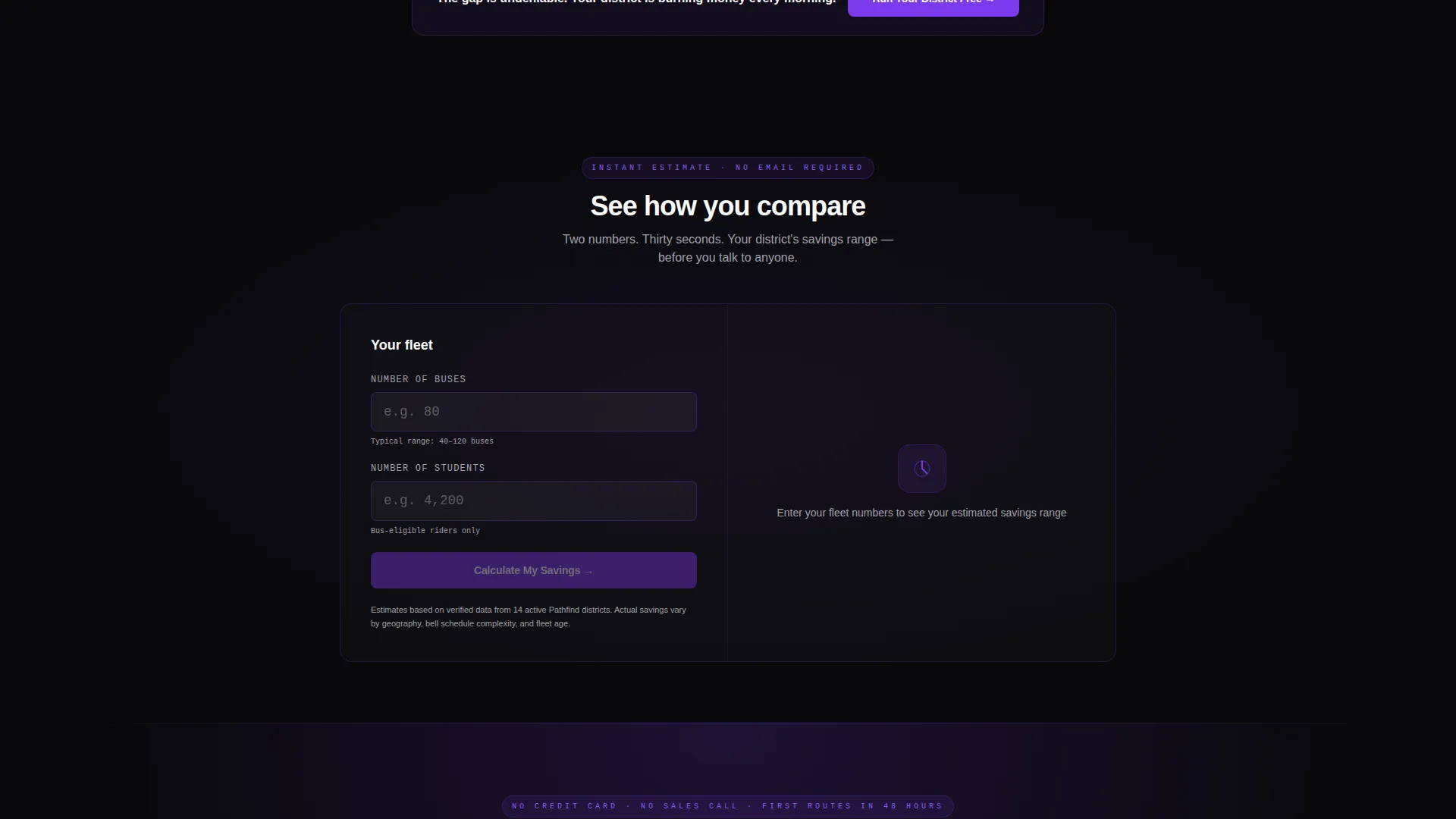
A persistent secondary banner sits at the bottom of the viewport throughout the scroll. Visitors enter two fields, number of buses and number of students, and receive an estimated savings range instantly. This gives every visitor a personal reason to act before reaching the primary call-to-action.
Prosecution-Style Scroll Narrative
The page is structured as a building argument. Stat pairs move from fleet-wide savings down to per-student ride time reduction, so each scroll feels more personal than the last. The narrative arc does the persuasion work so the call-to-action at the end feels like the only logical conclusion.
Void and Violet Color System
The design uses absolute void black as the background throughout, with electric violet reserved for every interactive and attention-demanding element. Buttons, progress bars, live metrics, and call-to-action elements all pulse in violet. White panels float forward to carry route maps and calculator surfaces.
Dual Conversion Path Layout
The template includes two distinct conversion triggers. The primary call-to-action, labeled "Run Your District Free," appears after the third stat pair. The sticky calculator banner provides a lower-commitment second path for visitors who are not yet ready to commit but are willing to see their own number.
Page sections overview
| Section | Purpose |
|---|---|
| Logo Bar Header | Establishes trust with recognizable district logos and a single large savings stat |
| Stat Panel One | Opens the fleet-wide savings argument with a bold headline metric and legacy comparison |
| Stat Panel Two | Deepens the case with diesel cost savings paired against a manual routing visual |
| Stat Panel Three | Makes the argument personal with per-student ride time data and on-time arrival rates |
| Primary call to action Block | Delivers "Run Your District Free" after the argument is complete and tension is highest |
| Sticky Calculator Banner | Provides a persistent two-field savings estimator visible throughout the entire scroll |
Design & branding system
The Pathfind template uses a Void and Violet palette built to feel like a mission control screen at pre-dawn. The overall mood is dark, focused, and precise, which mirrors how transportation directors think about their mornings.
- Backgrounds stay in absolute void black (#09090B) and deep space indigo (#1E1B4B) throughout the page
- Electric violet (#7C3AED) owns every button, metric highlight, progress bar, and active element
- White (#FAFAFA) is used exclusively for floating data panels, route map surfaces, and calculator interfaces
Mobile & speed optimization
The split-screen layout is designed to restack cleanly on smaller viewports without losing the stat-versus-comparison visual argument. The dark palette and focused element count keep the page lean.
- Stat panels shift to a single-column stacked layout on mobile so metrics lead and comparisons follow
- The sticky calculator banner remains accessible on mobile, anchored to the bottom of the screen
- The void-black background minimizes render-heavy gradients, keeping the page visually tight on slower connections
How this template helps you convert
The Pathfind template is built around a Comparison/Versus conversion strategy. Every layout and copy decision is designed to make the cost of staying with legacy routing feel real and urgent.
- The Logo Bar earns instant credibility with district names visitors recognize, so they read the first stat with trust already in place.
- The three escalating stat panels build a cumulative argument, moving from fleet-wide savings to personal ride time, so urgency grows with every scroll.
- The dual conversion path, a primary call-to-action plus a sticky calculator, means visitors have a low-commitment option at every point in the page, reducing drop-off before action.
Other information about this template
The Pathfind template is a strong fit for education technology companies in the school transportation and route optimization space. It is especially effective for platforms targeting district procurement cycles where data-driven comparisons accelerate decision-making.
- The template is built as a single-page, section-led landing page, not a multi-page site
- The Startup Velocity theme signals a modern, performance-oriented product to a buyer audience that values speed and precision
- The Stats-First Impact creative direction is directly suited to education software platforms where measurable outcomes matter more than feature lists
- The template style and color system can support a product demo or pilot program offer as the primary conversion goal
Theme
Startup Velocity
Creative direction
Stats-First Impact
Color system
Void & Violet
Style
Split Screen (50/50)
Direction
Comparison/Versus
Page Sections
Scrolling Logo Bar with Anchor Stat
Split-screen Stat Versus. Comparison Panels
Prosecution-style Scroll Narrative
Sticky Two-field Savings Calculator
Dual Conversion Path Structure
Void and Violet Design System
Related questions
Who is the primary audience for this landing page template?
Can I adapt the stat numbers and comparison panels to my own data?
What does the sticky savings calculator include?
Is this template suitable for a dark-mode brand identity?
How many conversion points does this template include?



