Agency Workflow Optimization Landing Page Template
The Pathfind streamlined agency workflow optimization landing page template is a dark-mode, glassmorphic comparison landing page built for marketing agency software. It guides ops directors and project managers from problem recognition to free trial signup through a structured Problem-to-Solution arc, a seven-row Before/After comparison table, case study cards, and an interactive bottleneck audit flow.
by Rocket studio
Quick summary
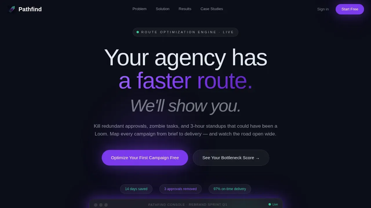
Pathfind is a single-page landing template built for a marketing agency route optimization platform. It opens with a pixel-crisp dashboard screenshot, walks visitors through a Problem-to-Solution arc, delivers a seven-row comparison table as its structural heart, and closes every scroll milestone with a freemium call to action. The design runs on a glassmorphic control-tower palette: deep void black, electric violet, and signal green.
Who this template is for
This landing page is built for B2B SaaS founders and marketing teams who sell workflow software to agencies. It speaks directly to the people inside those agencies who feel the pain most acutely.
- Ops directors at 30-to-200-person agencies who track margin erosion and spend weekends fixing Gantt charts nobody follows
- Project managers toggling between six project management tools to find a single status update
- SaaS marketers who need a landing page that converts skeptical, data-literate buyers without relying on flashy copy alone
What problem this template solves
Agency operations software is a crowded industry. A generic landing page fails because it cannot show a buyer the specific cost of their current chaos. Visitors land, skim, and leave. The problem is not the product; it is the page.
- Visitors do not immediately recognize their own pain in vague benefit statements, so they bounce before the value proposition lands
- Comparison pages that list features without context do not help buyers make data driven decisions or feel confident enough to start a trial
- Without a clear customer journey from problem to solution to proof to action, even well-built software fails to generate leads at the rate it should
What you get with this template
This template delivers a fully structured, single-focus landing page with every section defined, sequenced, and designed to move visitors forward. There is no navigation to distract them. The entire page is built around one conversion goal: starting a free campaign optimization.
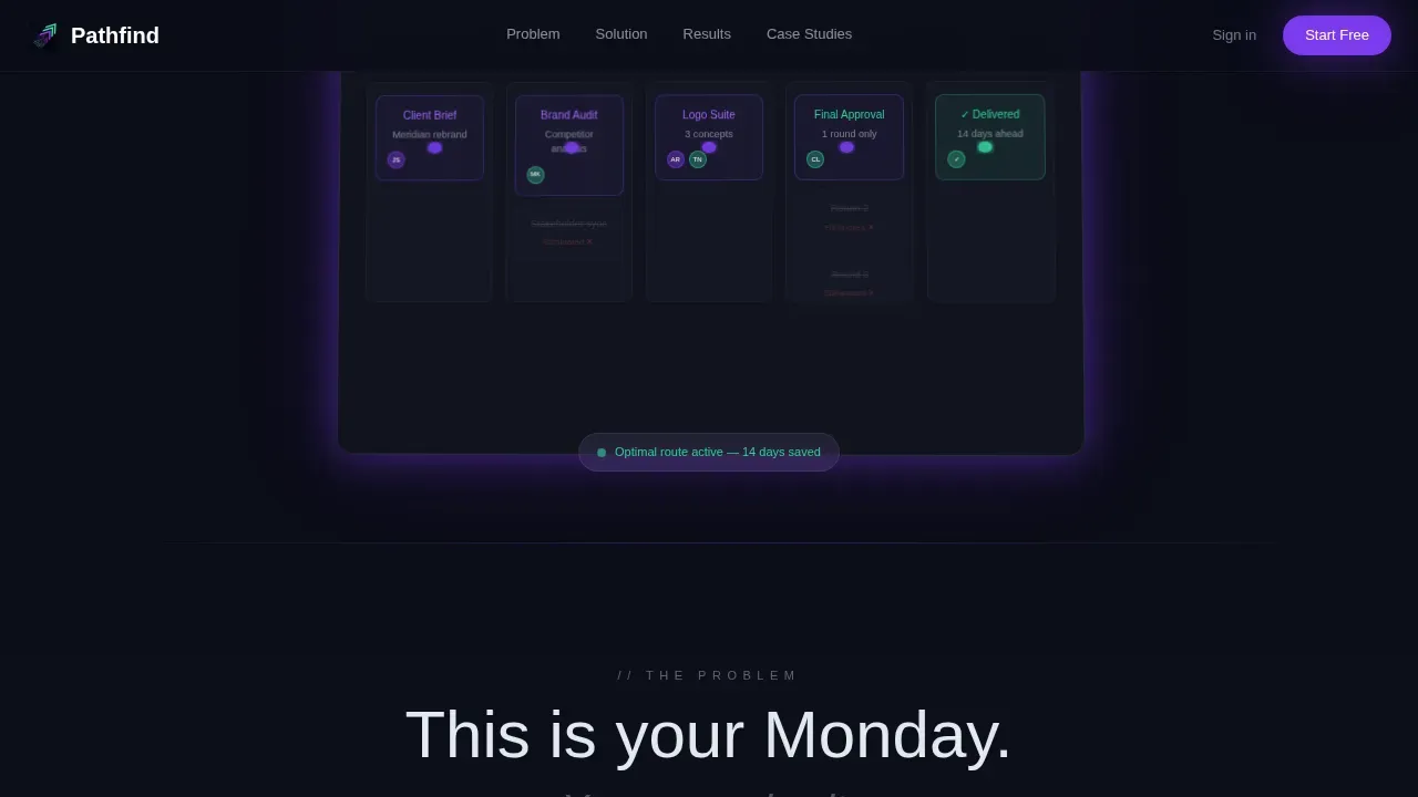
- A hero section with a product screenshot on a tilted glass card, a metrics bar, and an impactful headline above the fold
- A Problem-to-Solution arc spanning three sections: a tangled route map, an animated resolution, and a seven-row Before/After comparison table
- Three agency case study glass cards with route transformation visuals and ops director pull-quotes as social proof
- A sticky bottom conversion bar that activates after 40 percent scroll depth, plus a two-step glass modal and an interactive bottleneck audit
Feature list
This landing page template is built from purpose-designed components that work together. Each one earns its place by moving the visitor one step closer to clicking "Optimize Your First Campaign Free."
Glassmorphic Control-Tower Design System
The visual identity channels Startup Velocity through a dark glassmorphic layer system. Deep void black (#0B0D17) anchors the base. Frosted glass panels float above it at 12 percent white opacity. Electric violet (#7C3AED) pulses through calls to action and active states. Signal green (#34D399) marks every optimized metric. Cool mist (#E2E8F0) carries body text. Glass cards catch violet light at their edges with subtle backdrop-blur and no hard shadows, creating a focused, control-tower atmosphere where light appears only where decisions happen. Typography uses DM Sans for headings and Plus Jakarta Sans for body text, keeping every page title and label premium and distinct.
Problem-to-Solution Scroll Arc
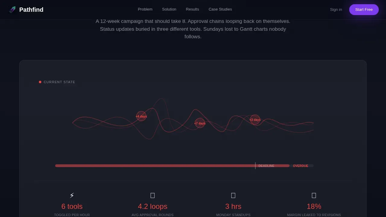
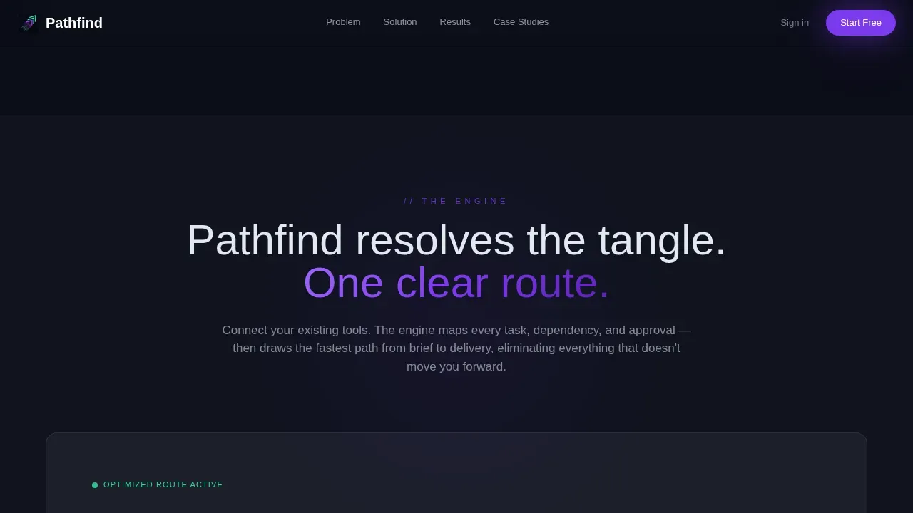
The page is structured as a three-act arc that mirrors the visitor's own experience. Section one renders the problem as a tangled route map with overlapping lines, red delay markers, and a timeline bleeding past deadline. The main headline above it sets the emotional hook. Section two introduces the resolution: an SVG animation powered by GSAP ScrollTrigger simplifies the tangle into a clean, violet-lit path. This arc turns passive scrolling into active recognition. Visitors do not read about the problem; they see their Monday morning rendered on screen.
Seven-Row Before/After Comparison Table
The comparison table is the structural heart of this landing page. It places "Before Pathfind" against "After Pathfind" across seven rows: average campaign delivery time, approval loops, tool switches per hour, margin leakage, Sunday planning hours, missed deadlines per quarter, and team satisfaction score. Every "After" cell pulses signal green. This format lets visitors make clear, data-based comparisons without needing a sales call. It supports data driven decisions by giving buyers the specific numbers they need to justify a trial to their leadership team.
Two-Step Freemium Conversion Modal
The primary call to action, "Optimize Your First Campaign Free," appears three times on the page. After the hero screenshot, below the comparison table, and in a sticky bottom bar that activates at 40 percent scroll. Clicking opens a two-step glass modal. Step one collects work email and agency size. Step two asks the visitor to connect one project management tool via OAuth. No credit card is required. Keeping the form minimal reduces friction and increases the likelihood that visitors complete it, a principle that applies across every high-converting landing page.
Interactive Bottleneck Audit
The secondary conversion path is a "See Your Bottleneck Score" interactive audit. It analyzes the visitor's current workflow inputs and delivers a personalized route map. This acts as gated content for buyers who are not yet ready to start a trial but cannot resist a diagnostic mirror of their own operations. It converts skeptics by giving them something immediately useful, drawing them further into the customer journey before asking for a deeper commitment.
GSAP Animation and Scroll Interactivity
The template includes high-fidelity animation built on GSAP ScrollTrigger. The route map SVG animates on entry. Comparison table rows stagger in as users scroll. Glass cards reveal with smooth transitions. Hover states glow with violet light. The hero screenshot tilts at a subtle two-degree perspective. These motion behaviors are not decorative; they direct the visitor's attention to the most important data points at exactly the right moment, keeping focus sharp and reducing the chance that key information is missed.
Page sections overview
| Section | Purpose |
|---|---|
| Hero Screenshot | Display dashboard mid-workflow on a tilted glass card with metrics bar and headline |
| Problem Route Map | Render the visitor's current workflow chaos as a tangled, deadline-bleeding route visual |
| Solution Animation | Animate the tangle resolving into a clean violet-lit optimized path |
| Comparison Table | Compare Before and After across seven agency workflow metrics in a signal-green table |
| Case Study Cards | Show three agency route transformations with ops director pull-quotes as social proof |
| Bottleneck Audit call to action | Offer an interactive workflow score to convert visitors not yet ready to start a trial |
| Sticky Conversion Bar | Activate a persistent bottom-bar call to action after 40 percent scroll to recapture intent |
| Conversion Modal | Collect email and agency size in step one; connect a project tool in step two |
Design & branding system
The design follows a strict brand style guide rooted in Startup Velocity and glassmorphic principles. Every color, type choice, and spacing decision points attention toward action. Visual elements like the hero image, glass cards, and animated route maps are central to how the page communicates, not decorative additions.
- Color system: deep void black (#0B0D17) base, frosted glass at 12 percent opacity, electric violet (#7C3AED) for calls to action, signal green (#34D399) for success states, cool mist (#E2E8F0) for body text
- Typography: DM Sans for all headings and page title labels, Plus Jakarta Sans for body copy; no Inter; no system defaults
- Animation: GSAP ScrollTrigger drives route map SVG reveals, table row stagger, glass card entrances, and hover glow effects across the entire page
Mobile & speed optimization
The template is desktop-first because ops directors and project managers primarily work from desktop environments. However, the layout is fully responsive and adapts cleanly to tablet and mobile viewports. Performance is built into the component architecture from the start.
- Server Components handle all static sections, reducing the JavaScript payload sent to the browser; Client Components are scoped only to animations and the conversion modal
- Images use lazy loading and the hero image is optimized for fast rendering; the goal is for the page to load in less than three seconds on a standard connection
- Touch-friendly button sizing and readable text scaling are applied across all breakpoints, ensuring the landing page remains usable on any device without degrading the conversion experience
How this template helps you convert
A well designed landing page does not leave conversion to chance. This template is engineered around a single goal and uses every scroll position to move visitors toward that goal without confusion or detour. A polished, professional landing page improves conversion rates because it builds trust at every step.
- The hero image and metrics bar capture the visitor's attention above the fold before a single word of body copy is read; the impactful headline "Your agency has a faster route. We'll show you." sets the promise immediately, matching the user intent of ops directors who already know they have a problem and are searching for a solution
- The comparison table delivers the clearest possible value proposition in a scannable format, giving visitors the specific before-and-after data they need to make a confident decision, while the signal-green "After" cells make the benefit undeniable without requiring manual effort to interpret
- The sticky conversion bar, three-position primary call to action, and bottleneck audit together create multiple on-ramps to conversion, so visitors who need more proof before they commit still have a low-friction path that keeps them engaged with the full customer journey rather than bouncing to a competitor's site
Other information about this template
This template sits at the intersection of marketing agency software, B2B SaaS landing page design, and conversion rate optimization. It is designed to be deployed as a standalone landing page for a single campaign or product, not as part of a broader multi-page website. Understanding how it fits into the broader world of landing page tools and search performance will help you get the most from it.
- Search and discoverability context: When publishing this landing page, treat it as you would any search-facing page. A clear page title and accurate meta description improve click-through from search results. Well-crafted title tags aligned to your primary keywords support organic traffic. On page optimization practices such as setting descriptive alt text on every image, maintaining a logical heading hierarchy, and keeping a focused word count all contribute to search visibility. Using Google Search Console after launch helps you monitor which search queries drive visitors to the page. Google Analytics provides session-level data on how users behave once they land. Google Business Profile is useful if the agency has a local search presence to reinforce.
- SEO strategy and keyword alignment: A solid seo strategy for this landing page starts with keyword research to identify the exact phrases ops directors type when they search for workflow solutions. Using those keywords naturally in the page title, meta description, headings, and alt text supports technical seo and on page optimization without forcing awkward phrasing. Natural language processing is increasingly how search engines evaluate page quality, so writing for humans first remains the best seo strategy. Organic traffic from well-aligned search intent converts better than paid traffic because visitors already understand the problem the page addresses.
- Landing page builder ecosystem: This template is designed to be built and customized within a modern landing page builder environment. Tools like Unbounce are landing page builder platforms designed to help marketers create and test landing pages without coding. Leadpages is a landing page builder designed for small businesses and entrepreneurs looking to create professional-looking pages without coding skills. Landingi is a landing page builder designed for businesses that need a straightforward and efficient way to create conversion-focused pages. Instapage supports collaboration features, making it ideal for teams managing multiple landing pages. HubSpot allows users to create landing pages, manage email campaigns, and track customer interactions from a single platform. ClickFunnels enables users to create entire sales funnels, including opt-in pages, upsell pages, and checkout pages, all within a single platform. Pathmonk leverages behavioral analytics and intent prediction to dynamically adjust landing page experiences based on user interactions.
- A/B testing and optimization: A/B testing is essential for optimizing landing pages and improving conversion rates over time. Running different versions of the hero headline, comparison table layout, or call to action button copy helps you identify what resonates with your target audience. VWO is a conversion rate optimization platform that helps businesses run experiments and improve landing page performance through A/B testing and behavioral analytics. Hotjar provides visual insights through heatmaps, session recordings, and user feedback tools to help businesses understand how visitors interact with their landing pages. User behavior analysis helps identify what elements on a landing page drive conversions, and understanding user behavior allows marketers to tailor landing page content to meet visitor needs and preferences. Behavioral analytics can inform the design and layout of landing pages to enhance user experience. Dynamic content adjustments based on user behavior can significantly improve landing page performance.
- Workflow optimization landing page context: A landing page template designed for agency workflow optimization highlights services aimed at reducing operational bottlenecks, such as AI integration and project management automation. Implementing a standardized template system can save agency teams over 20 hours weekly and reduce operational costs by at least 10 percent. Using ai tools to assist with copy variations, workflow data inputs, or personalized audit outputs can extend the page's effectiveness. Elements like reusable component libraries, global style controls, template versioning, and single-goal focus are essential for optimizing landing pages at scale. A landing page template for optimized agency workflows is a reusable, standardized framework that accelerates the creation of high-converting pages and supports the entire marketing strategy without rebuilding from scratch each campaign cycle.
- Broader landing page best practices: Above the fold refers to the content visible on a webpage without scrolling; this template places its highest-impact content there by design. Removing navigation from landing pages keeps visitors focused on the conversion goal, which is why this page has no site navigation menu. Using a specialized landing page template can increase conversion rates, speed up campaign deployment, reduce cost per acquisition, build trust and credibility, enable better data collection, and focus on results. Landing pages with video can increase conversions by 86 percent, so the template structure accommodates an embedded demo or case study video in the case study section. Social sharing buttons can help increase the reach of landing page offers to broader networks. A thank you page can jumpstart the next marketing touchpoint with calls to action pointing to other pages or resources. Gated content like the bottleneck audit acts as a secondary conversion for visitors not yet ready to commit, keeping them in the funnel and moving them through the full customer journey before a final ask. Analyzing user interactions on landing pages can reveal friction points that hinder conversions, and user behavior insights can guide the creation of personalized experiences on landing pages. Effective landing page design is informed by understanding the motivations and needs of the target audience.
Theme
Startup Velocity
Creative direction
Problem→Solution Arc
Color system
Glassmorphic
Style
Comparison Table
Direction
Freemium/Trial
Page Sections
Glassmorphic Control-tower Visual System
Problem-to-solution Scroll Arc
Seven-row Before/after Comparison Table
Three-position Freemium Call to Action and Sticky Bar
Interactive Bottleneck Audit
GSAP Scrolltrigger Animation Layer
Related questions
Who is this landing page template built for?
Can I customize the comparison table rows for different metrics?
Does the two-step conversion modal come included in the template?
How does the bottleneck audit support conversion for undecided visitors?
Is the template structured to support search visibility after publishing?



