Retro Fashion Professional Website Template
Patina is a dark, immersive gallery and detail landing page built for retro accessories brands with a serious sense of craft. Full-screen video, a desaturated hover gallery, expandable product detail panels, and a sticky upsell bar work together to pull visitors deeper into the brand world and move them toward curated, multi-piece purchases.
by Rocket studio
Quick summary
Patina is a single-page gallery and detail template for retro accessories brands that lead with atmosphere before price. A full-screen macro video opens the experience, a darkroom-style hover gallery follows, and expandable product panels carry the visitor through provenance, materials, and paired collections, all built around a tarnished brass and manuscript black visual system.
Who this template is for
This template is built for independent makers, workshop-born labels, and curated accessory brands whose products carry a story worth telling slowly. It suits sellers who compete on craft rather than trend, and whose buyers notice stitching, material origin, and finish before they notice price.
- Retro and heritage accessory brands selling leather goods, frames, or metal carry pieces
- Independent makers and small-batch labels who want their page to feel like a physical shop
- Creative directors and brand builders launching a new accessories line with a strong visual identity
What problem this template solves
Most product pages force visitors into a transactional mindset too quickly. For a brand like this, that friction kills the sale. Patina solves the problem of atmosphere loss, the gap between how a crafted object feels in person and how flat it looks on a generic grid page.
- Visitors leave before connecting with the brand because the page feels like every other shop
- Products that carry provenance and material detail get reduced to a thumbnail and a price
- Upsell opportunities are missed because companion pieces are never shown in context
What you get with this template
You get a fully designed landing page that builds brand world first and presents products inside it. Every section is purposefully sequenced: from the immersive video header through the gallery grid to the expandable detail panels and the sticky upsell bar at the bottom.
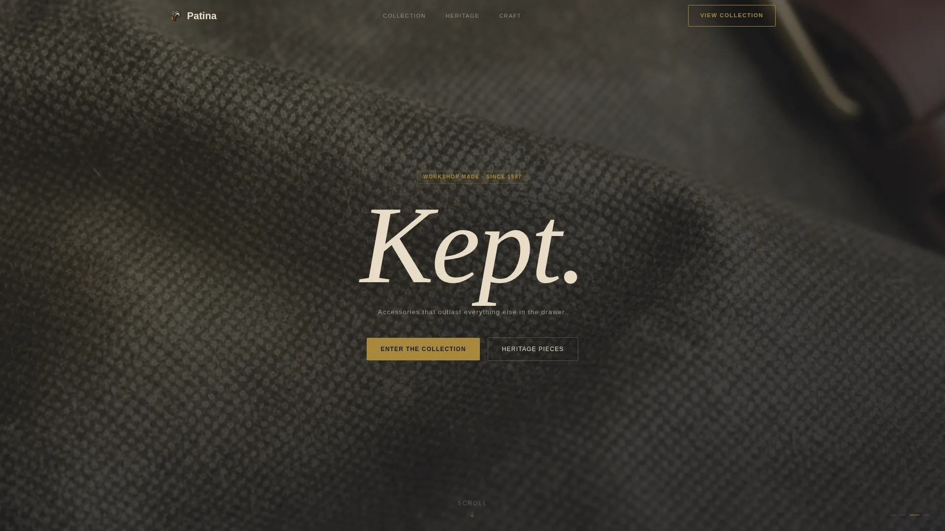
- A full-screen video header with slow macro footage and a centered, condensed serif headline
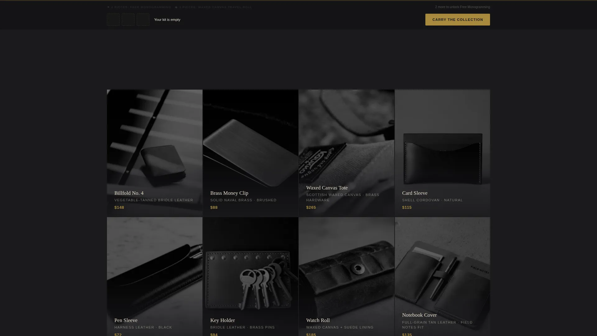
- A desaturated contact-sheet gallery that blooms into warm detail on hover
- Expandable full-width product panels with provenance notes, material sourcing, and a slow-zoom hero shot
- A "Complete the Set" module inside each panel showing companion pieces with a single combined price
- A sticky bottom bar with a tiered incentive progress bar that fills in tarnished brass as pieces are added
Feature list
Full-Screen Macro Video Header
The header runs slow, deliberate macro footage cycling through material textures: leather grain, a brass clasp closing, waxed thread being pulled taut. A single warm key light rakes from the left across a matte black surface. One condensed serif word fades in at center, followed by a short supporting line beneath it.
Darkroom Hover Gallery Grid
The gallery appears below the video like a contact sheet developing in a darkroom. Each thumbnail starts desaturated. On hover, it blooms into warm, lit detail. The transition reinforces the brand's atmosphere and rewards the visitor for exploring rather than scanning.
Expandable Full-Width Detail Panels
Clicking any gallery piece does not navigate away. Instead, a full-width detail panel expands in place, showing a slow-zoom hero shot, provenance notes, and material sourcing information. Visitors stay inside the page experience and go deeper into the story of each object.
"Complete the Set" Companion Module
Every product detail panel includes a "Complete the Set" section showing two or three companion pieces styled together. A single combined price is displayed alongside a brass-colored call to action reading "Carry the Collection." The pairing feels editorial, not algorithmic.
Sticky Upsell Bar with Progress Incentive
After the visitor opens their second detail panel, a sticky bottom bar appears. It shows the current selection and a tiered reward: two pieces unlocks free monogramming, three unlocks a waxed canvas travel roll. The progress bar fills in tarnished brass, making the upgrade feel earned rather than pushed.
Tiered Call-to-Action System
The primary action button reads "Add to Kit" rather than a generic cart label. This language reinforces curation over impulse. Combined with the brass-colored "Carry the Collection" call to action in companion modules, the page maintains a consistent voice across every decision point.
Page sections overview
| Section | Purpose |
|---|---|
| Video Header | Opens the brand world with macro texture footage and a centered serif headline |
| Hover Gallery Grid | Presents the full product range as a desaturated contact sheet that blooms on hover |
| Product Detail Panel | Expands inline to show provenance, materials, and a slow-zoom hero shot |
| Complete the Set | Shows curated companion pieces with a combined price and brass call to action inside each panel |
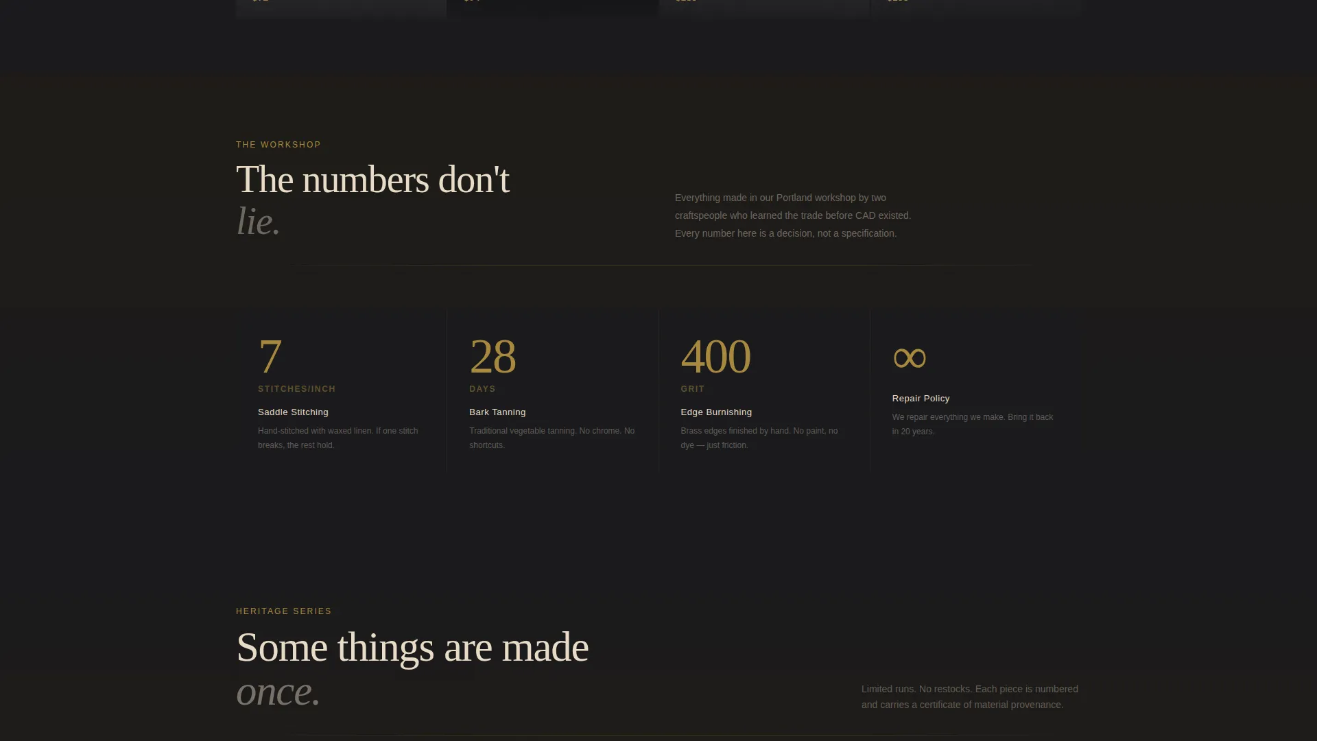
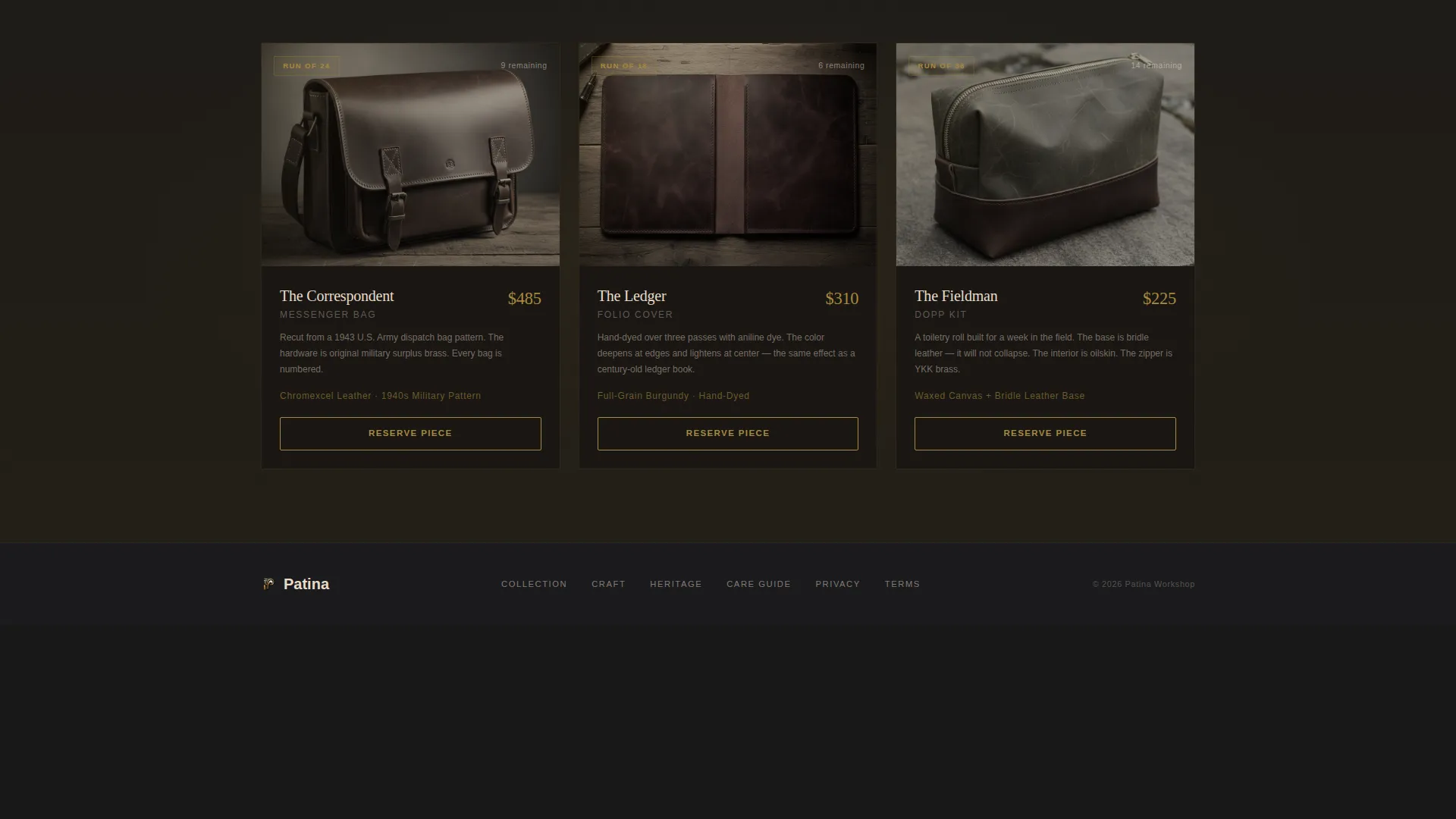
| Heritage Pieces Section | Deepens craft narrative with warmer lighting and shorter copy as scroll depth increases |
| Sticky Upsell Bar | Tracks selection and displays a tiered incentive progress bar after the second panel open |
Design & branding system
The visual identity runs on an Ink and Paper color system built around four values. Deep manuscript black (#1A1A1D) holds every background. Yellowed vellum (#E8DCC8) lifts product cards off the dark field. Fountain-pen blue-black (#2C3340) carries all body typography. Tarnished brass (#A8893E) appears only at hover states, price points, accent borders, and call-to-action elements, pulling the eye precisely where a decision needs to happen.
- Typography is set in a condensed serif for headlines and a measured text face for body copy, keeping the editorial feeling consistent
- Brass accents are used with restraint so every instance carries weight and directs attention purposefully
- The overall palette feels like a leather-bound journal left open under a single desk lamp: warm where light hits, impenetrable everywhere else
Mobile & speed optimization
The template is designed with a mobile-first layout hierarchy. The full-screen video header, expandable panels, and sticky bar are all structured to adapt across screen sizes without losing the atmospheric quality the desktop experience delivers.
- The gallery grid reflows to a single column on smaller screens, preserving the hover-to-bloom interaction where touch devices allow
- The sticky upsell bar and progress indicator remain visible and usable on mobile viewports
- Detail panels expand inline on all screen sizes, keeping the visitor inside the page experience rather than routing them away
How this template helps you convert
The page is designed so that conversion feels like a natural outcome of exploration rather than a moment of pressure. Every structural decision moves the visitor closer to a multi-piece purchase.
- The immersive video and gallery create genuine curiosity before any product is formally presented, so visitors arrive at detail panels already invested in the brand world.
- The "Complete the Set" module inside every panel makes companion purchases feel like the obvious next step, and the combined pricing removes the mental friction of calculating two separate decisions.
- The tiered sticky bar turns multi-piece selection into a rewarding progression: the visitor can see exactly what they unlock by adding one more piece, and the brass progress bar makes that moment feel satisfying rather than commercial.
Other information about this template
This template is built specifically for the retro fashion and lifestyle niche, where the product page itself is part of the brand experience. It is not a utility-first catalog page. It is an atmospheric, editorial landing page that treats every scroll interaction as an opportunity to deepen trust.
- The template style is Gallery and Detail, meaning it combines collection browsing with in-place product storytelling in a single continuous page
- The Dark Immersive theme and Atmosphere and Mood creative direction mean the design decisions prioritize feeling over function, while the Upsell and Upgrade landing page direction ensures that feeling still converts
- The Full-Screen Video header concept is included as a built-in structural section, not a separate integration, making it straightforward to swap in your own macro footage
- This template suits brands in the Fashion and Lifestyle category, particularly those operating in the Retro Fashion subcategory and the retro accessories brand niche
Theme
Dark Immersive
Creative direction
Atmosphere & Mood
Color system
Ink & Paper
Style
Gallery + Detail
Direction
Upsell/Upgrade
Page Sections
Full-screen Macro Video Header
Darkroom Hover Gallery Grid
Expandable Full-width Detail Panels
Complete the Set Companion Module
Sticky Upsell Bar with Tiered Incentives
Curated Call-to-action Language
Related questions
Can I replace the header video with my own footage?
Does the gallery hover effect work on touch screens?
How does the Complete the Set module work?
When does the sticky upsell bar appear?
Is this template suitable for a brand with only a small product range?



