Platform Engineering Landing Page Template
Pave is a split-screen landing page template built for platform engineering platforms. It guides visitors through a sharp Problem-to-Solution Arc, showing real product user interface six times before asking for anything. The Tech Glass visual theme, Feature Tab Switcher header, and click-through call to action flow make it ideal for platform teams ready to convert senior engineers into sandbox signups.
by Rocket studio
Quick summary
Pave is a single-page landing page template designed for platform engineering platforms. It pairs a 50/50 split-screen layout with a void-and-violet dark aesthetic to speak directly to platform leads drowning in infrastructure sprawl. The page builds trust through real product user interface and escalating problem-solution storytelling, then drives a low-friction click to a self-serve sandbox.
Who this template is for
This template is built for technical founders, platform engineering leads, and developer experience teams who need to convert skeptical senior engineers. If your audience reads YAML before marketing copy, this template speaks their language.
- Platform engineering leads at Series C+ startups and mid-enterprise organizations
- Developer experience teams launching internal developer platforms or service catalog tools
- Infrastructure product teams targeting staff engineers and site reliability engineering professionals
What problem this template solves
Most software-as-a-service landing pages talk at engineers instead of talking with them. A generic hero section and a feature grid will not earn trust from someone who has seen three platform tools fail. Pave solves the credibility gap by leading with recognizable pain and showing real product screens before making any claim.
- Engineers arrive skeptical and bounce when they see polished but vague marketing language
- Platform teams struggle to communicate the value of golden paths and paved roads to decision-makers and individual contributors alike
- Generic templates lack the layout structure needed to walk visitors through a logical problem-to-solution arc
What you get with this template
You get a fully structured, single-page layout that covers every stage of the buyer journey for a technical audience. The template is ready to populate with your own product screenshots, copy, and call-to-action links.
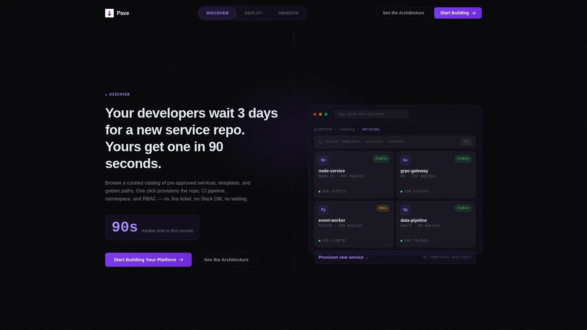
- A 50/50 split-screen layout with a Feature Tab Switcher header holding three tabs: Discover, Deploy, and Observe
- A Problem-to-Solution Arc with three escalating section pairs, social proof slots, and a full-width resolution panel
- Two call-to-action types: a primary electric violet button and a secondary ghost button, both wired to a no-form click-through flow
Feature list
The Pave template ships with a focused set of purposeful components. Each one is designed to earn engineer trust and move the visitor toward a sandbox signup.
Feature Tab Switcher Header
Three centered tabs labeled Discover, Deploy, and Observe sit above the split-screen viewport. Each tab swap triggers a glass-panel crossfade, swapping the right-side product screenshot while keeping the left-side problem statement anchored. This lets visitors self-direct their exploration without leaving the page.
50/50 Split-Screen Layout
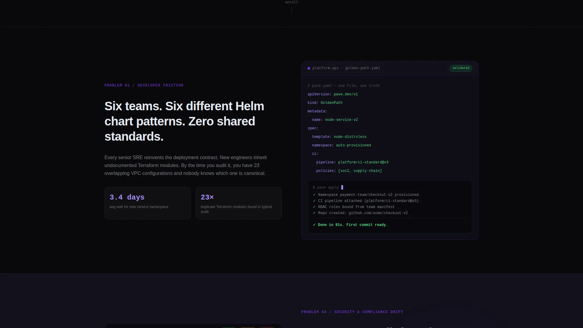
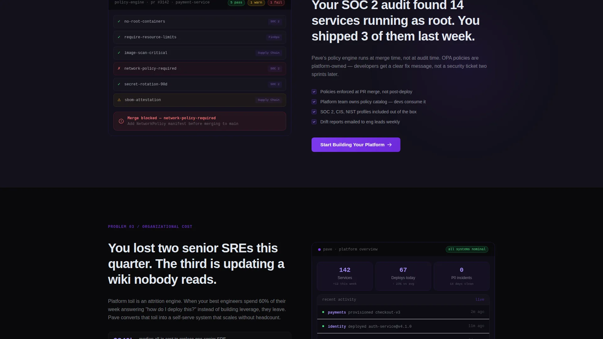
Every section pairs a left panel with a right panel. The left holds tight, specific problem statements in frosted white type over void black. The right holds annotated product user interface, architecture diagrams with violet connection lines, or short code snippets showing a platform application programming interface call. The layout collapses into a single full-width panel for the final resolution section.
Problem-to-Solution Arc Structure
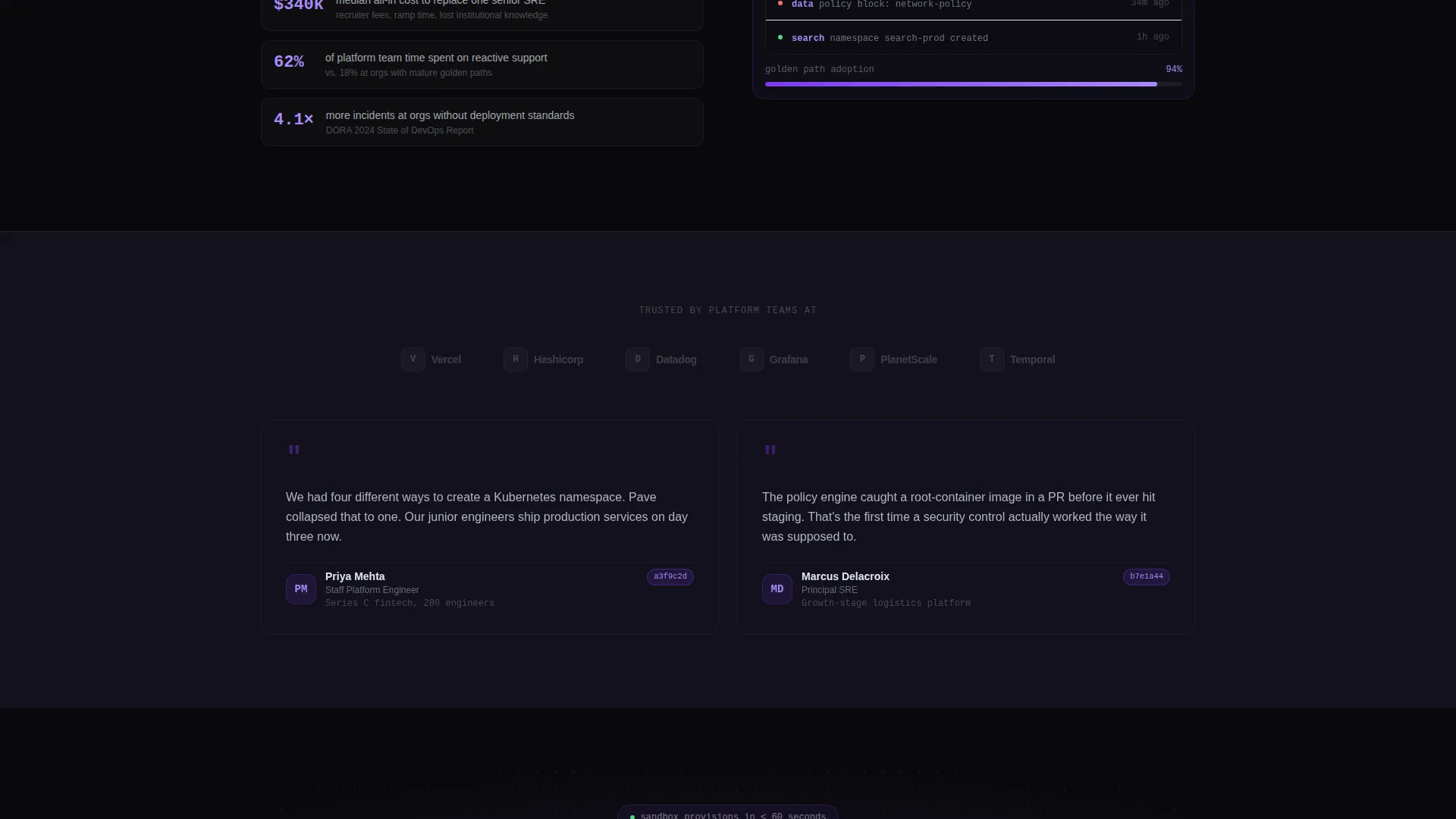
The scroll narrative escalates like a debugging session. Section one addresses developer friction. Section two covers security and compliance drift. Section three surfaces organizational cost through attrition numbers and incident frequency. The arc ends with a unified platform dashboard panel that shows the mess resolved into one view.
Social Proof Slots
Between each arc section, a social proof band appears with small monochrome logos and a single pull-quote attributed to a Staff Platform Engineer. This keeps credibility grounded at the practitioner level rather than the executive level.
No-Form Click-Through call to action System
The primary call-to-action button reads "Start Building Your Platform" and is pinned in the header navigation. It repeats after the second and final arc sections. A secondary ghost button reads "See the Architecture" for visitors who want a technical deep-dive before committing. Neither button triggers a form on-page; both land on an external signup flow.
Tech Glass Visual System
Glass-morphism panels with translucent surfaces, one-pixel border opacity, and soft backdrop blur float over faint dot-grid backgrounds. Violet gradients appear only on active tabs, primary buttons, and progress indicators. This restraint makes every violet highlight feel like a deliberate signal rather than decoration.
Page sections overview
| Section | Purpose |
|---|---|
| Feature Tab Switcher | Introduces the platform through three self-directed tabs |
| Left Problem Panel | States a sharp, specific pain point per section |
| Right Solution Panel | Shows annotated product user interface or architecture diagram |
| Social Proof Band | Places practitioner-level credibility between arc sections |
| Full-Width Resolution | Collapses the split layout into a unified dashboard view |
| Primary call to action Block | Drives clicks to the self-serve sandbox after key moments |
| Secondary Ghost call to action | Gives senior engineers an off-ramp to a technical deep-dive |
Design & branding system
The Void and Violet color system is designed to feel like a dark-mode integrated development environment where color earns its place. Every choice reinforces clarity and trust for a technical audience.
- Core palette: absolute void black (#09090B), deep interstellar (#13111C), electric violet (#7C3AED), and frosted glass white (#E2E8F0) for text and surface borders
- Hover and accent states glow in soft lilac (#A78BFA); violet gradients are reserved for active tabs, primary buttons, and progress indicators only
- Backgrounds layer subtle glass-morphism panels over faint dot-grid patterns that evoke infrastructure diagrams
Mobile & speed optimization
The template layout is structured to remain legible and functional across screen sizes. The split-screen panels are designed to reflow cleanly for smaller viewports.
- The 50/50 split-screen stacks vertically on mobile so problem statements and product screenshots remain readable in sequence
- Glass-morphism effects use backdrop blur and border opacity values chosen to render without heavy visual artifacts on common devices
- The no-form click-through model reduces page weight by removing on-page form scripts and validation logic
How this template helps you convert
Pave is built around one principle: show real product before asking for anything. The conversion path is deliberate and low-friction.
- The page shows real product user interface six times across the Problem-to-Solution Arc before presenting any call-to-action, building proof through repetition rather than promises.
- The primary call-to-action anchors in the header navigation and reappears after the second and final arc sections, catching visitors at the moments of highest conviction.
- The click lands on a signup flow that asks only for a work email and company size, reducing the barrier to sandbox access to a single field.
Other information about this template
Pave is built specifically for the platform engineering niche and reflects a real understanding of how internal developer platform buyers evaluate tools. The template style and content structure make it straightforward to adapt for related infrastructure and developer tooling products.
- The template is categorized under Platform Engineering Technology and is suited for internal developer platform landing pages, service catalog products, and CI/CD automation tools
- The creative direction follows a Problem-to-Solution Arc, a format well-suited to technical buyers who need to see evidence before they trust a claim
- The Tech Glass theme and Void and Violet color system are cohesive enough to carry a brand identity on their own, but the palette is flexible enough to adjust accent colors for different product identities
Theme
Tech Glass
Creative direction
Problem→Solution Arc
Color system
Void & Violet
Style
Split Screen (50/50)
Direction
Click-Through
Page Sections
Feature Tab Switcher Header
50/50 Split-screen Layout
Problem-to-solution Arc Structure
Social Proof Slots
No-form Click-through Call to Action System
Tech Glass Visual System
Related questions
Who is the intended audience for this template?
Does this template include a contact form?
Can I replace the product screenshots with my own user interface?
How does the Feature Tab Switcher work?
Is this template suitable for a product that is not yet launched?



