Expert Veterinary Services Landing Page Template
Kennel is a dark-mode, comparison-table landing page built for pet care software businesses. It guides visitors through a Problem-to-Solution arc, showing exactly how manual clinic workflows break down and how a modern CRM fixes them. The Tech Glass visual identity, electric chartreuse calls to action, and progressive-disclosure lead form make it ideal for converting clinic managers and boarding facility owners into qualified leads.
by Rocket studio
Quick summary
Kennel is a single-page, lead-generation landing page template designed for pet care CRM software. It uses a Problem-to-Solution scroll arc, a frosted-glass dashboard header, and a feature comparison table to move veterinary clinic managers, mobile groomers, and boarding facility owners from skepticism to sign-up.
Who this template is for
This template is built for pet care software companies and SaaS founders selling CRM tools to practice operators. It speaks directly to the people running day-to-day clinic operations, not IT buyers.
- Veterinary clinic managers handling dozens of daily appointments across multiple exam rooms
- Mobile groomers tracking client addresses, breed notes, and appointment history from their phones
- Boarding facility owners who need a faster, more professional way to communicate with pet parents
What problem this template solves
Pet care businesses often run on a patchwork of sticky notes, group texts, and spreadsheets. When the software pitch does not show the specific pain, prospects disengage before they see the value.
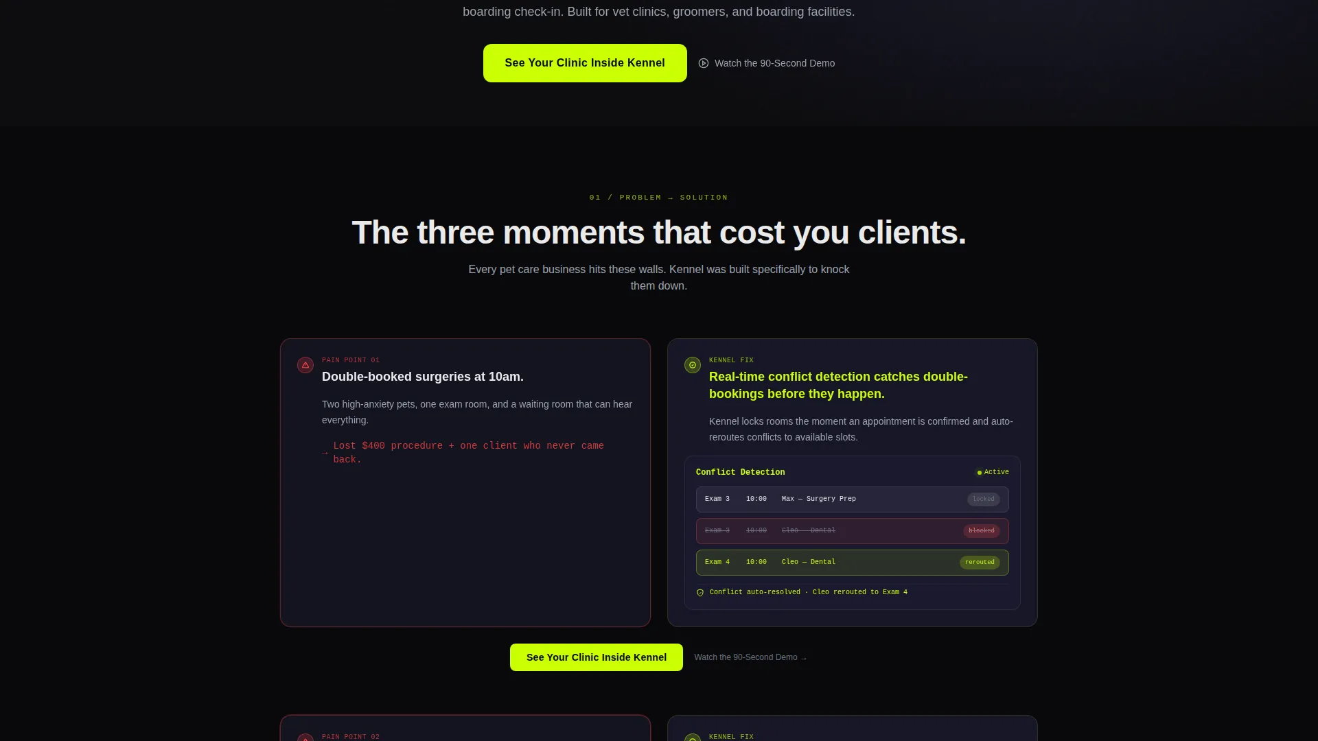
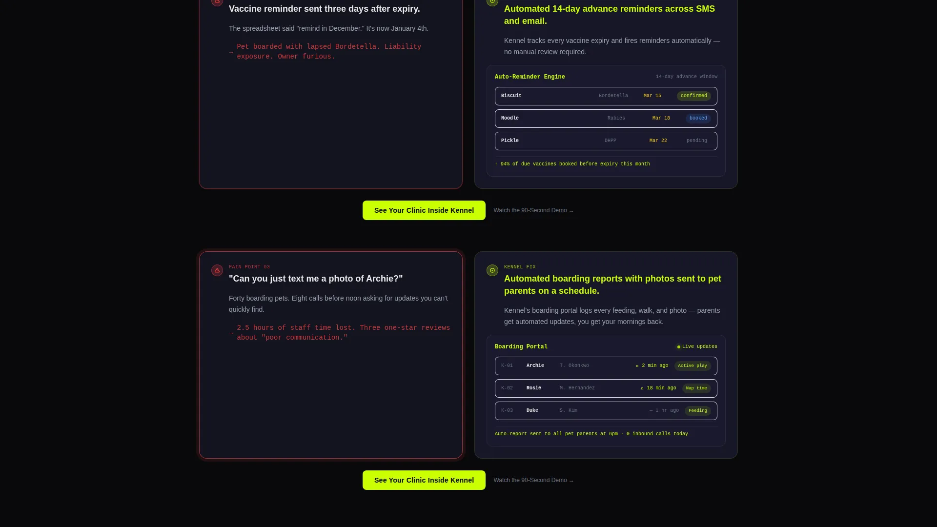
- Double-booked surgeries and expired vaccine reminders that slip through without automated alerts
- Boarding clients calling for updates that staff cannot find quickly
- No clear before-and-after proof that switching software is worth the disruption
What you get with this template
You get a complete, conversion-focused landing page layout that pairs emotional problem framing with hard feature evidence. Every section is designed to escalate urgency and then resolve it with the CRM's answer.
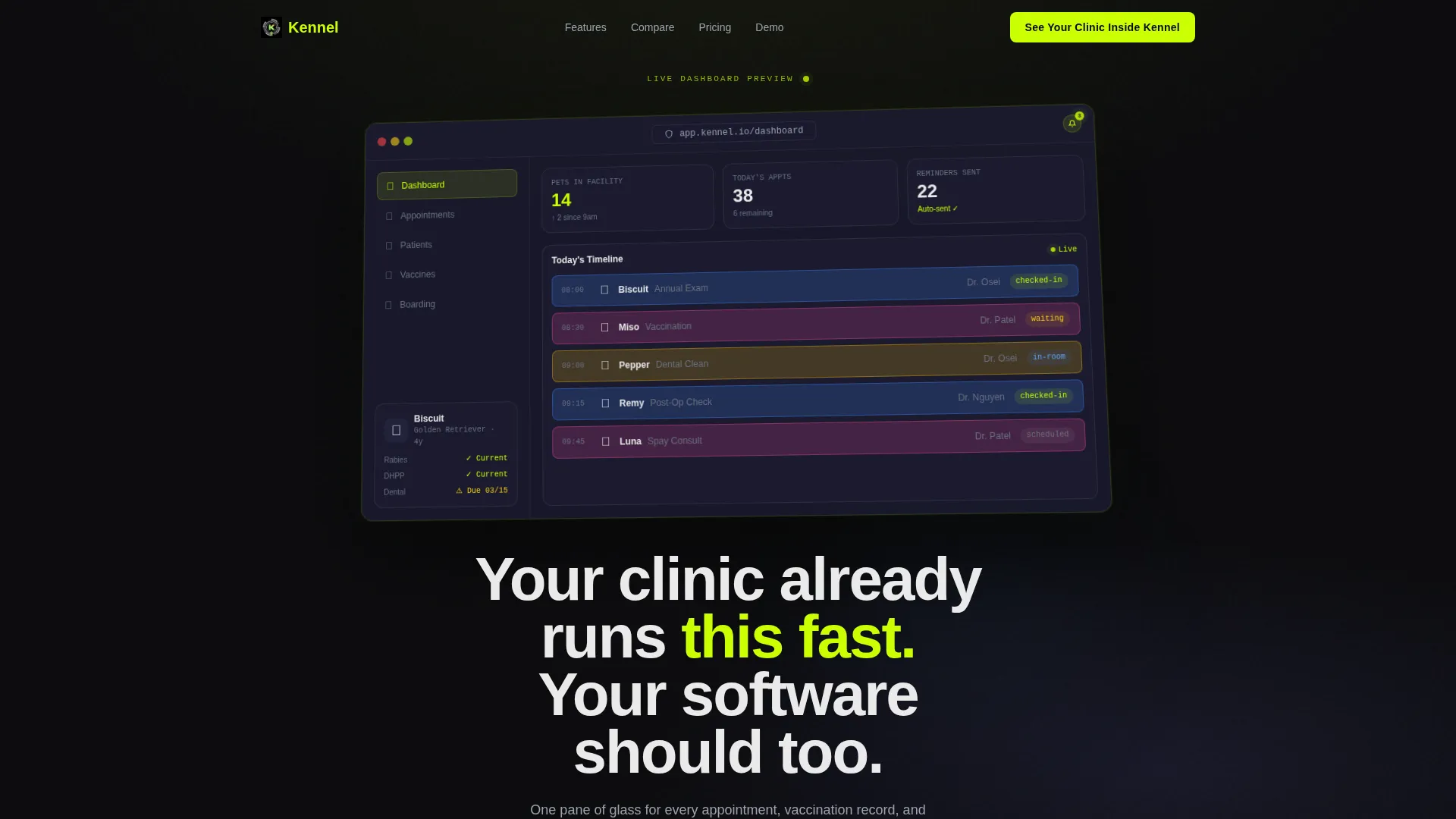
- A frosted-glass browser-frame header with a pixel-perfect CRM dashboard preview and a live-metric display
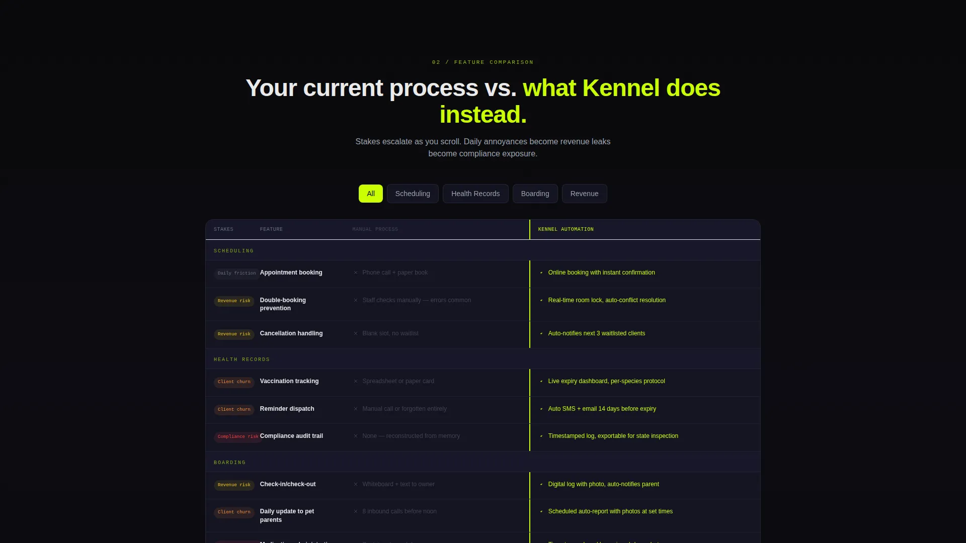
- A scrolling comparison table that places manual processes in muted gray against CRM automation lit in electric chartreuse
- A progressive-disclosure lead capture modal and a secondary demo video path for visitors who need more time
Feature list
This template delivers a focused set of design and layout capabilities grounded in the source brief.
Dashboard Preview Header
The header fills the full viewport with a frosted-glass browser frame containing a rendered CRM interface. Visible elements include a daily appointment timeline with color-coded species icons, a patient sidebar showing vaccination status, a real-time check-in counter, and a pulsing notification badge. A single headline sits beneath the render to anchor the value proposition immediately.
Problem-to-Solution Scroll Arc
Below the header, three problem cards appear in stark white text on void-black backgrounds, each carrying a subtle red pulse to signal urgency. As the visitor scrolls, each card transitions into a solution panel showing the specific CRM screen that resolves it. The progression moves from daily annoyances through revenue-affecting churn to compliance risk, building a sense of diagnosis before the cure appears.
Feature Comparison Table
The comparison table is the structural centerpiece of the page. Each row places a manual workflow in muted gray on the left and the automated CRM equivalent in electric chartreuse on the right. This side-by-side layout makes the software's advantage self-evident without requiring the visitor to read lengthy paragraphs.
Progressive Disclosure Lead Form
The primary call to action opens a glass-panel modal that collects information in stages: clinic name first, then number of practitioners, then daily appointment volume, then email. This onboarding-style sequence reduces form anxiety and gathers qualification data naturally. The modal design matches the overall Tech Glass aesthetic.
Persistent and Inline calls to action
The primary call-to-action button reads "See Your Clinic Inside Kennel" and appears both as a persistent floating button and anchored at the bottom of every comparison row. A secondary text link reading "Watch the 90-Second Demo" sits beneath each primary call to action. The demo path captures email on play, creating a second conversion lane for undecided visitors.
Acid Digital Color System
Interactive elements, data highlights, toggle states, and live metric numbers all use electric chartreuse (#CAFF04) to guide the eye. The background palette stays within void black (#09090B) and translucent panel gray (#1A1A2E). Cards use subtle glass-blur borders to create depth without distraction.
Page sections overview
| Section | Purpose |
|---|---|
| Dashboard Preview Header | Immerses visitor in a live-feel CRM interface with a headline anchoring the core promise |
| Problem Card Row | Presents three specific pet care pain points with urgent visual treatment |
| Solution Panel Row | Pairs each problem card with the matching CRM screen that resolves it |
| Comparison Table | Stacks manual versus automated workflows row by row in a scannable two-column layout |
| Lead Capture Modal | Collects clinic details through a progressive-disclosure form triggered by the primary call to action |
| Demo Video Path | Offers a secondary commitment level via a 90-second demo with email gate on play |
| Floating call to action Button | Keeps the primary call to action visible at every scroll depth |
Design & branding system
The visual language is built around a Tech Glass theme using the Acid Digital color system. The result feels like a dark-mode terminal displaying live operational data, calm and precise rather than decorative.
- Core palette: void black (#09090B) and translucent panel gray (#1A1A2E) for all backgrounds, with electric chartreuse (#CAFF04) on every interactive element and clinical white (#EAEAEA) for body text
- Cards use subtle glass-blur borders to float above the dark gradient, giving the layout a layered, three-dimensional quality without heavy drop shadows
- The dashboard header render is slightly rotated on the Z-axis, creating a perspective float that makes the product feel tangible before the visitor reads a single word
Mobile & speed optimization
The layout is structured for clean rendering across screen sizes, with every interactive element sized for touch input. The dark background and focused content areas reduce visual noise on smaller displays.
- Glass-panel cards and the comparison table are designed to reflow gracefully at mobile viewport widths
- The persistent floating call to action button remains accessible at all scroll depths on both desktop and mobile
How this template helps you convert
Every layout decision on this page is oriented toward one outcome: turning a skeptical clinic operator into a qualified lead. The page does not rely on generic feature lists alone.
- The Problem-to-Solution arc creates emotional momentum. Visitors recognize their own workflow pain in the opening cards, then watch it disappear as they scroll, making the CRM feel inevitable rather than optional.
- The progressive disclosure form reduces drop-off by asking for low-stakes information first. Clinic name and team size feel like onboarding steps, not data collection, so visitors reach the email field with less resistance.
- The secondary demo path captures visitors who are interested but not ready to fill in a form. Gating the video on email gives the sales team a second list of warm prospects at a lower commitment level.
Other information about this template
This template is a strong starting point for any pet care CRM or veterinary software product looking to run targeted landing page campaigns. A few additional context points are worth noting.
- The template style is a comparison table, making it well suited for campaigns where the primary objection is "why switch from what I already use"
- The header concept is a Dashboard Preview, which works especially well for software products that have a visually rich interface worth showing before the pitch begins
- The creative direction follows a Problem-to-Solution Arc, a proven structure for SaaS landing pages selling to operational buyers who think in terms of daily workflow pain
- The lead generation focus means the page is designed around form submissions and demo requests rather than content consumption or e-commerce transactions
- This template sits within the Pet Care Software and SaaS subcategory, making it relevant for tools covering appointment scheduling, vaccination record management, boarding communication, and follow-up automation
Theme
Tech Glass
Creative direction
Problem→Solution Arc
Color system
Acid Digital
Style
Comparison Table
Direction
Lead Generation
Page Sections
Dashboard Preview Header with Live Metrics
Problem-to-solution Scroll Arc
Feature Comparison Table
Progressive Disclosure Lead Form
Dual Call to Action Conversion Paths
Related questions
Who is this landing page template designed for?
Can I replace the comparison table content with my own features?
What information does the progressive disclosure form collect?
Can I use my own dashboard screenshot in the header?
Does the template support a secondary conversion path for undecided visitors?



