Certified Veterinary Software Professional Website Template
Triage is a split-screen veterinary help desk landing page template built on a Tech Glass visual system. It showcases a real-time ticket queue interface, priority-sorted case cards, and resolution metrics in a dark Midnight Blue palette with teal glow accents. Designed for app download conversion, it moves visitors from problem recognition to install tap in one confident scroll.
by Rocket studio
Quick summary
Triage is a single-page landing page template for a veterinary help desk and ticketing platform. It uses a 50/50 split-screen layout, a Tech Glass visual theme, and a Midnight Blue color system to give veterinary clinics a clear, compelling case for downloading the app. The page is built around launch-energy scroll momentum and a front-loaded ticket queue visual.
Who this template is for
This template is built for software teams and product marketers promoting a veterinary ticketing or help desk application. It speaks directly to the operational pain points of clinic staff, making it immediately relevant to anyone selling into that audience.
- Practice managers and clinic operators who need to demonstrate software value quickly
- Veterinary software founders presenting an app to front-desk and associate vet audiences
- Product teams launching or relaunching a clinic communication or triage tool
What problem this template solves
Veterinary clinics run on high-stakes communication. When urgent calls, refill requests, and post-op follow-ups pile up across sticky notes and browser tabs, cases fall through the cracks. This template makes that problem visceral and then resolves it visually before a visitor reads a single word of body copy.
- Clinics lack a single view of all open cases, creating costly delays and missed callbacks
- Front-desk staff juggle panicked pet-parent calls with in-person check-ins simultaneously
- Software landing pages often bury the value proposition instead of showing the product at work
What you get with this template
You get a fully designed, section-led landing page built for app download conversion. Every layout choice, color decision, and scroll sequence is defined in the brief and ready to build from.
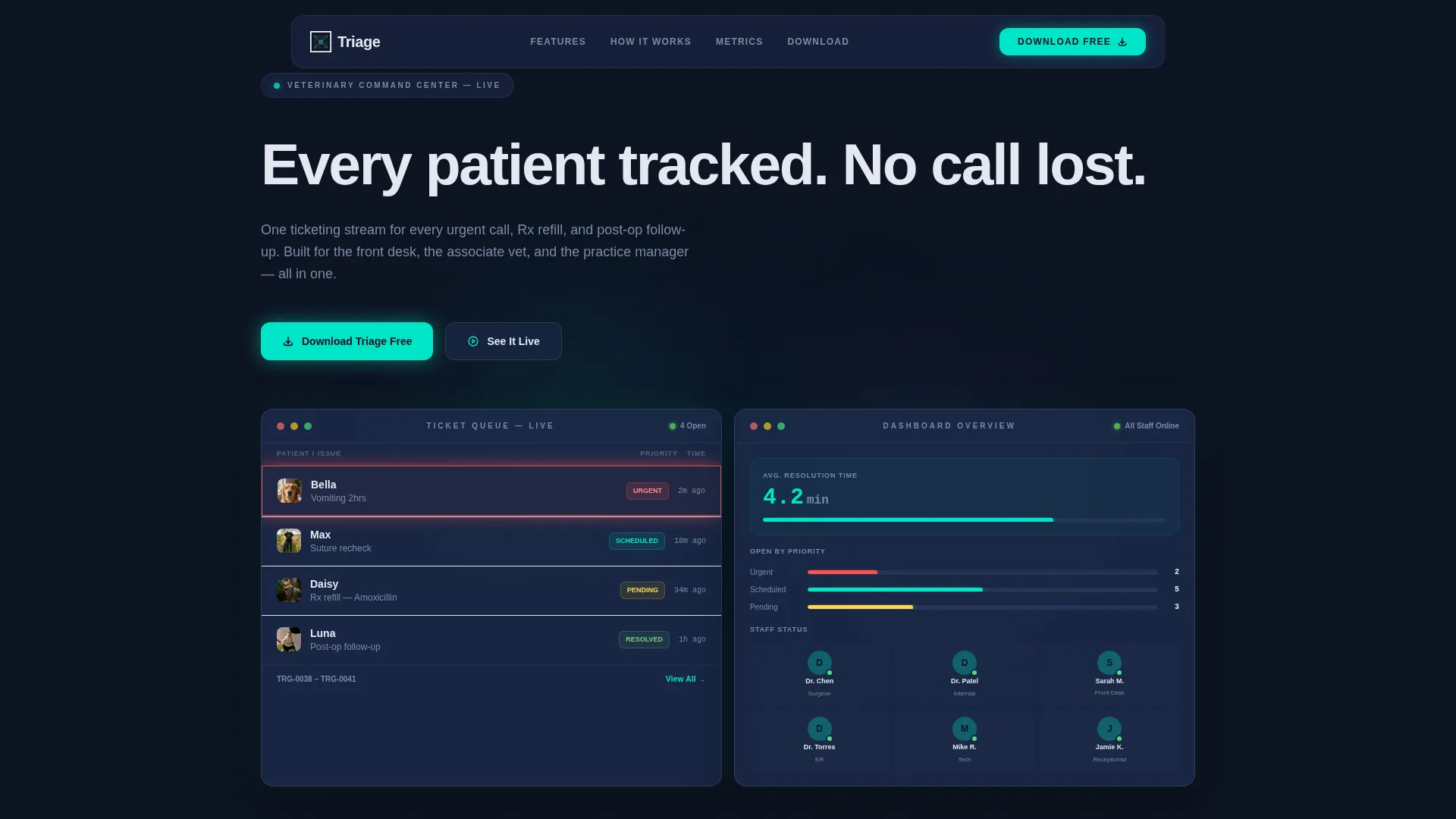
- A dark full-bleed header with a live-looking glass ticket queue card and a pulsing urgent-ticket glow
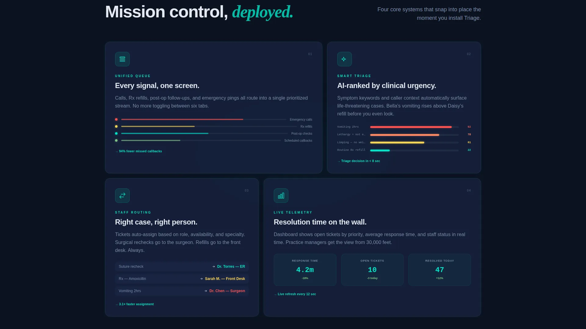
- A split-screen chaos-versus-clarity section, mission-control feature reveals, and speed-metric telemetry readouts
- A floating bottom bar with a persistent download call to action and paired App Store and Google Play badge placements
Feature list
This template includes a focused set of visual and structural features grounded in its veterinary help desk use case.
Live-Looking Ticket Queue Card
A glass-panel user interface card sits center-screen in the hero section. It displays sample entries such as "Bella, vomiting 2hrs, URGENT" with priority labels and status tags. The urgent ticket pulses once with a subtle teal heartbeat glow, making the product's core value immediately clear.
Split-Screen Chaos versus. Clarity Layout
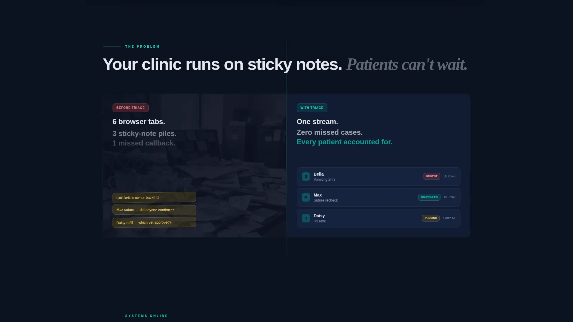
The first content section renders the problem as a literal visual split. A cluttered desk with paper charts occupies the left half. The clean ticketing interface occupies the right. The contrast communicates the before-and-after without requiring a single line of explanatory text.
Mission-Control Feature Reveal Sequence
Feature cards deploy one by one as the visitor scrolls. Each glass card slides into view with a glow-edge animation, mimicking systems coming online in a command center. The sequencing builds narrative tension and product confidence simultaneously.
Speed Metrics Telemetry Section
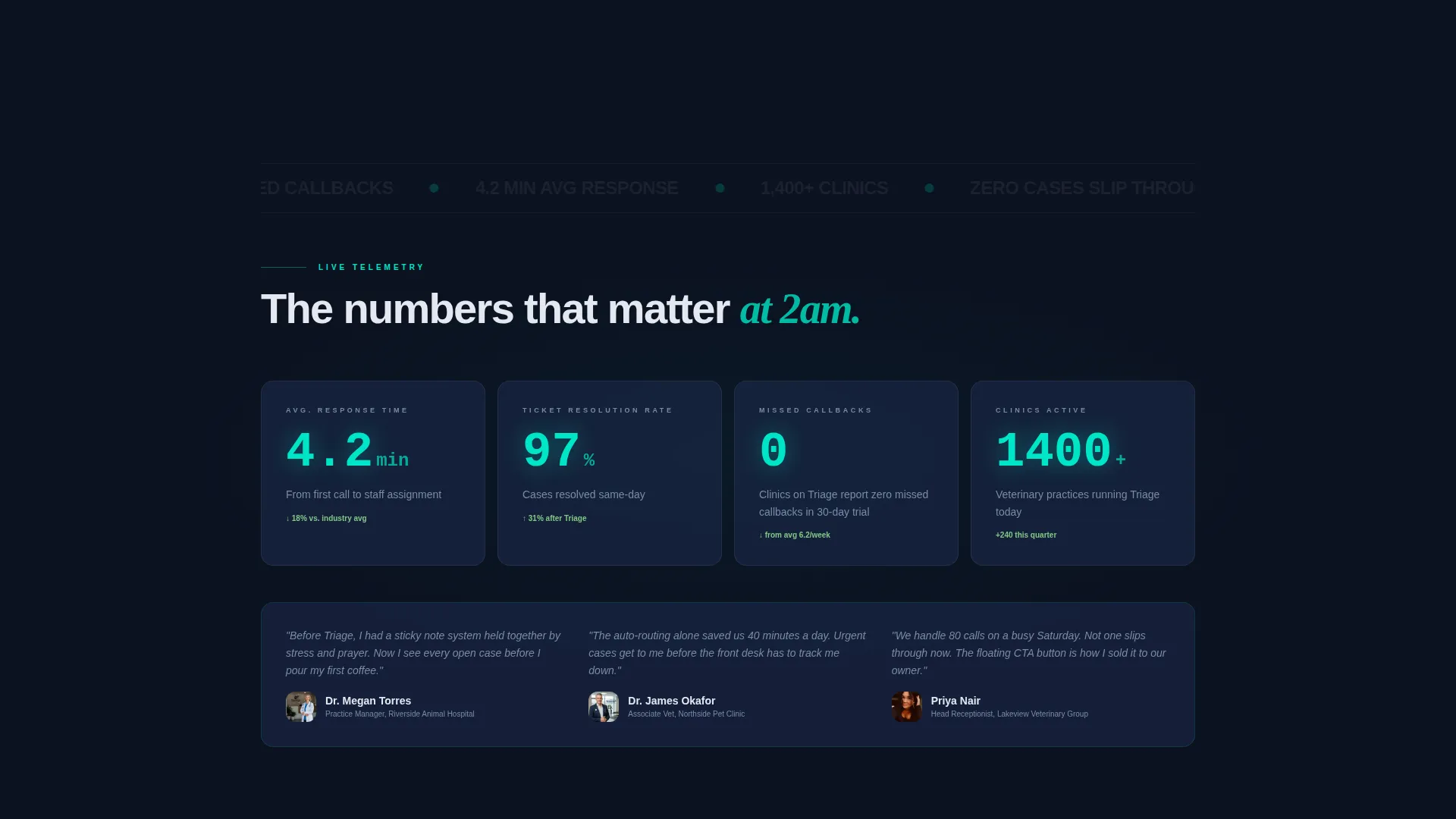
A dedicated section presents average response time and ticket-to-resolution data as live telemetry readouts. The visual style matches a real-time dashboard, reinforcing the platform's operational credibility and performance story.
Floating Persistent Download Bar
A sticky bottom bar reappears after the second scroll. It carries the primary download call to action so the install button is always present the moment a visitor decides. This removes friction between conviction and action.
Dual-Path Conversion Design
The primary call to action reads "Download Triage Free" with teal-glowing App Store and Google Play badges. A secondary path labeled "See It Live" links to an interactive demo. Both paths are visible without competing, giving visitors the choice that matches their readiness.
Page sections overview
| Section | Purpose |
|---|---|
| Dark Hero Header | Introduce the ticket queue visual and headline |
| Split Problem Section | Contrast cluttered workflow with clean interface |
| Feature Reveal Cards | Present core platform capabilities one by one |
| Telemetry Metrics Block | Show resolution speed and operational stats |
| App Download call to action | Drive installs with store badges and demo link |
| Floating Bottom Bar | Keep download action persistent across scroll |
Design & branding system
The template uses a Tech Glass visual identity built on a Midnight Blue color system. Every design decision reinforces the feeling of a dark, precise 24-hour emergency clinic environment.
- Core palette: deep terminal navy (#0B1120) for backgrounds, frosted-panel blue (#1B2A4A) for glass cards, cool clinical white (#E4E8F0) for body text, and bioluminescent teal (#00E5C7) reserved for interactive elements, hover states, and status indicators
- Glass card components use translucency and soft teal halo effects to create depth without adding visual noise
- Teal glow accents appear on the urgent ticket pulse, call to action buttons, App Store and Google Play badges, and glow-edge feature card animations
Mobile & speed optimization
The layout is designed with a focused single-column scroll path and a persistent floating bar that keeps the download action reachable at any point during the session.
- The 50/50 split-screen sections are structured to restack cleanly for narrower viewports without losing the chaos-versus-clarity contrast
- The floating bottom bar is built to remain visible and functional on mobile screens after the second scroll
- Section pacing shortens and becomes more visual toward the bottom of the page, reducing scroll fatigue on smaller devices
How this template helps you convert
The template earns the download tap by making the product's value undeniable before asking for any action. Each scroll stage removes doubt and builds momentum.
- The hero section front-loads the ticket queue visual so visitors immediately see their own workflow organized, establishing product relevance before any persuasive copy appears.
- The launch-energy scroll sequence accelerates pace as sections get shorter and more visual, building urgency that peaks at the app download call to action.
- The persistent floating bottom bar ensures the install button reappears the moment conviction hits, eliminating the need to scroll back up to convert.
Other information about this template
This template is purpose-built for the veterinary software niche, where emotional resonance with clinic staff is as important as feature clarity. A few additional details are worth noting.
- The template style is Split Screen (50/50), a layout format well-suited to before-and-after narratives common in practice management software marketing
- The header concept is Dark Full-Bleed with a Glow treatment, a high-impact approach typically used for tech and SaaS app launches
- The creative direction is Launch Energy, meaning scroll pacing and section length are intentionally calibrated to accelerate toward the download moment
- The landing page direction is App Download, with primary placement for App Store and Google Play badges and a secondary interactive demo path
Theme
Tech Glass
Creative direction
Launch Energy
Color system
Midnight Blue
Style
Split Screen (50/50)
Direction
App Download
Page Sections
Live Ticket Queue Hero Card
Split-screen Problem-solution Layout
Sequenced Feature Card Reveals
Telemetry-style Metrics Display
Persistent Floating Download Bar
Dual Conversion Path Design
Related questions
What kind of business is this landing page template designed for?
What layout style does this template use?
Does the template include both App Store and Google Play download paths?
Can I adapt this template for a non-veterinary software product?
What is the Tech Glass visual theme?



