Accounting Firm Professional Website Template
Ledger is a single-page accounting firm landing page template built around a glassmorphic comparison table. It guides startup founders, freelancers, and family estate clients from curiosity to sign-up through a tabbed hero, animated tier comparison, and a freemium conversion flow. Three fields and no credit card stand between a visitor and their free tier.
by Rocket studio
Quick summary
Ledger is a conversion-focused accounting firm landing page template. It opens with a three-tab hero switcher, flows into an animated tier comparison table, and closes with a lightweight modal sign-up. The design uses a glassmorphic palette of frosted whites, deep navy, and translucent mint to make complex financial information feel organized and approachable.
Who this template is for
This template is built for accounting firms and financial service practices that offer tiered service packages. It suits teams who want a polished freemium sign-up flow without building a custom page from scratch.
- Accounting firms presenting Free, Growth, and Full-Service plans side by side
- Solo consultants and boutique practices targeting startup founders, freelancers, and family trusts
- Finance professionals who want a visual, credibility-first landing page that drives sign-ups
What problem this template solves
Most accounting firm pages bury service details in dense paragraphs. Potential clients cannot tell which plan fits their situation, and the page loses them before they commit. Ledger solves that by turning service tiers into a structured, scannable comparison experience.
- Removes confusion about what each service tier includes
- Replaces a static service list with an interactive, scroll-driven comparison table
- Lowers sign-up friction with a three-field modal and no credit card requirement
What you get with this template
You get a complete, single-page layout with every visual and interactive component described below. Nothing needs to be assembled from separate parts.
- A Feature Tab Switcher hero with three service-specific panels and animated content transitions
- A scroll-animated comparison table with frosted-glass tier cards, micro-testimonials between rows, and a savings calculator
- A glassmorphic sign-up modal, a sticky conversion bar, and a secondary deep-scroll path for detail-focused researchers
Feature list
This template ships with six purpose-built components. Each one addresses a specific moment in the visitor's decision journey.
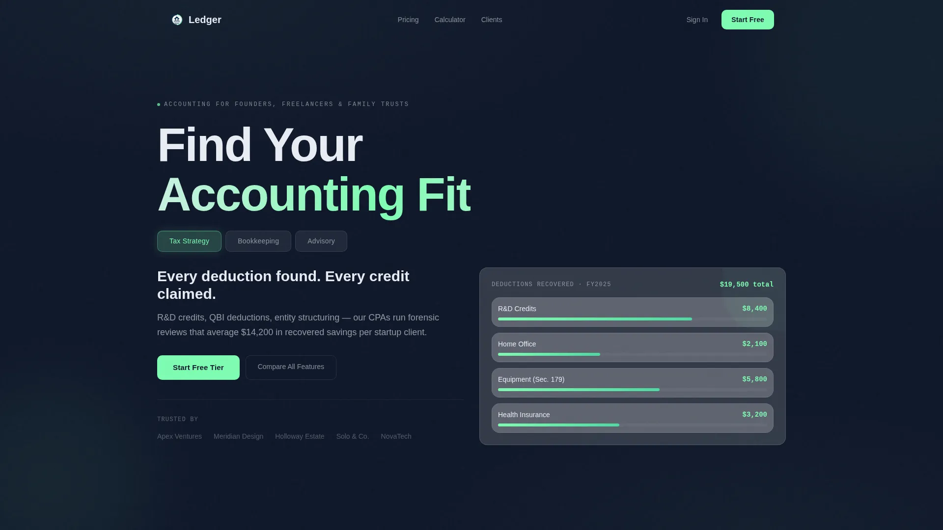
Three-Tab Service Hero
The header holds three frosted-glass tabs labeled "Tax Strategy," "Bookkeeping," and "Advisory." Each tab reveals a distinct content panel: a deductions dashboard, an animated ledger view, and a quarterly calendar. The active tab glows with a translucent mint edge, and panels slide laterally with a subtle depth parallax effect.
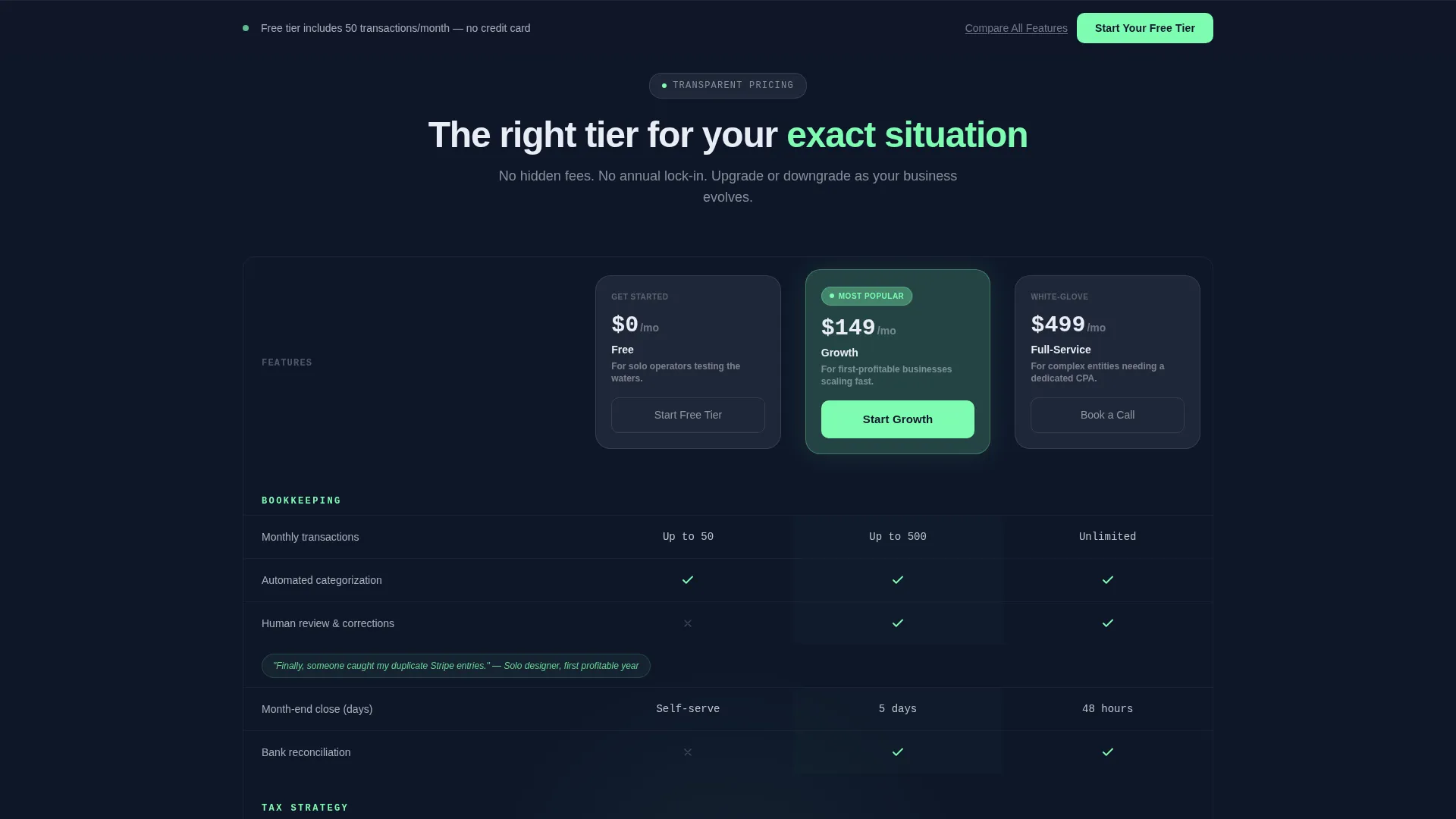
Scroll-Animated Comparison Table
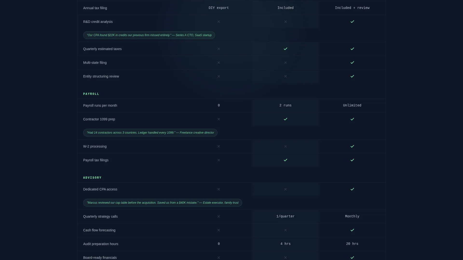
The comparison table fans open row by row as the visitor scrolls down the page. It contrasts Free, Growth, and Full-Service tiers across practical line items such as payroll runs per month, audit-preparation hours, and dedicated CPA access. Each tier is presented as a frosted card that sharpens visually on hover.
Micro-Testimonial Grid Integration
Short client proof points appear between table rows without breaking the grid layout. Each testimonial references a real client type, for example "Solo designer, first profitable year," so visitors see themselves reflected in the service story as they scroll.
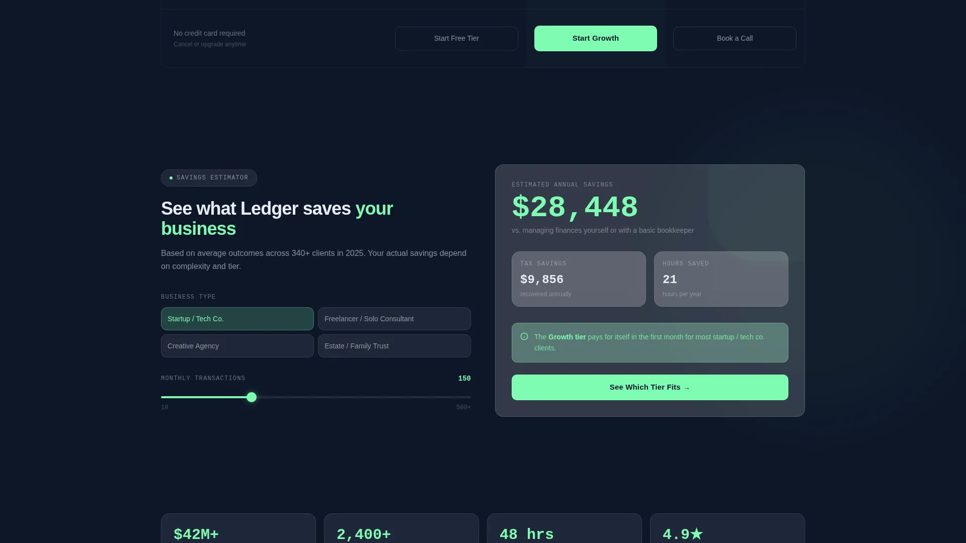
Savings Calculator Display
An animated savings calculator sits within the comparison section and updates running totals as the visitor reviews each tier. It creates a sense of momentum and makes the value of upgrading tangible before the visitor reaches the call to action.
Glassmorphic Sign-Up Modal
The primary call-to-action triggers a frosted-glass modal with exactly three fields: business type as a dropdown, estimated monthly transactions as a slider, and email address. No credit card is required, keeping the entry barrier as low as possible.
Sticky Conversion Bar
A sticky bar appears quietly once the visitor has scrolled past the page midpoint. It repeats the primary "Start Your Free Tier" call to action and stays in view without interrupting the reading experience.
Page sections overview
| Section | Purpose |
|---|---|
| Tab Switcher Hero | Introduce services through interactive, role-specific panels |
| Comparison Table | Show tier differences across real, searchable line items |
| Micro-Testimonial Rows | Add human proof between table rows without disrupting layout |
| Savings Calculator | Animate running value totals to build upgrade intent |
| Freemium Sign-Up Modal | Capture leads with a three-field, no-card entry form |
| Sticky Conversion Bar | Maintain call-to-action visibility past the page midpoint |
Design & branding system
The visual identity follows a Directory and Discovery theme expressed through a glassmorphic color system. Every surface feels like a frosted panel suspended over a deep, city-lit background.
- Core palette: frosted panel white (#FFFFFFB3) over deep ledger navy (#0F1729), with translucent mint (#7EFCB233) for active states and graphite (#3B4252) for body text
- Glassmorphic surfaces give tier cards, tabs, and the sign-up modal a semi-transparent, layered depth
- Active states and success indicators use the mint accent so the visitor always knows where they are in the page flow
Mobile & speed optimization
The layout is designed to stay organized and readable at any screen width. The comparison table and tab switcher adapt to narrower viewports so mobile visitors get the same structured experience.
- Frosted cards and tab panels reflow cleanly for smaller screens
- The sticky bar and modal remain accessible and usable on touch devices
- Scroll-triggered row animations are paced to feel smooth rather than abrupt on mobile
How this template helps you convert
Every section of this page is sequenced to move a cautious visitor toward a low-risk sign-up decision. The freemium path removes the biggest objection, which is commitment, before the visitor even sees the modal.
- The tab hero segments visitors by need immediately, so the right service type feels personal from the first scroll.
- The animated comparison table and savings calculator build perceived value row by row, making a tier choice feel logical rather than pressured.
- The three-field modal and sticky bar work together to capture intent at the exact moment a visitor is ready, without asking for more than necessary.
Other information about this template
This template is categorized under accounting firm website templates and is specifically designed for the accounting firm homepage niche. It fits practices that want a technology-forward presentation without sacrificing the trust signals that financial clients expect.
- The template style is a Comparison Table layout, making it well suited for firms presenting multiple service tiers
- The creative direction follows a Launch Energy approach, meaning the page is paced to accelerate visitor commitment as they scroll
- The Freemium and Trial landing-page direction means the conversion architecture is built around zero-barrier entry rather than a hard sell
- This template works as a standalone homepage or as a dedicated campaign landing page for a specific service launch
Theme
Directory & Discovery
Creative direction
Launch Energy
Color system
Glassmorphic
Style
Comparison Table
Direction
Freemium/Trial
Page Sections
Three-tab Service Hero Switcher
Scroll-animated Comparison Table
Micro-testimonial Row Inserts
Animated Savings Calculator
Glassmorphic Sign-up Modal
Sticky Midpage Conversion Bar
Related questions
Do I need a credit card to use the free tier sign-up flow?
Can I edit the tier names and comparison row labels?
Is this template suitable for a solo accounting practice or only for larger firms?
What triggers the sticky bar to appear?
How many tabs does the hero section support?



