Agriculture Software Reviews Website Template
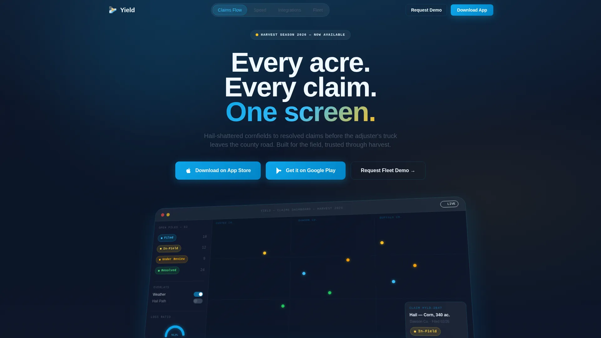
Yield is a hub-and-spoke agriculture claims management landing page template built for crop insurance professionals. It opens with a glass-morphic dashboard preview and uses Launch Energy pacing to walk visitors through three core capabilities before a clear app-download call to action. The Slate and Sky color system keeps every section sharp, calm, and immediately credible.
by Rocket studio
Quick summary
Yield is a single-page agriculture claims management landing page template designed for platforms serving crop insurance adjusters, agency managers, and independent agents. The Tech Glass visual theme, anchor navigation structure, and app-download conversion path work together to give visitors a fast, confident view of the product before they ever tap a button.
Who this template is for
This template is built for teams building or marketing agriculture claims management platforms. It speaks directly to the professionals who live inside those tools every day.
- Crop insurance adjusters managing dozens of open files across multiple counties
- Agency managers tracking loss ratios and adjuster workloads through harvest season
- Independent agents who need a clean, credible digital presence for a field-first audience
What problem this template solves
Crop insurance professionals deal with high-stakes, time-sensitive claims work. A generic software landing page fails to earn trust from an audience that knows the difference between real field tools and polished marketing fluff.
- Adjusters and agents need to see the platform doing actual work before they commit to a download
- Agency managers evaluating multi-seat deployments need a clear demo path, not just a sign-up form
- The template removes the gap between "looks interesting" and "I understand exactly what this does for me"
What you get with this template
You get a fully structured, single-page agriculture claims management landing page template with anchor navigation and a conversion flow optimized for app downloads. Every section is purpose-built from the source brief.
- A glass-morphic dashboard header with a three-quarter-axis claims map preview and live-style interface elements
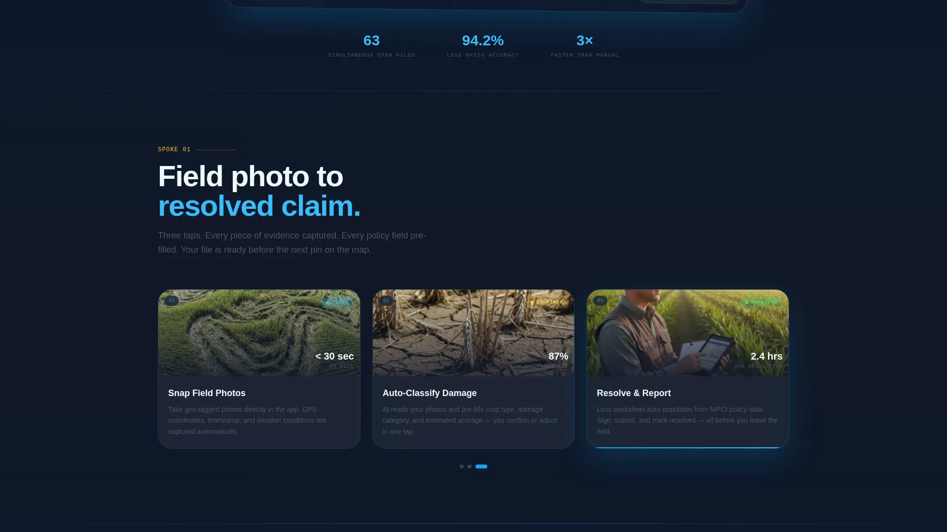
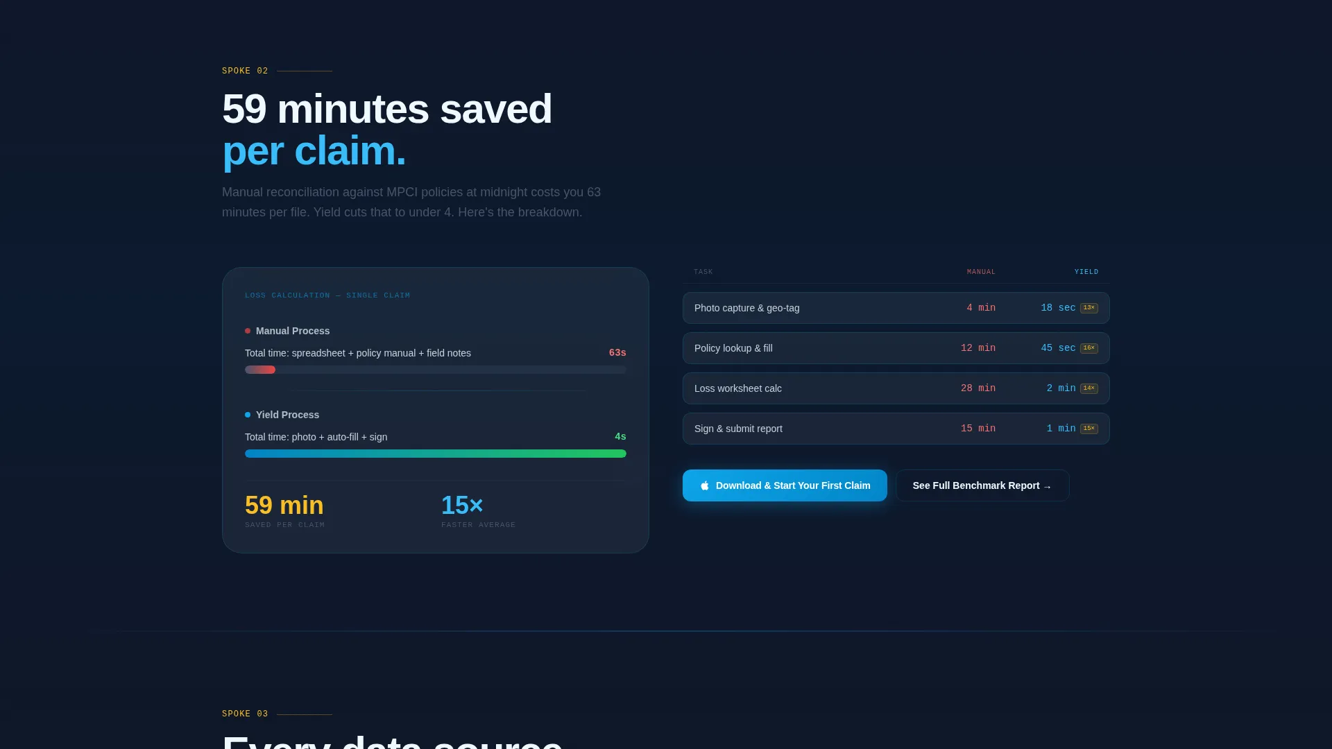
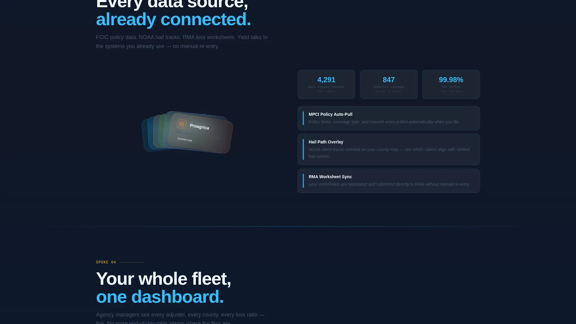
- Hub-and-spoke spoke sections covering field photo capture, loss calculation comparison, and integration partners
- Dual conversion paths: a primary app-download call to action and a secondary fleet demo request form
Feature list
This template delivers six focused design and layout capabilities, each grounded in the source brief.
Glass-Morphic Dashboard Header
The header features a floating, angled dashboard rendering showing colored claim-status pins across a county map, a sidebar with status chips (Filed, In-Field, Under Review, Resolved), a weather overlay toggle, and a loss-ratio gauge at 94.2%. The composition sits above a slate-to-sky gradient and is designed to feel like real software you want to hold.
Hub and Spoke Anchor Navigation
A sticky anchor nav links directly to each capability spoke section. Visitors can jump instantly to field photo capture, loss calculation, or integration coverage without scrolling past content they have already seen.
Kinetic Spoke Sections
Each spoke section opens with a bold stat or time-saved metric before the explanation. The first spoke animates field photos snapping into a claim file. The second spoke shows a side-by-side of manual versus automated loss calculation with a timer. The third spoke fans out integration partner logos like cards dealt across a table.
Dual Conversion Path Layout
The primary call to action "Download and Start Your First Claim" is paired with App Store and Google Play badge placements. It repeats at the header, after the second spoke, and in a pinned mobile bottom bar. A secondary form captures agency managers with fields for agency name, adjuster count, and primary crop region.
Crop-Gold Active State System
Accent hits of crop-gold (#FBBF24) mark active navigation states and notification badges throughout the page. Gold appears only where action or attention is needed, keeping the overall palette calm while making interactive elements unmissable.
Tech Glass Color and Surface System
Card surfaces use morning-frost white (#F0F9FF) for breathing room. Slate (#1E293B) dominates the navigation rail and section dividers. Open-sky blue (#0EA5E9) pulls the eye to data highlights and interactive elements. The result feels like looking through a rain-clean windshield at a glowing dashboard at dawn.
Page sections overview
| Section | Purpose |
|---|---|
| Header Dashboard Preview | Establishes platform credibility with a three-quarter-axis claims map rendering and headline |
| Anchor Navigation Rail | Lets visitors jump directly to any capability spoke without losing context |
| Spoke One: Field Photos | Shows field photo capture animating into a structured claim file |
| Spoke Two: Loss Calculation | Compares manual versus automated loss calculation with a visible time difference |
| Spoke Three: Integrations | Displays integration partner logos fanning out to signal ecosystem breadth |
| Primary Download call to action | Drives app downloads with paired App Store and Google Play badges |
| Fleet Demo Form | Captures agency managers evaluating multi-seat deployment with a short three-field form |
| Mobile Bottom Bar | Pins the primary download call to action for visitors scrolling on a phone |
Design & branding system
The Slate and Sky color system is built around four deliberate values that carry a specific mood. Every color has a clear job on the page, and none of them work against each other.
- Deep field slate (#1E293B) and weathered gray (#475569) anchor the nav rail and section dividers, while morning-frost white (#F0F9FF) gives content panels open space to breathe
- Open-sky blue (#0EA5E9) marks every interactive element and data highlight so the eye always knows where to move next
- Crop-gold (#FBBF24) appears only on active states and notification badges, making it a reliable signal rather than a decorative choice
Mobile & speed optimization
The template is structured with mobile crop insurance users in mind. Adjusters and agents are often on their phones in a truck cab or at the edge of a field, not at a desk.
- The anchor navigation collapses cleanly for smaller screens so spoke sections remain easy to reach
- The primary download call to action pins to a slim bottom bar on mobile, keeping the conversion path in reach without interrupting the scroll
- Card surfaces and glass-morphic elements are designed to stay legible and structured at smaller viewport widths
How this template helps you convert
The conversion strategy is built into the page's pacing. Visitors earn confidence through demonstration before they ever see a download button.
- The dashboard header shows real interface elements, claim status chips, and a live-style loss-ratio gauge so the platform feels credible inside the first three seconds of a visit
- Each kinetic spoke section opens with a metric or time-saved stat, then proves it with a visual, so by the time a visitor reaches the call to action they have already watched three claims move from field photo to resolution
Other information about this template
This template fits naturally within the broader agriculture software category, where trust and operational clarity matter more than visual novelty. A few additional details are worth noting for teams evaluating this template.
- The template style is Hub and Spoke with Anchor Navigation, meaning each spoke section functions as a focused destination reachable from a persistent nav rail
- The creative direction is Launch Energy, which means the page is paced to feel like a product release countdown, not a brochure
- The header concept is a Dashboard Preview, a design pattern common in agriculture software and crop management platform marketing
- The lp direction is App Download, making this template especially well-suited for platforms distributing through the App Store and Google Play
- The Tech Glass theme applies glass-morphism and layered depth to give the interface a modern, data-forward feel appropriate for agriculture technology products
Theme
Tech Glass
Creative direction
Launch Energy
Color system
Slate & Sky
Style
Hub & Spoke (Anchor Nav)
Direction
App Download
Page Sections
Glass-morphic Dashboard Header
Hub and Spoke Anchor Navigation
Kinetic Spoke Sections
Dual Conversion Path Layout
Crop-gold Active State System
Tech Glass Surface Design
Related questions
Who is this landing page template designed for?
What is the primary conversion goal of this template?
Can this template support a fleet demo request path for agencies?
What makes the hub and spoke structure useful for this type of platform?
Is this template specific to one crop insurance use case?



