Sticker Subscription Box Landing Page Template
Peel is a single-page landing page template built for sticker and decal subscription boxes. It features a layered flat-lay header mockup, draggable Before/After Reveal sliders, artist sticker cards with parallax effects, a live inventory counter, and a click-through flow to a plan selector. The Lavender Dream color system makes every section feel like a fresh sticker sheet ready to be peeled.
by Rocket studio
Quick summary
Peel is a visually immersive landing page template designed for monthly sticker subscription boxes. It layers overlapping violet panels, holographic pink call-to-action buttons, and a device flat-lay header to pull visitors straight into the unboxing fantasy. From the first scroll to the final click, the layout is built to make sticker lovers reach for that "Grab This Month's Box" button.
Who this template is for
This template is built for creative product businesses that sell stickers, decals, and curated subscription drops. It works best when the product has strong visual appeal and a community of collectors behind it.
- Sticker subscription box brands launching or refreshing their storefront page
- Independent artists and collectives offering limited-edition decal drops
- Retail and e-commerce shops in the stickers and decals space that want a dedicated conversion page
What problem this template solves
Most subscription box pages fail to communicate the physical thrill of receiving the product. They list features instead of showing transformation, and they ask for a commitment before earning it. Peel fixes this by letting the visitor experience the product visually before the click ever happens.
- Blank-to-decorated Before/After sliders show the product's impact without requiring imagination
- A live inventory counter and a sold-out thumbnail grid create honest, earned urgency
- A sticky bottom call-to-action bar keeps the primary action visible without interrupting the scroll experience
What you get with this template
Peel delivers a fully structured single-page layout that guides visitors from curiosity to checkout. Every section is purposeful, and the visual system is already matched to the sticker-and-decal niche.
- A device mockup flat-lay header with overlapping MacBook, hydroflask, and journal spread visuals
- Three escalating Before/After Reveal slider sections, each showing a bigger stickered surface than the last
- Angled artist sticker cards with parallax and drop shadow effects between reveal sections
- A primary call-to-action button and a sticky bottom bar, both leading to the plan selector
- A live boxes-remaining counter and a sold-out past-drop thumbnail grid
Feature list
This section covers the core built-in components that make Peel work as a conversion-focused sticker subscription landing page.
Layered Device Flat-Lay Header
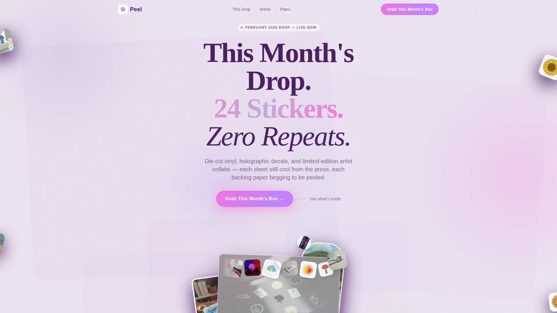
The header arranges a MacBook lid, a hydroflask, and a journal spread in a casual flat-lay composition. Each device is slightly rotated and overlapping, as if tossed onto a desk. Stickers bleed off device edges onto the background itself, breaking the frame. A headline fades in over the cluster: "This Month's Drop. 24 Stickers. Zero Repeats."
Draggable Before/After Reveal Sliders
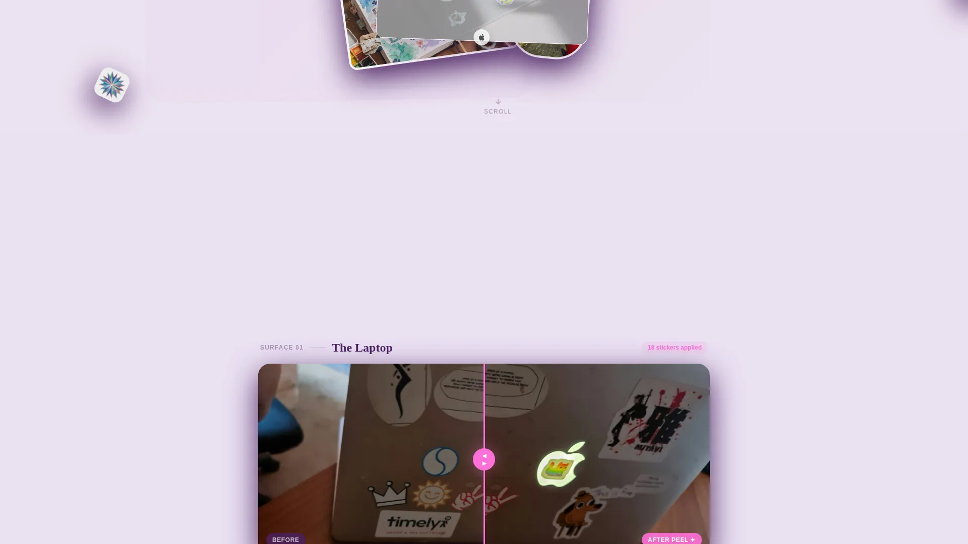
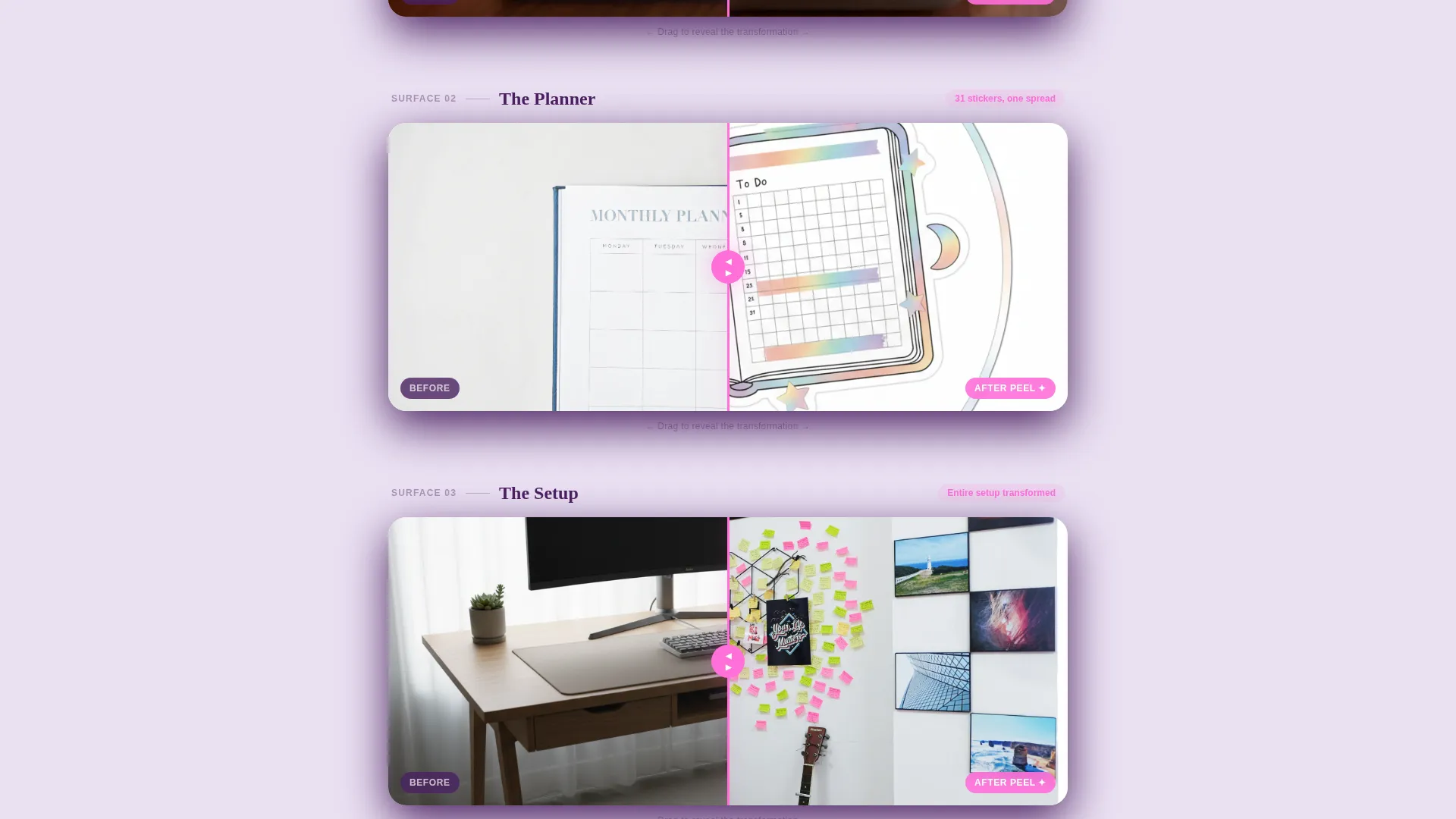
Three slider sections escalate the transformation fantasy. The first shows a single object, the second a full desk setup, and the third a bedroom wall collage. Visitors drag a slider to watch blank surfaces become fully stickered, building desire through visible accumulation rather than description.
Angled Artist Sticker Cards with Parallax
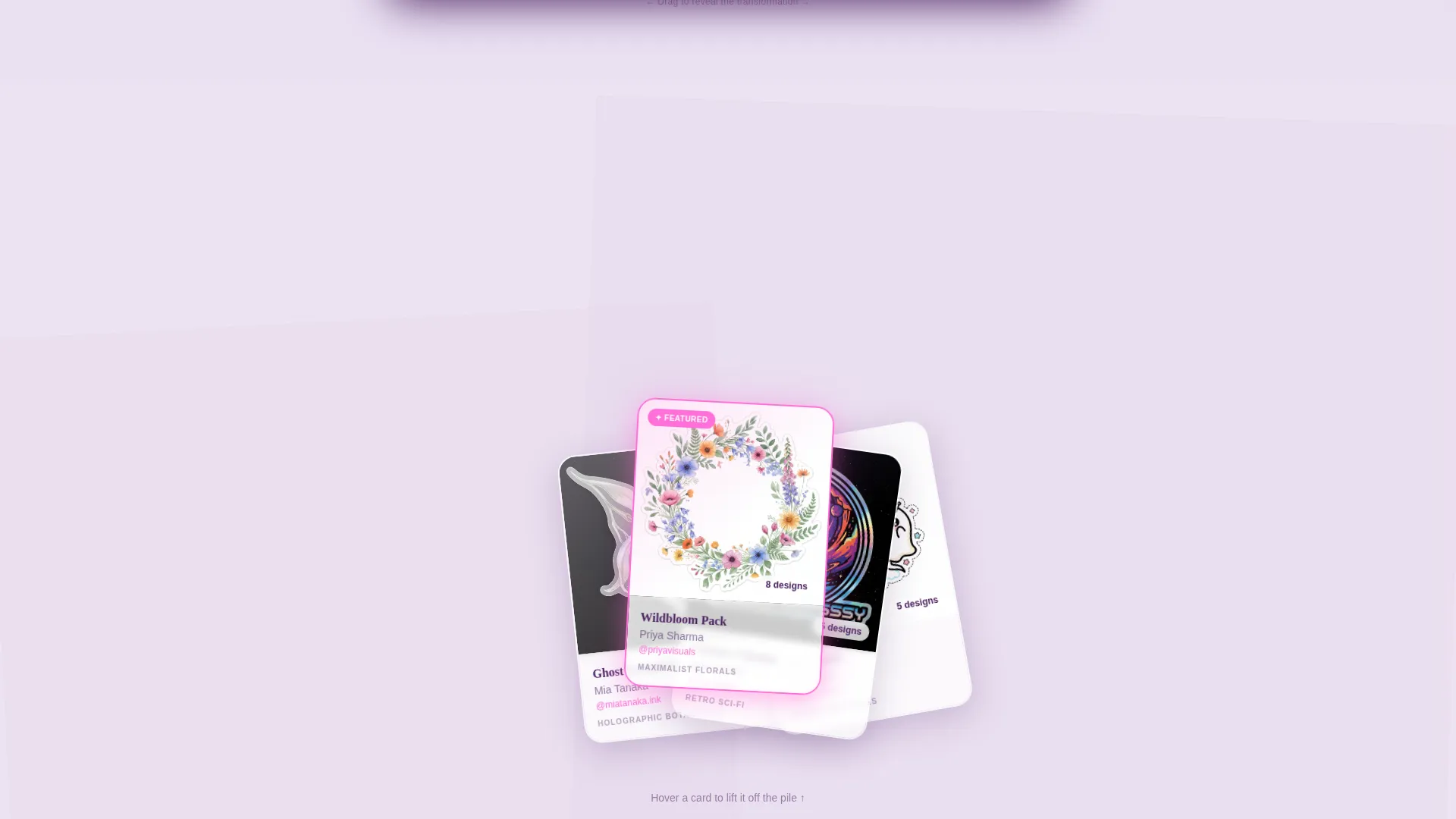
Between each reveal section, individual artist stickers appear on angled cards. Subtle parallax movement and drop shadows make each card feel liftable off the screen. This section highlights the artistry of each drop and reinforces the limited-edition, collaborative nature of the box.
Live Inventory Counter and Scarcity Grid
A live counter displays how many boxes remain for the current drop. Below it, a thumbnail grid shows past months marked as sold out. This pairing demonstrates real scarcity through evidence rather than pressure tactics alone.
Holographic Pink call to action System
The primary call-to-action button uses holographic pink and reads "Grab This Month's Box." It appears first beneath the header and again as a sticky bottom bar after the second reveal. Both placements link to the plan selector, which offers monthly, three-month, and annual options.
Overlapping Violet Panel Layout
The page background uses translucent violet panels that overlap like scattered stickers across the canvas. This Marketplace Grid structure creates visual depth without cluttering the content. Plum typography anchors readability while holographic pink draws attention to every interactive edge.
Page sections overview
| Section | Purpose |
|---|---|
| Device Mockup Header | Introduces the monthly drop with a stickered flat-lay composition and a fade-in headline |
| First Before/After Reveal | Shows a single object transformed from bare to fully stickered via a draggable slider |
| Artist Sticker Cards | Highlights individual stickers from the drop with angled cards, parallax, and drop shadows |
| Second Before/After Reveal | Escalates the transformation to a full desk setup, deepening the accumulation fantasy |
| Scarcity and Inventory Block | Displays the live boxes-remaining counter alongside a sold-out past-drop thumbnail grid |
| Third Before/After Reveal | Peaks the fantasy with a full bedroom wall collage transformation |
| Sticky Bottom call to action Bar | Keeps the "Grab This Month's Box" action visible after the second reveal without blocking scroll |
Design & branding system
The Lavender Dream color system makes this template feel like a sticker sheet printed on iridescent paper: pastel at rest and electric when the light catches it. Every color choice has a defined role, so the page stays cohesive while still feeling playful and bold.
- Soft violet mist (#C3AED6) and pale lilac white (#EDE3F2) form the background and panel layers
- Deep plum (#4A2060) anchors all body typography for strong contrast against the light palette
- Holographic pink (#FF6FD8) is reserved exclusively for call-to-action buttons and hover states, making every interactive element immediately recognizable
Mobile & speed optimization
The layered overlap design and parallax effects are structured to remain visually clear on smaller screens. Sections stack naturally in a single-column flow without losing the depth and energy of the desktop experience.
- Device mockup flat-lay elements reorder gracefully so the headline and sticker visuals stay prominent on mobile
- Angled sticker cards adjust their rotation and spacing to remain readable without crowding the viewport
- The sticky bottom call-to-action bar is particularly effective on mobile, keeping the conversion action accessible throughout the scroll
How this template helps you convert
Every layout decision in Peel is designed to reduce hesitation and build desire before the call to action appears. The page earns the click rather than demanding it.
- The Before/After sliders give visitors a tactile, interactive experience that demonstrates product value far more convincingly than a static product photo ever could.
- The live inventory counter and sold-out grid work together to show that demand is real, giving visitors a concrete reason to act now rather than return later.
- The sticky bottom call-to-action bar ensures the primary action is always one tap away, no matter how deep into the scroll the visitor has gone.
Other information about this template
Peel is categorized under Retail and E-Commerce, specifically within the stickers and decals store subcategory. It is a click-through landing page, meaning there is no form on the page itself. The single call to action routes visitors to an external plan selector where they choose their subscription tier.
- The template follows a Card Grid (Modular) structure within a Marketplace Grid theme, making it straightforward to swap artist cards and product imagery for each new monthly drop
- The Before/After Reveal creative direction is well suited to any product where visible transformation is the core selling point
- The Upsell and Upgrade landing-page direction means the layout is also adaptable for brands that want to present tiered subscription options or box upgrades as the primary pitch
Theme
Marketplace Grid
Creative direction
Before/After Reveal
Color system
Ink & Paper
Style
Card Grid (Modular)
Direction
Upsell/Upgrade
Page Sections
Layered Device Flat-lay Header
Draggable Before/after Reveal Sliders
Angled Artist Sticker Cards with Parallax
Live Inventory Counter and Scarcity Grid
Holographic Pink Call to Action System
Overlapping Violet Panel Background Layout
Related questions
Does this template include a checkout or payment form?
Can I update the artist sticker cards and device mockup visuals for each new drop?
How does the live inventory counter work in this template?
Who is this landing page template best suited for?
Can the color system be adjusted to match a different brand palette?



