Support Community Comparison Landing Page Template
Peer is a warm, structured landing page template built for peer support communities. It leads with a live-typed code snippet header, then unfolds a feature comparison table that positions your platform honestly against therapy apps, crisis hotlines, and AI chatbots. Two clear conversion paths serve individual visitors and HR buyers alike, all wrapped in a Tech Glass visual identity that feels clinical enough to trust and human enough to stay.
by Rocket studio
Quick summary
Peer is a single-page comparison landing page template for peer support communities. It opens with an animated terminal header, scrolls through a structured feature matrix, and closes with two targeted conversion paths. The design uses a Tech Glass aesthetic in a Teal Catalyst color palette, balancing digital precision with emotional warmth.
Who this template is for
This template is built for founders, community builders, and wellness teams who want to present a peer support platform clearly and persuasively. It speaks directly to the people most likely to land on your page.
- People in personal crisis who are searching for real human connection late at night
- HR managers evaluating affordable mental health benefits for their teams
- Therapists looking for a trusted community to recommend between sessions
What problem this template solves
Most peer support platforms struggle to explain what makes them different from therapy apps, crisis hotlines, or AI chatbots. Visitors arrive uncertain and leave without converting because the value is never made clear.
- There is no structured way to compare options, so visitors default to the most familiar choice
- Generic layouts feel cold, which works against a platform built on emotional trust
- Separate buyer audiences, such as individuals and HR managers, rarely get their own clear path
What you get with this template
This template gives you a complete, ready-to-customize single-page layout that handles both emotional persuasion and structured comparison in one scroll. Every section has a defined job to do.
- An animated code snippet hero that sets a warm, tech-meets-human tone immediately
- A feature matrix comparison table with teal check-marks and testimonial break-rows
- Two distinct conversion paths: a three-field personal sign-up form and a gated HR comparison sheet
Feature list
This template is built around a Feature Matrix creative direction, meaning the scroll is designed to inform and persuade through structured contrast rather than marketing claims alone.
Animated Terminal Hero
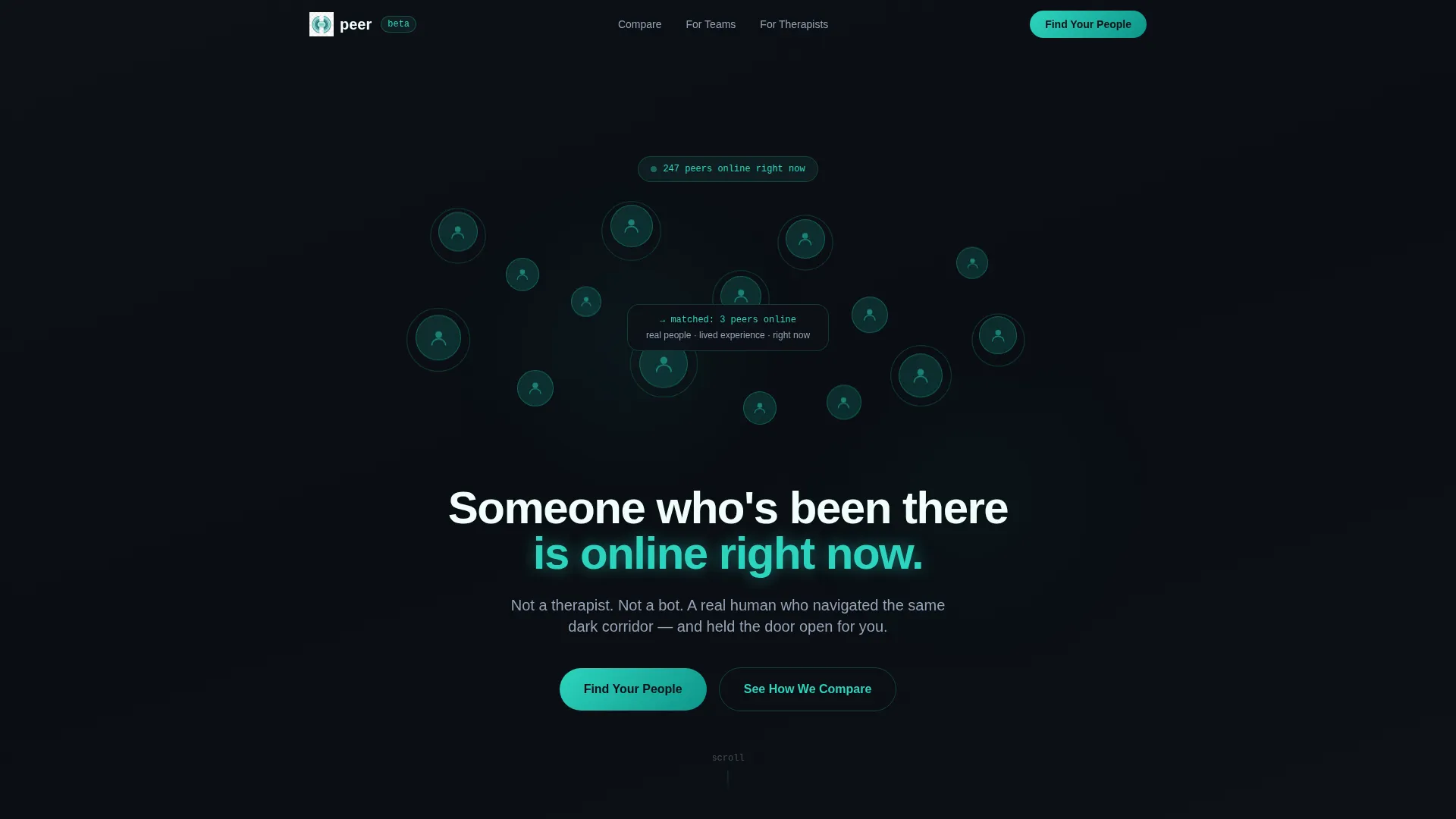
The header opens with a styled code snippet block that types out character by character in real time. Once the line resolves, the terminal window dissolves into a soft-focus mosaic of anonymous avatar circles pulsing with teal rings. The effect establishes both technical credibility and human presence in the first five seconds.
Multi-Row Comparison Table
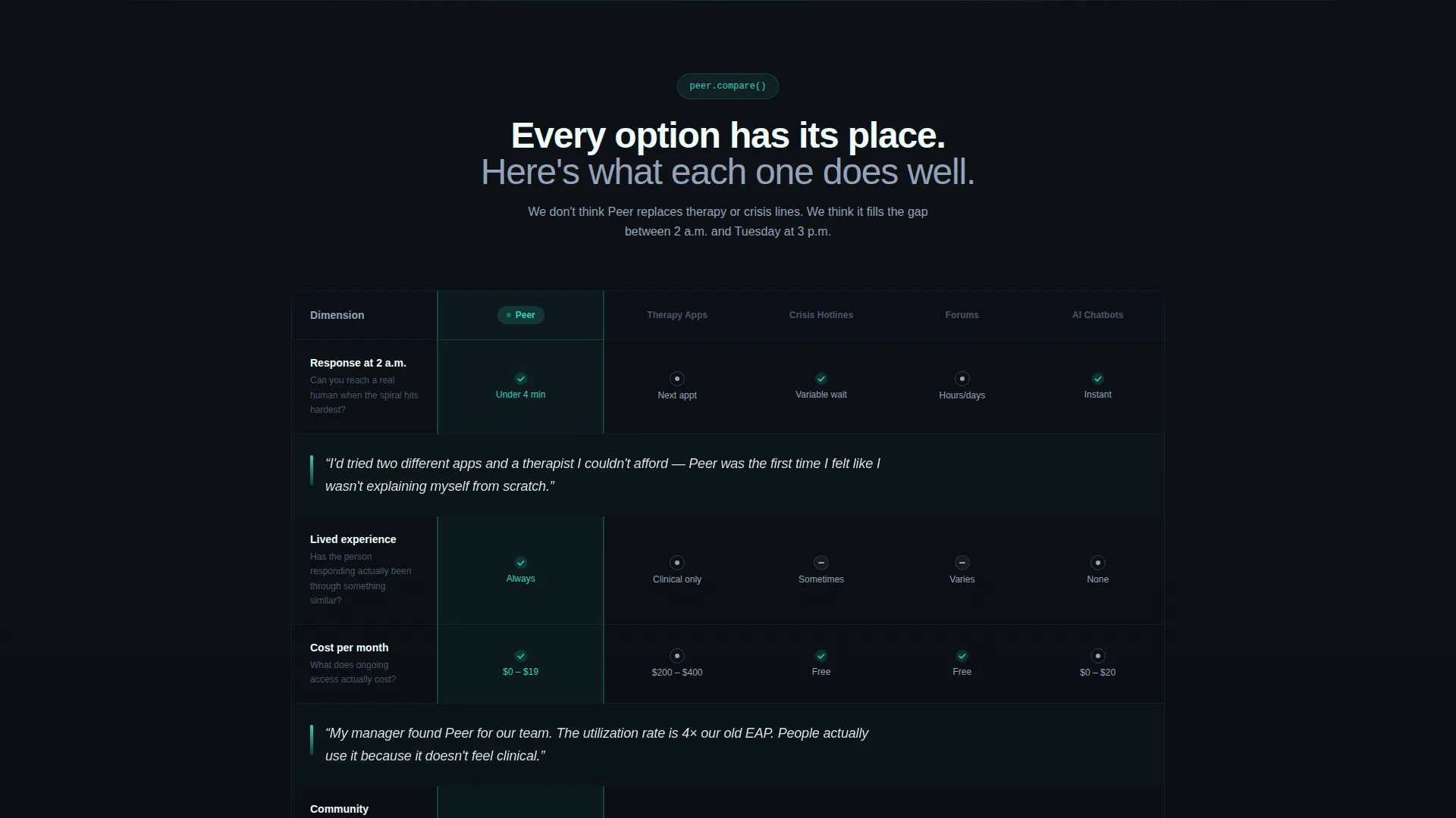
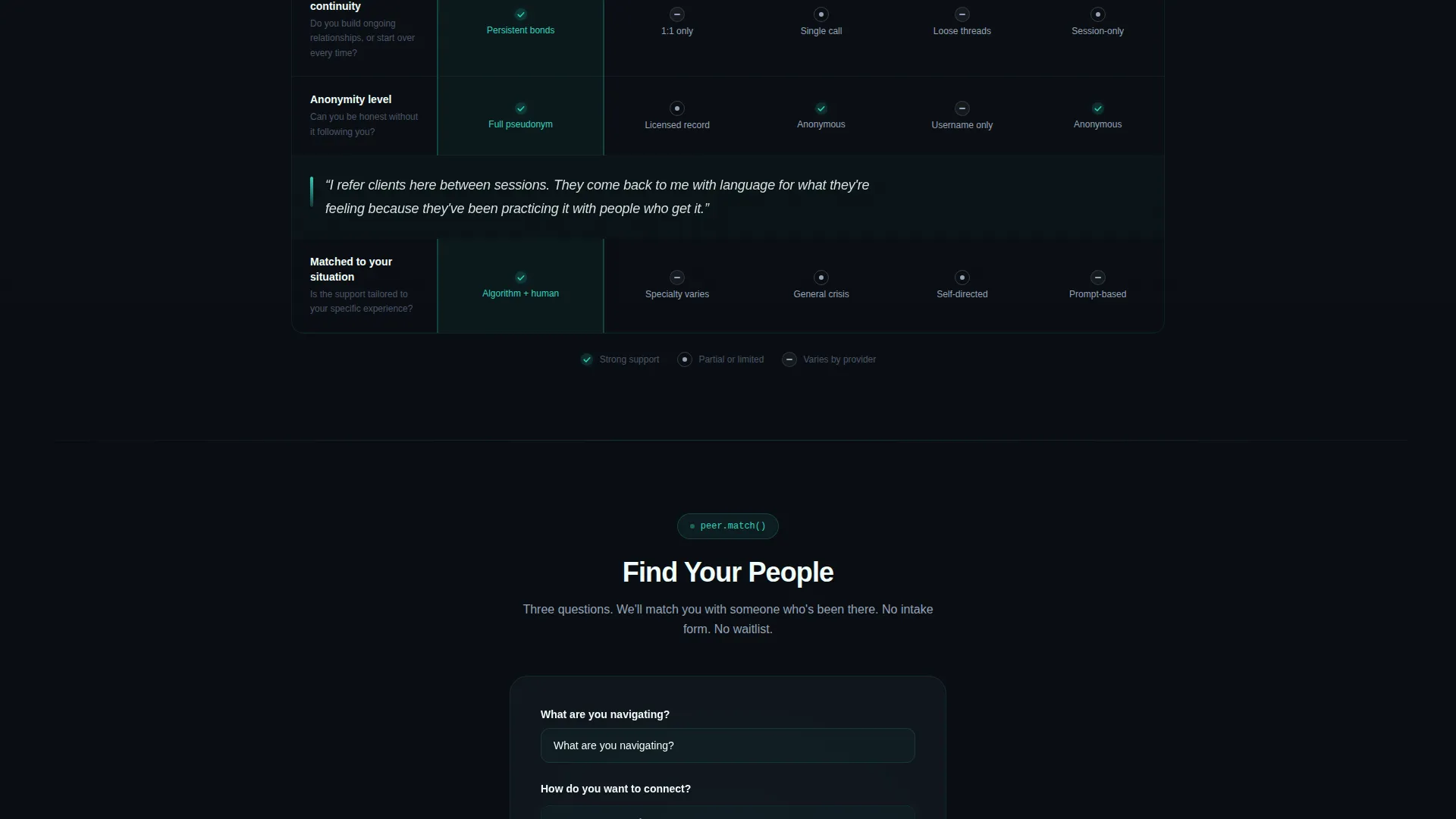
The core of the page is a structured table comparing the platform against traditional therapy apps, crisis hotlines, generic forums, and AI chatbots. Dimensions include response time at 2 a.m., cost per month, lived experience of the responder, community continuity, and anonymity level. Teal check-marks and slate neutral icons are used throughout, keeping the tone informative rather than combative.
Inline Testimonial Breaks
Single-sentence testimonials in italic text are placed between table sections. These short, honest quotes interrupt the grid rhythm and ground the data in real human experience. They pull the visitor forward without breaking the overall comparison structure.
Dual Conversion Path Design
After the first table section, a pinned primary call-to-action button labeled "Find Your People" leads to a three-field form covering what the visitor is navigating, their preferred connection style, and their email address. A secondary path targets HR buyers with a downloadable comparison sheet gated behind a work email, so both audiences get a route that fits their intent.
Teal Catalyst Color System
The palette is built around deep console black, translucent teal, muted slate for secondary text, and signal white for frosted surface panels. Each color has a specific role: teal signals live presence, slate recedes like quiet text, and white lifts content off the dark background. The result feels like a wellness app built with an engineer's precision.
Three-Field Sign-Up Form
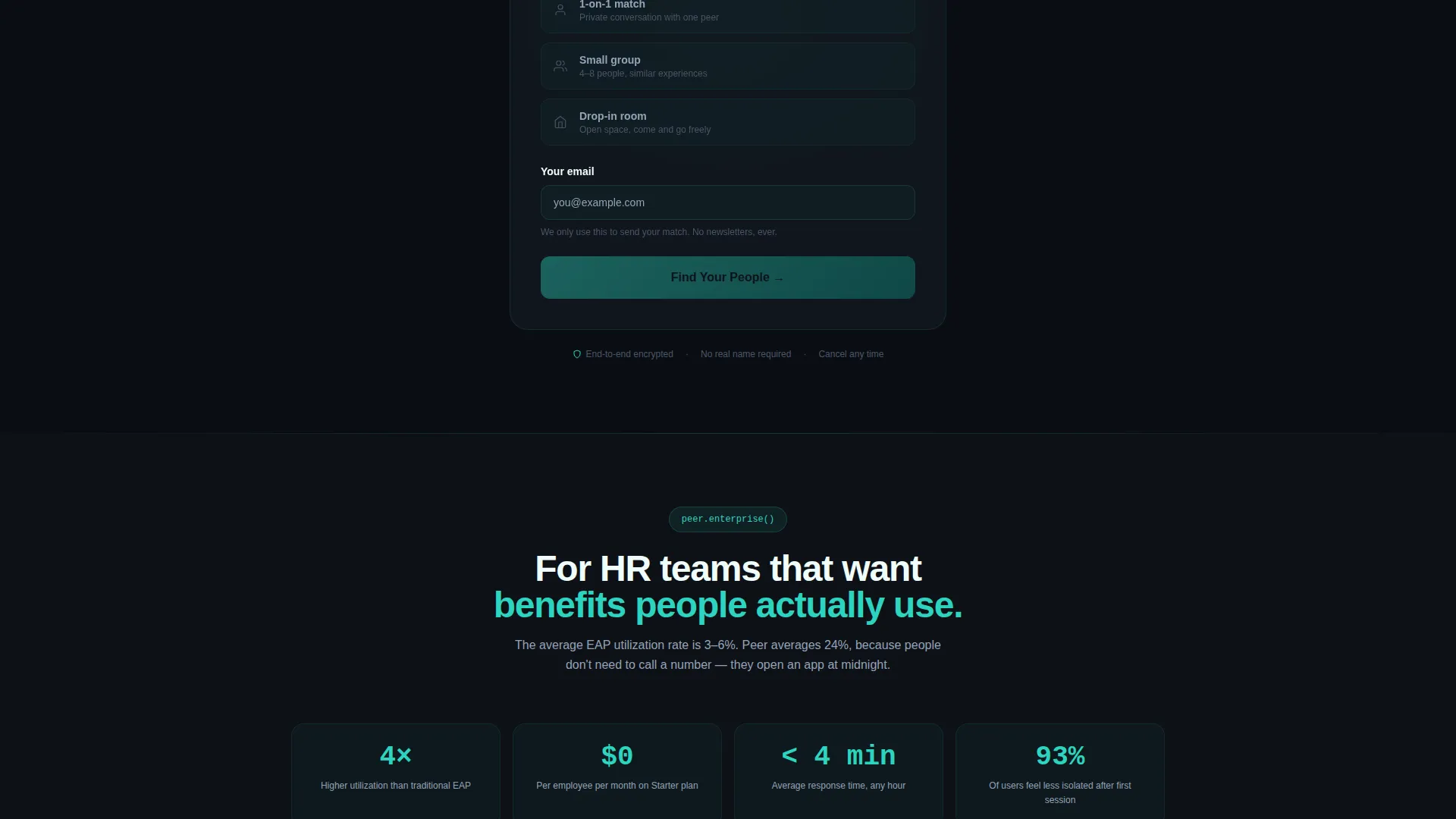
The personal sign-up form is kept intentionally short: a dropdown for what the visitor is navigating, a selection for preferred connection style such as one-on-one match, small group, or drop-in room, and an email field. The brevity makes it feel like the easiest next step, not a commitment.
Page sections overview
| Section | Purpose |
|---|---|
| Terminal Hero Header | Opens with live-typed code snippet and avatar mosaic to set tone |
| Comparison Table Block | Contrasts platform against four alternatives across five key dimensions |
| Testimonial Break Rows | Italicized single-sentence quotes placed between table sections for human proof |
| Primary call to action Form | Three-field sign-up form pinned after the first table section for individual visitors |
| HR Buyer Path | Secondary call-to-action linking to a gated downloadable PDF for HR managers |
Design & branding system
The Tech Glass theme pairs a dark, layered background with translucent surface panels that appear to float above it. The visual language borrows from developer interfaces but softens it with organic motion and warm tonal accents.
- Deep console black (#0D1117) forms the base, with signal white (#F0FDFA) frosted panels sitting above it
- Translucent teal (#2DD4BF) is used for interactive highlights, check-marks, avatar ring pulses, and the primary button
- Muted slate (#94A3B8) handles secondary text and neutral comparison icons, keeping non-critical content visually quiet
Mobile & speed optimization
The layout is built for the visitor who arrives at midnight on a phone, not a desktop. Every structural choice accounts for narrow viewports and distracted attention.
- The comparison table is designed to scroll horizontally on small screens without losing column context
- The three-field form stacks cleanly in a single column on mobile, reducing friction at the conversion point
- Avatar mosaic circles and teal ring animations are lightweight visual elements that support fast loading without heavy assets
How this template helps you convert
The page earns the conversion by letting structure and honesty do the work before asking for anything.
- The comparison table removes friction by answering the "how is this different?" question before the visitor has to ask it, building trust through transparency rather than marketing pressure.
- The dual call-to-action design respects the two distinct buyer mindsets on the page: the individual in distress who needs a low-commitment first step, and the HR manager who needs a professional document before taking action.
Other information about this template
This template sits at the intersection of the Documentation and Support category, the Community and Forum subcategory, and the Peer Support Community niche. It is well suited for any platform that relies on lived experience and human connection as its core differentiator.
- The Feature Matrix creative direction means the template is adaptable for any comparison-led positioning, not only peer support
- The Code Snippet header concept can be rewritten for any platform that wants to blend a technical identity with a human mission
- The Comparison/Versus landing page direction makes this template relevant for any community product launching against established alternatives
- Template style is Comparison Table, making it reusable for wellness platforms, support networks, and benefit-marketplace products that need structured side-by-side positioning
Theme
Tech Glass
Creative direction
Feature Matrix
Color system
Teal Catalyst
Style
Comparison Table
Direction
Comparison/Versus
Page Sections
Animated Terminal Code Hero
Structured Feature Comparison Table
Inline Italic Testimonial Rows
Dual Conversion Path Layout
Teal Catalyst Color System
Three-field Personal Sign-up Form
Related questions
Can I customize the comparison table rows and dimensions?
Who should use the HR buyer conversion path?
Does the template include the sign-up form logic?
Can the terminal hero animation be turned off?
Is this template suitable for platforms outside of peer support?



