Modern Control Landing Page Template
Swarm is a comparison table landing page built for pest control community forums. It targets solo operators, mid-size company owners, and commercial pest technicians. The page showcases Free, Pro, and Commercial membership tiers through animated card-flip rows, a live dashboard preview header, and a freemium signup flow that takes under ten seconds to complete.
by Rocket studio
Quick summary
Swarm is a dynamic motion landing page for a pest control professional community. It opens with a live-feel dashboard preview, rolls into a staggered comparison table for Free, Pro, and Commercial tiers, and closes conversions with a phosphor green "Join the Colony" call to action. The whole experience is built to feel like a job site, not a marketing brochure.
Who this template is for
This template is built for founders and operators launching a digital community platform aimed at pest control professionals. If you are building a forum, membership network, or knowledge-sharing hub for the trade, this landing page gives you a credible, high-energy starting point.
- Solo operators and independent exterminators who want a trusted peer community
- Mid-size pest control company owners managing seasonal crews and looking for faster answers
- Commercial pest technicians servicing restaurant chains or multi-site accounts who need trade-specific resources
What problem this template solves
Pest control professionals have no well-designed digital home built around their actual work. Generic forum templates look dated and fail to communicate real value to a skeptical, time-pressed trade audience. This template solves the credibility and conversion gap.
- It makes a new platform feel active and trustworthy from the first scroll
- It removes friction from signup by asking only three fields in the free tier form
- It visually separates tier value so visitors self-select without needing a sales conversation
What you get with this template
You get a single-page, section-led landing page with every visual component and layout structure pre-built. The design system is fully defined, and the page is organized to guide a pest control professional from curiosity to signup in one uninterrupted scroll.
- A parallax dashboard header with live-activity feed elements, member count ticker, and notification pulse
- A three-tier animated comparison table covering Free, Pro, and Commercial plans across key forum features
- Sticky bottom call-to-action bar, sample thread previews with verified-expert badges, and beta testimonials with truck logos
Feature list
This template includes purpose-built sections and components designed to convert trade professionals visiting a pest control community platform.
Animated Dashboard Header
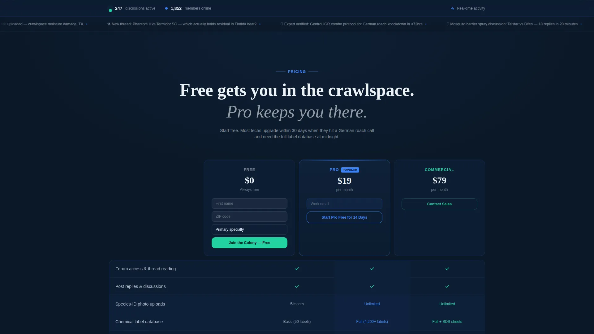
The header section displays a dashboard preview angled with parallax cursor drift. Panels slide in with spring-loaded easing. Thread titles, a pest-category heat map, member count, and a pulsing phosphor green notification badge are all part of the header layout.
Staggered Comparison Table
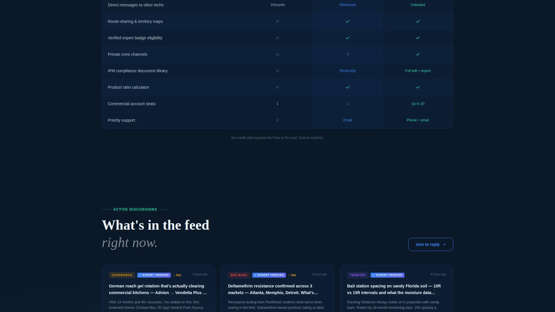
The comparison table presents Free, Pro, and Commercial tiers side by side. Rows cover features like species identification photo uploads, chemical label databases, route-sharing tools, and direct-message limits. Each row animates in as a card flip as the visitor scrolls.
Freemium Signup Flow
The Free tier call to action asks for only three fields: first name, zip code, and primary pest specialty selected from a dropdown. The Pro tier path adds a single email field and surfaces a "Start Pro Free for 14 Days" prompt directly inside the comparison table column.
Live Discussion Ticker
Below the comparison table, a live-count ticker displays the number of discussions happening at that moment. This section reinforces community activity and gives the platform social proof without requiring manual content updates in the layout.
Sample Thread Previews
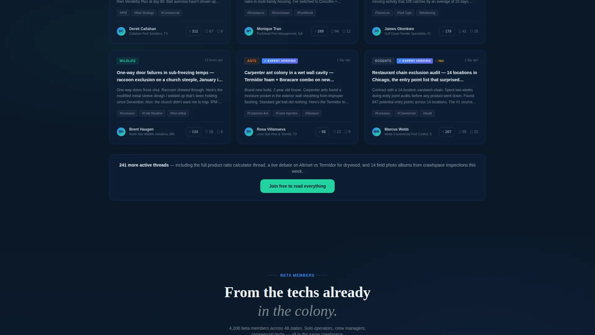
A section of sample threads with upvote counts and verified-expert badges shows visitors what real community content looks like. Each thread preview is styled to resemble an active forum feed, complete with post context relevant to real pest control fieldwork.
Sticky Conversion Bar
After fifty percent scroll depth, a sticky bottom bar appears with the primary "Join the Colony, Free" call to action rendered in phosphor green. It remains visible throughout the lower page, keeping the signup path accessible without interrupting the reading experience.
Page sections overview
| Section | Purpose |
|---|---|
| Dashboard Preview Header | Anchors attention with a live-activity forum snapshot |
| Comparison Table | Separates tier value across Free, Pro, and Commercial plans |
| Live Discussion Ticker | Shows community activity count in real time |
| Sample Thread Previews | Demonstrates real forum content with expert badges |
| Beta Member Testimonials | Builds trust with truck-logo testimonials from early members |
| Sticky Conversion Bar | Keeps signup call to action visible after fifty percent scroll depth |
Design & branding system
The visual identity uses a Midnight Blue color system built to feel technical, alert, and alive. Every color in the palette has a functional role tied to the forum's operational personality.
- Deep operational navy (#0B1929) serves as the primary page background, evoking a pre-dawn service call atmosphere
- Electric UV trap blue (#3B82F6) activates interactive elements and hover states across buttons and table rows
- Phosphor green (#22D3A0) marks status indicators, online-member pulses, and the primary call-to-action button
- Clean inspection-report white (#EDF2F7) is used for card surfaces and readable body text throughout
Mobile & speed optimization
The layout is structured for practical use on mobile devices, which matters for a trade audience that often checks community platforms from job sites or service vehicles.
- Kinetic slide-and-fade section transitions are designed to feel smooth and scroll-responsive across screen sizes
- The three-field signup form is intentionally minimal to reduce friction on smaller touch screens
- Spring-loaded easing and parallax elements are scoped to the header to keep the rest of the page lightweight in its motion load
How this template helps you convert
The page is engineered around a freemium model where the free tier does real selling work. Every section is sequenced to lower resistance and build urgency before asking for a signup.
- The dashboard header makes the platform feel alive and already populated, reducing the "empty room" hesitation new community platforms often face
- The comparison table lets visitors self-qualify across tiers without a sales conversation, making Pro feel like a natural next step after the free tier hooks them
- The sticky bottom bar and the anchored call-to-action beside the free tier column create two persistent signup entry points across the page's second half
Other information about this template
This template is part of the Swarm concept family, a design direction built specifically for trade and field-service community platforms. A few additional notes are worth knowing before you customize or deploy it.
- The Dynamic Motion theme uses spring-loaded easing and parallax drift as core interaction patterns, not decorative add-ons
- The comparison table rows are designed for the specific features mentioned in the brief: species identification uploads, chemical label databases, route-sharing tools, and direct-message limits
- The template is categorized under Technology with a subcategory of Pest Control Digital Presence, making it a niche-specific starting point rather than a generic forum template
- The Midnight Blue palette and phosphor green accent system are defined at the component level, making color swaps straightforward if a different brand identity is needed

Theme
Dynamic Motion
Creative direction
Launch Energy
Color system
Midnight Blue
Style
Comparison Table
Direction
Freemium/Trial
Page Sections
Animated Dashboard Preview Header
Staggered Comparison Table
Three-field Freemium Signup
Live Discussion Ticker
Sample Thread Previews
Sticky Bottom Conversion Bar
Related questions
Who is this landing page template designed for?
What membership tiers does the comparison table cover?
How does the freemium signup flow work?
Can I change the color palette to match my brand?
What makes this different from a generic forum landing page?



