Premium Veterinary Software Professional Website Template
Triage is a glassmorphic veterinary project management landing page built as a living, interactive dashboard. Practice managers, multi-location group operators, and relief vet coordinators can explore a fully functional mock clinic interface, drag patient cards, toggle views, and see real workflow logic before ever signing up. It is precise, dark, and immediately useful.
by Rocket studio
Quick summary
Triage is a single-page, click-through landing page for a veterinary project management platform. It opens with a functioning mock dashboard showing a mid-Tuesday clinic in full operation. Visitors interact with the product before they commit. The glassmorphic design is clinical, cool, and purpose-built for veterinary operations professionals who need clarity fast.
Who this template is for
This template is designed for veterinary operations teams who carry real operational weight every day. It speaks directly to people who manage complexity across staff, patients, and locations simultaneously.
- Practice managers coordinating multiple surgeons and dozens of daily appointments
- Multi-location veterinary group operators who need census data across many clinics at once
- Relief veterinarian coordinators who step into unfamiliar workflows and need immediate orientation
What problem this template solves
Veterinary teams lose time when critical information lives in disconnected systems. Scheduling, patient intake, lab tracking, and staff rotations are often managed in separate tools or on paper. This template presents a platform that unifies those workflows into one visible command center.
- Fragmented patient and scheduling data that slows clinical decision-making
- No single view for monitoring staff availability, surgery queues, and boarding census together
- Difficulty communicating platform value to busy professionals who will not read long feature lists
What you get with this template
This template delivers a fully interactive landing page where the product demonstrates itself. Visitors are not shown screenshots or explained features in paragraphs. They use the interface, build trust, and reach the call to action already converted.
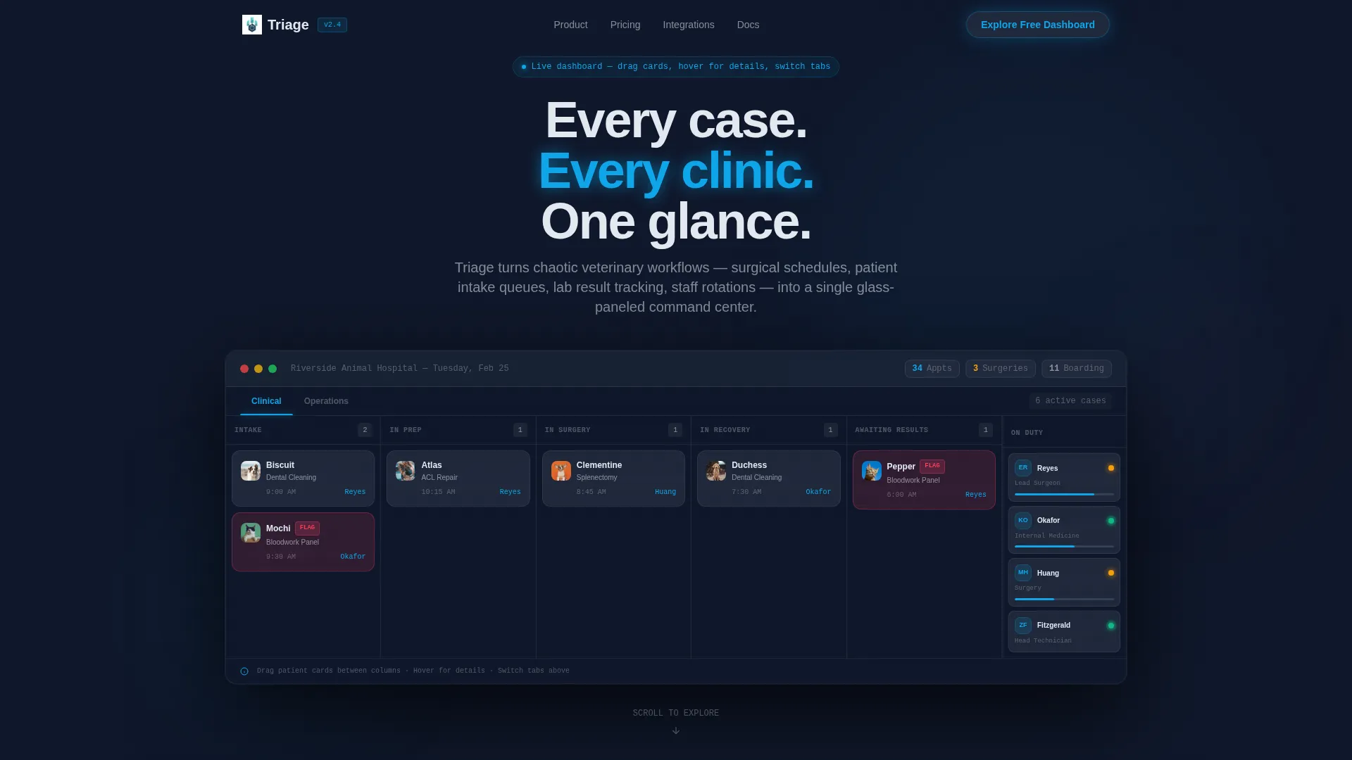
- A live mock dashboard viewport with draggable patient cards, status tooltips, and tab-switching views
- Scroll-driven section transitions that shift the dashboard context from scheduling to analytics to mobile
- Two clearly placed calls to action and a persistent secondary call to action bar for visitors who want more proof first
Feature list
This template includes six purpose-built interactive and visual components grounded in the source brief.
Live Interactive Header Dashboard
The header fills the entire viewport with a functioning mock clinic interface. Visitors see real fictional data: 34 appointments, 3 surgeries remaining, and a boarding census of 11. A Kanban swim lane shows patient cards in motion, a staffing sidebar displays four team members with live status indicators, and a top bar keeps key counts visible at all times.
Drag-and-Drop Patient Card Interaction
Visitors can physically drag one patient card across the Kanban swim lane. Hovering a card surfaces a patient detail tooltip. This single interaction communicates the platform's core value more effectively than any paragraph of copy could.
Scroll-Driven Dashboard Context Shifts
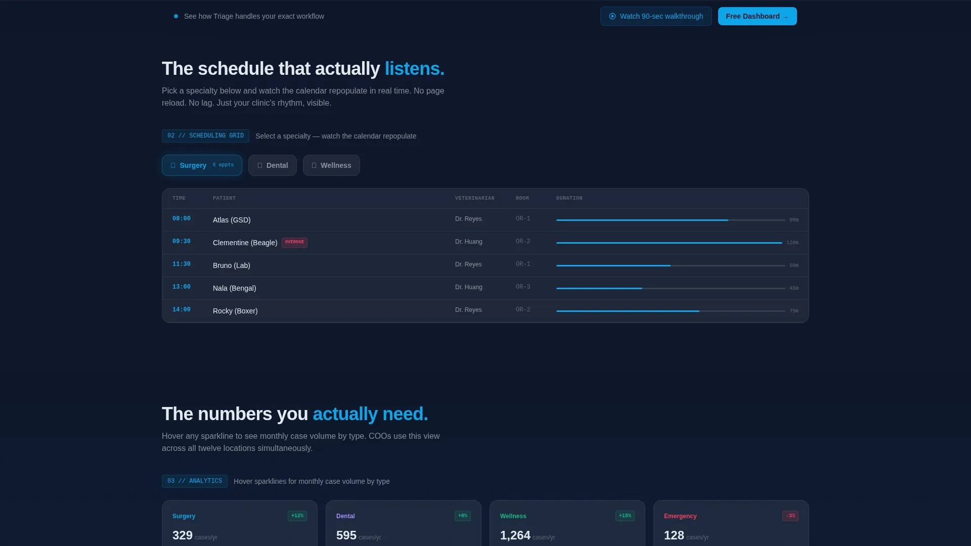
Each scroll depth changes what the dashboard is showing, not just what text appears on screen. Section two repopulates a scheduling grid by specialty. Section three reveals an analytics layer with interactive sparklines. Section four strips the view to a rotating mobile frame. The visitor drills into one product across four progressive states.
Specialty Scheduling Grid
In the second scroll section, visitors pick a specialty from surgery, dental, or wellness. The calendar grid repopulates accordingly. This interaction shows how the platform adapts to different clinical workflows without requiring a guided tour or a demo call.
Analytics Layer with Sparklines
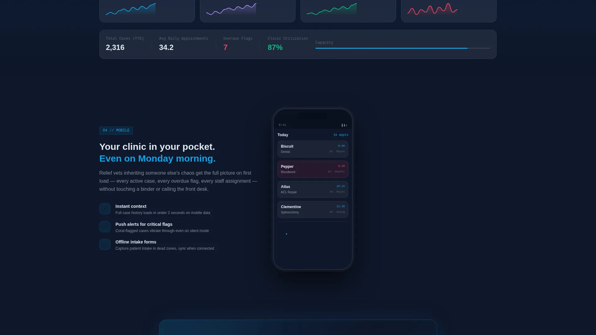
The third scroll section opens a data visualization layer. Hovering over a sparkline reveals monthly case volume broken down by type. Visitors see what their own reporting could look like, which reduces skepticism before the call to action appears.
Dual Call-to-Action Architecture
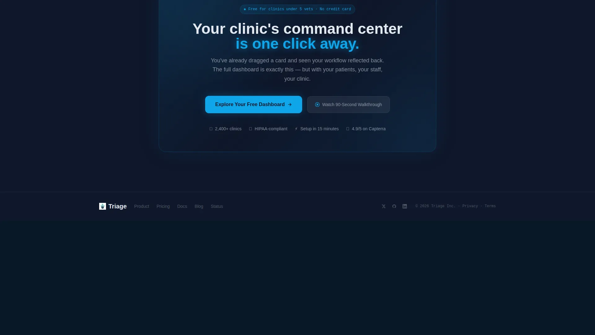
The primary call to action, labeled "Explore Your Free Dashboard," first appears as a frosted-glass pill in the top-right corner of the header. It reappears as a full-width glass panel after the mobile preview section. A secondary persistent bottom bar offers a 90-second walkthrough video for visitors who need more proof before clicking.
Page sections overview
| Section | Purpose |
|---|---|
| Interactive header dashboard | Immerses visitors in a live mock clinic interface immediately |
| Kanban patient swimlane | Shows patient card states and drag interaction in context |
| Staffing sidebar panel | Displays four team members with real-time status indicators |
| Top bar metrics | Surfaces appointment count, surgeries, and boarding census |
| Scheduling grid section | Lets visitors filter by specialty and watch the calendar update |
| Analytics sparkline section | Reveals case volume data through hover interaction |
| Mobile preview section | Shows the dashboard auto-rotating inside a phone frame |
| Primary call to action panel | Full-width glass panel prompting the main signup action |
| Persistent secondary bar | Anchored bottom bar offering the 90-second walkthrough video |
Design & branding system
The visual system is built on a Tech Glass theme using layered glassmorphism. Every surface is translucent, every border is whisper-thin, and every active state glows with clinical precision. The palette evokes looking through a rain-streaked clinic window at night.
- Base layer in deep surgical slate (#0F172A), card surfaces in frosted glass white (#E2E8F0) at 12% opacity, active states and progress indicators in clinical teal (#0EA5E9)
- Alert coral (#F43F5E) reserved strictly for overdue tasks and critical flags, keeping urgency signals visually distinct from all other user interface states
- Borders at 1px white with 8% opacity, layered background blur stacking to create depth, no solid fills anywhere in the layout
Mobile & speed optimization
The template addresses mobile directly as a product feature, not just a technical requirement. Section four of the scroll sequence strips the dashboard interface to a mobile view and auto-rotates it inside a phone frame. This shows visitors how the platform behaves on smaller screens while keeping the landing page itself lightweight and scroll-responsive.
- Mobile view auto-rotates inside a phone frame in section four, demonstrating responsive dashboard behavior as part of the product story
- Scroll-driven transitions replace heavy static assets with contextual state changes, keeping the interactive experience fluid across devices
- No forms appear on this page, reducing friction and keeping the page focused on a single conversion action
How this template helps you convert
This template is built around one principle: let the visitor use the product before they are asked to buy it. Every interaction is a micro-demonstration that builds confidence naturally.
- The interactive header dashboard lets visitors drag a card, hover for details, and switch views before reading a single line of marketing copy, so trust is earned before any call to action appears.
- The scroll-driven section sequence guides visitors through scheduling, analytics, and mobile previews, giving them a complete product impression through direct interaction rather than passive reading.
- The dual call to action architecture meets visitors at two moments of peak engagement, with a persistent secondary bar catching anyone who wants a walkthrough before committing.
Other information about this template
This template sits at the intersection of veterinary software and project management tooling, making it suitable for platforms that serve practice managers and group operations leaders. It is categorized under Technology and designed specifically for the veterinary project management niche.
- Template style is Dashboard and Data Grid, with a Tech Glass theme and Glassmorphic color system
- Creative direction follows an Interactive Explorer model, where each scroll depth changes the dashboard context rather than revealing static sections
- The header concept is an Interactive Preview, a live interface rather than a screenshot or video placeholder
- Landing page direction is Click-Through, with no form on the page and a guided signup flow triggered after the click
- The Intersection Match Score for this niche and template style combination is 13, indicating strong alignment between the visual format and the target use case
Theme
Tech Glass
Creative direction
Interactive Explorer
Color system
Glassmorphic
Style
Dashboard/Data Grid
Direction
Click-Through
Page Sections
Live Interactive Header Dashboard
Drag-and-drop Patient Card Interaction
Scroll-driven Dashboard Context Shifts
Specialty Scheduling Grid
Analytics Layer with Sparklines
Dual Call-to-action Architecture
Related questions
Is this a static template or does it include live interactions?
Who is the target audience for a landing page built with this template?
Does this template include a signup form?
Can the color system and branding be customized?



