Advanced Pet Care Digital Presence Cost Estimator Website Template
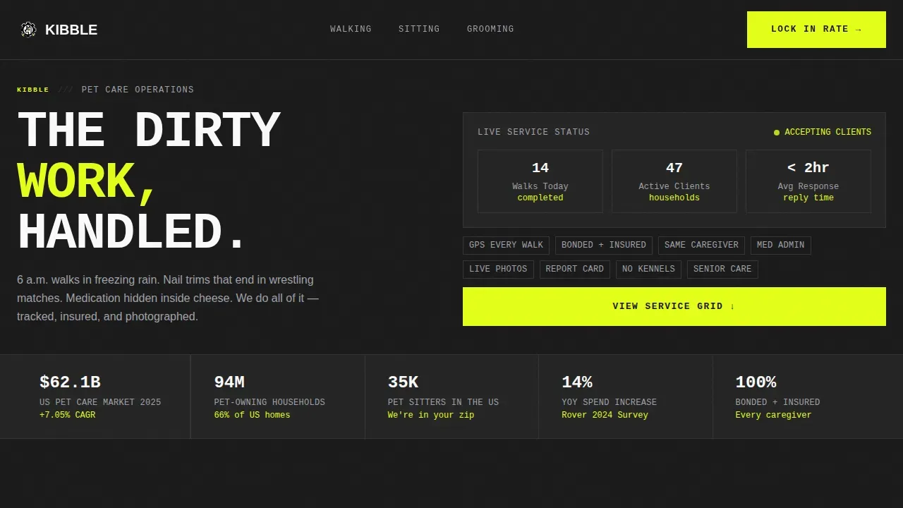
Kibble is a bold brutalist pet care dashboard landing page template built for neighborhood pet care services that want to lead with data, not decoration. It opens with a three-tab service switcher, moves visitors straight into a live cost calculator, and closes the argument with a twelve-metric competitor comparison grid. Every section is designed to justify the service and drive sign-ups.
by Rocket studio
Quick summary
Kibble is a single-page pet care landing page template designed around a calculator-first, comparison-heavy layout. The landing page skips the stock photography and leads with a Feature Tab Switcher that puts walking, sitting, and grooming data directly in front of the visitor. A live cost calculator and a twelve-metric competitor grid work together to turn browsers into booked clients.
Who this template is for
This landing page template is built for pet care service providers who operate at the neighborhood level and need a landing page that works as hard as they do. It is suitable for solo operators, small teams, and growing pet care businesses that want to present pricing and services with full transparency. The template is also suitable for any pet care business tired of looking like every other walker website on the market.
- Pet care business owners offering walking, sitting, or grooming services who want a landing page that leads with data and drives bookings every month.
- Frequent-traveler-focused pet sitting services that need to show clients exactly what they get, visit by visit, week by week.
- Pet care entrepreneurs creating a new service presence who want a ready-to-launch landing page template with a built-in competitive argument.
What problem this template solves
Most pet care landing pages look identical. A golden retriever on a green lawn, a phone number, and a contact form. That approach gives potential customers no real reason to choose one service over another. Visitors leave without signing up because nothing on the page helps them understand the value or compare the cost. This template solves that problem directly.
- Pet owners cannot easily compare local pet care services against kennels or app-based walkers, so they default to the cheapest or most familiar option rather than the best one.
- Pet care businesses have no structured way to present pricing, visit frequency, included extras, and service breakdowns on a single landing page without custom development.
- Traditional landing page designs for pet services rely on emotional imagery rather than functional information, which fails the data-driven, dual-income customer who wants every dollar justified before they sign.
What you get with this template
This landing page template delivers a complete, structured single-page layout built to convert visitors from curiosity to commitment. Every section of the landing page is designed to answer a specific question the visitor has before they are ready to sign up. The template is fully functional, modern, and clean, and it includes all the interactive layout components described below as part of the delivered template files.
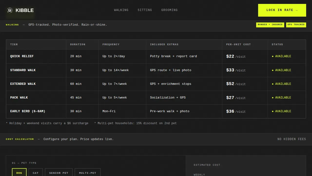
- A Feature Tab Switcher hero with three service tabs (WALKING, SITTING, GROOMING), each revealing a data grid showing duration, visit frequency, included extras, and per-unit cost for that service.
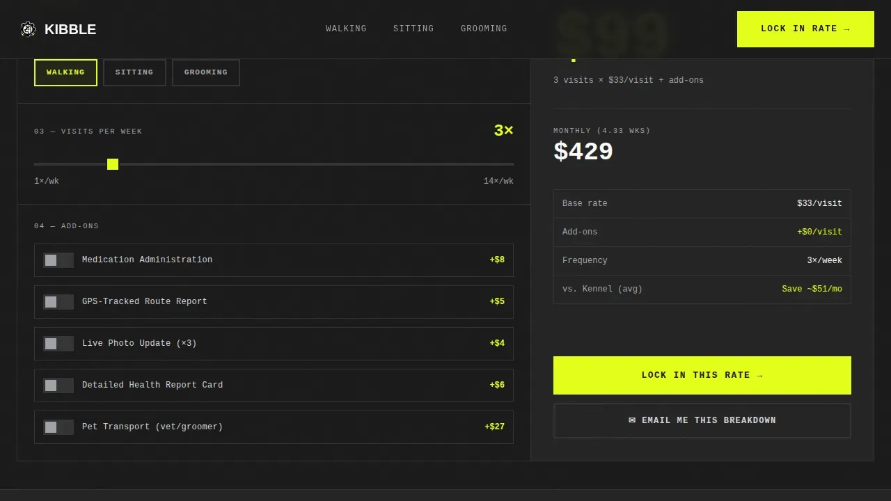
- A live cost calculator with pet type selection, a visits-per-week slider, and add-on toggles (including medication administration and GPS-tracked walks), displaying a live price output in oversized monospace type.
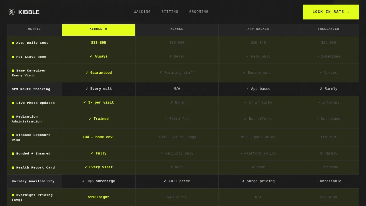
- A twelve-metric competitor comparison grid stacking this service against kennel boarding, app-based walkers, and freelance sitters, with winning rows highlighted in hazard yellow, followed by a lead capture form and a trust and stats bar.
Feature list
This landing page template is built around five core functional components. Each one is designed to deliver a specific persuasion job at a specific point in the visitor's scroll. Together they form a landing page that feels less like a brochure and more like a control panel for the pet owner's decision.
Feature Tab Switcher Hero
The header is a three-tab brutalist switcher labeled WALKING, SITTING, and GROOMING. Each tab swap replaces the entire viewport content with a service-specific data grid. The active tab is punched in hazard yellow against slab black. There is no hero image. The interface is the first impression, dense, clickable, and immediately useful, so visitors get service information the moment the landing page loads.
Live Cost Calculator
Before visitors read a single paragraph of copy, they interact. The cost calculator sits directly below the tab switcher and lets users select their pet type, drag a slider for visits per week, and toggle add-ons like medication administration or GPS-tracked walks. The calculated total updates live in oversized monospace type. This makes the landing page a tool rather than a brochure, which keeps visitor attention longer and builds trust in the pricing before the sign-up form appears.
Twelve-Metric Competitor Comparison Grid
The comparison section is the persuasion engine of this landing page template. It stacks this pet care service against kennel boarding, app-based walkers, and freelance sitters across twelve specific metrics displayed in a structured data grid. Every row where this service wins gets the hazard yellow highlight. Scrolling through the grid feels like building a case, cell by cell. It gives the visitor a clear, side-by-side view of why this service wins on value, not just on price.
Lead Capture Form with Emotional Anchor
The primary call-to-action form is labeled "Lock In Your Rate." It appears both beneath the calculator output and after the final comparison grid. The form asks for the pet's name first, which creates an emotional connection before asking for practical details like species, weight, zip code, and preferred start date. A secondary path lets visitors tap "Send My Comparison" to receive the full breakdown by email, capturing the lead even when the visitor is not ready to commit today.
Trust and Stats Bar
A trust bar sits below the comparison grid and before the footer. It is designed to surface the social proof that data-driven customers need before they sign: bonded and insured status, response time benchmarks, and market-level statistics. The bar is designed to answer the final round of hesitation before the visitor reaches the sign-up form.
Page sections overview
| Section | Purpose |
|---|---|
| Feature Tab Switcher | Swap service data grids for walking, sitting, and grooming |
| Live Cost Calculator | Let visitors build and price their own pet care plan |
| Competitor Comparison Grid | Show twelve-metric data case for choosing this service |
| Lead Capture Form | Collect pet name, details, zip, and start date |
| Trust and Stats Bar | Reinforce credibility with bonded status and response data |
| Footer (Linear Single-Row) | Provide navigation links and closing page structure |
Design & branding system
The visual identity of this landing page template follows a Bold Brutalist theme built on the Monochrome Steel color system. The design rejects symmetry and polished decoration in favor of raw, functional aesthetics and high-contrast visuals. A bold and brutalist design for a pet care dashboard landing page like this one prioritizes legibility and data density over style performance. Typography dominates the page, using large, blocky monospaced and sans-serif fonts. The layout feels intentionally dense, like a mechanic's toolbox cracked open under fluorescent light, with minimal spacing between elements to create a high-density, high-information appearance.
- Color system: Slab black (#1A1A1A) for primary backgrounds, rolled aluminum (#D4D4D8) for data cells and card surfaces, arc-weld white (#FAFAFA) for all body typography, and hazard yellow (#E4FF1A) exclusively for interactive elements, active states, and winning comparison highlights. This monochrome or high-contrast palette follows the principle of black, white, and neutral greys accented by a single loud color.
- Typography system: JetBrains Mono is used for all data values, numbers, and calculator output. Manrope is used for body copy. Typography in brutalist design dominates the page, using large, blocky fonts that are aggressively legible. Asymmetrical arrangements and intentionally overlapping elements create visual disruption throughout the layout.
- Interaction and animation approach: Medium animation level covers tab switching, live calculator updates, and row highlight reveals. Prominent call-to-actions use bolded, high-contrast styles to guide users toward booking services. Default browser-adjacent styles are used for functional elements like buttons and toggles, keeping the focus of interactions on functionality rather than a smooth, polished user experience.
Mobile & speed optimization
This landing page template is designed desktop-first. The data grids, comparison tables, and tab switcher require horizontal width to deliver their full impact. A mobile fallback is included so the landing page remains usable on smaller screens, ensuring that visitors on any device can still access the calculator and sign-up form. The template is built to ensure the core conversion path is never blocked by screen size.
- Desktop-first layout: The twelve-metric comparison grid and Feature Tab Switcher are designed for wide-screen viewing. The full data experience is intended for desktop or tablet users who need space to read and compare.
- Mobile fallback included: The landing page template includes a responsive fallback so mobile visitors can still access the cost calculator, review service information, and sign up. Core interactive elements remain functional on smaller screens.
How this template helps you convert
This landing page template is built for one outcome: turning a visitor into a signed, recurring client. Every section is placed to move the user forward. The calculator creates investment before the ask. The comparison grid removes every competing option from consideration. The form asks for the pet's name first, so by the time the visitor reaches the zip code field, they are already emotionally committed.
- Calculator-first engagement: The live cost calculator appears before any marketing copy. Visitors interact, set their visits per week, and see a real number. By the time they scroll to the sign-up form, they have already decided what they want to spend each month.
- Comparison grid persuasion: The twelve-metric grid does the selling without a single claim. It lays the data out, highlights the wins in hazard yellow, and lets the visitor reach their own conclusion. This approach is far more persuasive than a testimonials section for the data-driven customer who needs every dollar justified.
- Dual lead capture paths: "Lock In Your Rate" captures visitors who are ready to commit. "Send My Comparison" captures visitors who need more time. Both paths bring the lead into the business. Neither path lets a visitor leave empty-handed.
Other information about this template
This section covers additional context that helps pet care business owners, designers, and developers understand the full scope and flexibility of this landing page template. The Kibble bold brutalist pet care dashboard landing page template is a fully functional, modern and clean landing page suitable for pet services of many kinds. It is built to operate as a standalone landing page and can be adapted for any other business that needs a comparison-heavy, calculator-first layout.
- The template is built with HTML, CSS, SCSS, and JS files, ensuring a simple, seamless user experience out of the box. All template files are included and ready to customize.
- The template includes both dark and light template variants, giving designers the flexibility to explore different visual directions without starting from scratch. The dark variant ships with the Monochrome Steel color system described above. The light variant uses the same layout with an inverted surface treatment.
- Customers can conveniently access all necessary service information on one landing page. This single-page structure ensures visitors never need to navigate away to understand the full value of the pet care service being offered.
- The template can be adapted for any other business that relies on comparison-based selling or calculator-first conversion, not just pet care landing pages. Its structure is suitable for home services, subscription businesses, and other local service providers.
- The landing page design is desktop-first but ships with a mobile fallback, making it suitable for teams that serve customers across device types. The core conversion path, from calculator to form, remains accessible on mobile screens.
- This template is suitable for use as inspiration for pet care dashboard design. Key metrics are displayed in plain, text-based, and bordered table structures throughout, following best practices for data legibility in a bold and modern style.
- Inspiration for pet care dashboard design and walker website layouts can be found in the way this template sets up its data grids and comparison tables. The approach is replicable and adaptable.
- The template is designed for the USA market with USD pricing, imperial measurements, and localization details set for American pet care customers. Future localization changes can be made directly in the template files.
- Effective landing pages often include clear calls to action that guide users towards desired outcomes. This template includes two distinct call-to-action paths, each designed to meet the visitor where they are in the decision process. Prominent call-to-action buttons use bolded, high-contrast styles throughout, including a large and clearly outlined primary sign-up button.
- Pet adoption services, vet practices, and other adjacent pet care businesses can use this landing page template as a foundation and make changes to sections, copy, and color tokens to fit their own brand.
- The template is intended for pet care business owners and designers who want a high-converting landing page without building from scratch. It delivers a ready-made product that covers the full conversion flow from first interaction to lead capture.
- This template does not include backend systems, analytics integrations, or CRM connections. All interactive elements are front-end only.
- Cookies and related consent handling are not pre-configured in this template. Teams should review applicable terms and add cookie consent tools as needed for their specific site.
- Sharing the comparison output via the "Send My Comparison" secondary lead path is a built-in feature of this template. It is designed to enable email-based lead capture for visitors who are not ready to sign up on the day they visit the landing page.
- The template acknowledges the reality that many pet care business owners need a fast path to a professional landing page. This product provides that path without requiring custom graphic design or development work.
- Using bold colors and engaging graphics in a pet care dashboard enhances visual appeal. This template applies that principle through its hazard yellow highlight system and high-contrast data grid layout.
- Functional elements in a pet care dashboard should include easy access to pet profiles. The lead capture form in this template is designed to collect pet-specific information, starting with the pet's name as an emotional anchor.
- Imagery in a brutalist design uses high-contrast photos or black-and-white photography that are not heavily edited. This template is designed to work with or without pet-focused photography, as the interface itself is the visual centerpiece.
- Elements like images and text may intentionally overlap in a brutalist design to create a collage effect. This template follows that principle in its asymmetrical layout arrangements, creating visual disruption that holds user attention.
- The focus of interactions in this template is on functionality. Visitors are guided to interact with the calculator, review the comparison grid, and sign up. Navigation remains functional and simple despite the rough aesthetic.
- Log in to your template marketplace account to access and download the full set of template files after purchase. Updates to the template will be available in the same place.
Theme
Bold Brutalist
Creative direction
Calculator/Tool First
Color system
Monochrome Steel
Style
Dashboard/Data Grid
Direction
Comparison/Versus
Page Sections
Feature Tab Switcher Hero Section
Live Interactive Cost Calculator
Twelve-metric Competitor Comparison Grid
Dual-path Lead Capture Form
Trust and Stats Bar
Related questions
What kind of pet care business is this landing page template designed for?
Can I use this template for a pet care service that is not walking or sitting?
Do I need design or development experience to use this template?
Does the template include both dark and light versions?
How does the secondary lead capture path work?



