Church Analytics Landing Page Template
Pew is a church analytics landing page template built for ministry leaders who need real data fast. It features an interactive tab switcher showing attendance trends, giving breakdowns, and volunteer engagement in live dashboard mockups. The scroll-reveal layout progressively builds trust, and every section moves visitors toward downloading the app or trying a live demo.
by Rocket studio
Quick summary
Pew transforms raw Sunday headcounts and tithe envelopes into living dashboards. This landing page template is designed for a church analytics platform serving pastors, administrators, and denominational leaders. The layout uses scroll-reveal progression, a three-tab header switcher, and an App Download call-to-action flow that earns the click before asking for it.
Who this template is for
This template is built for ministry-focused software products that need to communicate complex data value to a non-technical church audience. It speaks directly to people managing congregations of every size.
- Executive pastors overseeing multi-campus megachurch operations who need real-time insight across locations
- Small church administrators tracking attendance and giving with limited tools and limited time
- Denominational overseers benchmarking performance across hundreds of congregations at once
What problem this template solves
Church leaders often carry attendance figures in spiral notebooks and reconcile giving records in spreadsheets. The gap between raw numbers and useful insight costs time that pastors simply do not have. This template helps a church analytics platform communicate clearly why that gap matters.
- Ministry teams lose visibility when data lives in disconnected tools with no unified view
- Volunteer engagement and sermon reach go unmeasured because the right dashboard never existed
- Potential users cannot picture the product's value until they see real data working in a real interface
What you get with this template
You get a single-page scroll-reveal layout that builds its case section by section. Each scroll earns the next by answering the question the previous section raised. The result is a landing page that feels guided rather than overwhelming.
- An interactive Feature Tab Switcher header with three dashboard views: Attendance, Giving, and Engagement
- A progressive Feature Matrix with animated metric cards, integration connection visuals, and a comparison table
- A dual call-to-action path pairing a primary App Download with a secondary live demo option
Feature list
This template includes purpose-built components aligned to the church analytics use case. Each piece serves a specific conversion or communication role in the scroll journey.
Interactive Three-Tab Dashboard Header
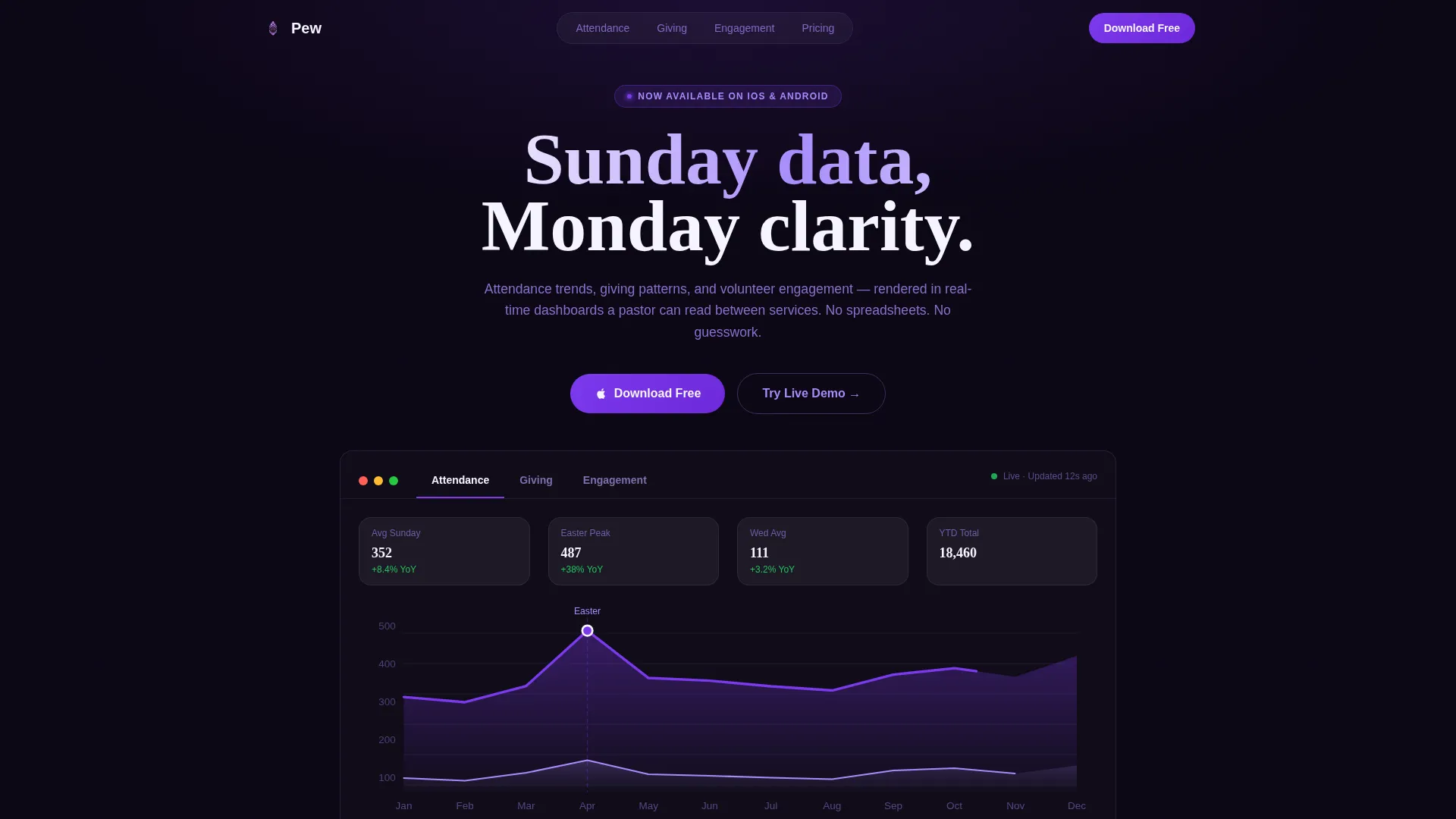
Three tabs labeled Attendance, Giving, and Engagement sit over a live dashboard mockup on a deep void-black background. Clicking each tab swaps the entire dashboard view, showing a twelve-month attendance line chart, a waterfall giving breakdown, or a volunteer hour heatmap. Specific numbers, dates, and ministry names make the data feel immediately familiar to any church leader.
Scroll-Reveal Metric Cards
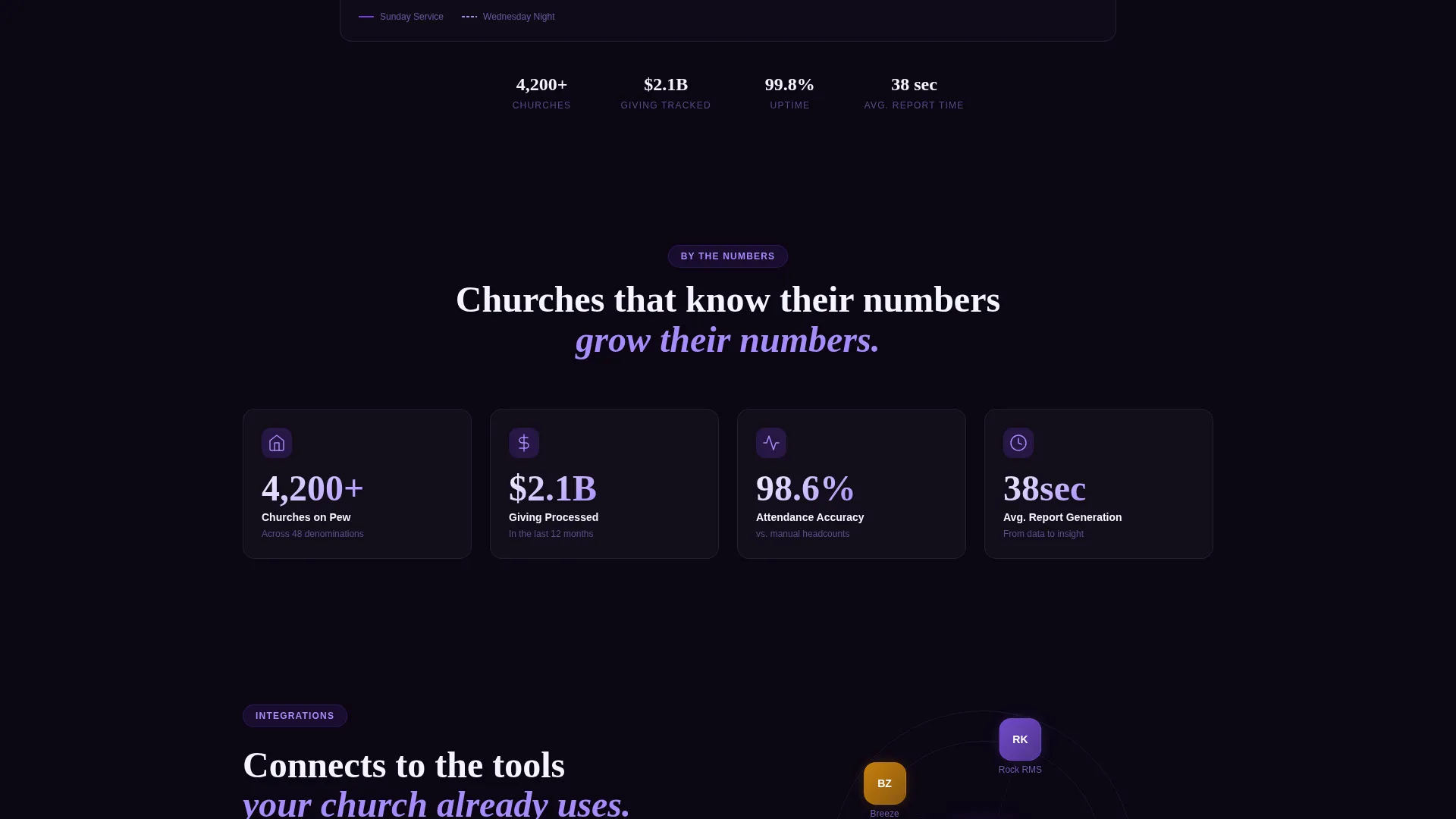
Core metrics cards fade into view one by one as the visitor scrolls. Each card includes a micro-animation that counts the number up from zero, reinforcing the feeling of real-time data loading. This section introduces the platform's key performance indicators before the visitor reaches the call to action.
Integration Visual with Animated Connections
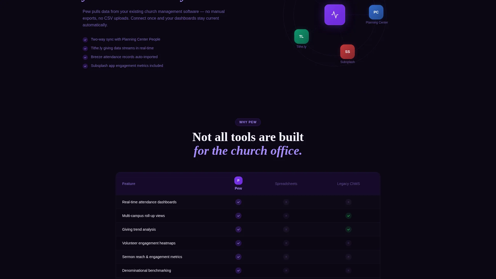
Integration logos slide in from the edges of the screen and connect to a central hub with animated dotted lines. This section communicates platform compatibility at a glance without requiring the visitor to read a word of technical documentation.
Feature Comparison Matrix
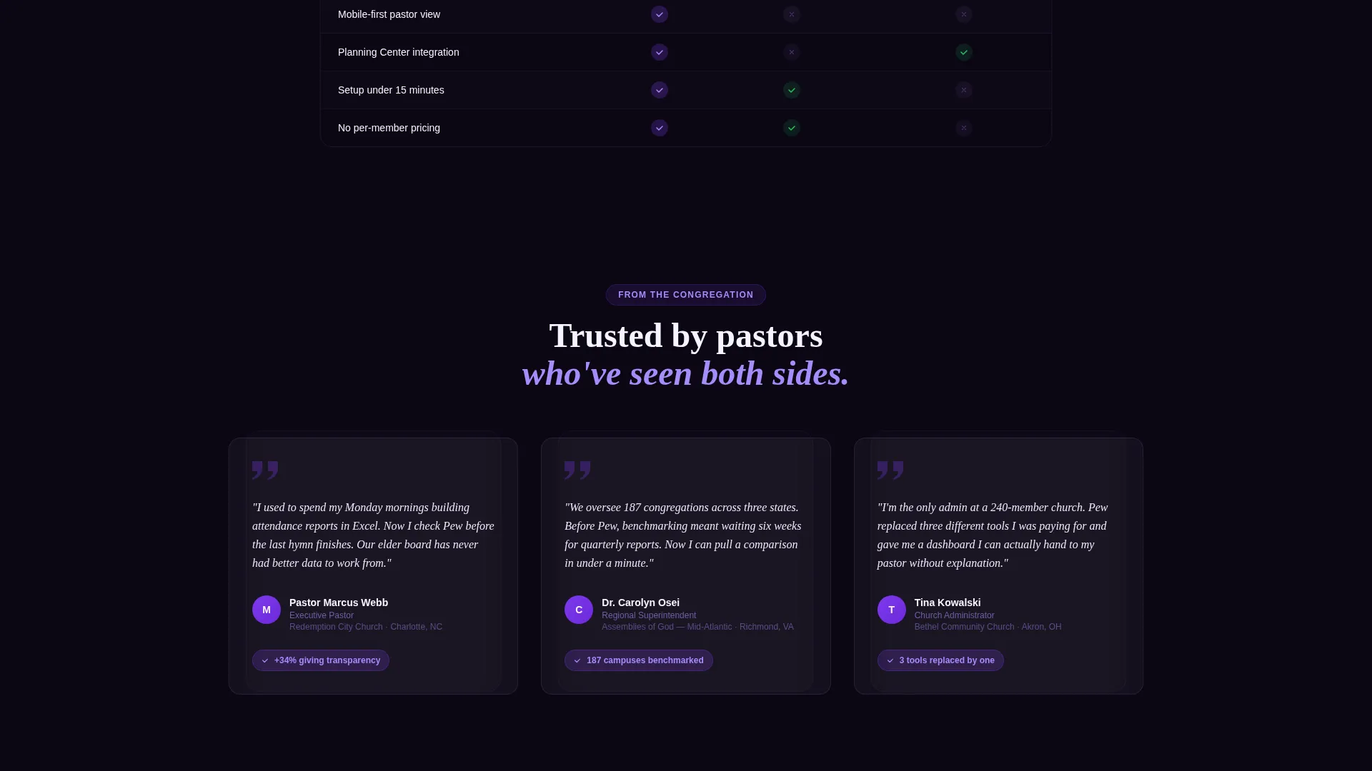
A side-by-side comparison table materializes row by row as the user scrolls. Pew is placed against spreadsheets and legacy church management platforms, with violet checkmarks appearing progressively in each cell. The animation rewards continued scrolling and reinforces product superiority through visual contrast.
Sticky App Download Bar
A sticky bottom bar appears after the second scroll and persists as the visitor continues down the page. It carries the primary "Download Pew Free" call to action alongside App Store and Google Play badges. The repeated placement removes friction at the moment a visitor decides they want the product.
Live Demo Secondary Path
A secondary call-to-action labeled "Try the Live Demo" links to a browser-based sandbox preloaded with sample church data. This path lets hesitant visitors explore the real product interface before committing to a download. Seeing the product in action is the template's most powerful trust-building mechanism.
Page sections overview
| Section | Purpose |
|---|---|
| Tab Switcher Header | Show live dashboard previews for Attendance, Giving, and Engagement |
| Primary call to action Block | Drive app downloads with App Store and Google Play badges |
| Metric Cards Reveal | Animate core platform KPIs into view with counting micro-animations |
| Integration Connections | Visualize platform compatibility through animated hub-and-spoke layout |
| Comparison Matrix | Contrast Pew against spreadsheets and legacy tools row by row |
| Sticky Download Bar | Persist the primary app download call to action after the second scroll |
| Live Demo call to action | Offer a browser-based sandbox as a low-commitment secondary path |
Design & branding system
The visual identity follows a Dashboard Pro theme using a Void and Violet color system. The palette reads like a stained-glass window at night: darkness at the edges, violet light pulsing from the center. Every design choice reinforces that the product is sacred in purpose but undeniably modern in execution.
- Deep void black (#0B0614) as the primary background, electric violet (#7C3AED) for active states and data highlights, muted lavender (#A78BFA) for secondary text and chart gridlines, and communion white (#F5F3FF) for card surfaces and body typography
- Card surfaces use communion white to lift content off the dark background, creating clear visual hierarchy without relying on heavy borders
- Active tab states, checkmark animations, and call to action buttons use electric violet to draw the eye to the most important interactive elements on the page
Mobile & speed optimization
The scroll-reveal structure is built to work across screen sizes. Progressive disclosure keeps the layout from overwhelming mobile visitors by showing content in layers rather than all at once.
- Each animation layer activates on scroll entry, so the page loads initial content quickly and defers heavier visual elements until they are needed
- Sticky call to action bar placement is calibrated to appear at the natural decision point in the scroll journey, keeping the download prompt visible without blocking content on smaller screens
- Tab switcher interactions are touch-friendly, allowing mobile visitors to explore all three dashboard views without a mouse
How this template helps you convert
The template earns the conversion by letting visitors experience the product before asking for anything. The scroll journey is structured so that every section answers a question and raises the next one, keeping momentum through to the call to action.
- The interactive tab header gives visitors a hands-on preview of real dashboard data in the first seconds on the page, establishing product credibility before any copy is read
- The progressive Feature Matrix builds the value case layer by layer, using animations to reward continued scrolling and a comparison table to neutralize hesitation about switching from existing tools
- The dual call to action structure means visitors who are ready download immediately, while those who need more convincing can explore the live demo sandbox and arrive at the same destination with greater confidence
Other information about this template
This template is part of a growing category of vertical Software as a Service (SaaS) landing pages designed for ministry technology products. It is built for teams who want a polished, conversion-focused page without starting from scratch.
- The Dashboard Pro theme and Void and Violet color system are purpose-designed for data-heavy interfaces that still need to feel approachable to non-technical users
- The template is styled to complement church management platforms and is compatible with ministry software ecosystems including tools like Planning Center, Subsplash, Tithe.ly, and Breeze, which are referenced in the source brief as integration examples
- The scroll-reveal progressive layout suits any church analytics dashboard product that needs to communicate tiered value to audiences ranging from solo administrators to enterprise denominational teams
Theme
Dashboard Pro
Creative direction
Feature Matrix
Color system
Void & Violet
Style
Scroll Reveal (Progressive)
Direction
App Download
Page Sections
Three-tab Interactive Dashboard Header
Scroll-reveal Metric Card Animations
Animated Integration Hub Visual
Progressive Feature Comparison Matrix
Persistent Sticky App Download Bar
Live Demo Secondary Call to Action
Related questions
Who is this landing page template designed for?
Can I customize the dashboard tab content for my own platform?
Does the template include both App Store and Google Play download paths?
What makes the comparison matrix useful for conversions?
Is the live demo link included in the template?



