Gothic Fashion Professional Website Template
Crypt is a storybook dark landing page template built for gothic resale platforms. It uses a full-screen video header, scroll-linked parallax sections, and an Obsidian and Gold color system to pull visitors into an atmospheric buying journey. Every design decision serves one purpose: making "Enter the Vault" feel like the only logical next step.
by Rocket studio
Quick summary
Crypt is a single-page dark landing page template built for curated gothic resale. It opens with slow macro video footage, moves through a six-piece Vault gallery, seller story portraits, and a sensory texture montage, then closes on a solid gold call-to-action button. The page design prioritizes atmosphere over instruction, letting immersion do the converting.
Who this template is for
This template is built for founders, sellers, and creative operators running niche dark fashion platforms. If your products carry provenance and your buyers know the difference between authentic subculture pieces and mass-market reproductions, this landing page was designed around you.
- Gothic and alternative resale shop owners launching or refreshing their website
- Independent sellers in the dark fashion community seeking a professional landing page
- Theater costumers, stylists, and niche collectors who want their storefront to match the style of what they sell
What problem this template solves
Most resale landing page templates feel clinical. They were designed for generic e-commerce, not for products that carry years of subculture history. Crypt solves this by leading with mood before mechanics, so visitors feel the value of what they are browsing before they ever read a price tag.
- Standard templates flatten the atmosphere that makes dark fashion products feel rare and worth collecting
- Generic page design fails to signal authenticity to buyers who can immediately spot a mismatched aesthetic
- Sellers lose attention before the call-to-action because nothing on the landing holds the right emotional register
What you get with this template
This template delivers a fully structured, single-page landing that guides visitors from arrival to click-through without a single form field. The layout is set up to let the products and their stories do the selling.
- A full-screen video header with a typewriter headline and a ghost call-to-action button
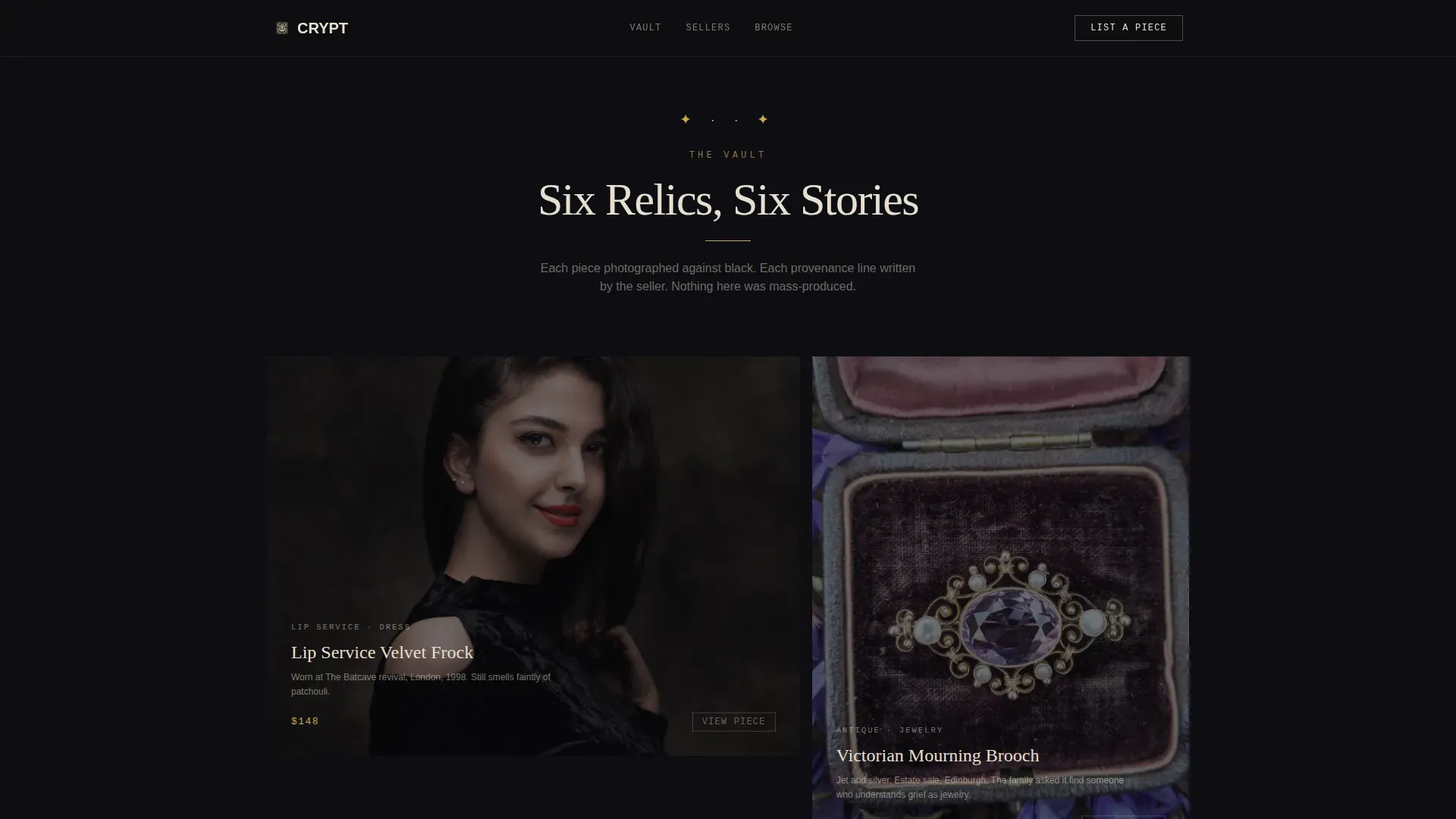
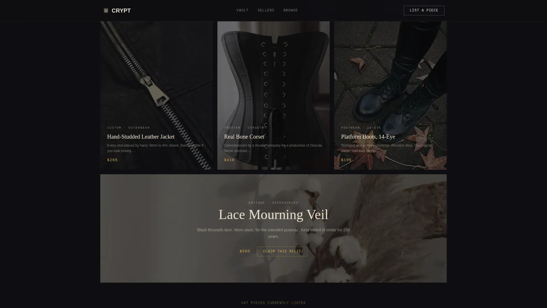
- A six-piece Vault gallery where each featured item floats center-screen with a provenance line beneath it
- Seller story portraits with crypt stone background shifts, a parallax texture montage, and a final solid gold conversion button
Feature list
This template is built around six core design and interaction capabilities that work together to create a cohesive dark landing experience.
Full-Screen Video Header with Typewriter Effect
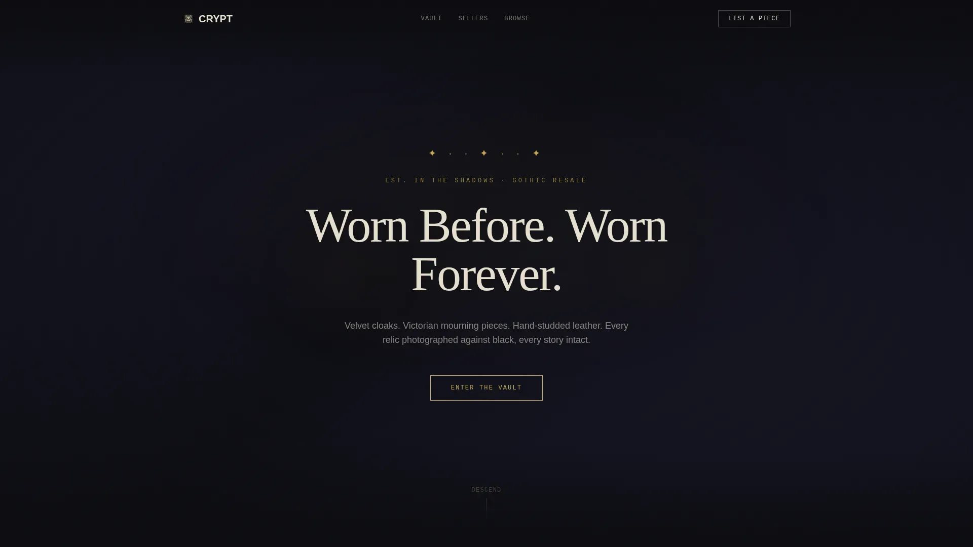
The header plays slow macro footage of gothic artifacts cycling through smoke and shadow dissolves. The headline "Worn Before. Worn Forever." materializes letter by letter over the video, set in bone ivory against deep obsidian. A gold-outlined ghost button sits below, ready to route visitors into the browse experience.
Six-Piece Vault Gallery
Each of the six featured pieces occupies its own full-page frame. The item floats center-screen against pure black, with a single provenance sentence beneath it. This section is inspired by the idea of a locked cabinet opened slowly, one relic at a time. The page design here is deliberate and unhurried.
Seller Story Portraits Section
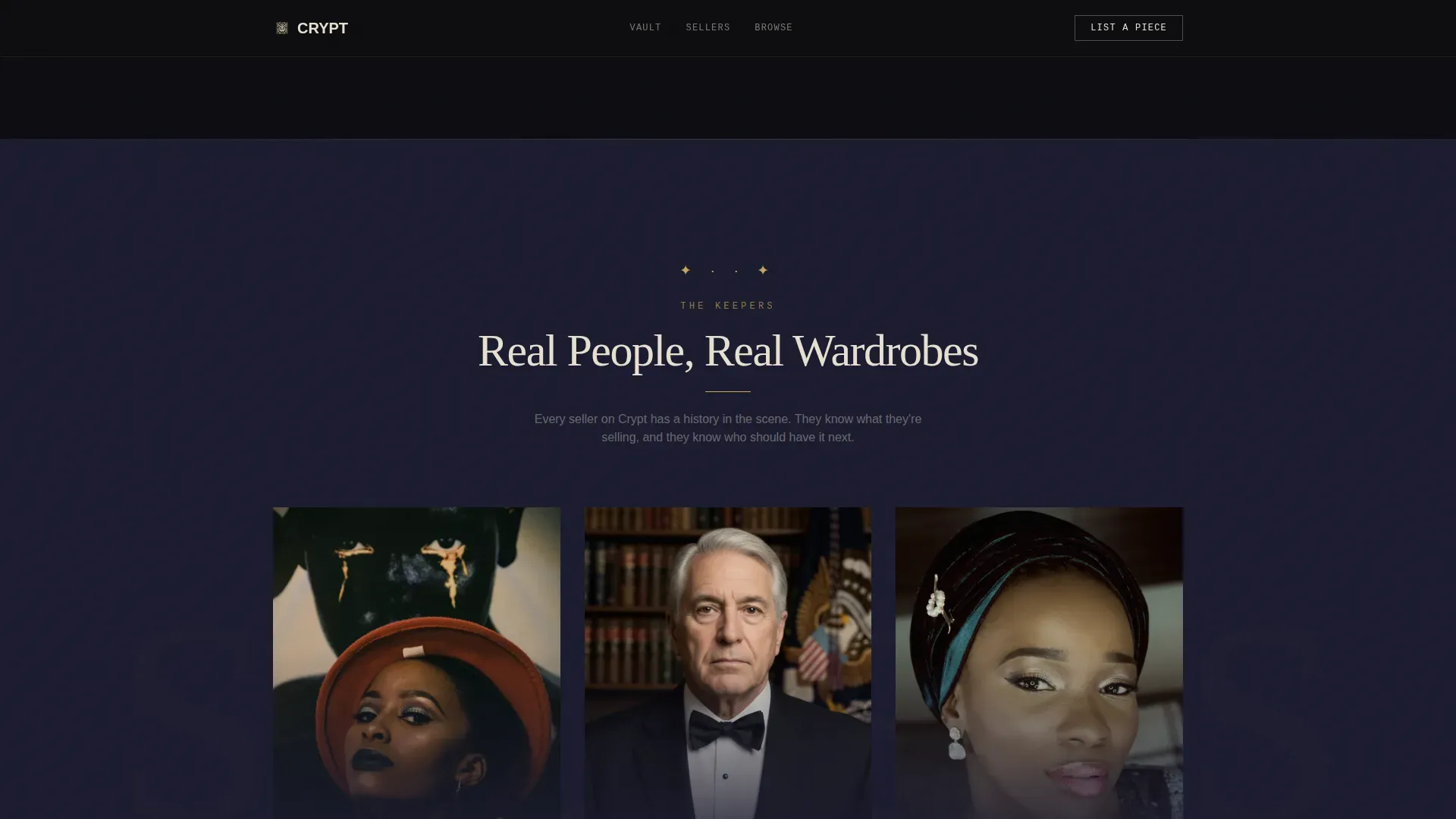
As visitors scroll, the background shifts from obsidian to crypt stone. Real seller portraits and subculture histories appear here, adding social proof through lived context rather than star ratings. This section helps visitors understand who is on the other side of each listing.
Parallax Texture Montage
Before the final call-to-action, a pure sensory section cycles through lace, chain mail, crushed velvet, and cracked leather. There is no text. The animation is entirely scroll-linked, allowing the textures to speak for themselves and prime the visitor emotionally for conversion.
Dual Call-to-Action Placement
"Enter the Vault" appears twice: once as a ghost button at the base of the video header, and once as a solid gold button after the texture montage. Both route to the same browse destination. This dual placement catches visitors at two different points of readiness without cluttering the page design.
Fixed Navigation with Seller Path
The top navigation bar stays visible at every scroll position. "List a Piece" sits in bone ivory on the right side, always accessible but visually subordinate. This keeps a secondary conversion path open for sellers who arrived as buyers, without competing with the primary landing page flow.
Page sections overview
| Section | Purpose |
|---|---|
| Video Header | Opens with atmospheric footage and typewriter headline |
| Ghost call to action Button | First call-to-action placed above the fold |
| Vault Gallery | Six featured pieces with provenance lines |
| Seller Story Portraits | Background shifts; real seller context and subculture histories |
| Texture Montage | Parallax sensory section; no text, pure immersion |
| Final call to action Block | Solid gold button routing to full browse experience |
| Fixed Top Nav | Always-visible navigation with secondary seller path |
Design & branding system
The color system is built on obsidian black (#0B0B0F) as the dominant surface, covering roughly eighty percent of the viewport at any scroll position. Crypt stone (#1A1A2E) provides section separation. Tarnished cathedral gold (#C9A84C) appears only on hover states, active links, and price tags, making every gold moment feel earned. Bone ivory (#E8E0D0) carries all body text.
- Typography uses Fraunces for serif display headlines, DM Sans for body copy, and JetBrains Mono for labels and prices
- Gold is intentionally scarce, used as an accent style rather than a background, to protect its visual weight and signal value
- Surface overlays and crypt stone shifts create hierarchy across sections without relying on shadows, which are invisible on deep dark backgrounds
Mobile & speed optimization
This template is desktop-first by design. The full-screen video header, parallax montage, and floating Vault gallery are built to use the full viewport width. A mobile fallback is included so the landing page remains functional on smaller screens without breaking the core experience.
- Lazy-load images and IntersectionObserver-based reveals keep the page design responsive to scroll velocity on any device
- The video header and parallax sections degrade gracefully on mobile, maintaining atmosphere without overwhelming smaller viewports
- Accessibility is a real consideration in dark page design; bone ivory body text against obsidian provides strong contrast, and checking readability across device sizes is built into the layout logic
How this template helps you convert
Dark landing pages that lead with atmosphere can close the emotional distance between a visitor and a purchase faster than pages that lead with features. This template is set up around that principle.
- The call-to-action appears above the fold in the video header, so visitors know where to go from the first seconds on the page, meeting best practices for landing page design that places dominant calls to action early and clearly
- The Vault gallery and seller story sections build desire and trust progressively, so by the time visitors reach the final solid gold button, clicking through feels like a natural continuation rather than a prompted decision
Other information about this template
This template sits within a wider world of dark landing page templates that have grown steadily in popularity. Dark landing page design is no longer niche to gothic or alternative industries. Many companies now search for dark landing page inspiration across sectors including technology, creative tools, and app products. Dark interfaces tend to appeal to younger, design-conscious audiences and can serve millions of users across any website or app.
- For more inspiration on dark landing page style ideas, browsing a broad set of dark templates helps identify what page design patterns translate well across products
- This template was built with the same contrast and accessibility best practices that apply to any landing page, including checking text legibility and using an online contrast checker to verify that bone ivory on obsidian meets readability standards
- The template is a wonderful starting place for any operator who wants a dark landing experience that feels genuinely inspired by subculture rather than borrowing its aesthetic from the surface
- Dark landing page templates are available in both coded and no-code formats; this template is built for teams who love the atmospheric style and want to get started quickly without rebuilding the page design from scratch
- Email capture for new drop announcements can be added to the footer area if desired, as the design supports additional content without disrupting the core landing page flow
Theme
Dark Immersive
Creative direction
Atmosphere & Mood
Color system
Obsidian & Gold
Style
Storybook/Full-Page
Direction
Click-Through
Page Sections
Full-screen Video Header with Typewriter Headline
Six-piece Vault Gallery
Seller Story Portraits Section
Scroll-linked Parallax Texture Montage
Dual Call to Action Placement Strategy
Fixed Navigation with Seller Path
Related questions
Does this template include the video footage for the header?
Can I adapt the Vault gallery to show more or fewer than six pieces?
Is this template suitable for sellers with only a few listings?
How does the secondary "List a Piece" path work?
Can this dark landing page template be adapted for other niches?



