Pharmacy Digital Presence Appointment Booking Website Template
Dispense is a bold brutalist pharmacy booking landing page template built for digital healthcare brands that want to cut through the noise. It combines a raw Slate & Sky color system, monospaced metrics typography, and a hub-and-spoke anchor nav to move patients from landing to app download in one straight line. No fluff, no gradients, no wasted clicks.
by Rocket studio
Quick summary
Dispense is a single-page brutalist landing page template for pharmacy booking apps. It opens with an oversized stats wall, drops visitors into five anchor-linked spoke sections, and closes with a fixed bottom call-to-action bar. Every design decision is intentional: raw concrete backgrounds, clinical sky-blue accents, and stark typography that tells patients exactly what to do next.
Who this template is for
This template is built for pharmacy tech brands and healthcare app teams that need a landing page that converts without being polished into meaninglessness. Designers and developers working in the healthcare space will find the brutalist layout refreshingly direct. It also works well as inspiration for any project where bold, honest web design matters more than decorative gloss.
- Pharmacy app founders driving mobile downloads
- Designers and developers building healthcare-focused web pages
- Brands that want a brutalist website presence without coding from scratch
What problem this template solves
Most pharmacy websites bury the booking action under menus, modals, and marketing copy. Patients who need a refill at 2 a.m. do not want to browse through five pages. This landing page template solves that by putting the action front and center. The brutalist design strips away visual noise and delivers one thing: a fast path to booking.
- Eliminates confusing navigation by using a pinned anchor nav with five blunt labels
- Replaces hero imagery with bold metric blocks that pre-sell the app before the scroll begins
- Removes friction from the download path with a platform-detection prompt and SMS fallback
What you get with this template
You get a fully structured hub-and-spoke landing page with every section pre-built. The layout is asymmetrical and boxy, giving the page a raw feel that stands out from conventional, polished websites. The template is ready to customize with your own copy, fonts, and brand colors.
- Stats wall header with three live-counter metric blocks and a primary call-to-action button
- Five anchor-navigated spoke sections (Book, Track, Remind, Consult, Transfer) each formatted as a feature matrix card grid
- Fixed bottom call-to-action bar, platform-detection modal, and SMS link input field
Feature list
This landing page template is packed with features that match the brutalist concept while keeping user flow fast and honest.
Brutalist Metrics Header
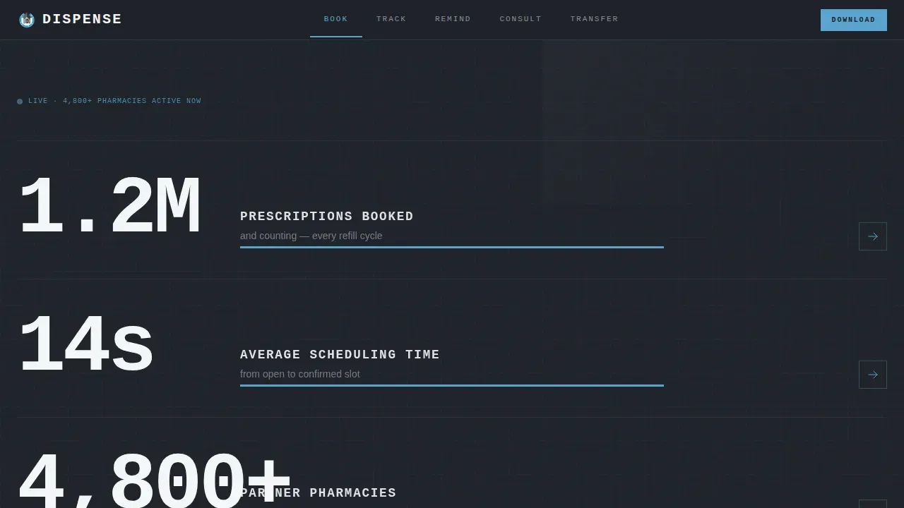
The header displays three oversized brutalist type slabs in monospaced fonts. Each metric block sits on a dark slate background with a sky-blue underline that pulses once on load. No hero image is needed; the numbers convey authority at a glance and pre-sell the download before the visitor reads a single line of body text.
Hub-and-Spoke Anchor Navigation
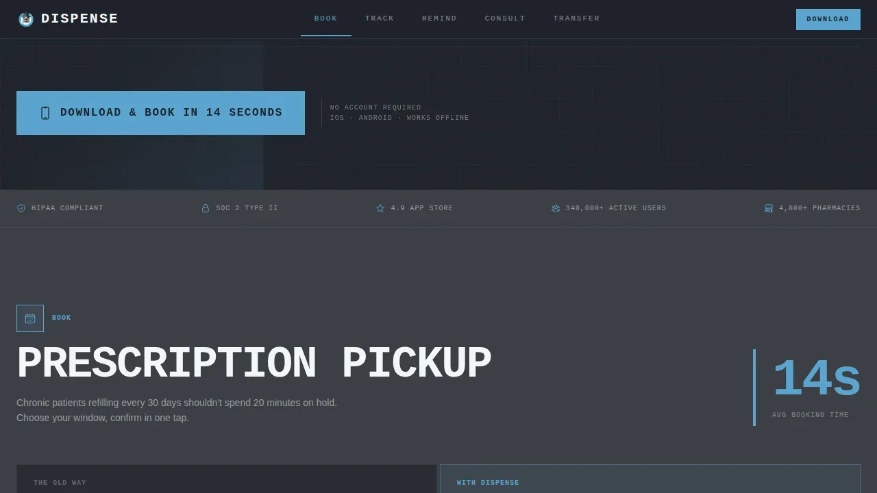
A persistent anchor nav pins to the top of the page with five blunt single-word labels. Visitors can jump directly to any spoke section without losing context. This design approach keeps browsing efficient and removes the guesswork that typically frustrates users on long-scroll landing pages.
Feature Matrix Card Grid
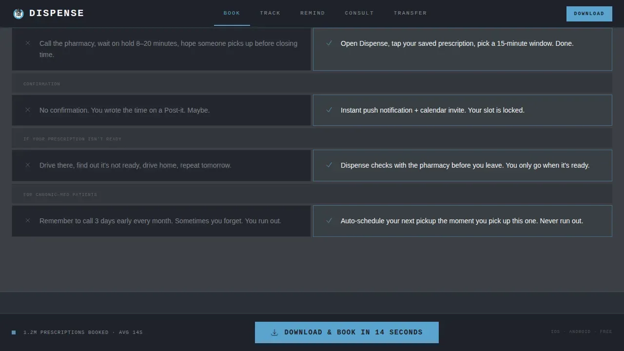
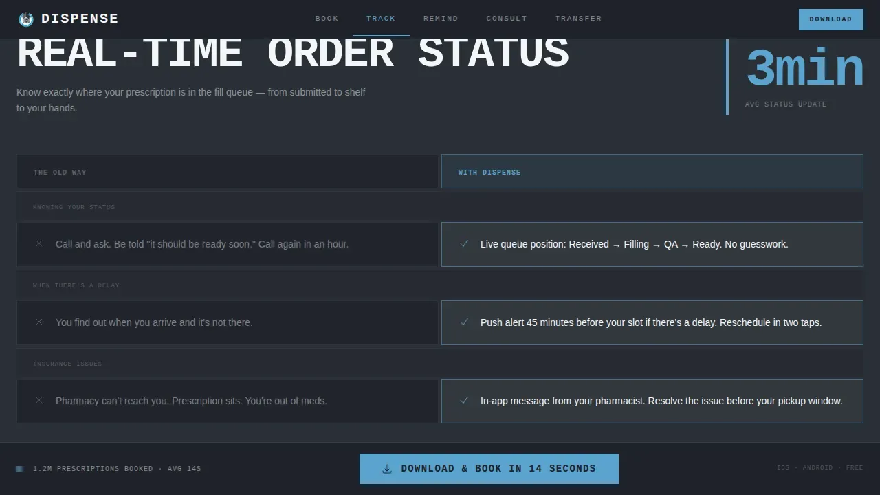
Each spoke section uses a brutalist card grid that compares the app feature against the old way of doing things. Hard-cut scroll reveals replace transition animations, reinforcing the mechanical rhythm of the layout. High contrast color inversions on hover snap slate to sky and sky back to slate.
Fixed Bottom Call-to-Action Bar
After the visitor passes the second spoke section, a fixed bottom bar surfaces the primary call-to-action. Tapping it triggers a platform-detection prompt for iOS or Android, with a QR code fallback for desktop users. A secondary field lets visitors receive a link via SMS using only a phone number.
Stark Typography System
The template uses JetBrains Mono for all metric labels and bold display elements, and Manrope for headings and body text. This pairing creates stark typography that prioritizes clarity over decoration, which is a core principle of honest brutalist web design. Large, raw type shapes reinforce the utilitarian concept throughout.
Linear Single-Row Footer
The footer follows a clean linear single-row pattern that keeps the page exit tidy without adding visual noise. It displays only the essential links and information, consistent with a brutalist style that refuses to pad content unnecessarily.
Page sections overview
| Section | Purpose |
|---|---|
| Stats Metrics Wall | Opens the page with live-counter figures and the primary download call-to-action |
| Book Spoke Section | Compares prescription pickup scheduling against the old process using a card grid |
| Track Spoke Section | Displays real-time order status features versus traditional wait-and-wonder methods |
| Remind Spoke Section | Shows smart refill reminder features compared to manual tracking habits |
| Consult Spoke Section | Presents pharmacist video and chat features against in-person or phone consultation |
| Linear Footer | Closes the page with a minimal single-row footer strip |
Design & branding system
The Slate & Sky color system is the backbone of this template's visual brand identity. Poured-concrete charcoal (#3B3F45) sets the section backgrounds. Exposed-rebar dark slate (#1E2229) grounds the persistent nav. Clinical sky blue (#5BA4CF) punches through on buttons, active states, and hover inversions. Antiseptic white (#F4F6F8) keeps card surfaces and body text legible. There are no gradients anywhere; every color relationship is raw and deliberate.
- High contrast between dark backgrounds and white body text maintains readability across all sections
- Sky-blue accent color serves as the single interactive element color, making calls-to-action unmissable
- Rectangular shapes and boxy card borders reinforce the brutalist aesthetic without decorative compromise
Mobile & speed optimization
This template is built mobile-first, because the primary goal is app downloads from users on their phones. The fixed bottom call-to-action bar is sized for thumb taps. The platform-detection modal handles iOS and Android routing automatically, with a QR code option for desktop users who are browsing from a laptop or monitor.
- SMS input field requires only a phone number, reducing form friction to a single tap
- Hard-cut scroll reveals avoid heavy transition animations that slow down mobile rendering
- Static server components handle all non-interactive sections to keep the page lean and fast
How this template helps you convert
The conversion path in this landing page is engineered to work in sequence. The stats wall makes the argument first. The anchor nav keeps visitors oriented. The fixed bar closes the deal.
- The metrics header leads with social proof figures like 1.2 million prescriptions booked and a 14-second scheduling time, giving visitors a reason to trust the app before they interact with anything else
- The feature matrix spokes replace vague marketing copy with honest side-by-side comparisons, so users understand the value of each feature in concrete terms
- The fixed bottom bar and SMS field simplify the final conversion step, letting visitors download or receive a link without filling out a long form or navigating away from the page
Other information about this template
This template belongs to a broader collection of brutalist landing page ideas suited for bold, high-stakes digital products. It is particularly relevant for designers and developers who study brutalism website examples as professional inspiration or for an art director building a concept that needs to convey raw authority fast.
Brutalism as a design movement takes its name from the French word "béton brut," meaning raw concrete, and that philosophy is visible in every element of this page. The template does not lie about what it is. It does not dress up its layout with soft gradients or decorative shapes. It displays its structure honestly, the way a raw concrete building displays its load-bearing frame.
- This template can serve as a reference point or portfolio piece for designers who want to showcase brutalist web design skills
- It fits naturally alongside a portfolio website collection that includes bold, unconventional web work
- Developers can use the existing CSS structure and code scaffolding as a starting point for custom pharmacy or healthcare projects
- The template showcases how brutalist landing pages can be professional and functional, not merely ugly or provocative
- Software teams building consumer healthcare apps will find the layout, interactive components, and code organization ready to adapt
- The dispense bold brutalist pharmacy booking landing page template is a strong example of how stark, honest design can drive real conversion for digital health brands
Theme
Bold Brutalist
Creative direction
Feature Matrix
Color system
Slate & Sky
Style
Hub & Spoke (Anchor Nav)
Direction
App Download
Page Sections
Brutalist Stats Wall Header
Hub-and-spoke Anchor Navigation
Feature Matrix Card Grid
Fixed Bottom Conversion Bar
Stark Dual-font Typography System
Linear Single-row Footer
Related questions
Can I change the colors and fonts in this template?
Is this template suitable for a pharmacy that does not have an app yet?
How does the platform-detection modal work in this template?
Can this template be adapted for a portfolio website or design showcase?
Does this template use gradients or decorative animations?



