Pharmacy Software Reviews Website Template
Dispense is a bold, brutalist-styled pharmacy membership management landing page built on a split-screen layout. It guides independent pharmacy owners, regional chain operators, and pharmacy benefit consultants from a vivid problem diagnosis to a clean solution reveal. The page drives freemium trial signups with a three-field form, a CSV import preview, and a sticky conversion bar.
by Rocket studio
Quick summary
Dispense is a single-page, split-screen landing page template for pharmacy membership management platforms. It uses a Problem to Solution scroll arc, a Feature Tab Switcher header, and a bold brutalist visual system. The page is built to convert independent pharmacy owners and regional operators into free-trial users through honest product demos and a frictionless signup flow.
Who this template is for
This template is designed for pharmacy software founders, product teams, and consultants who need a high-conviction landing page that sells a complex platform to a skeptical, time-poor audience.
- Independent pharmacy owners who currently manage loyalty programs in spreadsheets
- Regional chain operators needing unified membership data across multiple locations
- Pharmacy benefit consultants building white-label membership tiers for employer groups
What problem this template solves
Pharmacy membership platforms are hard to sell because the pain is invisible until it compounds. Lapsed cards, missed renewal windows, and fragmented patient records feel like minor inconveniences until revenue starts leaking. A generic landing page cannot show that pain credibly, and it cannot show the fix convincingly enough to earn a signup.
- Visitors leave before understanding what the platform actually does
- No clear before-and-after proof makes the value proposition easy to dismiss
- Complicated signup flows kill conversion before the product gets a fair look
What you get with this template
You get a fully structured, single-page layout that walks visitors through the problem, demonstrates the solution, and closes with a low-friction trial offer. Every visual decision serves that arc.
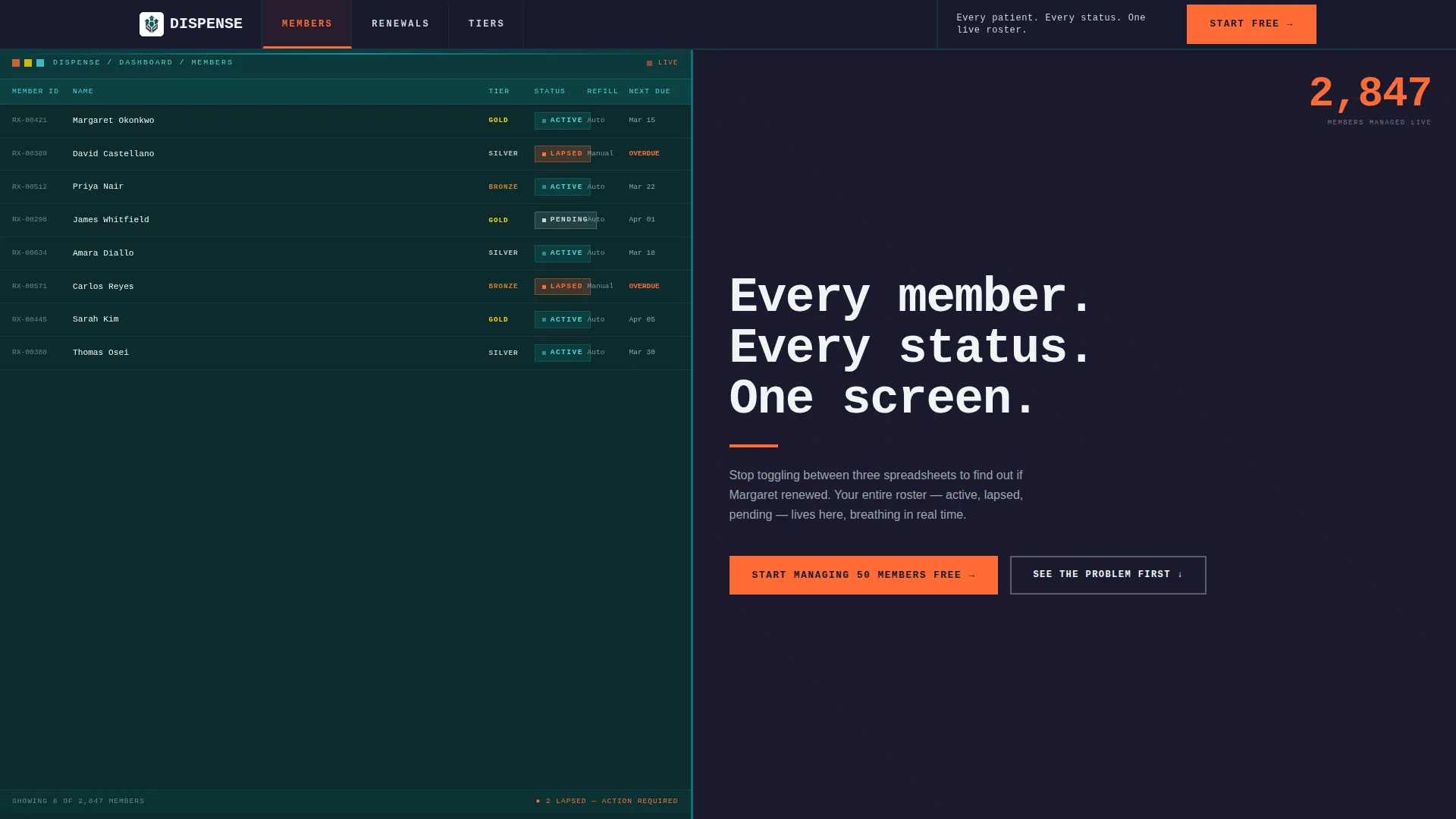
- A Feature Tab Switcher header with three live-view tabs: MEMBERS, RENEWALS, and TIERS
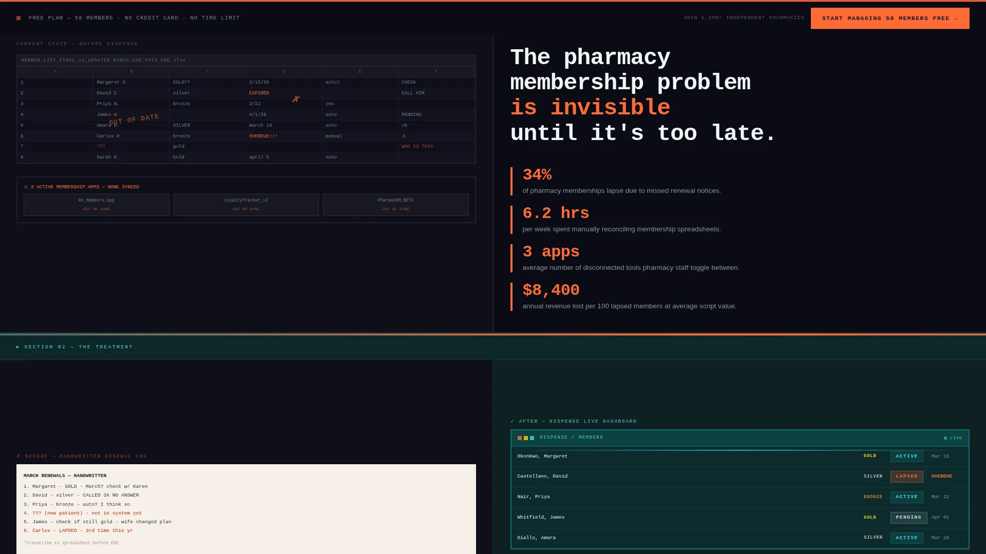
- A Problem to Solution scroll arc with split before-and-after panels escalating from individual member chaos to multi-location clarity
- A freemium conversion block with a three-field form, a sticky bottom bar, and a CSV drag-and-drop import preview zone
Feature list
This template delivers focused, prompt-grounded components that work together as a complete sales argument for a pharmacy membership platform.
Feature Tab Switcher Header
Three brutalist tabs stamped in all-caps mono type sit across the top of the viewport. Each tab snaps the left panel to a different dashboard view: a scrolling patient roster, a calendar heatmap of upcoming renewals, or a drag-and-drop tier builder. The right panel updates with a concise value statement on every tab switch.
Problem to Solution Scroll Arc
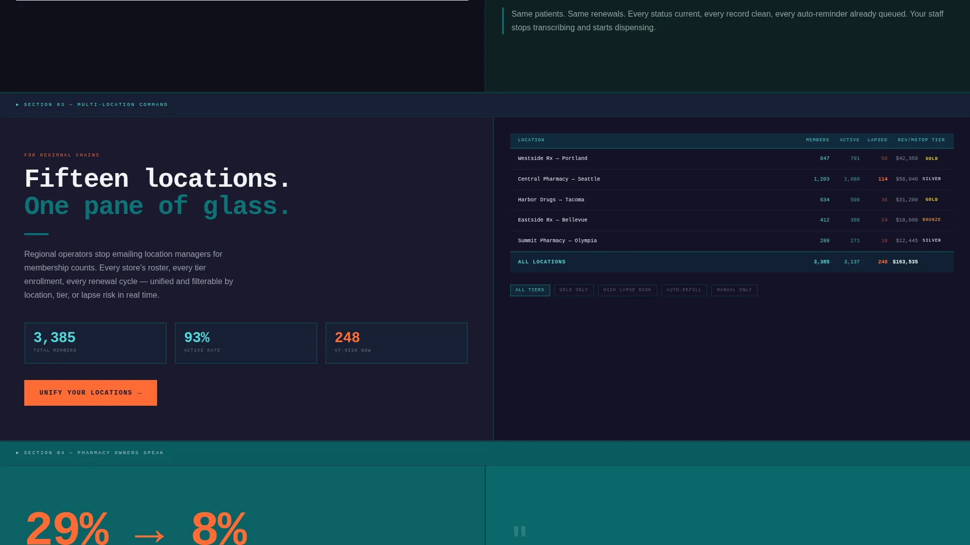
The top half of the page functions as a problem ward, showing cluttered spreadsheets, handwritten renewal logs, and fragmented app screens alongside stark statistics. A hard horizontal rule acts as a visual threshold. Below it, each split panel dissolves the messy reality into the clean platform interface, escalating from member management to multi-location analytics to lifecycle automation.
Split-Screen Panel Layout
Every section uses a strict 50/50 split. The left panel carries visual evidence and interface previews. The right panel carries copy, statistics, or form elements. This structure keeps the argument and the proof always side by side.
Freemium Trial Signup Block
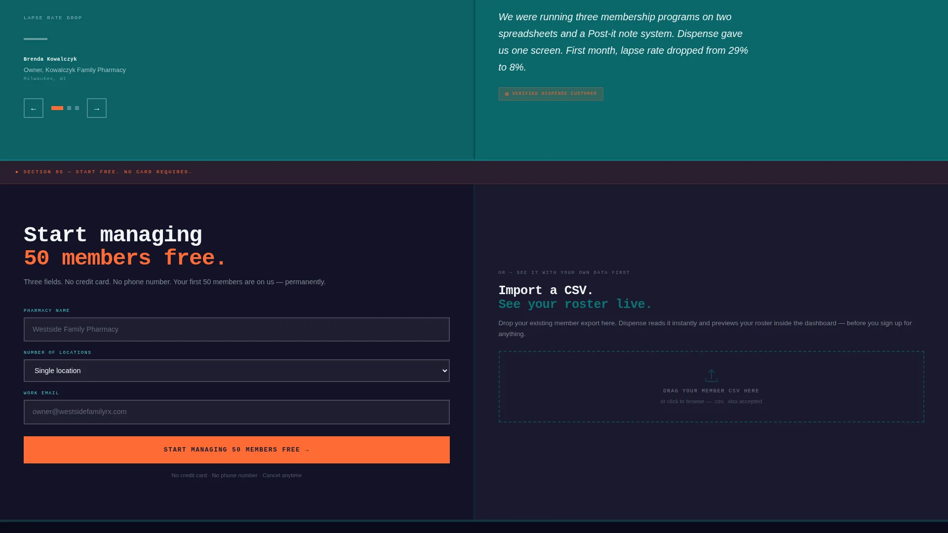
The primary call to action reads "Start Managing 50 Members Free." The signup form asks for pharmacy name, number of locations, and work email. No credit card and no phone number are required. The same call to action reappears in a sticky bottom bar after the first scroll.
CSV Import and Live Preview Zone
Below the signup form, a secondary path invites visitors to import a CSV file. A drag-and-drop upload zone instantly previews their member list inside a mock platform dashboard. This lets prospects see the product working with their own data before committing to anything.
Drag-and-Drop Tier Builder
The TIERS tab within the header switcher reveals a tier builder where benefit blocks slot into bronze, silver, and gold columns. This component lets visitors visualize their own membership structure directly inside the page, making the platform's capability concrete rather than abstract.
Page sections overview
| Section | Purpose |
|---|---|
| Feature Tab Switcher | Introduce core platform views |
| Problem Ward Panels | Show pharmacy membership pain |
| Statistics Block | Quantify the renewal gap |
| Solution Reveal Panels | Demonstrate clean platform output |
| Multi-location Analytics | Escalate value for chain operators |
| Lifecycle Automation Panel | Show automated renewal campaigns |
| Trial Signup Form | Capture freemium conversion |
| Sticky Conversion Bar | Persist the primary call to action |
| CSV Import Zone | Prove value before signup |
Design & branding system
The visual identity follows a Bold Brutalist theme built on the Teal Catalyst color system. Every design choice is intentional and unapologetic, treating whitespace as a structural element rather than decoration.
- Deep pharmaceutical teal (#0D7377) dominates surface areas, clinical charcoal (#1A1A2E) anchors typography and structural blocks, and reactive white (#F0F5F5) provides deliberate breathing space
- Catalyst orange (#FF6B35) appears exclusively on buttons, badges, and notification pings to create unmissable focal points
- Backgrounds alternate between charcoal and teal in heavy, flat slabs with no gradients; all corners are sharp, all shadows are hard; typography is oversized and mono-weighted throughout
Mobile & speed optimization
The template is structured for clarity on any screen size. The split-screen layout and heavy typographic scale translate cleanly to narrower viewports without losing the brutalist visual logic.
- Sharp-edged panels and flat color blocks avoid rendering complexity while maintaining visual impact
- The sticky bottom bar keeps the primary call to action reachable on mobile without interrupting the scroll arc
- The three-field form and drag-and-drop CSV zone are designed to stay compact and usable at every viewport width
How this template helps you convert
The page earns the click by showing the product working before asking for anything. Every structural choice moves the visitor closer to the trial signup.
- The Feature Tab Switcher lets visitors self-select their biggest pain point and immediately see the platform's answer, making the value proposition personal before any copy does the work.
- The Problem to Solution arc creates emotional momentum, turning frustration with current pharmacy membership workflows into confidence in the platform's approach before the signup form appears.
- The CSV import preview closes the last gap between curiosity and commitment by showing prospects their own member data inside the platform before they create an account.
Other information about this template
This template is built specifically for the pharmacy software niche and carries design and structural choices that reflect that context. It is a strong fit for product-led growth strategies in healthcare technology.
- The template style is Split Screen (50/50), with the header concept built as a Feature Tab Switcher
- The creative direction follows a Problem to Solution Arc, and the landing page direction targets Freemium and Trial conversion
- The Bold Brutalist theme and Teal Catalyst color system are intentional signals of seriousness and precision, designed to resonate with pharmacy professionals who value accuracy over decoration
- The page includes one statistic embedded in the problem ward panels: 34 percent of pharmacy memberships lapse due to missed renewal notices
Theme
Bold Brutalist
Creative direction
Problem→Solution Arc
Color system
Teal Catalyst
Style
Split Screen (50/50)
Direction
Freemium/Trial
Page Sections
Feature Tab Switcher Header
Problem to Solution Scroll Arc
Freemium Trial Signup Block
CSV Import Live Preview
Drag-and-drop Tier Builder
Sticky Conversion Bar
Related questions
Who is the Dispense landing page template built for?
What conversion path does this template use?
Can visitors preview the platform before signing up?
What does the Feature Tab Switcher show?
What design style does this template use?



