Pharmaceutical Digital Presence Privacy Policy & Terms Website Template
Pharmacommand is a split-screen pharmaceutical landing page template built for drug pipeline teams, biotech marketers, and agency producers. It pairs a live clinical trial tracker with a drug portfolio grid inside a Dashboard Pro layout using a Carbon Fiber color system. Every section is designed to demonstrate credibility fast and move compliance-focused buyers toward action.
by Rocket studio
Quick summary
Pharmacommand is a precision-built pharmaceutical landing page template designed around a 50/50 split-screen layout. It combines a clinical trial pipeline tracker with a drug portfolio grid, wrapped in a dark Dashboard Pro interface. The Carbon Fiber color system keeps everything purposeful and sterile-clean, while a single pharma-grade cyan accent drives the eye to what matters most.
Who this template is for
This template is built for teams that operate at the intersection of life sciences and digital presence. It speaks the language of compliance-heavy stakeholders without sacrificing visual impact.
- Biotech marketing directors launching specialty drug microsites or rebrand campaigns
- Pharmaceutical IT leads replacing outdated legacy portals with modern dashboard interfaces
- Agency producers pitching digital concepts to regulatory and compliance-conscious clients
What problem this template solves
Most pharmaceutical web templates default to brochure-style layouts that feel generic the moment a compliance reviewer sees them. They lack the structured visual language that scientific and regulatory audiences expect.
- Generic templates carry no built-in framework for communicating trial phases, portfolio status, or regulatory timelines
- Compliance-heavy stakeholders reject creative work that cannot demonstrate structure and process at a glance
- Legacy portals look dated and erode trust with the exact audience that needs to feel confident in the platform
What you get with this template
You get a fully structured pharmaceutical landing page that leads with data, builds credibility through comparison, and converts through an inline configurator flow. Everything is placed with precision, from the interactive header down to the gated secondary call to action.
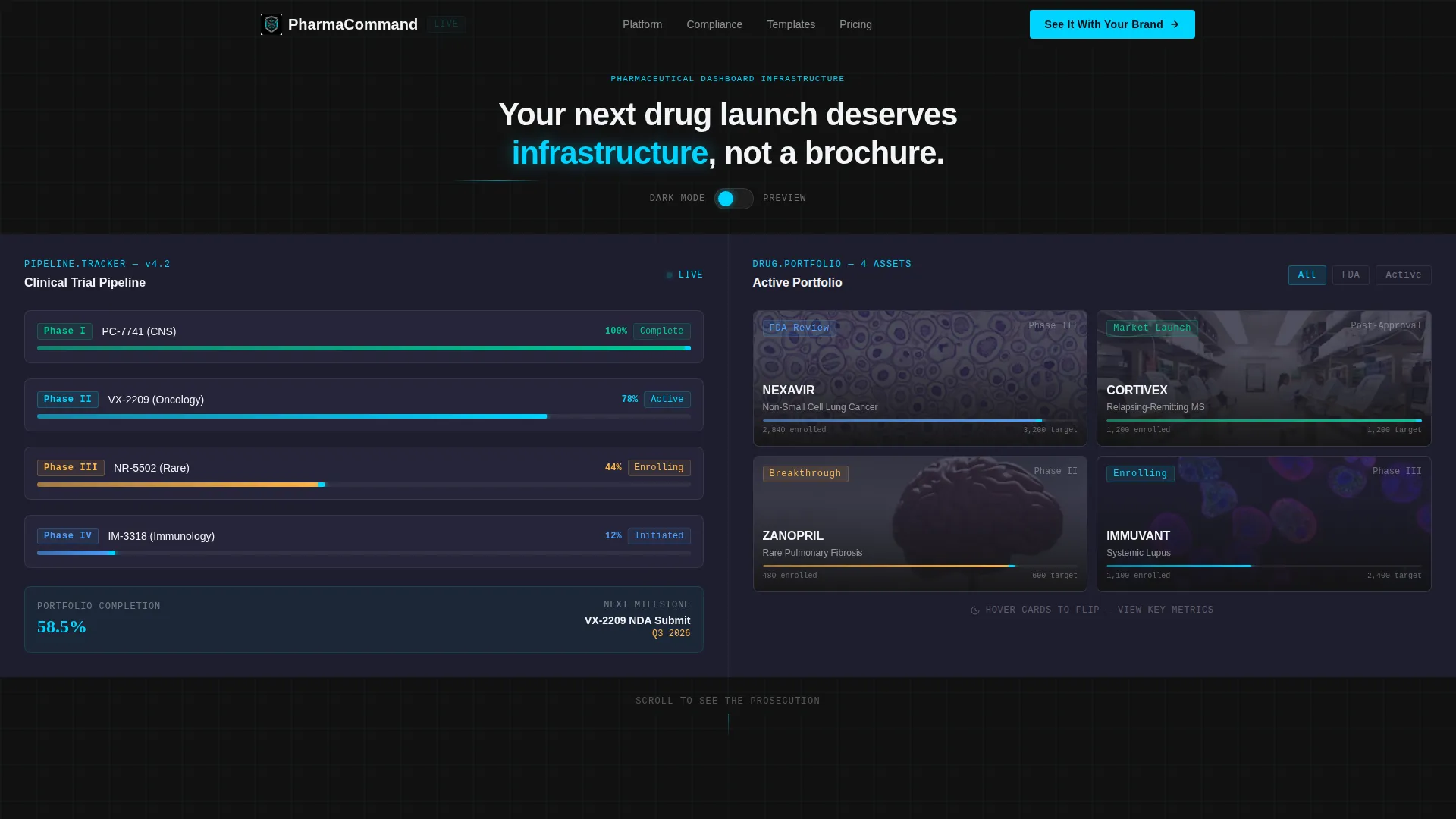
- A split-screen interactive header featuring a clinical trial pipeline tracker and a drug portfolio grid with hover-flip cards
- Three animated KPI tiles, a side-by-side comparison section, and an inline brand configurator
- A secondary conversion path offering a downloadable compliance checklist behind an email gate
Feature list
This template includes a focused set of purpose-built components. Each one is designed to serve a specific role in the pharmaceutical buyer's decision journey.
Interactive Split-Screen Header
The header occupies the full viewport as a functioning pharmaceutical dashboard mockup. The left panel displays a clinical trial pipeline tracker with Phase I through Phase IV rendered as horizontal progress bars with real percentage labels. The right panel shows a drug portfolio grid with thumbnail cards stamped with status badges such as "FDA Review" and "Market Launch."
Hover-Flip Portfolio Cards
Each card in the drug portfolio grid responds to hover with a flip animation that reveals additional context. This interaction signals product depth and keeps visitors engaged without requiring a page scroll or navigation click.
Dark and Light Mode Toggle
A visible mode toggle lets visitors switch between dark and light interface states. The pharma-grade cyan accent adapts and ripples across data points in both modes, ensuring the dashboard always reads clearly regardless of the visitor's preference.
Animated KPI Counter Tiles
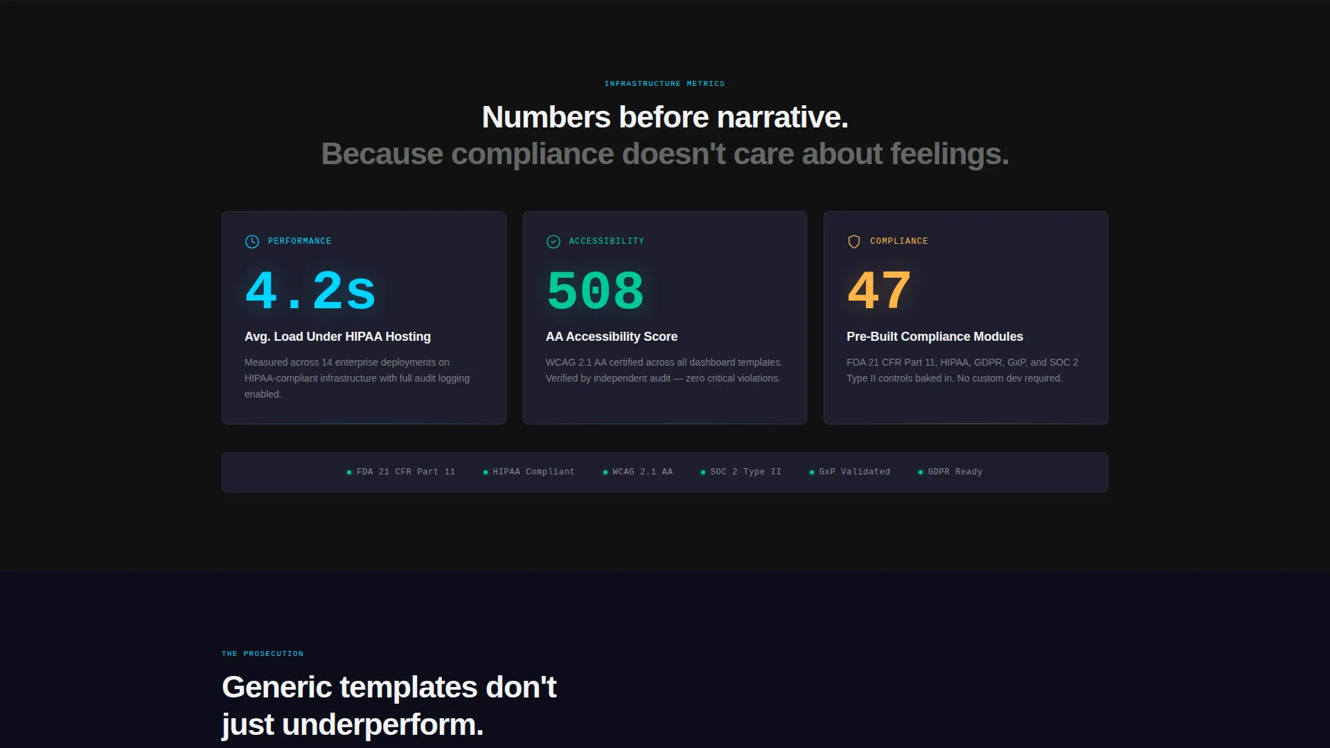
The first section below the fold opens with three oversized KPI tiles that animate into view with counter-roll effects. These tiles lead with numbers before narrative, establishing credibility at the exact moment a visitor begins to scroll.
Comparison Prosecution Layout
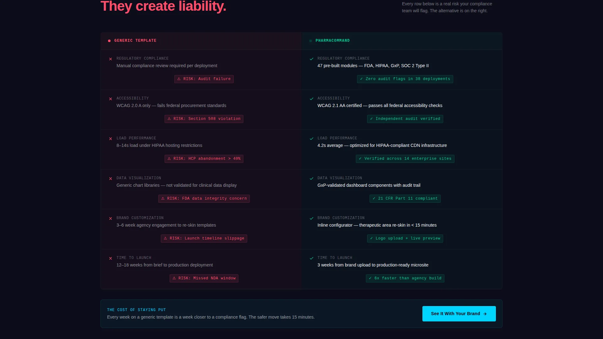
Each comparison row places a generic template screenshot on the left, grayed out and annotated with red compliance flags, against the Pharmacommand template on the right in full color with green checkmarks. A subtle risk label sits on the competitor side of every row, reinforcing the cost of not switching.
Inline Brand Configurator
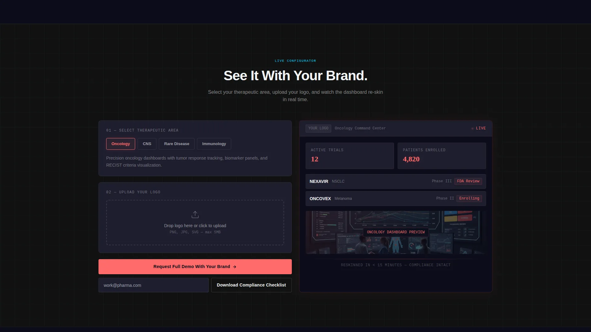
The primary call to action triggers an inline configurator. Visitors select a therapeutic area from options including oncology, central nervous system, rare disease, and immunology, then upload a logo to watch the dashboard preview re-skin in real time.
Page sections overview
| Section | Purpose |
|---|---|
| Split-screen header | Displays interactive trial pipeline and drug portfolio grid |
| KPI counter tiles | Opens scroll with three animated performance stats |
| Comparison rows | Contrasts generic templates against Pharmacommand side by side |
| Inline configurator | Lets visitors preview the template with their own brand assets |
| Email-gated checklist | Captures leads not yet ready to commit via compliance download |
Design & branding system
The visual identity follows a Dashboard Pro theme built on the Carbon Fiber color system. The palette is clinical and purposeful, drawing from the visual language of medical instrumentation rather than consumer web design.
- Deep instrument black (#121212) and titanium panel gray (#1E1E2E) form the primary dark surface layer, with clinical white (#F4F5F7) for readable content areas
- Pharma-grade cyan (#00D4FF) is reserved exclusively for live data points, hover states, and call-to-action pulses, never used as a decorative fill
- The overall aesthetic feels like the cockpit of a medical-grade instrument: matte dark surfaces with a single glowing readout that signals everything is within spec
Mobile & speed optimization
The template is structured to maintain its split-screen visual logic across different screen sizes. The dashboard components are designed to reflow without losing the clinical precision of the original layout.
- The 50/50 split adapts to single-column stacking on smaller viewports, preserving the pipeline tracker and portfolio grid as distinct readable blocks
- Hover interactions and counter animations are scoped to perform without overloading the interface on mobile devices
How this template helps you convert
The entire page is built around a Comparison/Versus conversion strategy. Every design and copy decision is calibrated to make the choice feel obvious and the risk of staying with the alternative feel real.
- The animated KPI tiles establish instant credibility with specific numbers before a visitor reads a single paragraph, anchoring trust at the scroll entry point.
- The comparison rows build a prosecution-style argument, pairing red-flagged competitor examples with green-checkmarked Pharmacommand sections row by row until the case feels complete.
- The inline configurator removes hesitation by letting visitors see the template wearing their own brand before they commit, while the email-gated checklist captures buyers who need more time.
Other information about this template
This template is categorized under Technology with a focus on pharmaceutical digital presence. It is designed for teams building within the pharmaceutical website template niche, where design, compliance framing, and data visualization must work together.
- The template style is a 50/50 Split Screen, making it well suited for side-by-side storytelling and product comparison flows
- The Dashboard Pro theme and Carbon Fiber color system make this template visually distinct from standard healthcare or life sciences web themes
- The header concept is an Interactive Preview, meaning the very first thing a visitor sees is a working dashboard, not a static hero image
- The Stats-First Impact creative direction prioritizes numbers over narrative, which is particularly effective with analytical pharmaceutical and biotech audiences
- A floating headline above the split screen reads: "Your next drug launch deserves infrastructure, not a brochure," setting the tone for the entire page
Theme
Dashboard Pro
Creative direction
Stats-First Impact
Color system
Carbon Fiber
Style
Split Screen (50/50)
Direction
Comparison/Versus
Page Sections
Interactive Split-screen Header Dashboard
Animated KPI Counter Tiles
Comparison Prosecution Layout
Inline Brand Configurator
Dark and Light Mode Toggle
Email-gated Compliance Checklist
Related questions
Who is this landing page template designed for?
Can I preview the template with my own brand assets?
What does the split-screen header actually show?
Is there a path for visitors who are not ready to configure the template?



