Specialist Pharmaceutical Digital Presence Professional Website Template
Pharmalearn is a bento grid landing page template built for pharmaceutical course and training platforms. It combines an interactive dashboard header, simulation-driven module previews, and a freemium conversion flow into one precision-designed page. The Midnight Blue color system and Dashboard Pro theme make it feel like a validated lab instrument panel, purposeful and immediately credible.
by Rocket studio
Quick summary
Pharmalearn is a single-page bento grid template for pharmaceutical training platforms. It opens with a live interactive dashboard preview, guides visitors through simulation-based course modules, and closes with a friction-free freemium sign-up flow. The page is built for platforms serving pharmacologists, regulatory affairs specialists, and compliance teams who need credibility on first contact.
Who this template is for
This template is designed for teams building digital training products in the pharmaceutical and life sciences space. It speaks directly to platform operators whose learners have high stakes and zero tolerance for vague promises.
- Pharmaceutical e-learning platforms offering regulatory affairs and Good Manufacturing Practice (GMP) compliance courses
- Training providers targeting mid-career professionals, fresh graduates preparing for licensing exams, and Quality Assurance managers seeking team recertification
- Course operators who need a landing page that earns trust through interaction, not just marketing copy
What problem this template solves
Generic course landing pages fail pharmaceutical training audiences. These learners are technically rigorous. They need to feel the product before they commit to it. A static screenshot and a bullet list of benefits will not move a regulatory affairs specialist to sign up.
- Visitors cannot assess course quality from a flat promotional page alone
- Platforms struggle to communicate simulation depth, compliance credibility, and module structure at a glance
- The conversion path from curious visitor to registered learner is often too long and too vague
What you get with this template
You get a fully structured, interaction-first bento grid landing page built around the pharmaceutical training experience. Every section is designed to demonstrate the platform rather than describe it.
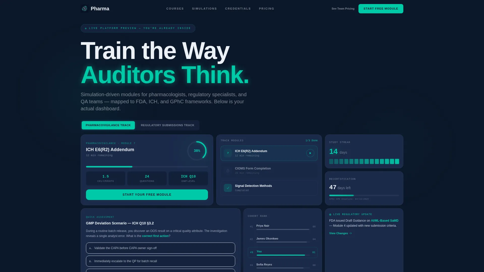
- An interactive header dashboard with a live bento grid preview, animated progress ring, track toggle, and a draggable mock quiz tile
- A scroll-driven interactive explorer with a course catalog grid, simulated audit walkthrough, and a credential wall with expandable accreditation details
- A two-step freemium conversion form with role selection, module choice, and no credit card requirement, plus a sticky conversion bar and a secondary team pricing path
Feature list
This template is built around interactions that mirror the platform experience itself. Each feature below reflects a specific component described in the source brief.
Live Interactive Header Dashboard
The header loads as a fully functional bento grid dashboard. Visitors can click a sample module card, watch a micro-progress ring animate from zero to thirty-eight percent, toggle between the Pharmacovigilance Track and the Regulatory Submissions Track, and interact with a mock quiz tile featuring draggable answer options. The header puts visitors inside the product before they scroll.
Flip-Card Course Catalog Grid
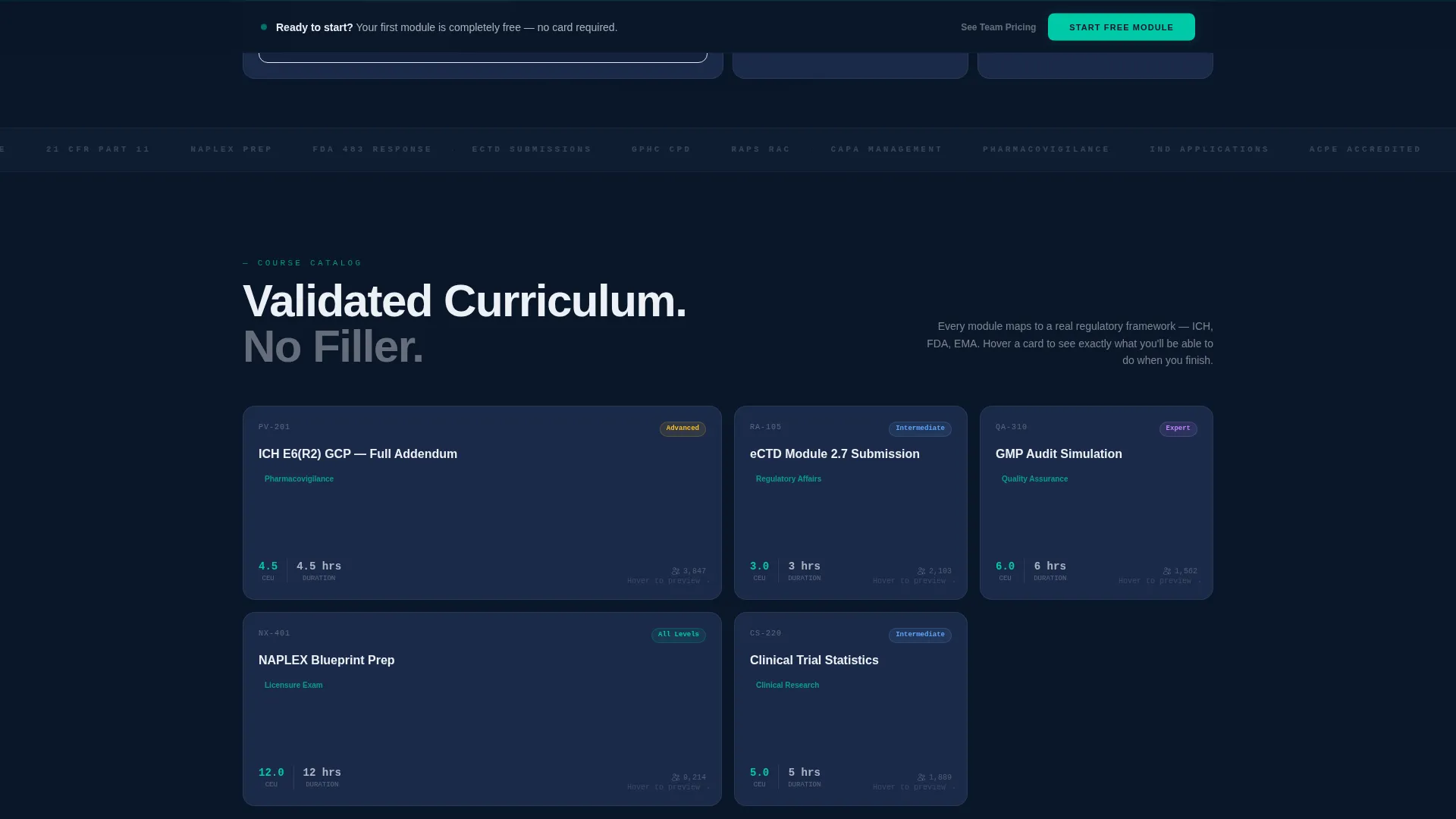
The course catalog section presents module tiles in a bento grid layout. Hovering any tile flips it to reveal learning outcomes and Continuing Education Unit (CEU) credit details. This gives prospective learners a clear sense of curriculum depth without leaving the page.
Simulated Audit Walkthrough Section
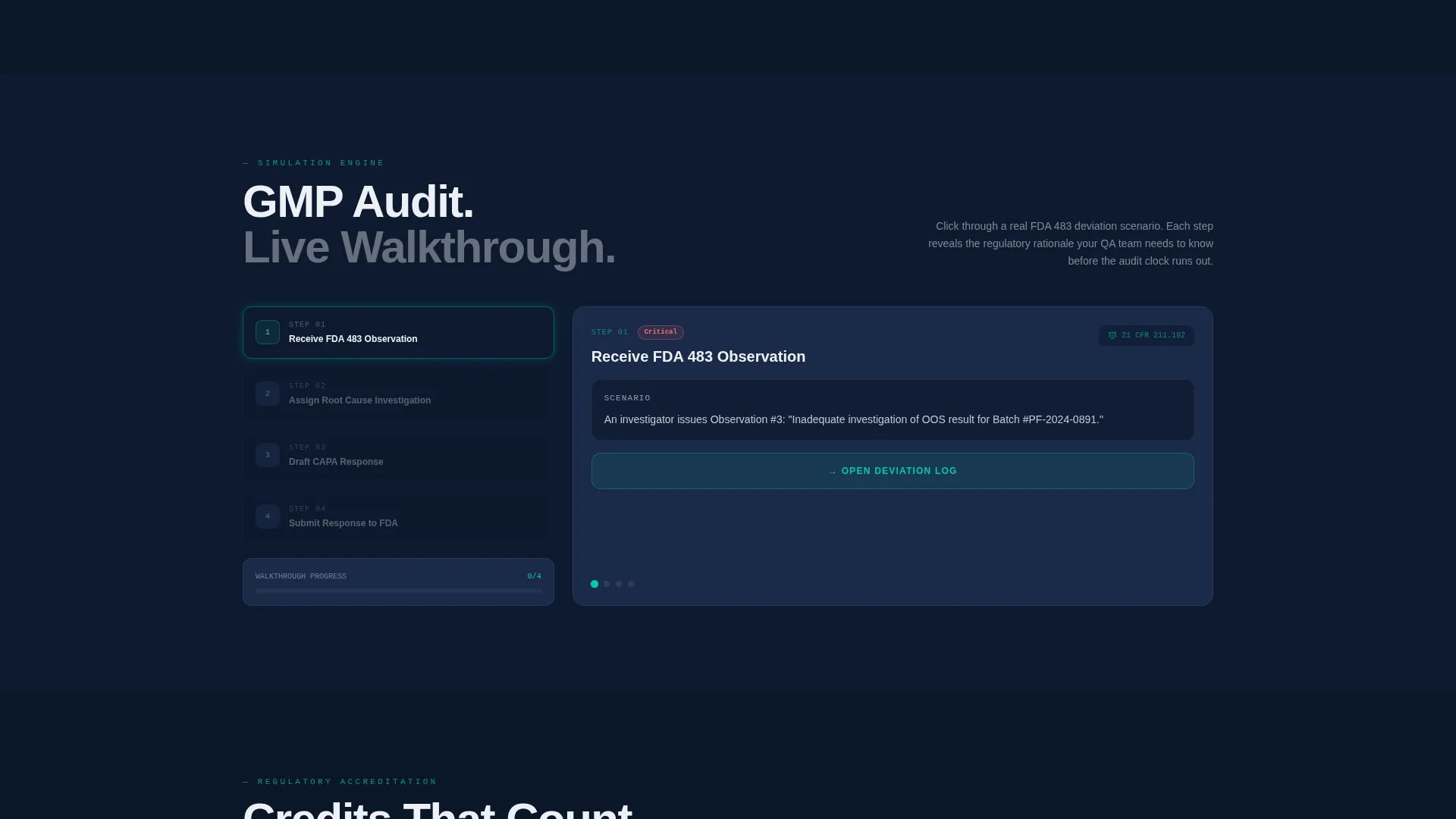
A dedicated scroll section guides visitors through a step-by-step audit simulation. Clicking through each step demonstrates how the platform teaches deviation handling in GMP and regulatory contexts. The interaction model proves the teaching method by replicating it.
Credential Wall with Expandable Verification
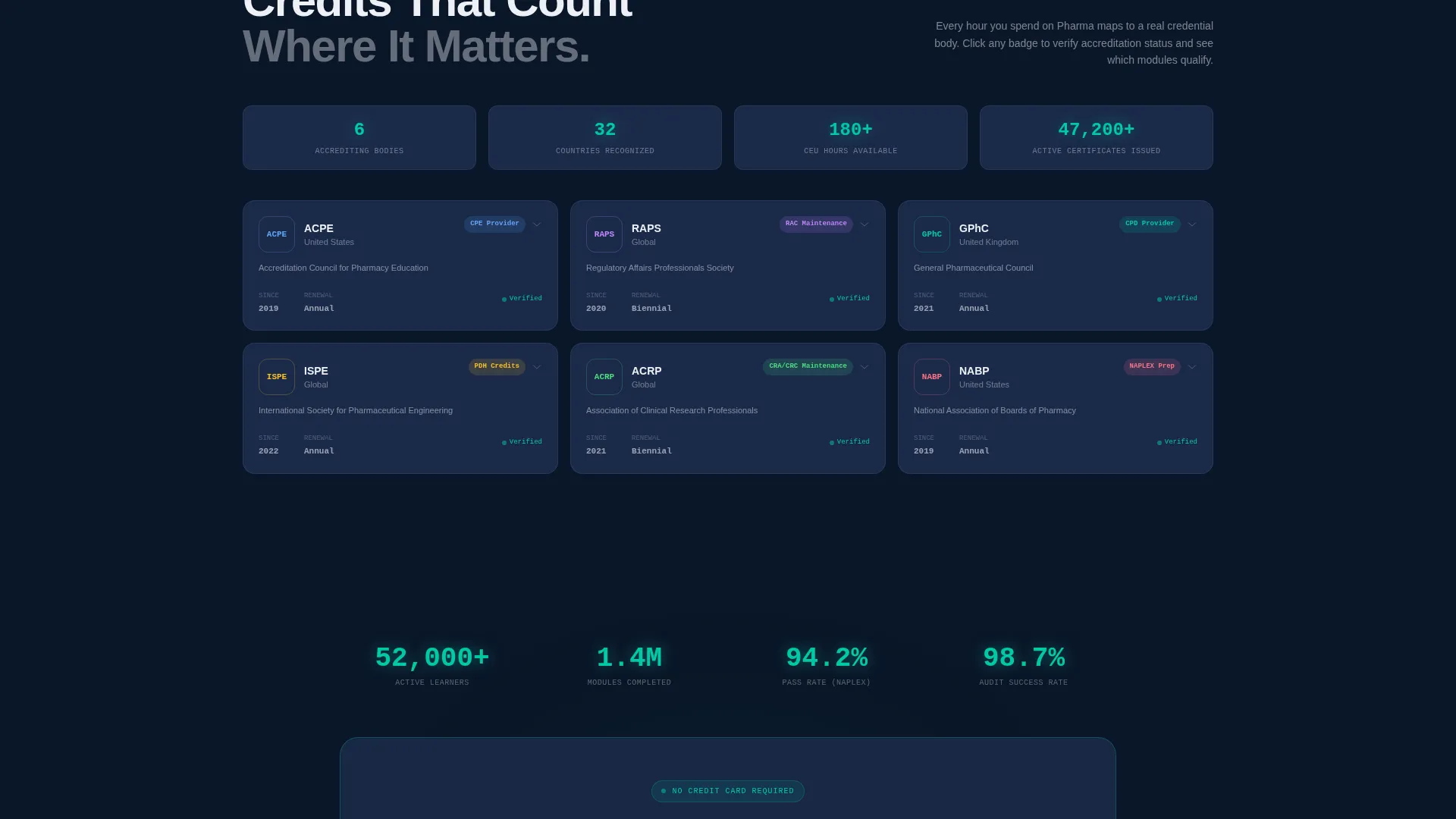
A structured credential wall displays regulatory body accreditations. Each accreditation entry is expandable, letting visitors verify details on demand. This section is designed to address the trust threshold that pharmaceutical and clinical research audiences bring to any training product.
Two-Step Freemium Conversion Form
The primary call to action opens a two-step sign-up form. Step one captures name, email, and professional role via a dropdown. Step two lets the visitor choose their first free module from three options with estimated completion times. No credit card field appears at any point in the flow.
Sticky Conversion Bar and Secondary Pricing Path
After the third scroll section, a sticky bottom bar repeats the primary call to action to keep the conversion opportunity visible. A secondary text link labeled "See Team Pricing" sits beneath the primary button to serve Quality Assurance managers purchasing seats in bulk.
Page sections overview
| Section | Purpose |
|---|---|
| Interactive Header Dashboard | Lets visitors explore a live bento grid preview with animated progress, track toggle, and a draggable quiz tile |
| Course Catalog Grid | Presents flip-card module tiles that reveal learning outcomes and CEU credits on hover |
| Audit Walkthrough Section | Guides visitors through a clickable GMP deviation-handling simulation |
| Credential Wall | Displays regulatory accreditations with expandable verification detail panels |
| Freemium Conversion Form | Captures name, email, and role in step one; module selection in step two |
| Sticky Conversion Bar | Keeps the primary call to action visible after the third scroll section |
Design & branding system
The visual identity follows a Dashboard Pro theme built on a Midnight Blue color system. The palette is designed to feel like a validated laboratory instrument panel: cool, precise, and purposeful at every data point.
- Core colors include deep terminal navy (#0A1628) for primary backgrounds, clinical steel (#1B2A4A) for card surfaces, sterile white (#EDF0F5) for text and data labels, and regulatory teal (#00C9A7) for progress bars, completion badges, and hover states
- Depth shadows on bento grid tiles create a sense of layered instrument panels without decorative noise
- The teal accent pulses on the primary call-to-action button, drawing attention without disrupting the clinical, measured feel of the overall layout
Mobile & speed optimization
The bento grid layout is structured to adapt across screen sizes without losing the interaction model that drives conversion. Interactive elements are sized and spaced for reliable touch input on smaller screens.
- Bento grid tiles reflow naturally for narrower viewports, keeping the dashboard feel intact on mobile devices
- The sticky conversion bar is positioned to remain accessible on mobile without obstructing the main content scroll
- Interactive components including the progress ring, flip cards, and quiz tile are built to function on touch screens as well as pointer devices
How this template helps you convert
This template earns the conversion by giving visitors a real product experience before asking anything in return. The page is structured so that each interaction builds conviction, and the sign-up form arrives at exactly the right moment.
- The interactive header dashboard puts visitors inside a sample module immediately. By the time they scroll, they have already touched the product, which lowers the perceived risk of signing up.
- The two-step form removes friction at the decision point. No credit card, a simple role dropdown, and a module choice that feels personal rather than generic all reduce drop-off at the final step.
Other information about this template
This template is designed for pharmaceutical training platforms that need a page reflecting both the precision of the industry and the engagement standards of modern e-learning products. A few additional points worth noting:
- The template style is Bento Grid, and the creative direction is Interactive Explorer, meaning each scroll section is designed to deliver a fresh interactive moment rather than static promotional content
- The header concept is Interactive Preview, which is a deliberate design decision to demonstrate the platform's simulation-driven teaching model from the very first viewport
- The landing page direction is Freemium/Trial, so every structural decision from the pulsing call-to-action button to the sticky bar is oriented toward starting a free session, not closing a sale
- The template suits platforms whose learner audiences include professionals preparing for National Association of Boards of Pharmacy (NAPLEX) exams, General Pharmaceutical Council (GPhC) registration, or annual compliance recertification before regulatory audit cycles
Theme
Dashboard Pro
Creative direction
Interactive Explorer
Color system
Midnight Blue
Style
Bento Grid
Direction
Freemium/Trial
Page Sections
Live Interactive Header Dashboard
Flip-card Course Catalog Grid
Simulated Audit Walkthrough
Expandable Credential Wall
Two-step Freemium Conversion Form
Sticky Bar and Team Pricing Path
Related questions
Who is the target audience for this template?
Does the sign-up form require a credit card?
Can the template support team or bulk seat purchases?
What interactive features are built into this template?
How does the page guide visitors toward signing up?



