Pharmaceutical AI Price Optimization Landing Page
Pharmasignal is a split-screen landing page template built for pharmaceutical AI price optimization platforms. It combines a stats-first scroll flow, a live-styled pricing waterfall chart, and a freemium trial conversion path. The design uses a Midnight Blue palette to give the page the focused intensity of a real-time trading terminal, built for brand directors, market access leaders, and pricing analysts.
by Rocket studio
Quick summary
Pharmasignal is a single-page, split-screen landing page template designed for pharmaceutical AI price optimization platforms. It opens with institutional credibility via a scrolling logo bar, then drives conviction through confrontational data moments, pairing uncomfortable market statistics with the platform feature that resolves each one. Every scroll step is built to move a skeptical pricing professional toward a free simulation.
Who this template is for
This template is built for teams that live and breathe pharmaceutical pricing strategy. If your buyers need hard evidence before they act, this page was designed for them.
- Brand directors at mid-size pharma companies launching specialty drugs into competitive therapeutic areas
- Market access vice presidents negotiating with pharmacy benefit managers who arrive at the table with more data
- Pricing analysts at biosimilar firms trying to find the lowest viable price without leaving revenue behind
What problem this template solves
Pharmaceutical pricing decisions carry enormous financial weight, but most platforms pitch their value with soft claims and generic dashboards. Skeptical, data-literate buyers scroll past those pages without slowing down.
- Visitors with deep domain expertise need to feel the product's precision before they trust it, not after a demo request
- A generic hero section with a tagline and stock image does not communicate gross-to-net erosion analysis or formulary timing intelligence
- The standard "request a demo" single call to action creates too much friction for a buyer who just wants to validate the concept first
What you get with this template
You get a fully structured, high-conviction landing page layout built specifically for the pharmaceutical pricing niche. Every section is designed with a clear persuasion role and a specific visual behavior.
- A 50/50 split-screen layout where the left panel leads with a single massive statistic and the right panel reveals the corresponding platform feature
- A freemium trial conversion flow starting with a corporate email gate, then progressively disclosing therapeutic area and pricing model selection inside the product
- A secondary exploration path labeled "Explore the Drug Pricing Directory" that lets hesitant visitors browse anonymized competitive pricing benchmarks without committing to registration
Feature list
This template is built around a specific set of prompt-defined components. Each one serves a deliberate role in the page's persuasion architecture.
Scrolling Logo Bar Header
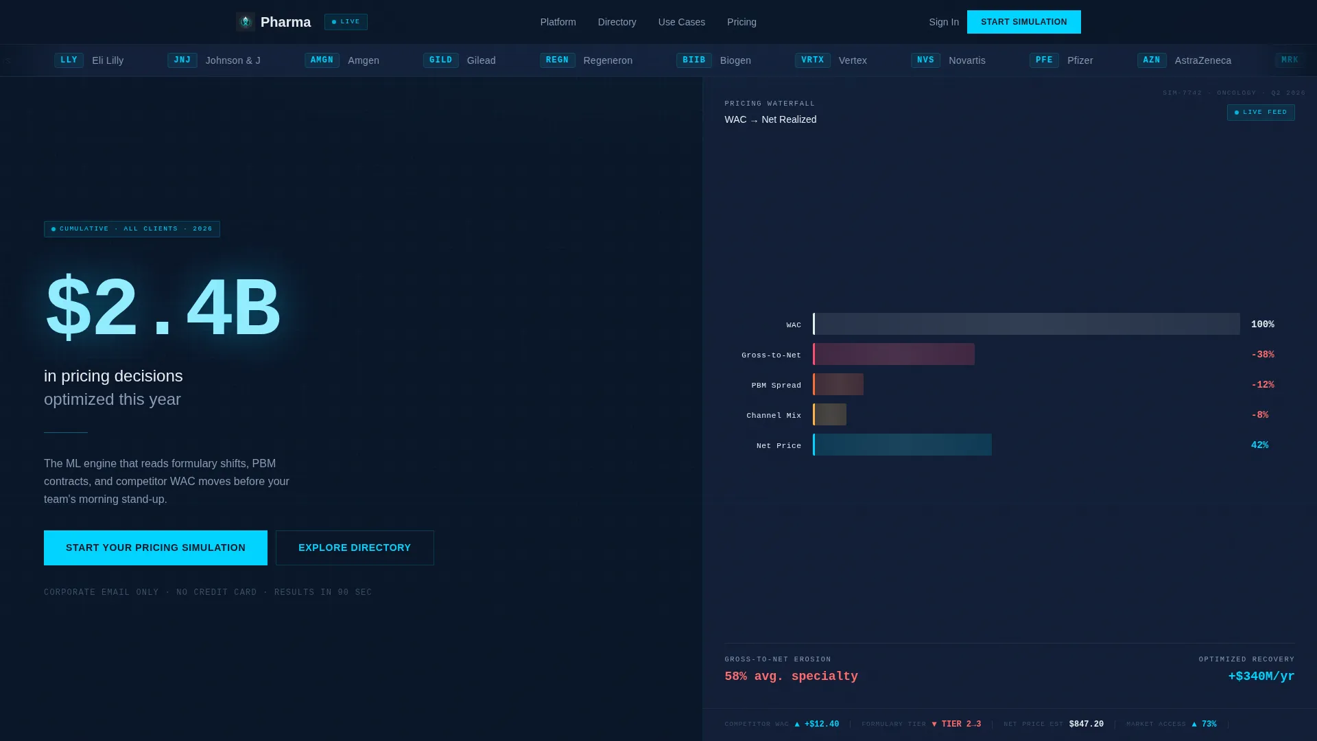
A horizontal ribbon of pharmaceutical company logos and industry partner marks moves at a slow, confident pace across the top of the viewport. It establishes institutional credibility before any headline or claim appears, using recognizable marks to do the trust-building work silently.
Stats-First Split Screen Layout
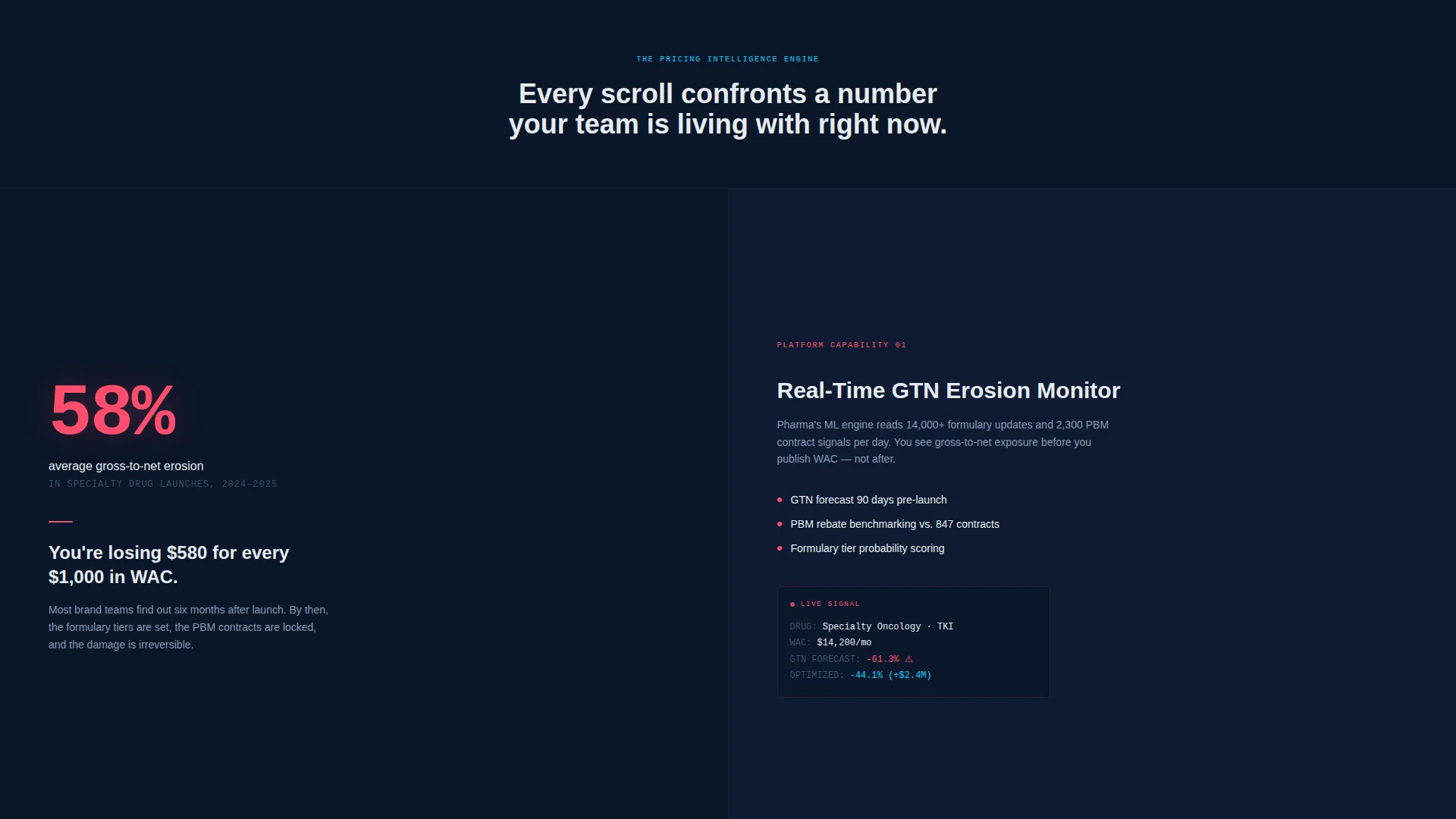
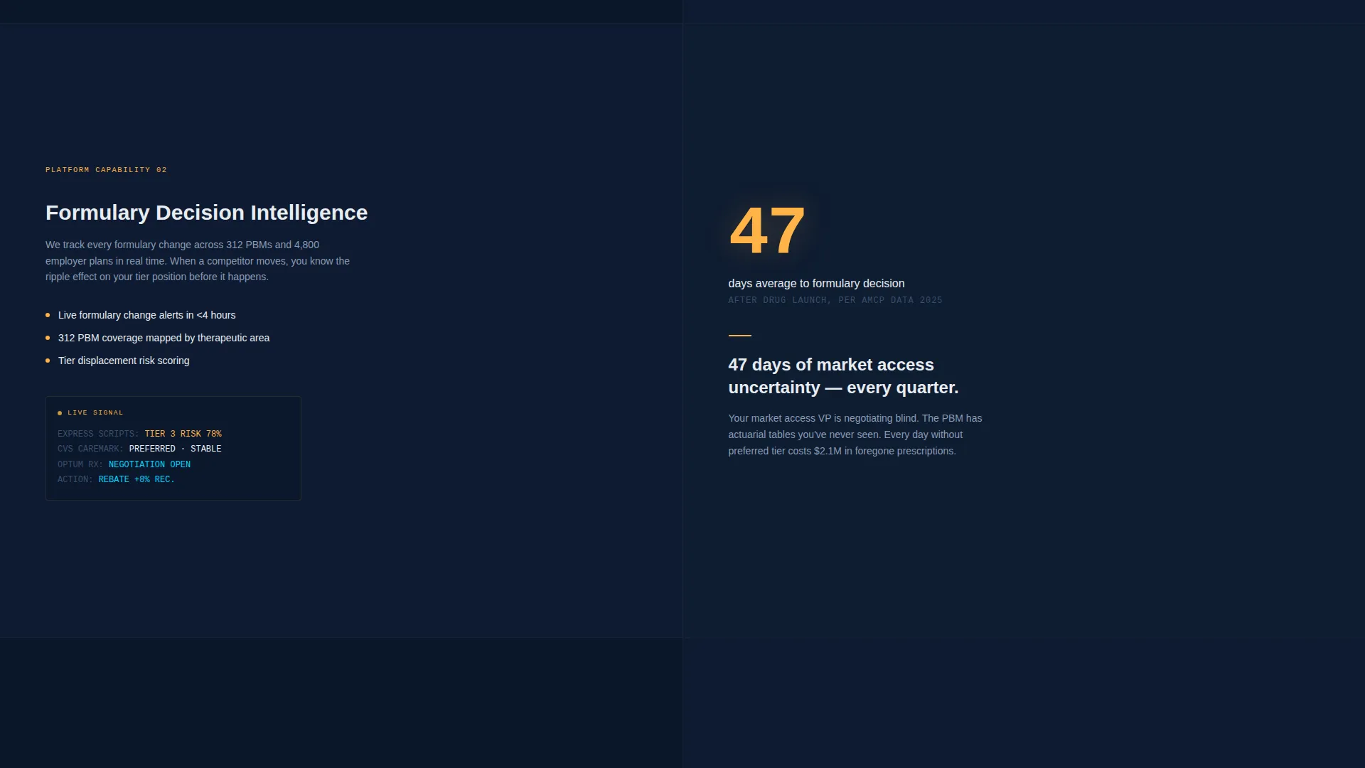
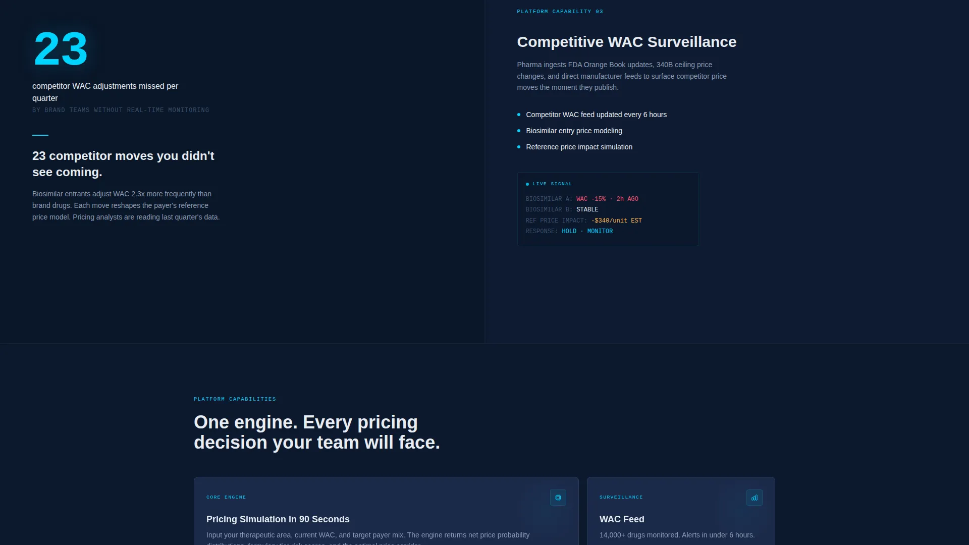
Each section of the page opens with a large, confrontational number on the left, gross-to-net erosion percentages, days to formulary decision, or competitor price moves missed per quarter. The right panel then reveals the platform feature that directly addresses that pain point. The scroll pattern stacks evidence rather than building a conventional narrative.
Live-Styled Pricing Waterfall Chart
The right panel of the hero section displays an animated pricing waterfall chart that moves segment by segment from WAC (wholesale acquisition cost) to net price. Each step is labeled in clinical white type, giving the page an immediate sense of real data activity.
Freemium Trial Conversion Path
The primary call to action, "Start Your Pricing Simulation", appears first below the hero waterfall and again as a sticky bottom bar after the third scroll section. The trial gate is progressive: corporate email only on step one, then therapeutic area and pricing model selection inside the product on subsequent steps.
Drug Pricing Directory Secondary Path
A secondary conversion option labeled "Explore the Drug Pricing Directory" gives hesitant visitors a lower-commitment entry point. They can browse anonymized competitive pricing benchmarks without registering, building trust through direct utility before a sign-up request appears.
Signal Cyan Data Highlight System
Live data points, active interface states, and all call-to-action elements are rendered exclusively in signal cyan (#00D4FF) against the terminal navy background. This color rule creates an immediate visual hierarchy where the numbers and actions that matter most pull the eye without any supporting decoration.
Page sections overview
| Section | Purpose |
|---|---|
| Logo Bar | Establish institutional credibility silently before any headline |
| Hero Split Screen | Pair a key platform stat with the animated pricing waterfall chart |
| Stats-Pain Section 1 | Confront visitor with gross-to-net erosion data, resolve with feature |
| Stats-Pain Section 2 | Surface formulary decision timing data, reveal the matching capability |
| Stats-Pain Section 3 | Show competitor price moves missed, introduce the monitoring feature |
| Primary call to action Block | Prompt "Start Your Pricing Simulation" with corporate email gate |
| Sticky call to action Bar | Reappear after third section as a persistent bottom-bar prompt |
| Directory Path | Offer browse-only access to anonymized pricing benchmarks |
Design & branding system
The visual identity follows a Directory and Discovery theme executed entirely within a Midnight Blue color system. The palette is designed to feel like a monitoring dashboard in a dim operations room, only the numbers that matter glow.
- Deep terminal navy (#0A1628) serves as the primary background, pharmaceutical steel (#1B2A4A) as the surface color for cards and secondary panels, and clinical white (#E8ECF1) for body text and data labels
- Signal cyan (#00D4FF) is reserved exclusively for live data points, active interface states, and call-to-action elements, it appears nowhere decorative
- Typography for the hero stat is set at 120 pixels in signal cyan, creating an immediate visual anchor that communicates scale and precision before the visitor reads a single word
Mobile & speed optimization
The split-screen layout is structured to adapt cleanly when the two-column format collapses on smaller viewports. The stats-first scroll logic remains intact at every screen size so the persuasion sequence does not break on mobile.
- The sticky bottom call-to-action bar is positioned for thumb reach and remains visible throughout the lower sections of the page on mobile devices
- Animated elements such as the pricing waterfall chart are designed as progressive visual layers, meaning the content hierarchy holds even if motion is reduced or delayed on slower connections
How this template helps you convert
This template is designed for a specific buyer psychology: data-literate professionals who distrust soft claims and need to feel product precision before they act. Every structural decision supports that conversion dynamic.
- The stats-first scroll pattern creates a confrontation-then-resolution rhythm that makes inaction feel riskier than signing up, evidence accumulates with every section rather than being front-loaded and forgotten
- The two-step conversion architecture lowers the commitment barrier at entry: a corporate email is all step one asks for, and the deeper qualification questions appear only after the visitor is already inside the product experience
- The secondary directory path captures visitors who are not yet ready to simulate, turning a potential exit into a trust-building browse session that keeps the platform top of mind
Other information about this template
This template is category-matched to the Technology and AI for Pharmaceutical space. It is designed for single-page deployment as a dedicated acquisition surface for a pharmaceutical AI price optimization platform.
- The page style is classified as a split-screen (50/50) layout following a Directory and Discovery theme with a Stats-First Impact creative direction
- The header concept is a Logo Bar, and the primary conversion direction is Freemium and Trial, both defined in the matched intersection context for this template
- This layout is purpose-built for the pharmaceutical pricing niche and is not a general-purpose SaaS landing page; the visual language, data framing, and conversion flow are specific to this use case
Theme
Directory & Discovery
Creative direction
Stats-First Impact
Color system
Midnight Blue
Style
Split Screen (50/50)
Direction
Freemium/Trial
Page Sections
Scrolling Logo Bar for Instant Credibility
Stats-first Split-screen Scroll Flow
Animated Pricing Waterfall Chart
Progressive Freemium Trial Gate
Drug Pricing Directory Path
Signal Cyan Data Highlight System
Related questions
Who is this landing page template designed for?
Can I edit the placeholder statistics and chart data in the template?
What does the freemium conversion flow look like to the visitor?
Does the page offer a path for visitors who are not ready to sign up?
Is this template suited for more than one pharmaceutical pricing model?



