Pharmaceutical AI Image Generator Landing Page
Pharmasynth is a Bold Brutalist comparison landing page template built for pharmaceutical AI image generation tools. It leads with a stats-driven header, walks visitors through a cost-heavy problem block, and anchors conviction with a three-column comparison table. The design uses deep teal, charcoal, and catalytic magenta to make the business case visually undeniable before the first call to action appears.
by Rocket studio
Quick summary
Pharmasynth is a single-page comparison landing page template designed for pharmaceutical AI image generator products. It opens with three oversized performance metrics, pivots through a problem-and-solution arc, and closes with a conversion-optimized comparison table. The Bold Brutalist visual system signals industrial precision, and every section is engineered to make the cost and compliance case before asking for a click.
Who this template is for
This template is built for teams selling or promoting pharmaceutical AI image generation tools. It speaks directly to the buyers who feel the pain of traditional pharma image workflows every single day.
- Brand managers at mid-size pharmaceutical companies handling Medical, Legal, and Regulatory (MLR) review cycles for campaign assets
- Medical affairs directors who need mechanism-of-action visuals for healthcare professional (HCP) presentations
- Agency creatives and product marketers burning studio budget on assets that get rejected before launch
What problem this template solves
Pharmaceutical marketing teams face a costly, slow image production cycle. Stock photo licensing, compliance markup, reshoot requests, and re-review rounds can stretch a single asset over six weeks and thousands of dollars. Generic landing page templates cannot communicate that specific pain with enough precision to earn trust from a compliance-aware buyer.
- No standard template captures the pharma-specific workflow bottlenecks that make this tool's value obvious
- Comparison pages built on generic layouts fail to isolate the criteria that actually matter to MLR-sensitive teams
- Visitors leave without a business case unless the cost and compliance disparity is made mathematically clear
What you get with this template
You get a fully structured, single-page comparison landing page that leads with data, builds conviction through contrast, and converts with a frictionless call to action. Every section is purposefully sequenced.
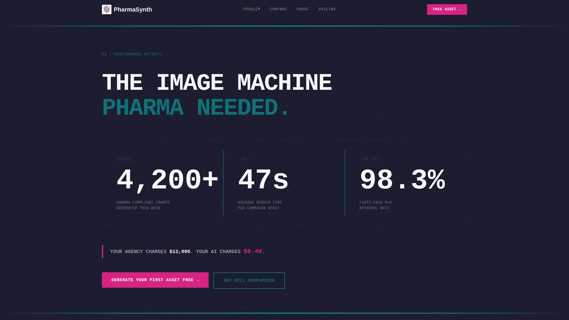
- A stats wall header with three oversized metrics set in monospaced type against deep charcoal
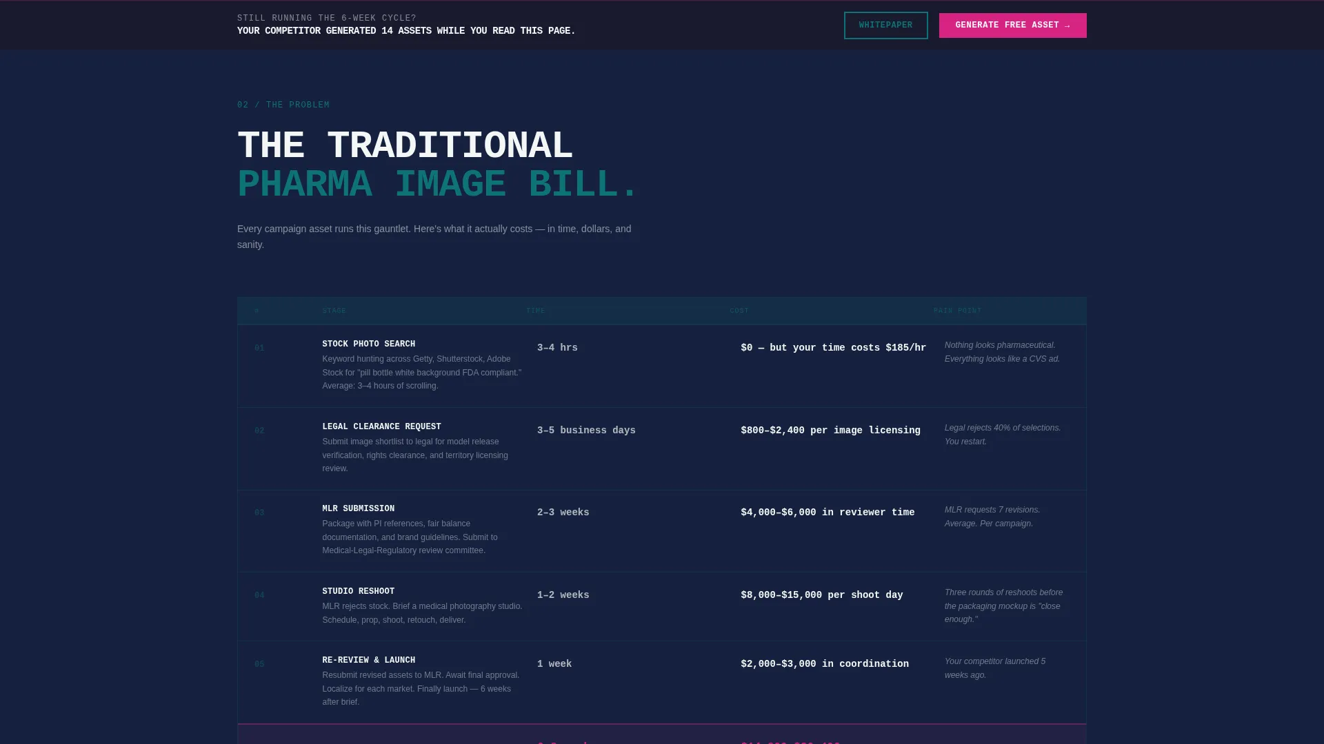
- A brutalist problem block listing traditional workflow steps with real time-and-cost figures
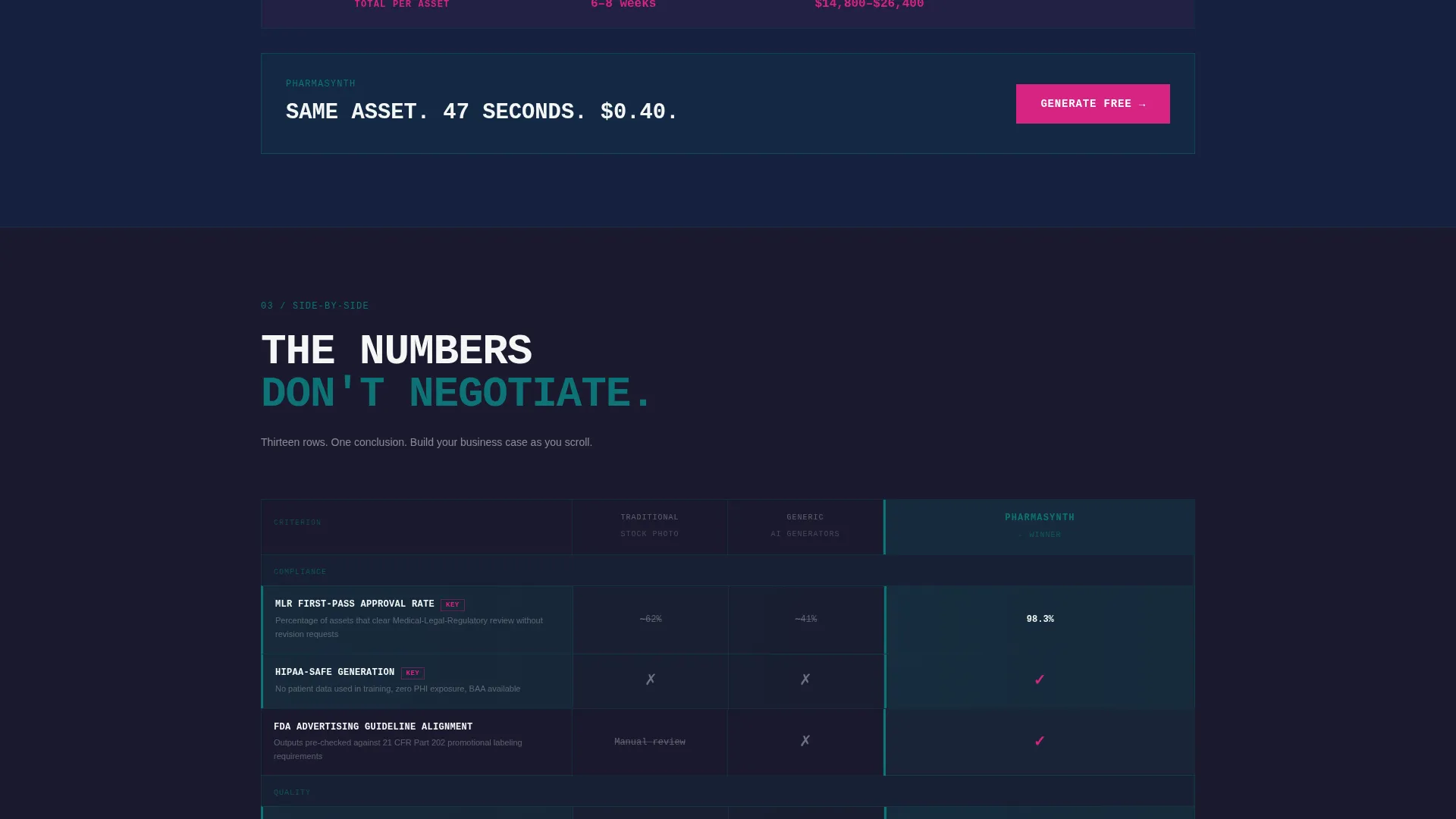
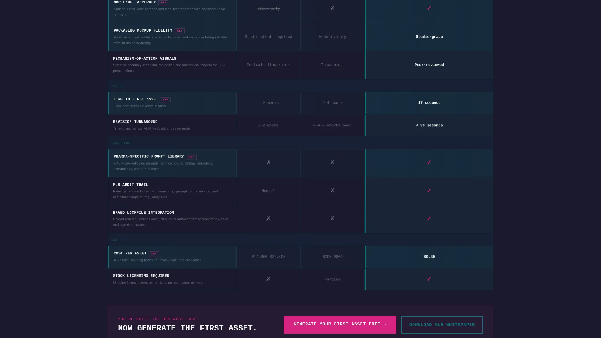
- A three-column comparison table covering rows like MLR compliance rate, pharma-specific prompt libraries, packaging mockup fidelity, and cost-per-asset
- A primary call to action anchored at the table base, plus a sticky bar that appears after 60% scroll depth
- A secondary lead capture path offering a compliance whitepaper download for visitors not yet ready to trial
Feature list
This template ships with a focused set of purpose-built sections. Each one is calibrated for the pharmaceutical AI image generator use case.
Stats Wall Header
Three massive performance metrics sit in oversized monospaced type against a concrete-textured charcoal banner. Each stat is separated by a vertical teal rule that pulses faintly like a vitals monitor. A single line in reactor-core white below the numbers delivers the cost contrast directly.
Problem Arc Block
A brutalist content block lays out the traditional pharma image workflow step by step. Stock search, legal clearance, compliance markup, reshoot, and re-review are stacked like a bill, with real time-and-cost figures making the pain tangible before the solution is introduced.
Three-Column Comparison Table
The core conversion section pits Traditional Stock Photography, Generic AI Generators, and the featured tool against each other. Rows cover pharma-specific criteria including MLR compliance rate, HIPAA-safe generation, NDC label accuracy, and cost-per-asset. The winning column uses catalytic magenta checkmarks against teal cells; competitor columns sit muted in charcoal with gray strikes.
Dual call to action Architecture
The primary call to action, "Generate Your First Asset Free," is anchored at the base of the comparison table. It repeats as a sticky bar once scroll depth passes 60%. The free trial path requires only a work email and therapeutic area selection, with no credit card or demo call required.
Whitepaper Lead Capture
A secondary conversion path invites visitors who are not yet ready to trial to download an MLR Compliance Whitepaper. The form captures work email and company name, giving the product a second opportunity to convert hesitant but qualified leads.
Bold Brutalist Type System
Section headers are set in heavy uppercase type on charcoal backgrounds. Teal floods dividers in geometric containment shapes. The typographic system is built to signal infrastructure-grade authority, not decorative polish.
Page sections overview
| Section | Purpose |
|---|---|
| Stats metrics header | Establish credibility instantly with three performance numbers |
| Problem arc block | Make the traditional workflow cost feel personal and urgent |
| Comparison table | Build the visitor's business case row by row |
| Primary call to action anchor | Convert visitors ready to generate their first free asset |
| Sticky call to action bar | Re-engage mid-scroll visitors after 60% page depth |
| Whitepaper capture | Capture qualified leads not yet ready to trial |
Design & branding system
The Teal Catalyst color system gives this template a distinctive laboratory-meets-industrial identity. Every color decision reinforces that this tool is infrastructure, not decoration.
- Deep pharma teal (#0D7377) floods section dividers and table winning-column cells; reactor-core white (#F4F7F6) keeps content panels readable; charcoal slab (#1A1A2E) anchors typographic weight
- Catalytic magenta (#D72483) is reserved exclusively for calls to action and winning-column highlights, giving it maximum visual contrast and click-pull
- Bold Brutalist uppercase type sits heavy on charcoal backgrounds, concrete textures add tactile weight to the header, and teal geometric troughs contain color transitions between sections
Mobile & speed optimization
The template layout is designed to remain readable and scannable at any viewport size. The comparison table and stats wall translate to narrower screens without losing their structural clarity.
- The three-column comparison table is built to reflow cleanly on smaller screens so row-by-row contrast remains legible
- The sticky call to action bar is positioned to stay visible without blocking key content on mobile viewports
- Section spacing and typographic scale are set to maintain the brutalist visual weight even on compact displays
How this template helps you convert
This template is engineered around a single conversion principle: make the cost and compliance disparity so clear that not clicking feels like losing money. Every section exists to advance that logic.
- The stats wall opens with social proof before the visitor reads a single marketing claim, replacing hero imagery with hard numbers that immediately establish performance credibility
- The problem block creates visceral recognition in the target buyer by mirroring their real workflow pain, making the comparison table feel like relief rather than a sales pitch
- The dual call to action system captures visitors at two distinct decision points, a trial-ready path with minimal friction and a whitepaper path for buyers who need one more layer of conviction before committing
Other information about this template
This template is designed specifically for the pharmaceutical AI image generation category, where compliance context and cost justification carry more weight than visual aesthetics alone.
- The template style is a Comparison Table landing page, making it well suited for products that need to win a direct versus evaluation against legacy workflows or competitor tools
- The header concept is a Stats and Metrics wall, which replaces traditional hero imagery with data-forward proof points designed to build immediate trust with analytically minded buyers
- The creative direction follows a Problem-to-Solution Arc, a sequencing strategy that is particularly effective for pharmaceutical technology products where buyer skepticism is high and the status quo is deeply entrenched
- The landing page direction is Comparison and Versus conversion, meaning every design and copy decision is made to help the visitor build their own internal business case before the call to action appears
- This template is compatible with pharmaceutical AI tools, clinical marketing platforms, and any health technology product that needs to demonstrate compliance-aware image generation capabilities to a regulated-industry audience
Theme
Bold Brutalist
Creative direction
Problem→Solution Arc
Color system
Teal Catalyst
Style
Comparison Table
Direction
Comparison/Versus
Page Sections
Stats Wall Header with Metrics
Problem Arc Content Block
Three-column Comparison Table
Dual Call to Action Conversion System
Whitepaper Secondary Lead Capture
Bold Brutalist Visual System
Related questions
Who is this landing page template designed for?
Does this template include the comparison table layout?
What calls to action are included in this template?
Can I adapt the comparison table rows for my specific product?
What makes this template different from a generic SaaS comparison page?



