Advanced Speech Recognition Technology Professional Website Template
Phoneme is an iridescent-styled landing page template built for speech recognition research labs. It uses a modular card grid, a three-tab feature switcher, and a Problem-to-Solution scroll arc to move technical visitors from real-world failure cases through lab-backed solutions to a clear call to action, all without a single form.
by Rocket studio
Quick summary
Phoneme is a single-page, card grid landing page template designed for a speech recognition research lab. It opens with an interactive Feature Tab Switcher, flows through a Problem-to-Solution Arc, and closes with resource cards linking to models, datasets, and API endpoints. The visual identity uses an AI Iridescent color system on a deep void black background.
Who this template is for
This template is built for technical teams and research organizations working in speech and language technology. It speaks directly to people who need to communicate complex findings quickly and credibly.
- Natural language processing engineers who are hitting accuracy limits with existing automatic speech recognition models
- Product managers at hearing-aid or voice-interface companies sourcing better speech models
- Computational linguists benchmarking new corpora against state-of-the-art word error rate metrics
What problem this template solves
Most research lab pages bury their strongest results in dense text or static PDFs. Visitors leave before they understand why the work matters. Phoneme fixes this by structuring the page as a live argument, showing failure, then resolution, then usable output.
- Technical visitors need real numbers and real failure cases before they trust a research source
- There is no obvious path from "this is interesting" to "I can use this today" on most lab pages
- A generic portfolio layout does not communicate the difference between clean-room benchmarks and real-world speech performance
What you get with this template
You get a fully structured, single-page layout with every major section pre-built and logically sequenced. The template handles the hardest part of research communication: earning trust before asking for a click.
- A three-tab Feature Tab Switcher header with live visualizations, research summaries, and key performance metrics per tab
- A scrolling card grid that transitions from problem mini-case-studies to solution cards to downloadable resource cards
- A persistent primary call-to-action bar on mobile and a pinned highlight card on desktop, with no form required anywhere on the page
Feature list
This section outlines the core built-in components delivered with the Phoneme template.
Three-Tab Feature Switcher Header
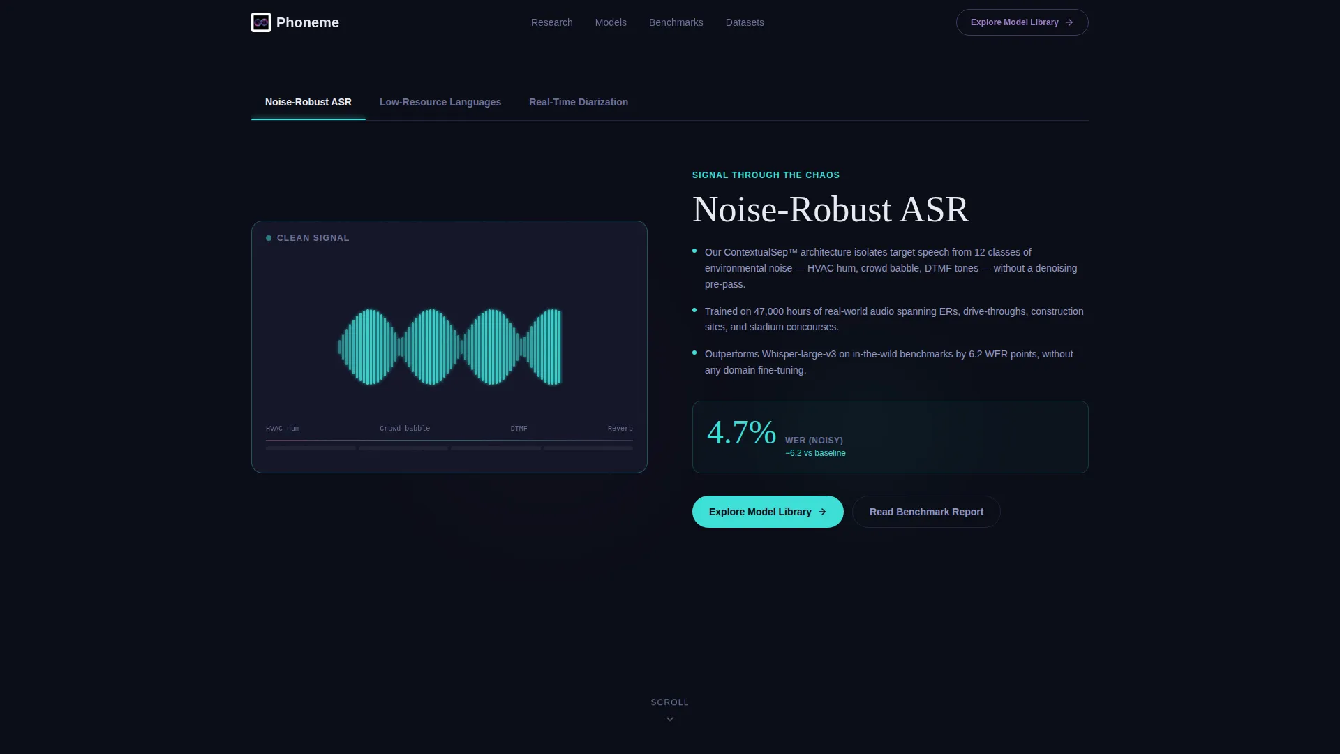
The header contains three tabs: "Noise-Robust ASR," "Low-Resource Languages," and "Real-Time Diarization." Each tab reveals a full-viewport visualization on the left and a three-line research summary with one key metric on the right. Metrics include word error rate percentage, language count, and processing latency in milliseconds.
Problem Card Flip Mechanic
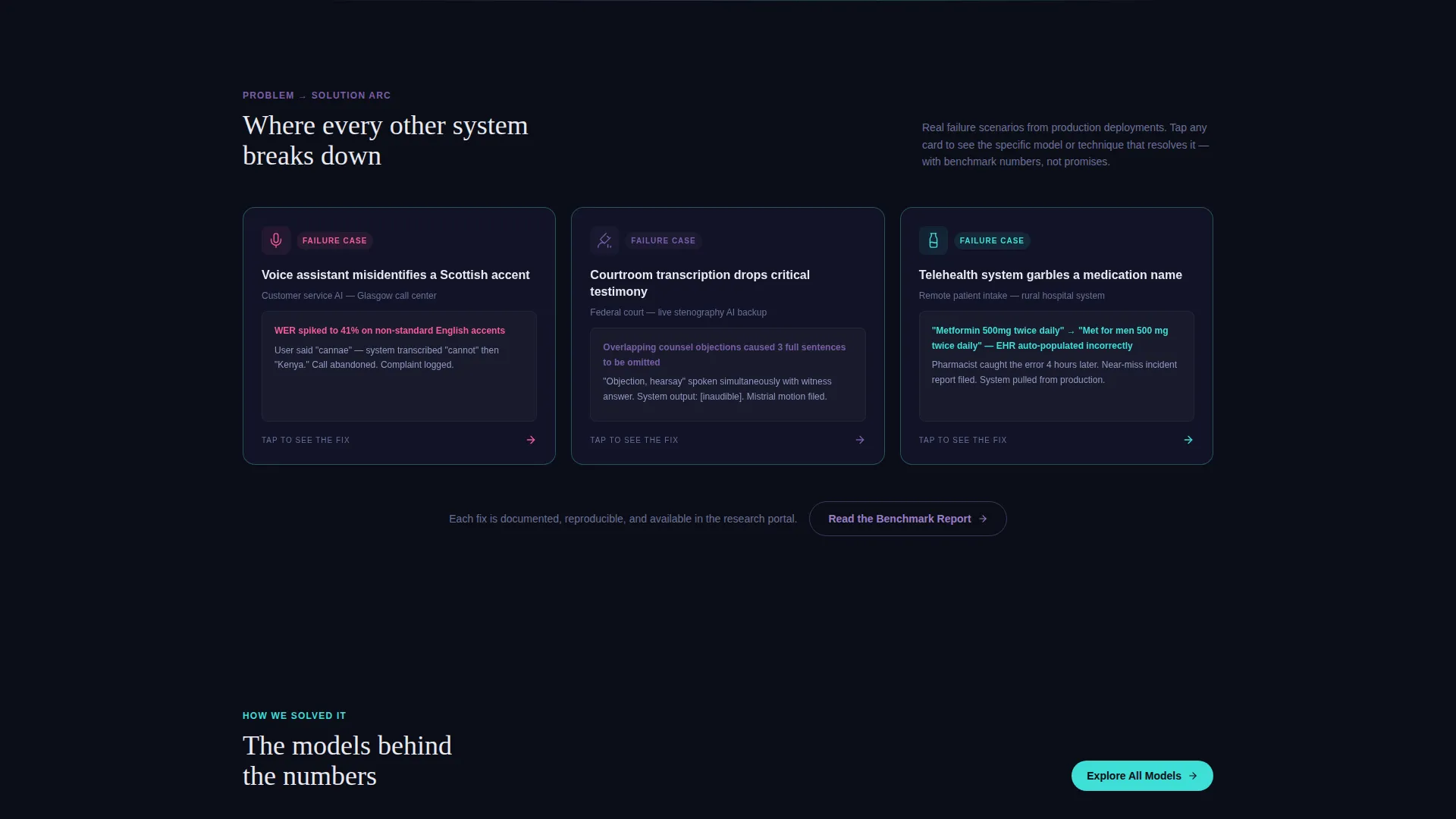
Each problem card presents a real-world speech failure scenario as a mini case study. Tapping or clicking a card flips it to show the specific model or technique that resolves that failure, a benchmark comparison chart, and a link to the related research paper.
Progressive Card Grid Layout
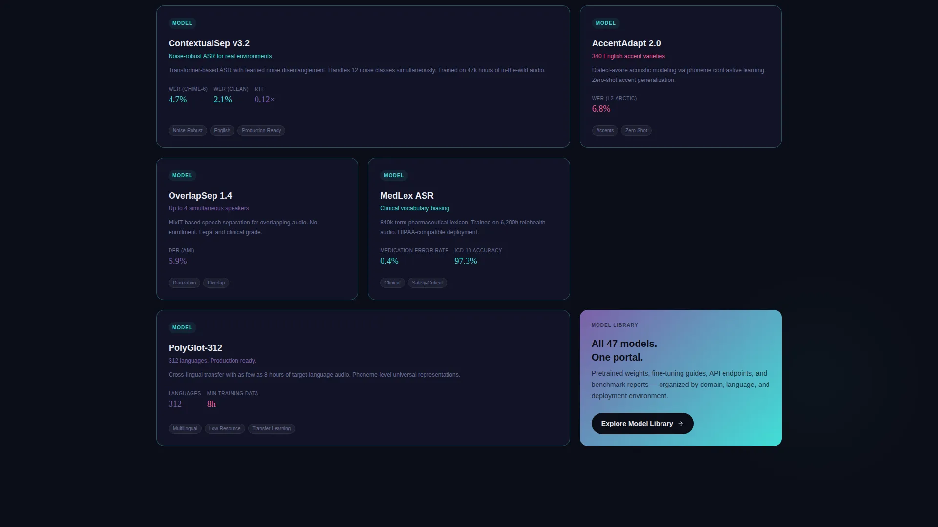
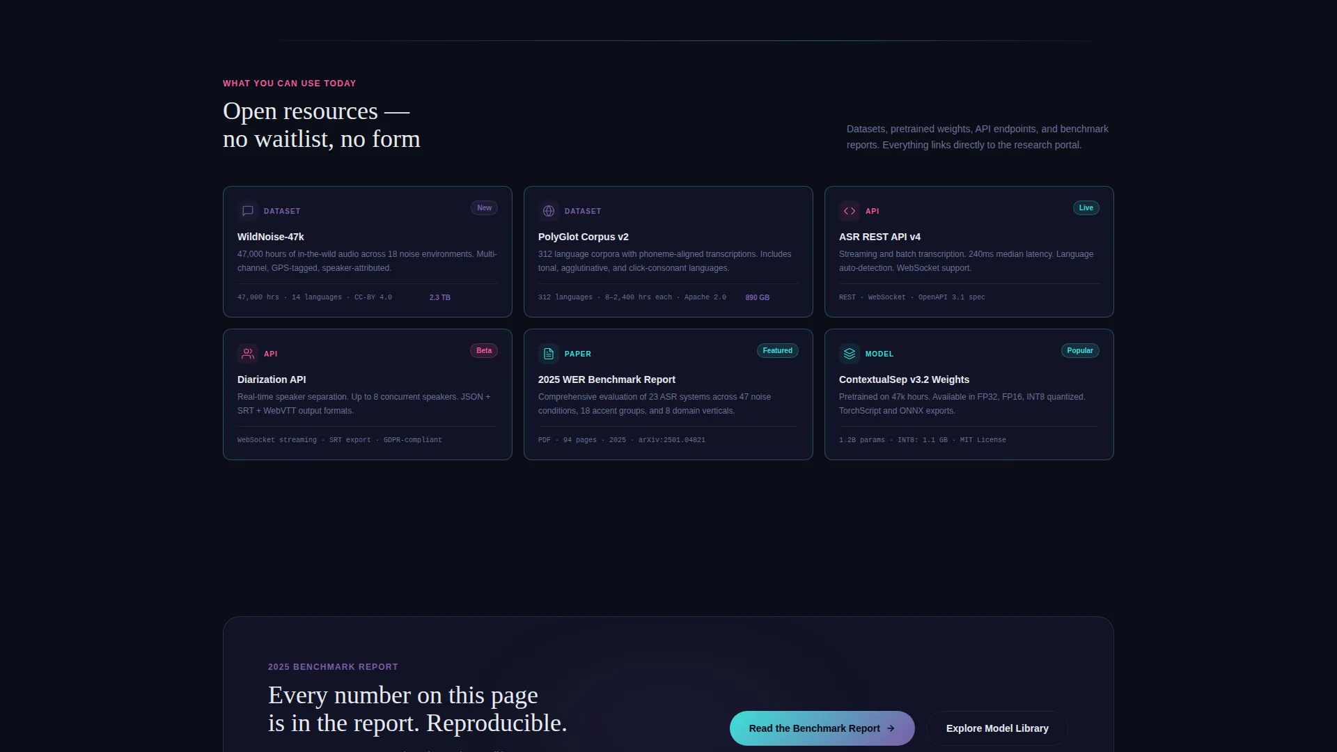
The grid is organized into three distinct row types: problem cards, solution cards, and resource cards. Each row is visually denser than the last, guiding the visitor from context through evidence into actionable outputs such as datasets, pretrained models, and API endpoint links.
Dual Call-to-Action System
The primary call to action, "Explore the Model Library," appears as a persistent bottom bar on mobile and as a pinned highlight card in the top-right of the desktop grid. A secondary call to action, "Read the Benchmark Report," surfaces after the problem row resolves, catching visitors at their highest moment of curiosity.
Iridescent Border and Color Animation
Cards sit on a near-black surface with thin one-pixel iridescent borders that cycle subtly. Hover states and active indicators use signal pink, while spectral violet marks labels and metadata. The palette shifts with context, feeling luminous without being garish.
Live Spectrogram-Style Visualizations
Each tab in the header includes a distinct live visualization: a layered waveform with noise being stripped algorithmically, a map lighting up under-documented language regions with sample spectrograms, and a multi-speaker timeline separating overlapping voices into color-coded channels.
Page sections overview
| Section | Purpose |
|---|---|
| Feature Tab Switcher | Opens with three research tabs, each showing a live visualization and key metric |
| Problem Card Row | Presents real-world speech failure scenarios as tappable mini case studies |
| Solution Card Row | Flips context to lab techniques and benchmark comparisons that resolve each failure |
| Resource Card Row | Offers datasets, pretrained models, and API endpoint links for immediate use |
| Persistent call to action Bar | Keeps "Explore the Model Library" accessible on mobile at all scroll depths |
| Pinned Desktop call to action | Anchors the primary call to action to the top-right of the desktop grid |
| Secondary call to action Block | Places "Read the Benchmark Report" after the solution row at peak visitor interest |
Design & branding system
The visual identity is built around an AI Iridescent color system applied to a Directory and Discovery layout theme. Every color decision references the metaphor of light diffracting through a prism onto a dark lab bench.
- Core palette: void black (#0B0D17) for backgrounds, near-black (#111326) for card surfaces, spectral violet (#7B5EA7) for labels and metadata, shifting cyan (#3EDFD7) for active visual elements, and signal pink (#F45B9A) reserved for hover states and active indicators
- Typography uses clean white (#E8E9F0) at body scale, keeping text legible against dark card surfaces without competing with the iridescent border animations
- Cards float on the near-black surface with thin one-pixel borders that cycle through the iridescent palette subtly, creating depth without visual noise
Mobile & speed optimization
The template is designed so that the core conversion path works cleanly on small screens. No feature is hidden or degraded on mobile.
- The primary call to action becomes a persistent bottom bar on mobile, so it stays visible without interrupting the scroll experience
- Tab visualizations and card grids reflow for narrow viewports, keeping the Problem-to-Solution sequence intact on any screen size
- The card flip mechanic is touch-friendly, allowing mobile visitors to explore problem and solution pairs without a mouse
How this template helps you convert
Phoneme is built around earning the click before asking for it. Every layout decision is designed to build credibility progressively so that visitors arrive at the call to action already confident in the work behind it.
- The Feature Tab Switcher leads with real numbers, word error rate, language count, and latency, so technically fluent visitors immediately see that the lab's claims are specific and measurable
- The Problem-to-Solution Arc moves visitors from recognizable failure scenarios through concrete fixes, creating a natural moment of resolution that the secondary call to action captures at precisely the right scroll depth
Other information about this template
The Phoneme template is a strong fit for research groups that publish regularly and need a public-facing entry point that routes visitors to a deeper research portal. Because the page contains no forms, the conversion goal is purely click-through, reducing friction for technically skeptical audiences.
- The template style is a Card Grid with modular rows, making it straightforward to add or remove card groups as a lab's output grows
- The creative direction follows a Problem-to-Solution Arc, a structure well suited to positioning novel research against known industry pain points in automatic speech recognition
- The landing page works as a standalone entry point that links outward to model libraries, benchmark reports, API documentation, and paper archives rather than hosting that content itself
- The Directory and Discovery theme means the page can scale in information density without losing visual coherence, since each card row is self-contained
Theme
Directory & Discovery
Creative direction
Problem→Solution Arc
Color system
AI Iridescent
Style
Card Grid (Modular)
Direction
Click-Through
Page Sections
Three-tab Feature Switcher Header
Tappable Problem Card Flip
Progressive Card Grid Rows
Dual Call-to-action Placement
Iridescent Card Borders and Hover States
Live Spectrogram Visualizations Per Tab
Related questions
Does this template include forms or data-capture fields?
Can I change the three tab labels in the header?
How does the card flip mechanic work on a touchscreen?
What kinds of resources can the resource card row link to?
Is this template suited for a lab that publishes research regularly?



