Micro-SaaS & Developer Tools Comparison Website Template
Ping is a single-page feedback widget landing page template built for micro-SaaS founders and product teams. It leads with a live interactive demo, walks visitors through a feature comparison grid, and converts with a two-line code snippet and OAuth sign-up. The dark Void & Violet design feels sharp, electric, and built for developers.
by Rocket studio
Quick summary
Ping is a modular card grid landing page template for a floating feedback widget. The page opens with a live interactive preview so visitors experience the product before reading a single word of copy. A feature comparison grid then builds the case row by row, and a sticky call-to-action closes the loop with just two lines of code.
Who this template is for
This template is designed for founders and product teams who need to show, not just tell, what their feedback tool does. It speaks directly to people who live inside product data every day.
- Product managers who receive bug reports and feature requests with no context or attached screenshots
- Independent SaaS founders who study session recordings late at night trying to understand why users leave
- Growth leads who need to prove to executives that structured feedback loops actually improve product metrics
What problem this template solves
Most feedback tool landing pages describe the product. This template demonstrates it. Visitors often leave comparison pages unconvinced because the page lists features without showing what losing those features actually costs. Ping solves that by making the grid itself the argument.
- Visitors arrive skeptical and leave having already evaluated the alternatives inside the page
- The comparison grid shows real friction costs for missing capabilities, not just absent checkmarks
- The two-line code snippet and OAuth path remove every remaining barrier to starting
What you get with this template
You get a fully structured, single-page template with every section already wired for conversion. The layout is modular, meaning each card block can be rearranged or replaced without breaking the overall rhythm.
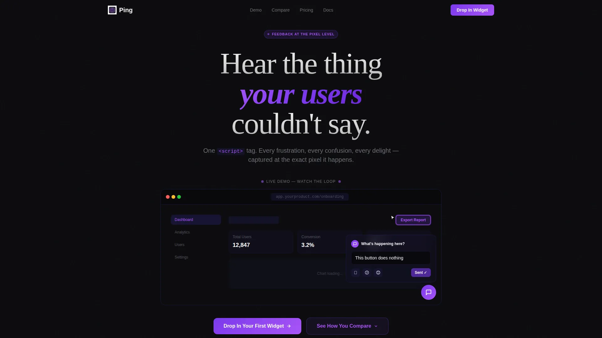
- An interactive header with a live widget demo embedded directly in the page
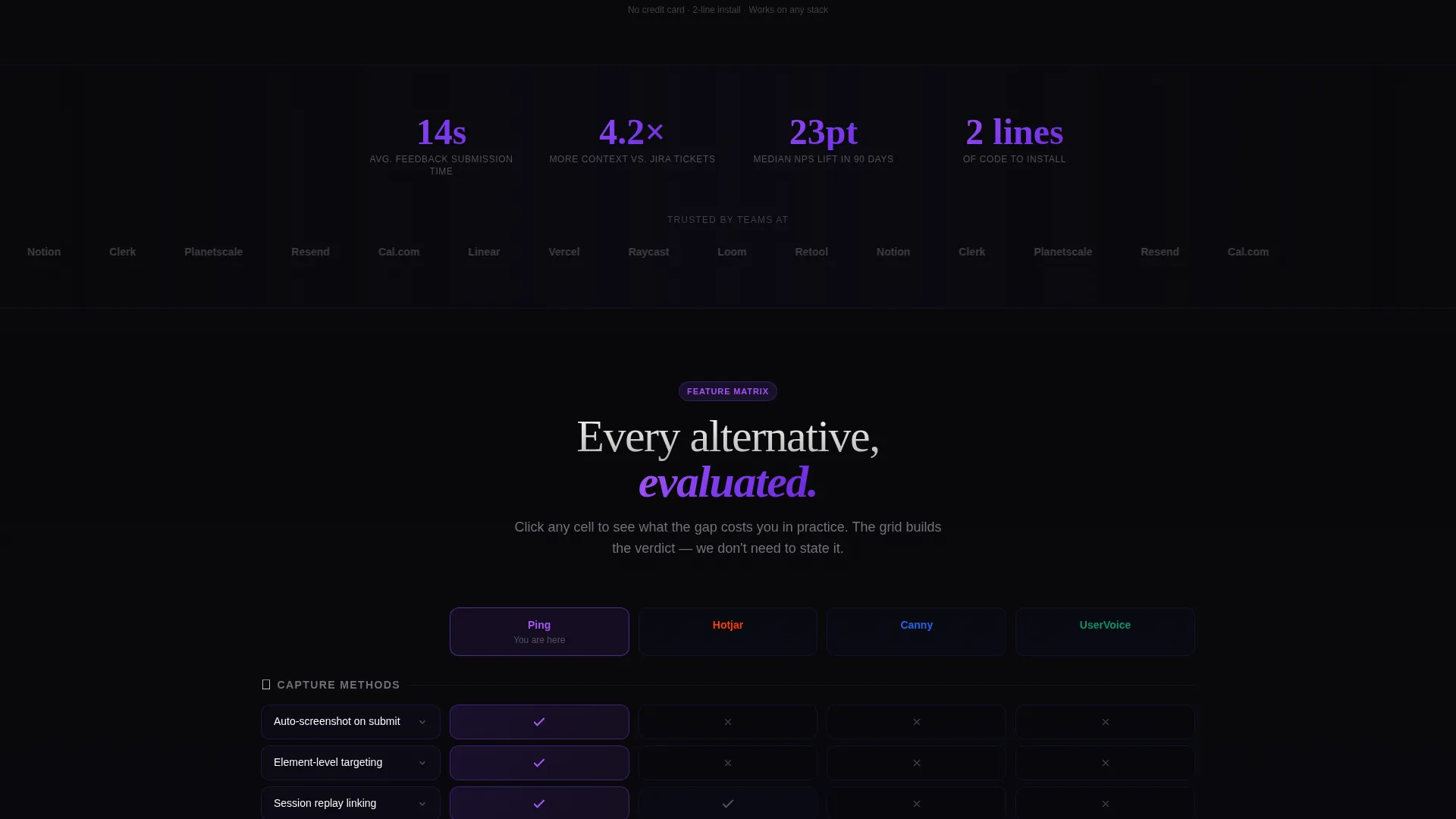
- A multi-column feature comparison grid with flip-on-click cards and grayed-out competitor cells
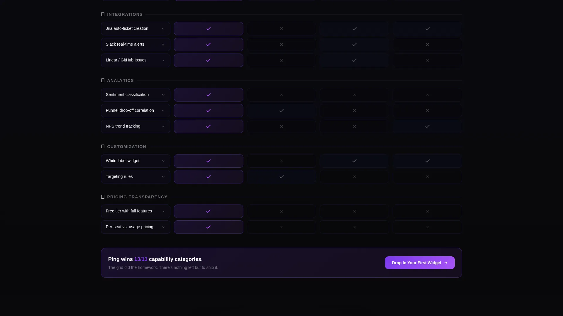
- A sticky call-to-action bar at the top of the grid and a full-width repeat card at the bottom
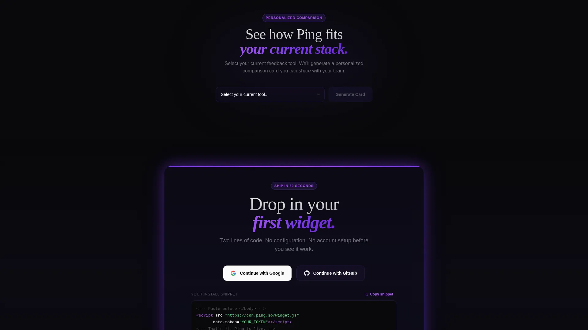
- A personalized comparison card generator triggered by a tool-selector dropdown
Feature list
This section covers the core capabilities built into the Ping template as described in the source brief.
Live Interactive Header Demo
The header section embeds a functioning feedback widget directly in the page. Visitors see a mock product interface with the widget floating in the bottom-right corner. An animated cursor clicks, highlights a user interface element, types a comment, and sends it in roughly four seconds. A dashboard card then appears below showing the captured screenshot, browser details, timestamp, and sentiment tag.
Modular Feature Comparison Grid
The grid organizes competitor comparisons into capability rows covering capture methods, integrations, analytics, customization, and pricing transparency. Each column represents a competing tool. Cards expand or flip on click to reveal detail. Cells where competitors fall short show a grayed-out label and a one-line explanation of the practical cost to the user.
Sticky and Base Call-to-Action Blocks
The primary call-to-action, "Drop In Your First Widget," is placed as a sticky bar at the top of the comparison grid and repeated as a full-width card at the grid's base. No form is required. Visitors sign up with a Google or GitHub OAuth button and immediately see a two-line script snippet preview.
Personalized Comparison Card Generator
A secondary conversion path lets visitors choose their current feedback tool from a dropdown. The page generates a personalized side-by-side comparison card based on that selection. Visitors can share the card directly with their team, making the evaluation process social and shareable.
Void & Violet Visual System
The template uses a strictly defined dark color palette. Card surfaces sit on absolute void black with deep space indigo borders. Electric violet gradients drive calls-to-action and active comparison columns. Hot orchid accent states appear on hover. White text floats clean against the dark background throughout.
Page sections overview
| Section | Purpose |
|---|---|
| Interactive Header Demo | Show the widget in action before any copy |
| Live Dashboard Card | Reveal captured feedback output instantly |
| Feature Comparison Grid | Compare capabilities row by row against competitors |
| Sticky call to action Bar | Keep the primary action visible while scrolling |
| Tool Selector Dropdown | Generate a personalized comparison card on demand |
| Shareable Comparison Card | Let visitors send their evaluation to teammates |
| Full-Width call to action Block | Close the page with a repeated sign-up prompt |
Design & branding system
The Void & Violet color system is built to feel like a dark-mode development environment. Every color decision reinforces the sense that the product is precise, technical, and made for people who notice the details.
- Core palette: absolute void black (#09090B) backgrounds, deep space indigo (#1E1B4B) card borders, electric violet (#7C3AED) gradients on calls to action and active grid columns, and reactive white (#FAFAFA) for body text and card surfaces
- Hover and accent states glow in hot orchid (#A855F7), making interactive elements feel alive and responsive
- The overall theme follows a Startup Velocity visual rhythm where sharp contrast and purple pulse signals create urgency without relying on traditional hero copy
Mobile & speed optimization
The modular card grid layout is designed to reflow cleanly across screen sizes. Individual card blocks stack vertically on smaller viewports without losing the comparison logic.
- The comparison grid cards adapt from multi-column rows to single-column stacks on mobile displays
- The sticky call to action bar remains visible and tappable across all viewport widths
- The interactive header demo is scoped to a contained frame so it does not interfere with page scroll on touch devices
How this template helps you convert
The conversion architecture in Ping is built around progressive proof. By the time a visitor reaches the bottom call-to-action, the page has already done the evaluation work for them.
- The interactive demo at the top creates immediate product understanding without requiring the visitor to read anything, reducing the cognitive cost of the first impression
- The comparison grid builds a verdict row by row, showing capability gaps in competitor tools with plain-language cost labels, so the visitor arrives at the final call-to-action already convinced
- The two-line script snippet and OAuth sign-up remove every remaining friction point, making the decision feel like pressing play rather than filling out a form
Other information about this template
This template sits within the Micro-SaaS and Developer Tools category and is optimized for feedback widget products competing in a crowded market. The design language and conversion structure suit teams launching or repositioning a user feedback tool.
- The template is categorized under Technology and is built around the Feedback Widget niche with a Comparison/Versus landing page direction
- The card grid format supports easy content swaps if the competitor columns or capability rows need to change after launch
- The Interactive Preview header concept works particularly well for widget products because the demo removes all abstraction between the visitor and the value proposition
- The template is well suited for teams currently using tools like Hotjar, Canny, or UserVoice who want to position a leaner, developer-friendly alternative
Theme
Startup Velocity
Creative direction
Feature Matrix
Color system
Void & Violet
Style
Card Grid (Modular)
Direction
Comparison/Versus
Page Sections
Live Interactive Header Demo
Modular Feature Comparison Grid
Sticky and Base Call to Action Blocks
Personalized Comparison Card Generator
Void & Violet Dark Color System
Related questions
Does this template require coding skills to customize?
Can I add more competitor columns to the comparison grid?
Does the interactive header demo use real widget functionality?
Can visitors share the personalized comparison card with their team?



