Pinnacle — Expert IT Consulting Landing Page Template
Uptime is a bold brutalist bento grid landing page built for IT services companies offering managed IT, cloud migration, and cybersecurity. It uses a Feature Tab Switcher header, data-dense bento cells, and a progressive lead capture form to guide operations directors, CFOs, and startup CTOs toward a free IT health audit.
by Rocket studio
Quick summary
Uptime is a single-page bento grid template designed for IT services companies that bundle managed IT, cloud migration, and cybersecurity into one retainer. It leads with a Feature Tab Switcher, displays evidence through data-dense bento cells, and converts visitors with a progressive audit form. The visual identity is Bold Brutalist with an iridescent dark palette.
Who this template is for
This template speaks directly to IT services providers who sell to business buyers, not consumers. The page was built around the specific language, proof points, and friction patterns that make operations leaders and finance decision-makers act.
- IT service providers targeting mid-market firms with 50 to 500 seats
- Managed service providers pitching cloud migration or cybersecurity retainers
- IT consultancies replacing an outgoing solo sysadmin for a growing company
What problem this template solves
Most IT services landing pages look like a generic brochure. They list features without evidence, ask for a call before building trust, and lose prospects who needed proof first. Uptime solves this by leading with data and earning the conversion.
- Visitors leave without engaging because the page lacks credible, specific numbers
- Sales cycles stall when prospects cannot self-qualify before booking a demo
- The free audit offer gets ignored because the page has not yet proven domain expertise
What you get with this template
You get a fully structured, single-page bento grid layout with every section already mapped to a sales stage. The design is ready to receive your brand, your proof points, and your offer without rebuilding from scratch.
- A Feature Tab Switcher header with three tabs: MANAGED IT, CLOUD, and SECURITY
- Bento card layouts that rearrange per active tab, showing service-specific stats and comparisons
- A persistent bottom-right call to action cell with a three-step progressive lead capture form
- A secondary gated PDF offer for lower-commitment lead capture
Feature list
This template's design and structure were built as a system. Each feature serves the broader goal of converting a skeptical, data-literate business buyer.
Feature Tab Switcher Header
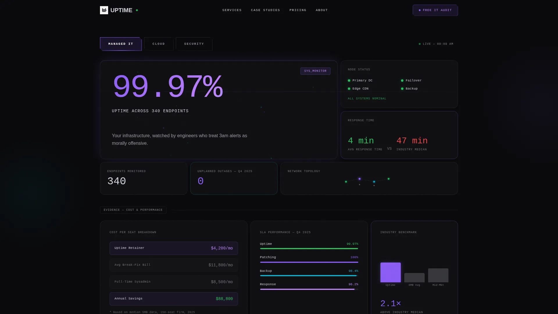
Three brutalist tabs labeled MANAGED IT, CLOUD, and SECURITY sit across the full viewport width. Selecting a tab triggers a bento card rearrangement below, so each service line gets its own evidence-first layout. The active tab edge glows in iridescent violet.
Hero Stat Display with Particle Mesh
Each tab view opens with an oversized mono-type stat dominating the viewport against void black. The example stat "99.97% Uptime Across 340 Endpoints" sets the tone. A subtle particle mesh animation runs behind the numbers, evoking a live network or threat map.
Data-Dense Bento Grid Layout
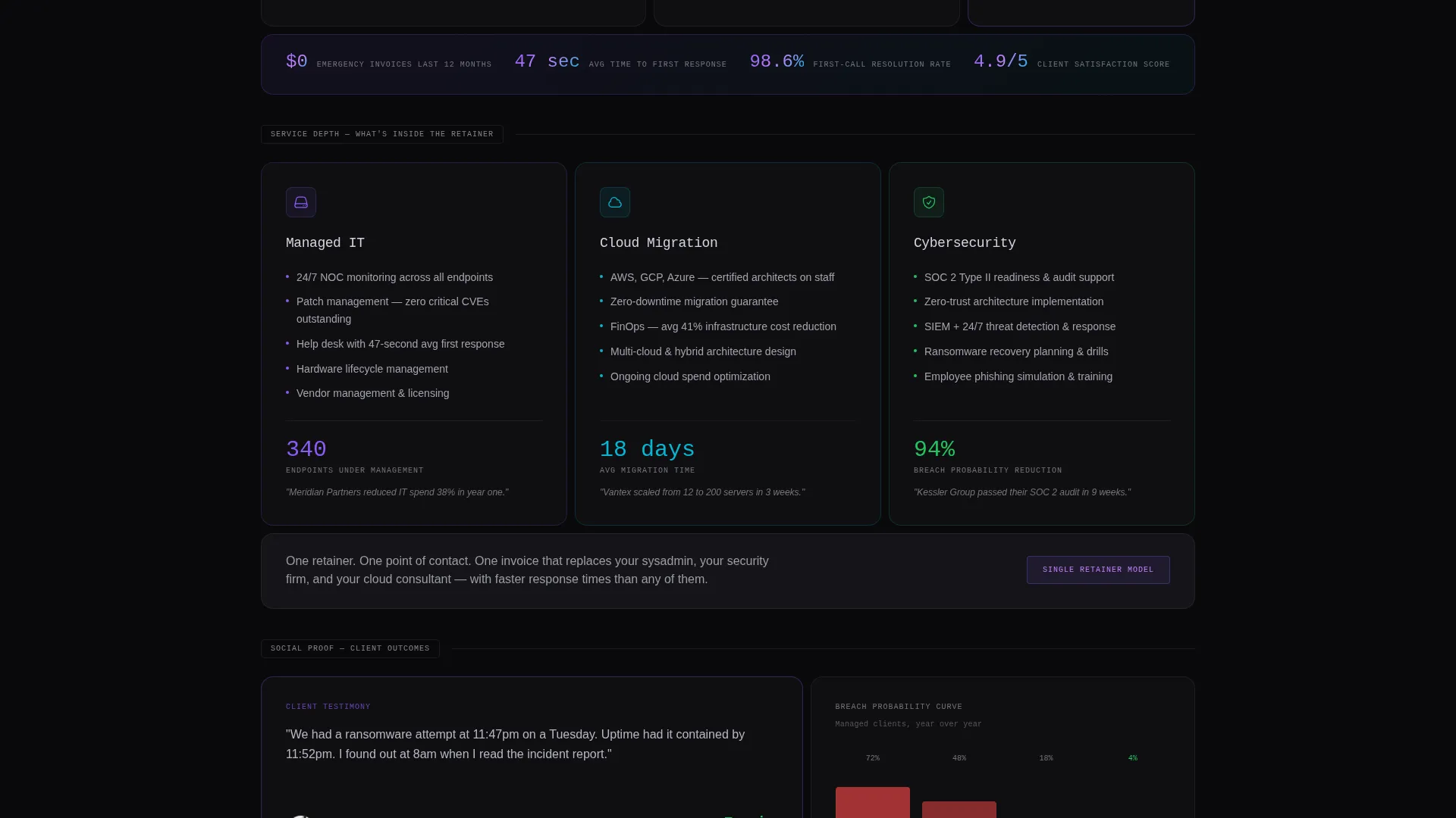
The grid shifts rhythm across the page, alternating between wide cinematic cells and dense four-packs of metrics. Each cell holds a single data point, case stat, or comparison chart, such as response times versus industry median or cost-per-seat breakdowns.
Progressive Lead Capture Form
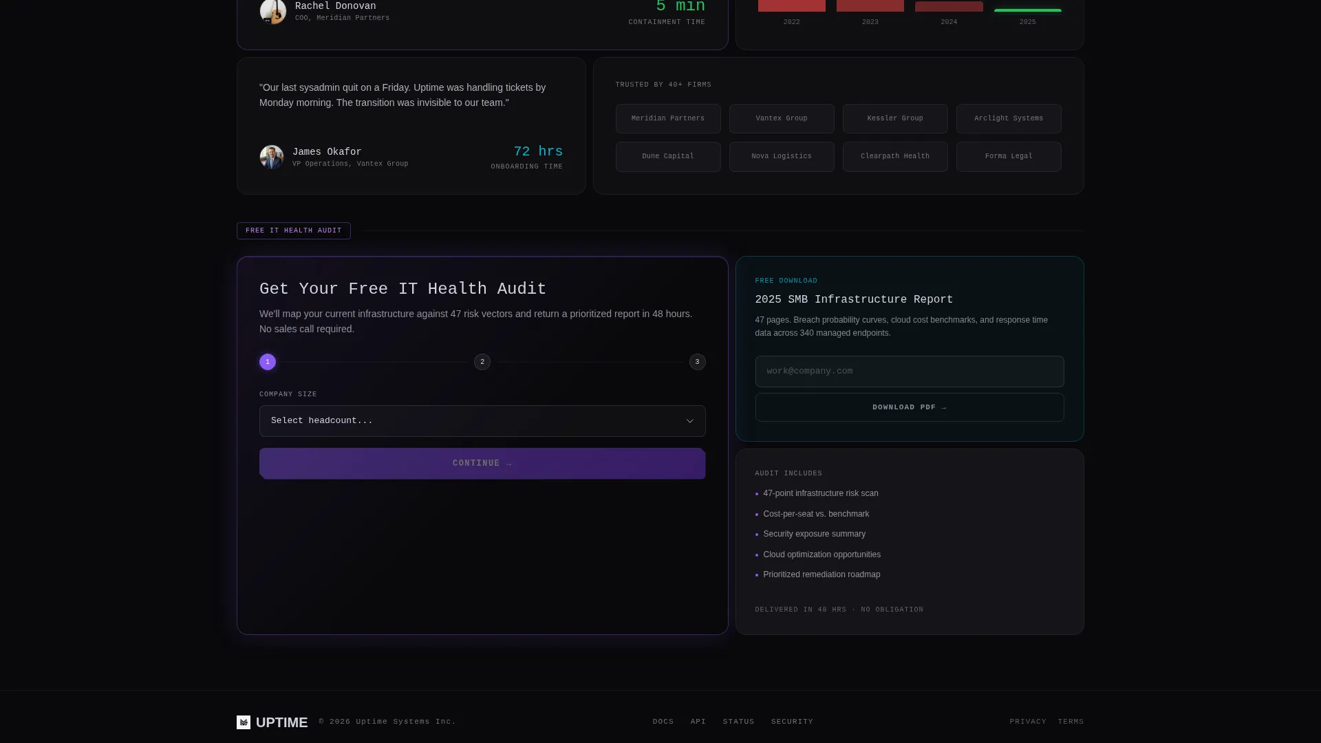
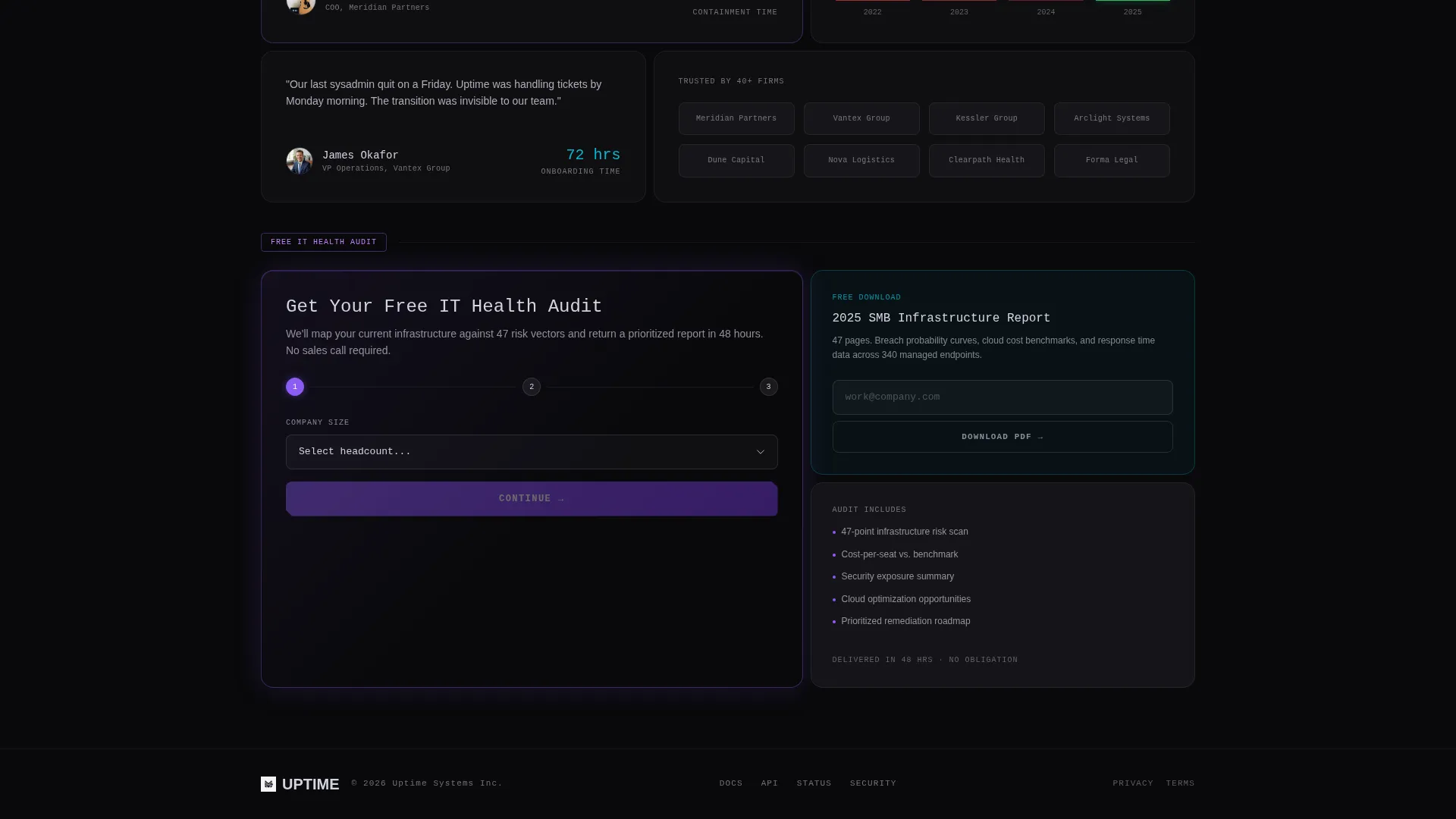
The primary call to action is "Get Your Free IT Health Audit," embedded in a persistent bento cell that follows the scroll in the bottom-right quadrant. The form is three steps: company size dropdown, pain point multi-select chips, and work email.
Gated PDF Secondary Offer
A second conversion path offers "Download the 2025 SMB Infrastructure Report" as a lower-commitment lead capture. Visitors who are not ready for an audit can still enter the funnel through a content download.
Industry Report Creative Direction
The scroll cadence mimics paging through a proprietary benchmark study. Evidence accumulates section by section until the audit offer feels like the logical next step, not a hard sell.
Page sections overview
| Section | Purpose |
|---|---|
| Tab Switcher Header | Lets visitors self-select their service priority and see relevant evidence |
| Hero Stat Block | Anchors trust with a single dominant, verifiable performance number |
| Wide Cinematic Cells | Opens each service story with a high-impact data or case narrative |
| Metric Comparison Charts | Shows response time and cost-per-seat data against industry benchmarks |
| Breach Probability Curve | Visualizes cybersecurity risk to justify the security retainer |
| Dense Metric Four-Pack | Compresses multiple proof points into a tight, scannable grid cluster |
| Persistent Audit call to action | Keeps the free audit offer visible throughout the scroll journey |
| Gated PDF Offer | Provides a softer conversion path for undecided or early-stage visitors |
Design & branding system
The palette and type system were chosen to feel like a terminal window reflecting off a curved monitor in a dark room. Monolithic black surfaces are interrupted by electric, almost biological flickers of color that suggest machine intelligence.
- Core colors: void black (#09090B), liquid chrome (#D4D4E0), holographic violet (#8B5CF6), and signal cyan (#06B6D4) used for interactive states and data accents
- Typography uses oversized mono type for hero stats and data callouts, creating a terminal-native reading rhythm
- Interactive states glow in iridescent violet at tab edges and cyan at data accent points, making the interface feel live
Mobile & speed optimization
The bento grid adapts across screen sizes so the template remains usable on any device. Layout density is managed through grid reflow rather than hiding content.
- Bento cells reflow from multi-column to single-column stacks on smaller screens
- The persistent call to action cell remains accessible on mobile without obstructing the main content scroll
- The particle mesh animation behind hero stats is designed as a subtle background layer that does not interfere with text legibility
How this template helps you convert
The page is engineered around a freemium or trial conversion model. Every design decision moves the visitor closer to submitting the audit form without feeling pressured.
- The tab switcher lets visitors self-identify their priority, which means they arrive at the audit form already pre-qualified by service line.
- Data-dense bento cells build evidence incrementally, so the free audit call to action lands after the visitor has already accepted the provider's authority.
- The two-path conversion model captures both high-intent visitors via the audit form and early-stage researchers via the gated PDF report.
Other information about this template
This template is built for IT services providers who need a landing page that does the heavy qualification work before a sales call ever happens. It suits companies offering managed services, cloud migration support, or cybersecurity retainers to business clients.
- Template style: Bento Grid
- Theme: Bold Brutalist
- Color system: AI Iridescent
- Creative direction: Industry Report
- Header concept: Feature Tab Switcher
- Conversion model: Freemium and trial with a progressive form and gated content secondary path
- Target buyer profiles include operations directors who recently lost their solo sysadmin, CFOs managing break-fix costs, and startup CTOs scaling their infrastructure
Theme
Bold Brutalist
Creative direction
Industry Report
Color system
AI Iridescent
Style
Bento Grid
Direction
Freemium/Trial
Page Sections
Feature Tab Switcher Header
Hero Stat Block with Particle Mesh
Data-dense Bento Grid
Progressive Lead Capture Form
Gated PDF Secondary Offer
Related questions
Who is this landing page template built for?
What is the primary call to action on this template?
Can I use this template for a single IT service line?
What does the secondary conversion path offer?
Does the bento grid layout stay organized on mobile screens?



