Pipeline - Hardened DevSecOps Landing Page Template
Pipeline is a split-screen DevSecOps consulting landing page built for security-forward engineering teams. It leads with a live Cost and Risk Estimator, then walks visitors through a side-by-side comparison of reactive versus embedded security. The dark Dashboard Pro aesthetic and animated gate-by-gate layout make the value of shifting security left feel immediate and undeniable.
by Rocket studio
Quick summary
Pipeline is a single-page DevSecOps consulting landing page built on a split-screen layout. It opens with an interactive Cost and Risk Estimator, then unfolds a gate-by-gate versus architecture comparing manual security practices against automated, embedded alternatives. The design uses a void-black and electric violet palette that feels like a live production dashboard.
Who this template is for
This template is designed for DevSecOps consulting teams who need to convert technically sophisticated buyers. It speaks directly to decision-makers who understand CI/CD pipelines and feel the pressure of compliance deadlines, deployment velocity, and inherited infrastructure risk.
- Engineering vice presidents at Series B through Series D startups who have recently failed a SOC 2 audit
- Platform leads at mid-market software-as-a-service companies whose deployment frequency has outpaced their security posture
- Chief Technology Officers inheriting legacy infrastructure after an acquisition
What problem this template solves
Most DevSecOps consulting pages talk about security in the abstract. This template addresses the real operational pain: reactive "scan-and-scramble" cycles, manual compliance tracking, and post-deploy vulnerability discovery. Visitors arrive with a specific pressure point, and the template surfaces their own cost and risk numbers before asking them to act.
- Engineering teams lose measurable time and money remediating vulnerabilities after code ships to production
- Compliance audits expose gaps that accumulated slowly because security was never embedded into the pipeline
- Decision-makers need a concrete business case, not a features list, before they engage a consulting partner
What you get with this template
You get a fully structured single-page layout with two primary conversion paths and a progression-based content architecture. Every section is designed to build proof incrementally, so the call to action at the bottom feels like the logical next step rather than a cold ask.
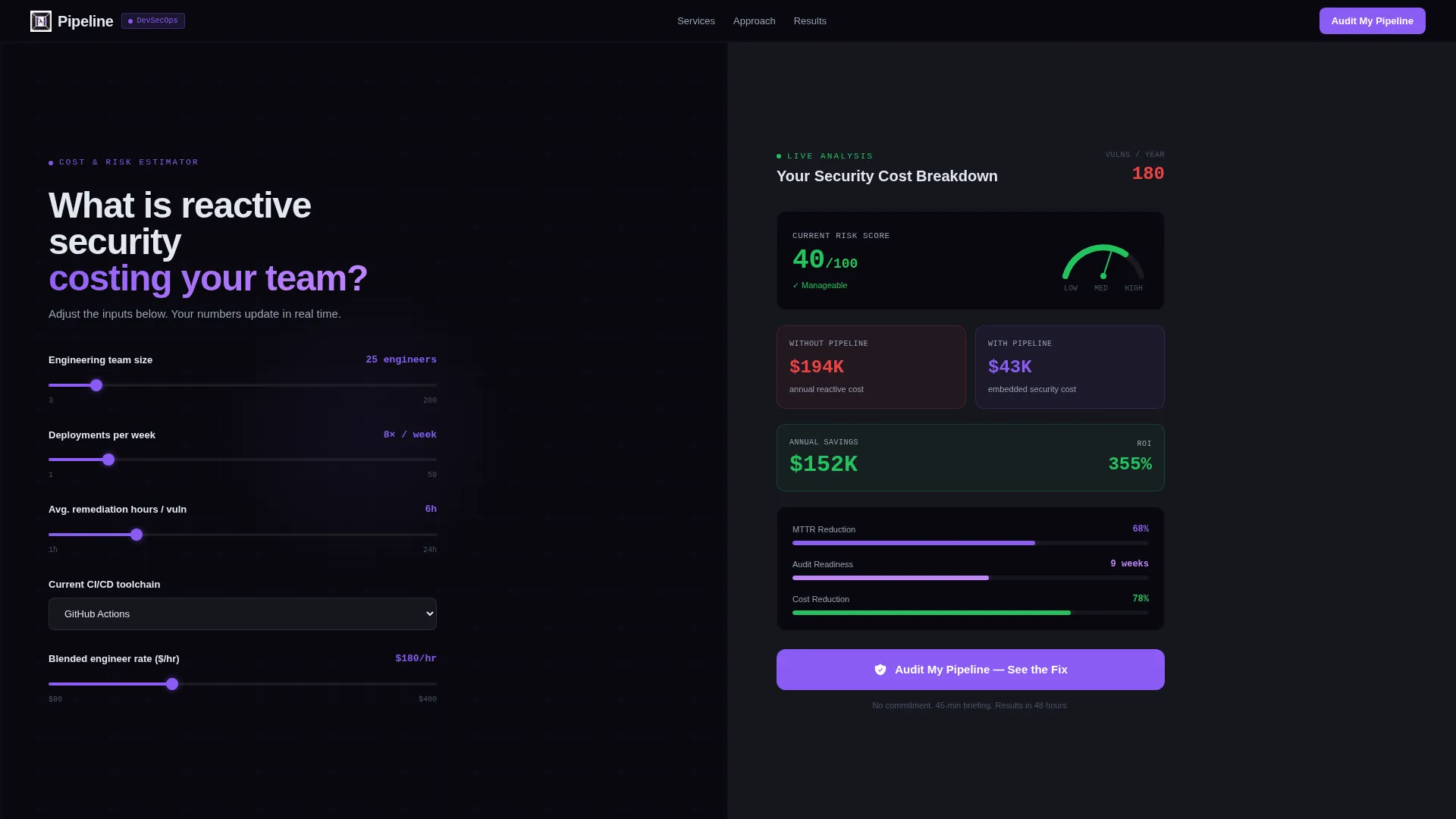
- A live Cost and Risk Estimator in the header with real-time animated readouts for annual cost comparison, mean-time-to-remediation reduction, and audit-readiness timeline
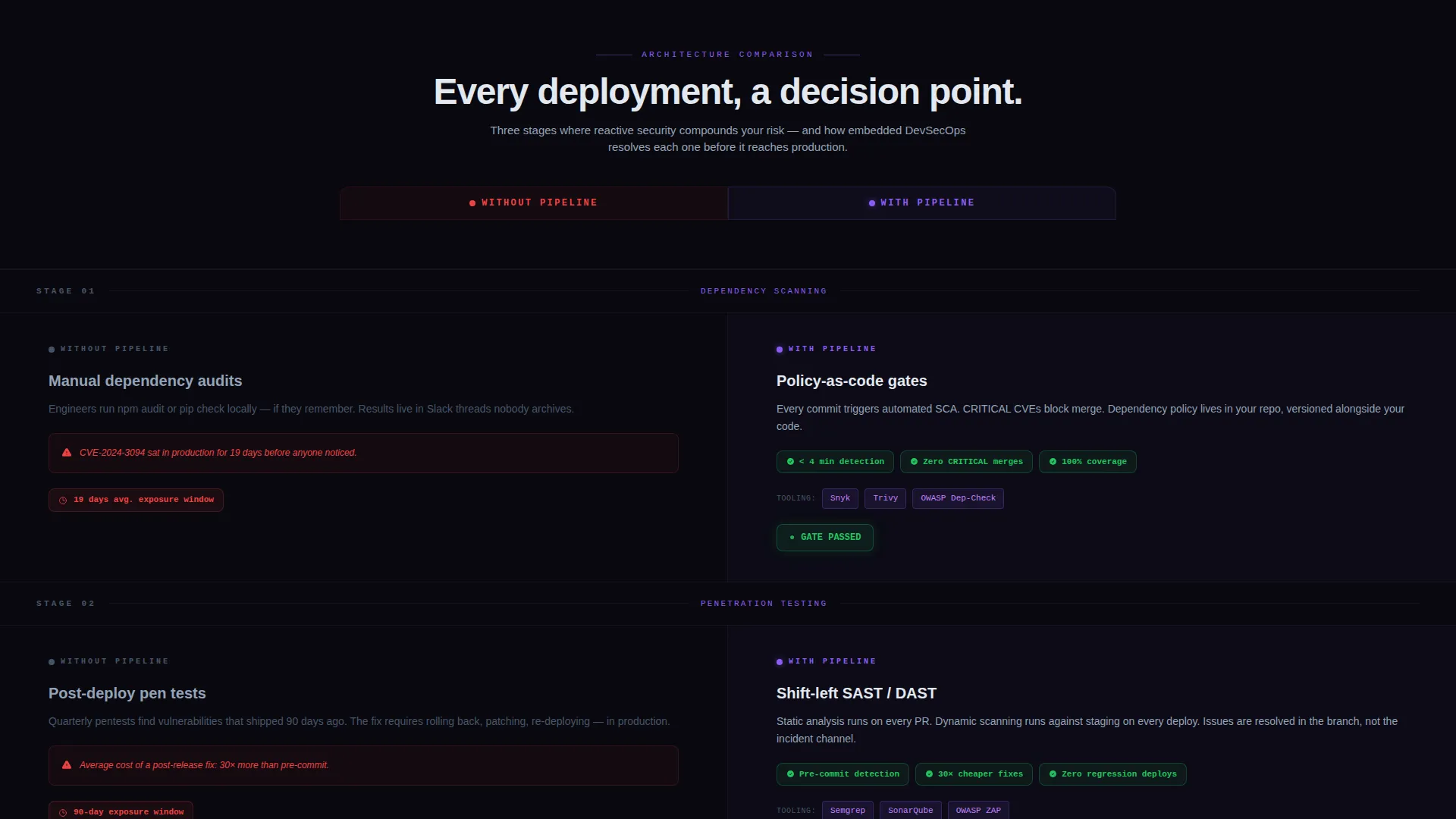
- A scroll-driven versus architecture with animated comparison rows showing manual security failure modes against automated, policy-as-code alternatives
- Two conversion paths: a primary "Audit My Pipeline" two-step form and a secondary gated PDF download for early-stage visitors
Feature list
This section covers the core functional components built into the Pipeline template.
Live Cost and Risk Estimator
The header splits into two equal panels. The left panel presents an interactive calculator where visitors enter team size, deployment frequency, average remediation hours per vulnerability, and current toolchain via dropdowns. The right panel renders a dashboard-style readout in real time, animating violet progress bars, ticking cost figures, and a risk score gauge that sweeps from red to green as inputs change.
Animated Versus Architecture
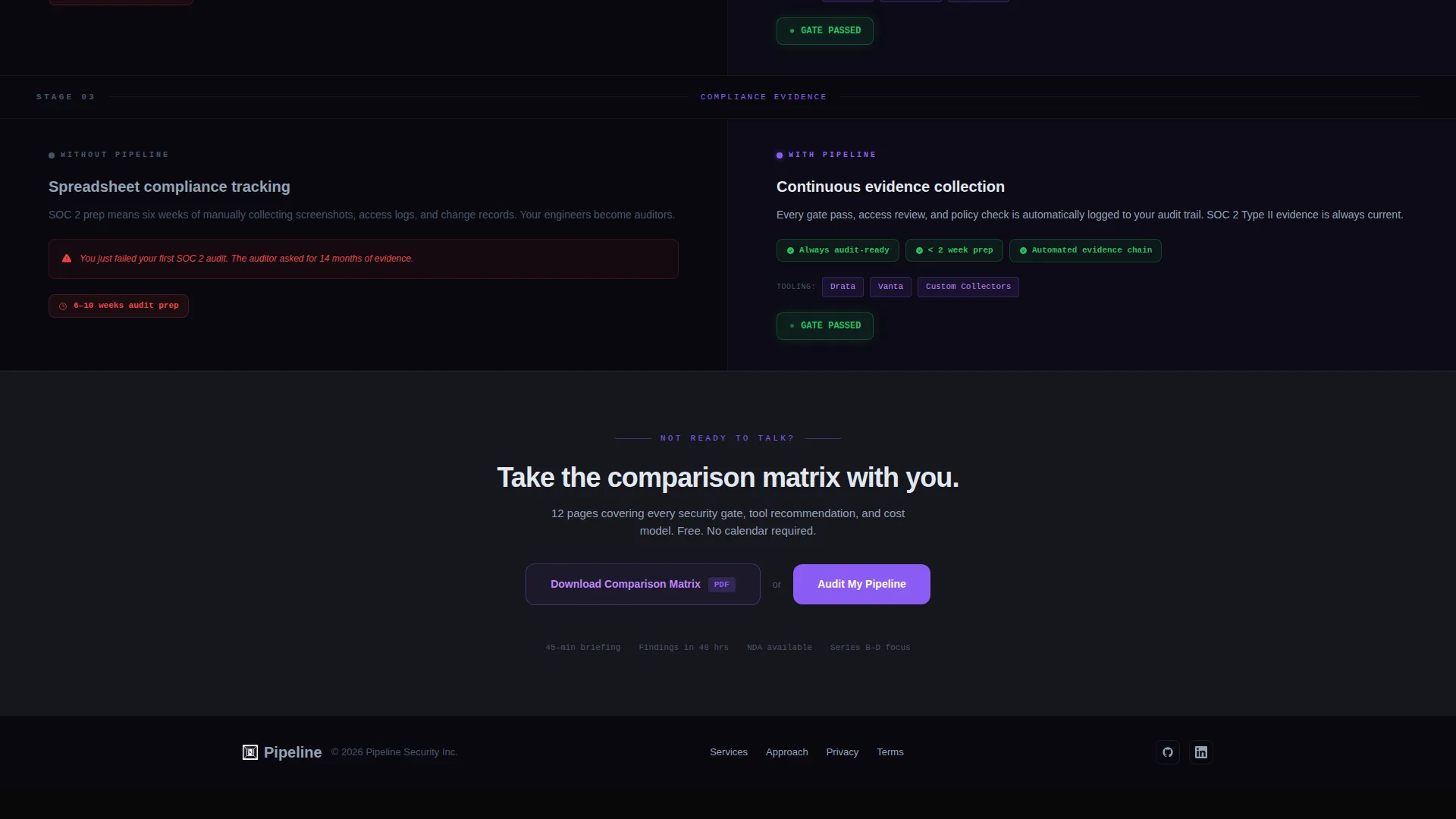
Below the estimator, the page runs a structured comparison layout. The left column, labeled "Without Pipeline," stays muted and static. The right column, labeled "With Pipeline," lights up section by section on scroll with metrics, tool logos, and pass/fail badges. Each comparison row covers a specific failure mode: manual dependency scanning versus policy-as-code gates, post-deploy penetration tests versus shift-left static and dynamic analysis integration, and spreadsheet compliance tracking versus continuous evidence collection.
Two-Step Audit Form
The primary call to action, "Audit My Pipeline," opens a two-step form. Step one captures company name, infrastructure stack via multi-select checkboxes for cloud and hybrid environments, and the visitor's biggest security concern from a dropdown. Step two asks for email and preferred briefing window. This progressive disclosure reduces friction and filters for high-intent leads.
Gated PDF Secondary Path
Visitors not ready to book a briefing can download a comparison matrix as a gated PDF. The capture requires only an email address and delivers the asset immediately. This secondary conversion path keeps early-stage visitors in the funnel without pressuring them toward a call.
Sticky Conversion Bar
A sticky call-to-action bar appears after the visitor scrolls past the third comparison row. It keeps the "Audit My Pipeline" prompt visible throughout the rest of the page without interrupting the content experience in the earlier sections.
Page sections overview
| Section | Purpose |
|---|---|
| Header Estimator Split | Interactive cost and risk calculator with real-time animated results panel |
| Without Pipeline Column | Muted static display of reactive security failure modes |
| With Pipeline Column | Animated proof of automated, embedded security alternatives |
| Comparison Row: Scanning | Contrasts manual dependency scanning with policy-as-code gates |
| Comparison Row: Testing | Contrasts post-deploy penetration tests with shift-left analysis |
| Comparison Row: Compliance | Contrasts spreadsheet tracking with continuous evidence collection |
| Sticky call to action Bar | Persistent "Audit My Pipeline" prompt after third comparison row |
| Audit My Pipeline Form | Two-step lead capture form with stack and concern qualification |
| PDF Download Gate | Email-only capture for the gated comparison matrix asset |
Design & branding system
The visual identity follows a Dashboard Pro theme built entirely around the Void and Violet color system. The palette is calibrated to feel like a live production monitoring dashboard at 2 AM: dark enough to create focus, with violet indicators that communicate system health at a glance.
- Core colors: absolute void black (#09090F) for primary backgrounds, deep terminal gray (#16161E) for card surfaces, electric violet (#8B5CF6) for active states and data highlights, and cool phantom white (#E2E8F0) for typography and borders
- Accent pulses of hot orchid (#C084FC) appear on hover states and live-data animations, adding depth to interactive elements without distracting from the content hierarchy
- The Launch Energy creative direction structures the scroll like a countdown sequence, with each comparison row building momentum until the cumulative proof creates a natural pull toward the call to action
Mobile & speed optimization
The split-screen layout adapts to narrower viewports by stacking the two panels vertically, keeping the estimator inputs and results readable without horizontal scrolling. Comparison rows reflow into single-column stacks with the "Without Pipeline" state above and the "With Pipeline" state below.
- Animated elements are scoped to scroll-triggered transitions, so the page does not perform heavy animation work until each section enters the viewport
- Form steps are designed for thumb-friendly input on mobile devices, with dropdowns and checkboxes sized for touch interaction
How this template helps you convert
The template is structured so that every scroll position moves the visitor closer to a conversion action. Trust is built progressively rather than all at once.
- The estimator personalizes the value proposition immediately. Visitors see their own numbers reflected in the dashboard readout before they read a single line of persuasion copy, which builds credibility faster than testimonials or case studies alone.
- The versus architecture stacks proof row by row, making the accumulated cost of manual security practices feel concrete and urgent by the time the sticky call-to-action bar appears.
- The dual conversion paths match different buyer readiness levels. High-intent visitors book a pipeline audit. Research-phase visitors download the comparison matrix and stay in the funnel for follow-up.
Other information about this template
This template is built specifically for DevSecOps consulting services that need to communicate technical depth and business impact to an engineering-literate audience. The toolchain dropdowns in the estimator reference common continuous integration and delivery platforms, making the calculator feel relevant to a visitor's actual stack rather than generic.
- The template's conversion architecture is designed around the Comparison/Versus landing page direction, where the primary persuasion mechanism is contrast rather than narrative
- The two-step form structure is intentional: step one qualifies the lead by infrastructure stack and concern type, step two captures contact details, reducing drop-off at the most sensitive data point
- The PDF gating path supports a longer sales cycle without requiring a separate nurture page or additional template build

Theme
Dashboard Pro
Creative direction
Launch Energy
Color system
Void & Violet
Style
Split Screen (50/50)
Direction
Comparison/Versus
Page Sections
Live Cost and Risk Estimator
Scroll-driven Versus Architecture
Two-step Audit Lead Form
Gated PDF Download Path
Sticky Conversion Bar
Related questions
Who is this landing page template designed for?
What makes the header estimator different from a standard hero section?
Can this template support two different types of leads at once?
How does the versus architecture build persuasion across the page?
When does the sticky call-to-action bar appear?



