Pipeline - High-Performance Stream Processing Landing Page Template
Pipeline is a scroll reveal landing page template built for a high-performance stream processing framework. It uses a Data Command visual identity with a Carbon Fiber color system to present technical specifications, a live code snippet header, and a sticky comparison table. Engineers and platform teams get a persuasive, evidence-first page that earns trust before asking for a commitment.
by Rocket studio
Quick summary
Pipeline is a single-page, scroll reveal landing page template for a high-performance stream processing framework. The design follows a Data Command theme with a Carbon Fiber color palette. Every section materializes progressively as the visitor scrolls, presenting benchmarked specifications and minimal code examples before guiding engineers toward a clear conversion action.
Who this template is for
This template is built for technical audiences who evaluate infrastructure tools on evidence, not marketing language. If your users need to verify claims before they trust a framework, this layout speaks their language directly.
- Backend engineers debugging real-time data pipelines and event consumer lag
- Platform teams replacing fragile batch jobs with a stream processing layer they can reason about
- Chief Technology Officers building an internal case for a real-time data infrastructure decision
What problem this template solves
Most developer tool pages rely on generic benefit statements that technical buyers immediately distrust. Engineers want numbers, reproducible benchmarks, and a clear API surface before they consider any commitment. This template removes that friction.
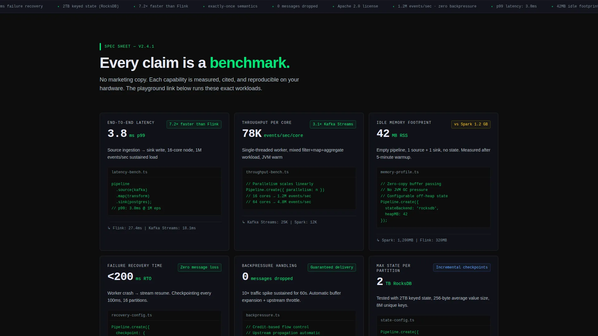
- It replaces vague marketing copy with benchmarked spec cards showing latency, throughput, and memory footprint
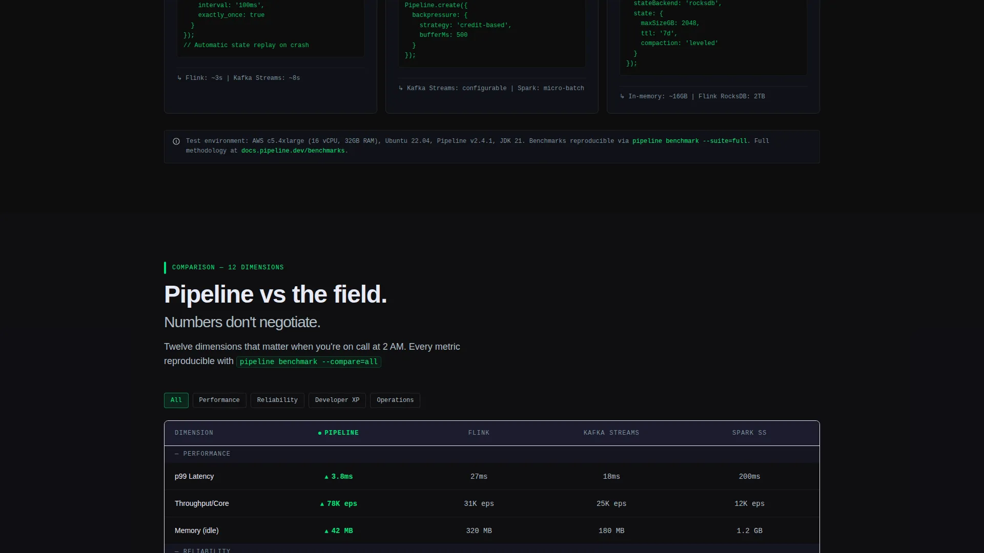
- It surfaces a comparison table early so visitors can evaluate the framework against known alternatives without leaving the page
- It positions the primary call to action only after the visitor has already seen verifiable proof
What you get with this template
You get a complete scroll reveal landing page structured around technical credibility. Each section is pre-built to deliver one persuasive data point at a time, progressively deepening the case as the visitor scrolls.
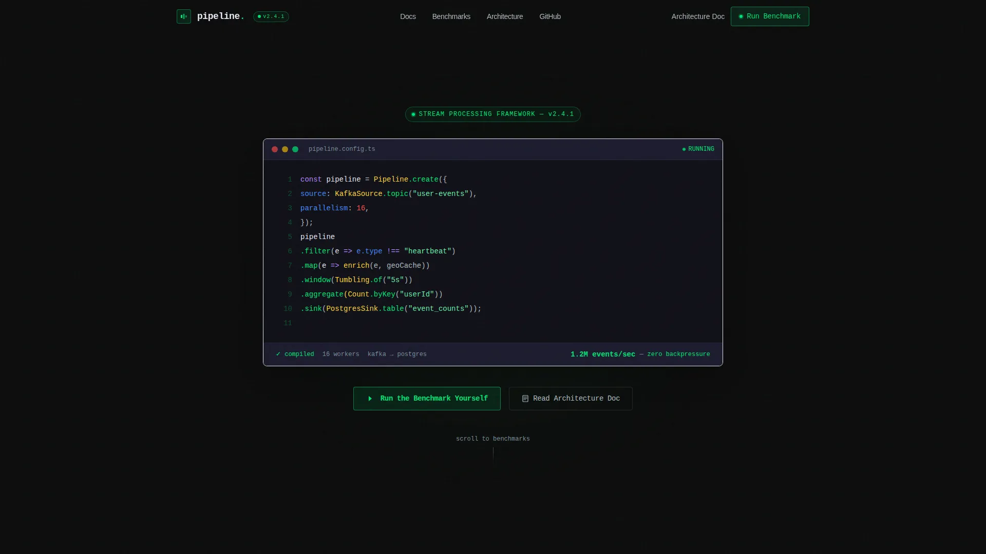
- A syntax-highlighted code snippet hero with a type-on animation and a live throughput metric
- Scrollable spec cards that each expose one benchmarked capability paired with a minimal API code example
- A sticky comparison table and two distinct conversion paths targeting different stages of buyer readiness
Feature list
This template ships with a focused set of purpose-built sections and interactive design elements that serve a technically demanding audience.
Animated Code Snippet Header
The header renders a syntax-highlighted pipeline definition in a monospaced font against a pure carbon black background. Each line appears with a subtle type-on animation, walking through a source reading from a Kafka topic, a filter step, a map step, a window step, and a sink writing to Postgres. A single animated metric below the code counts upward to 1.2 million events per second with zero backpressure noted.
Progressive Scroll Reveal Spec Cards
Each spec card materializes as the visitor scrolls into view, presenting one capability as a benchmarked, cited specification rather than a marketing claim. Latency is shown in p99 milliseconds. Throughput is shown in events per second per core. Memory footprint is shown in megabytes. Each card is paired with a minimal code example illustrating the API surface for that feature.
Sticky Comparison Table
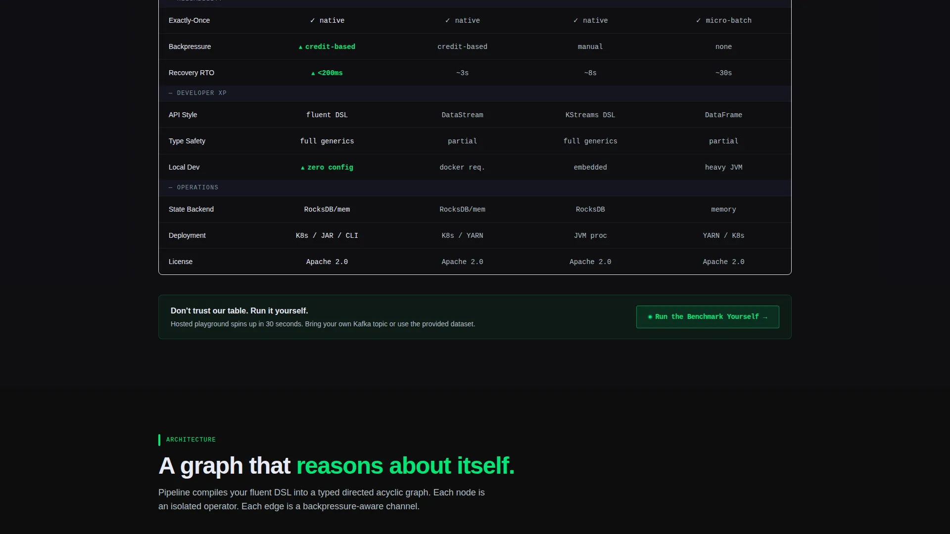
A comparison table pins the framework against three well-known stream processing alternatives across twelve evaluation dimensions. The table stays fixed as the user scrolls through supporting content, letting visitors reference the comparison without losing context.
Dual Conversion Path Layout
The primary call to action is "Run the Benchmark Yourself," linking to a hosted playground environment. A secondary path offers "Read the Architecture Doc" as a gated PDF download, designed for engineers who need to circulate technical justification internally. Both paths coexist without competing for attention.
Data Command Visual Theme
The entire layout uses the Carbon Fiber color system: deep carbon black for backgrounds, machined graphite for card surfaces, status-green for throughput indicators and active states, and cool titanium gray for secondary text and dividers. No stock photography, no decorative gradients. Every visual element is functional.
Page sections overview
| Section | Purpose |
|---|---|
| Code Snippet Hero | Opens with an animated pipeline definition and a live throughput metric to establish technical credibility immediately |
| Throughput Spec Card | Presents events-per-second-per-core throughput as a benchmarked figure paired with a minimal API example |
| Latency Spec Card | Shows p99 latency in milliseconds as a cited specification alongside relevant code showing the configuration surface |
| Memory Spec Card | Displays memory footprint in megabytes with a code snippet illustrating the resource profile of a running pipeline |
| Sticky Comparison Table | Pins the framework against three alternatives across twelve dimensions, staying visible as users scroll |
| Primary call to action Block | Positions "Run the Benchmark Yourself" after the comparison, linking directly to a hosted playground |
| Architecture Doc Gate | Offers "Read the Architecture Doc" as a secondary PDF download for internal technical review and sign-off |
Design & branding system
The template uses a Carbon Fiber color system that evokes the inside of a server rack at midnight. Every color choice is functional, every surface is intentional, and nothing is purely decorative.
- Deep carbon black (#0D0D0D) for page backgrounds, machined graphite (#1A1A2E) for card and section surfaces, status-green (#00E676) for throughput indicators and active state highlights, and cool titanium gray (#B0BEC5) for secondary text and dividers
- Monospaced typography throughout the header and spec card code blocks, reinforcing the technical datasheet aesthetic
- Scroll reveal animations progressively expose each section as the visitor moves down the page, creating a layered, spec-by-spec reading experience with no gradients or imagery
Mobile & speed optimization
The template layout is structured to remain functional and readable across screen sizes. The scroll reveal behavior and code snippet rendering are designed with a single-column flow that adapts cleanly to narrower viewports.
- Spec cards reflow into a single-column stack on smaller screens, keeping benchmarked data and code examples legible without horizontal scrolling
- The sticky comparison table is built to allow horizontal scroll on mobile so all twelve dimension columns remain accessible without truncating content
How this template helps you convert
This template is built around a specific conversion logic: show proof first, then ask for commitment. The layout earns trust at each scroll step before presenting any action.
- The animated code snippet and live throughput metric establish credibility in the first viewport, giving skeptical engineers a reason to keep reading before any pitch begins.
- The sticky comparison table gives visitors the side-by-side context they need to reach their own conclusion, reducing the need for external research and keeping attention on the page.
- The dual conversion paths address two distinct buyer stages at once, offering an immediate hands-on action for engineers ready to test and a downloadable document for those building internal approval cases.
Other information about this template
This template is built specifically for the stream processing tool and framework category within the broader stream processing technology space. It is designed for teams evaluating real-time data infrastructure at a technical level.
- The template is well suited for showcasing frameworks that compete in the same space as Apache Flink, Kafka Streams, and Spark Structured Streaming, making direct positioning straightforward
- The gated architecture document section can support lead capture workflows, giving go-to-market teams a built-in content asset touchpoint
- The hosted playground call to action works particularly well for developer-led growth models where hands-on trial is the primary conversion mechanism
- The page structure is fully customizable, so teams can swap benchmark figures, comparison dimensions, and code examples to match their specific framework's actual performance profile
Theme
Data Command
Creative direction
Spec Sheet
Color system
Carbon Fiber
Style
Scroll Reveal (Progressive)
Direction
Comparison/Versus
Page Sections
Animated Code Snippet Hero Section
Scroll Reveal Spec Card Layout
Sticky Comparison Table
Dual Conversion Path Design
Carbon Fiber Visual Identity
Related questions
Who is this landing page template designed for?
Can I replace the code snippet and benchmark numbers with my own data?
What are the two conversion paths included in this template?
Does the comparison table support a different number of evaluation dimensions?
Is this template suitable for a framework still in early access or beta?



