Pipeline - Highvelocity Recruiting Landing Page Template
Pipeline is a split-screen recruiting landing page template built for speed-focused staffing teams. It combines a Feature Tab Switcher header, animated live metrics, and a stats-first layout to drive app downloads. Designed for startup founders, ops directors, and agency recruiters, it makes every section feel like a live scoreboard, urgent, data-driven, and built to convert.
by Rocket studio
Quick summary
Pipeline is a single-page recruiting template built around one idea: speed wins. The 50/50 split-screen layout pairs live-style metrics with clear download prompts on every scroll stop. From a tab-switching header to a sticky SMS footer, every element pushes the visitor toward one action, downloading the app before their competitor fills the role first.
Who this template is for
This template is designed for recruiting-focused businesses that need to communicate pace, precision, and results without slowing visitors down with long copy.
- Startup founders scaling headcount rapidly and needing to demonstrate a fast hiring tool to their teams
- Operations directors at growth-stage companies who need to justify adopting a new recruiting platform
- Agency recruiters managing many open roles at once who want one clear, credible place to send prospects
What problem this template solves
Recruiting platforms often struggle to earn trust quickly. Visitors land on a page and immediately ask: does this actually work, and will it work fast? This template answers both questions before the visitor scrolls past the header.
- Static pages fail to communicate speed, leaving visitors unconvinced that the tool is live and active
- Buried calls to action make it hard for mobile visitors to find the download link when they are ready
- Generic recruiting copy sounds like every other platform, giving no reason to act right now
What you get with this template
You get a fully structured, single-page layout that leads every section with a bold metric and follows it with context and proof. The design system, copy structure, and interactive header are all ready to customize.
- A Feature Tab Switcher header with three product screens and auto-rotating stats that freeze on hover
- A Stats-First Impact layout where animated numbers open every scroll stop before any explanation appears
- App Store and Google Play badge pairs on the right panel of every split section, plus a sticky SMS link footer
Feature list
This template ships with a set of purpose-built components aligned to the recruiting platform use case.
Feature Tab Switcher Header
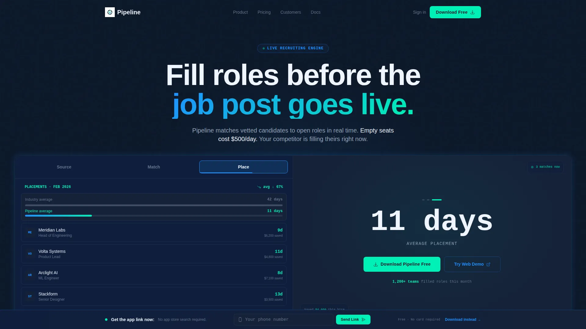
The header splits into two panels. The left panel holds three tabs labeled "Source," "Match," and "Place." Each tab swaps in a different product screen: a live candidate pipeline, an AI match-score breakdown with percentage bars, and a placement tracker showing days-to-hire shrinking. The right panel displays a bold stat that updates with the active tab. Tabs auto-rotate every four seconds and freeze on hover.
Stats-First Section Rhythm
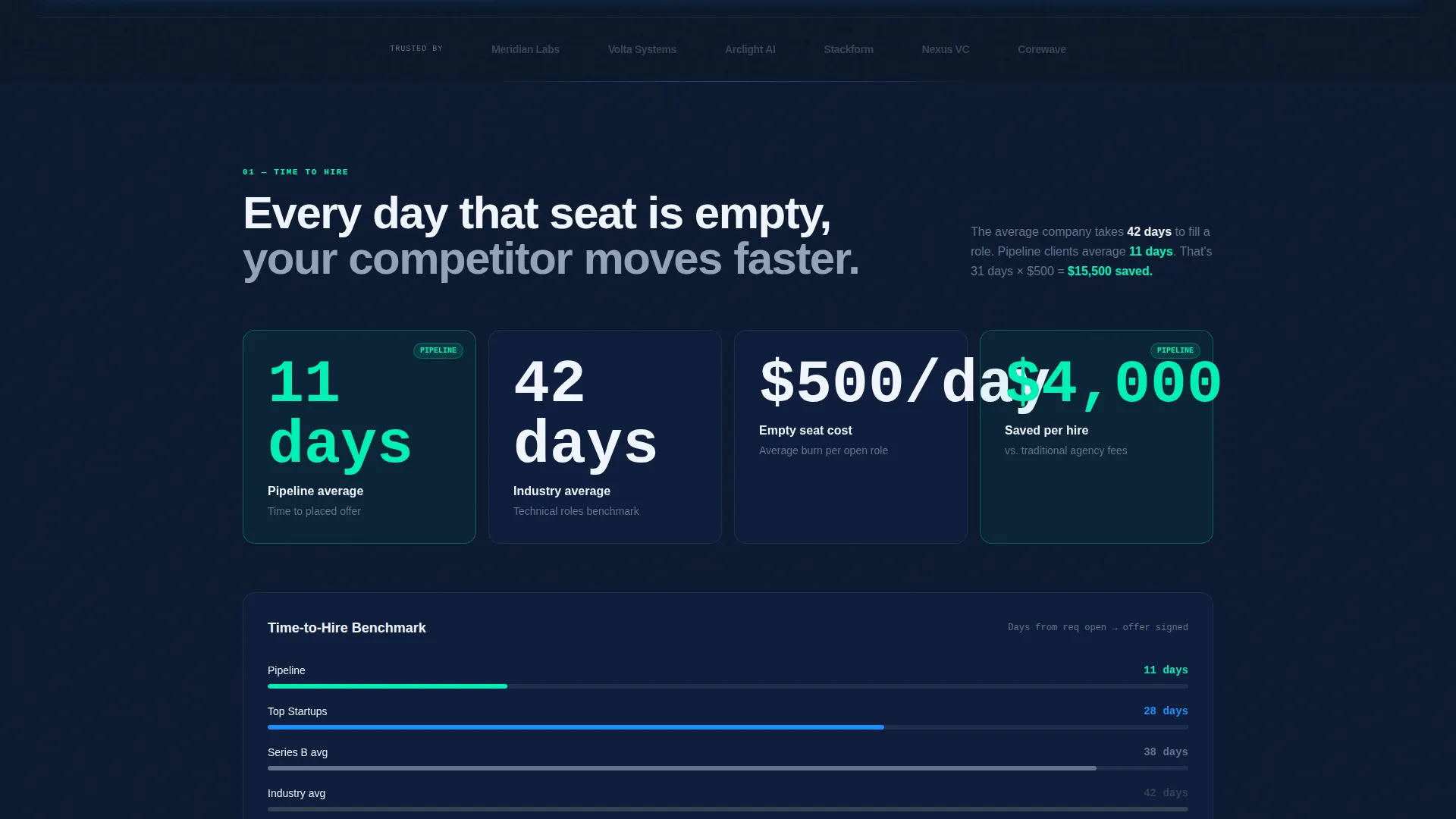
Every section opens with a large, animated number before any explanatory copy appears. The sequence repeats across all sections: metric first, story second, proof underneath. This structure keeps the visitor reading like they are watching a live scoreboard rather than a brochure.
Split-Screen Section Layout
Each section uses a 50/50 horizontal split. One side carries the data story and one side carries the action prompt. This consistent structure makes the page feel fast and focused, with no visual clutter between the metric and the next step.
Dual App Download call to action Pairing
App Store and Google Play badges appear on the right panel of every split section. This gives both iOS and Android visitors a clear, immediate path to install without scrolling to find a download link. A secondary "Try the Web Demo" option serves desktop visitors who want to explore before committing.
Sticky SMS Footer
A single-field SMS link option lives in a sticky footer bar on desktop. The visitor enters only their phone number. This removes friction for anyone who prefers to get the download link sent directly to their device rather than searching for their phone while browsing.
Live Metrics Display Sections
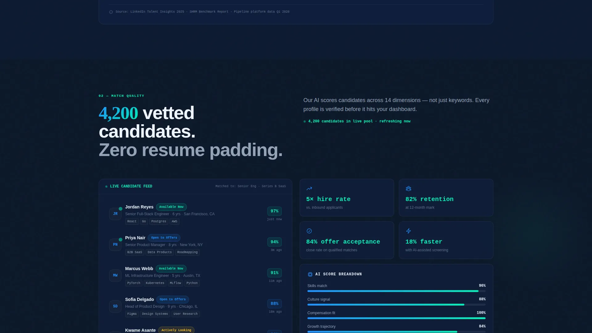
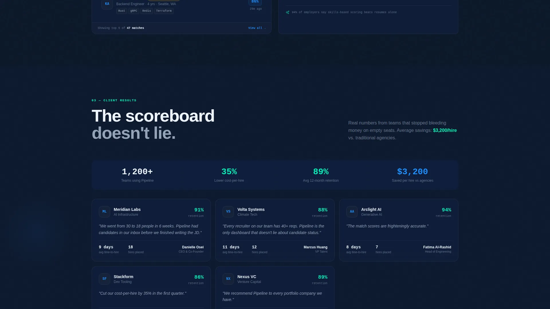
Section one shows time-to-hire benchmarks against industry averages. Section two displays candidate quality scores with a live-updating feed aesthetic. Section three shows client logos beside retention rates. The rhythm of number, story, and proof repeats across all three sections.
Page sections overview
| Section | Purpose |
|---|---|
| Tab Switcher Header | Introduce three core product screens with rotating stats |
| Time-to-Hire Section | Compare platform speed against industry benchmarks |
| Candidate Quality Feed | Display quality scores with a live-updating visual style |
| Client Proof Section | Show client logos paired with retention rate data |
| Sticky SMS Footer | Provide a persistent, low-friction mobile download path |
Design & branding system
The visual identity follows a Startup Velocity theme built around a Midnight Blue color system. The palette is designed to feel like a mission control screen: dark, focused, and purposeful with every bright element earning its place.
- Core background in deep terminal navy (#0A1628), with signal blue (#1E90FF) used for active states and data highlights
- Slate gray (#64748B) for secondary text and dividers, keeping non-critical information visually quiet
- Electric mint (#00F0B5) reserved exclusively for calls to action and success indicators, making every conversion prompt immediately visible
Mobile & speed optimization
The template is structured to keep the download path reachable at every point in the scroll, on any screen size. The sticky SMS footer ensures mobile visitors never have to hunt for the link.
- The 50/50 split layout is designed to reflow cleanly for smaller screen widths without losing the metric-first hierarchy
- App Store and Google Play badges appear in every split section so mobile visitors encounter a download prompt at each scroll stop
How this template helps you convert
The conversion strategy in this template is built on urgency and proof. Every design decision is aimed at shortening the time between "I'm interested" and "I downloaded the app."
- The stats-first layout creates immediate credibility by leading with numbers like "4,200 candidates sourced this week" and "11-day average placement" before any marketing copy appears.
- The dual app badge placement and sticky SMS footer eliminate every extra step between intent and install, keeping the path to download short regardless of device.
Other information about this template
This template is part of a staffing and recruiting digital presence category within the broader technology template set. It is well-suited for teams building a recruiting platform landing page that needs to communicate velocity and data confidence to a skeptical, time-pressed audience.
- The template style is Split Screen (50/50), which suits both product-led and metrics-led storytelling for staffing tools
- The App Download landing page direction means the primary goal is install volume, with the web demo path as a secondary conversion option
- The Startup Velocity theme and Midnight Blue color system make this template visually distinct from typical light-mode recruiting pages, helping it stand out in a crowded category
Theme
Startup Velocity
Creative direction
Stats-First Impact
Color system
Midnight Blue
Style
Split Screen (50/50)
Direction
App Download
Page Sections
Feature Tab Switcher Header
Stats-first Section Rhythm
Dual App Download Call to Action Pairing
Sticky SMS Download Footer
Split-screen 50/50 Layout
Live Metrics Proof Sections
Related questions
Who is this template designed for?
Can I customize the tab labels and stats in the header?
Do both App Store and Google Play badges appear on every section?
What is the sticky SMS footer for?
Is this template suitable for a staffing agency that does not have an app yet?



