DataOps Managed Service Landing Page Template
Pipeline is a dark-themed, bento grid landing page template built for DataOps managed services. It features a live-typed YAML hero, a toggleable comparison matrix with expandable capability tiles, and an interactive ROI calculator that leads visitors to a booking call to action. Designed for VP Engineering and data leaders, it converts through math before marketing.
by Rocket studio
Quick summary
Pipeline is a single-page landing page template built for a DataOps managed service. It opens with an animated YAML code block, moves through a toggleable bento feature matrix, and closes with a three-field ROI calculator. The entire layout is engineered around one conversion goal: making in-house data infrastructure feel expensive before the booking button appears.
Who this template is for
This template speaks directly to technical decision-makers who have lived through the pain of fragile pipelines. It is built for people who evaluate tools on a laptop during a quiet Tuesday morning, not on a phone at a conference.
- VP of Engineering at Series B to D startups who have outgrown their first data hire
- Data Engineering Managers and Chief Data Officers at mid-market companies facing sync failures and runaway cloud costs
What problem this template solves
Growing engineering teams hit a specific wall: pipelines break at 2 AM, on-call rotations get ruined, and hiring a full platform team is hard to justify. Standard marketing pages cannot articulate that operational burden clearly enough to move a technical buyer.
- Generic SaaS landing pages fail to earn trust with VP-level engineering audiences who see through vague claims
- Most service pages lack an honest, side-by-side cost comparison that lets a skeptical buyer do their own math
What you get with this template
This template delivers a complete, structured landing page layout with high interactivity and a dark terminal aesthetic. Every section has a clear job and feeds into the next.
- A GSAP-animated YAML hero block, a bento grid comparison matrix with toggle and expand interactions, and a live ROI calculator
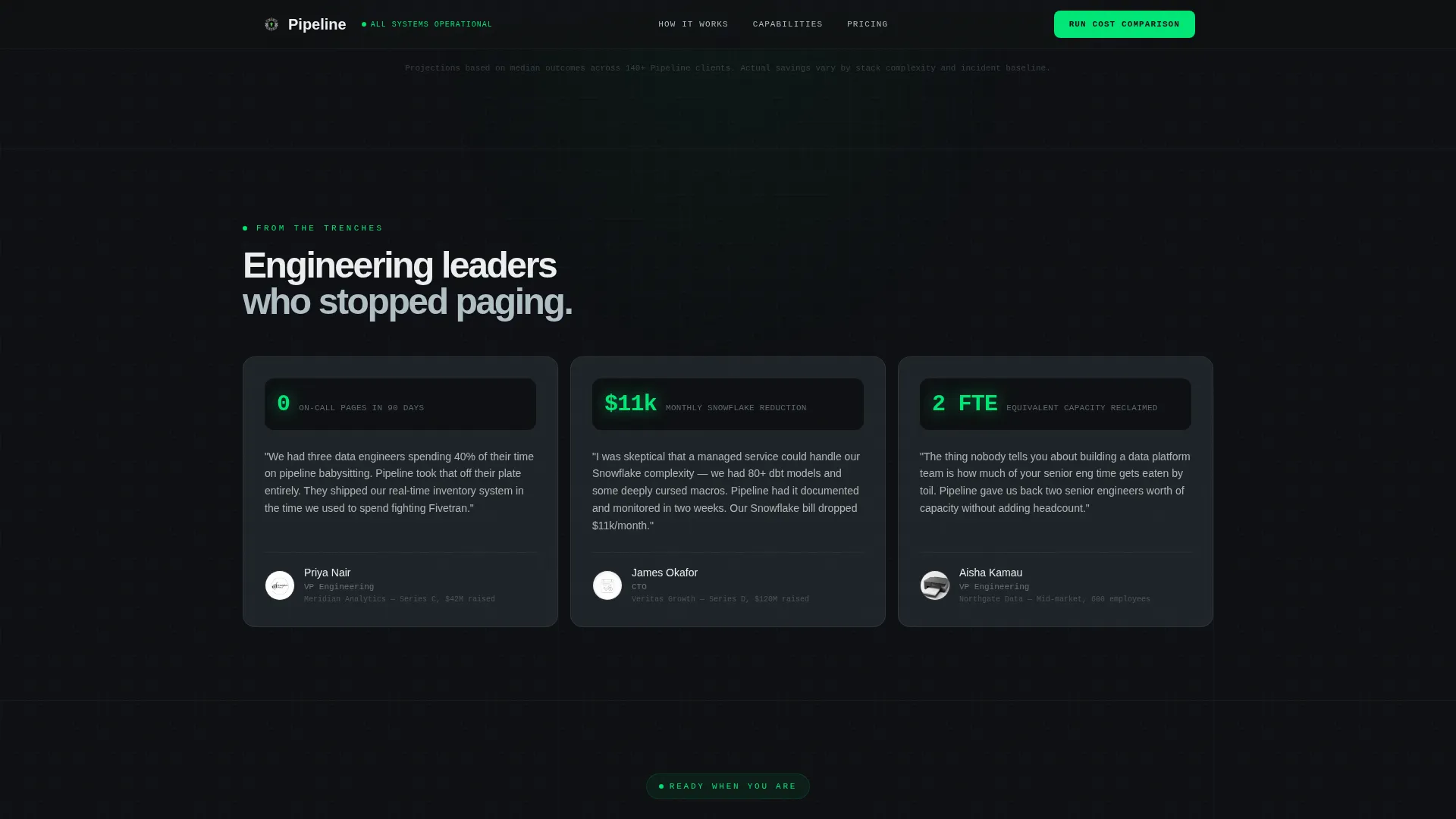
- A testimonials section with specific metric placeholders, an operational stats bar, and a minimal developer-style footer
Feature list
This template is built around five distinct interactive and visual systems. Each one earns attention through specificity rather than decoration.
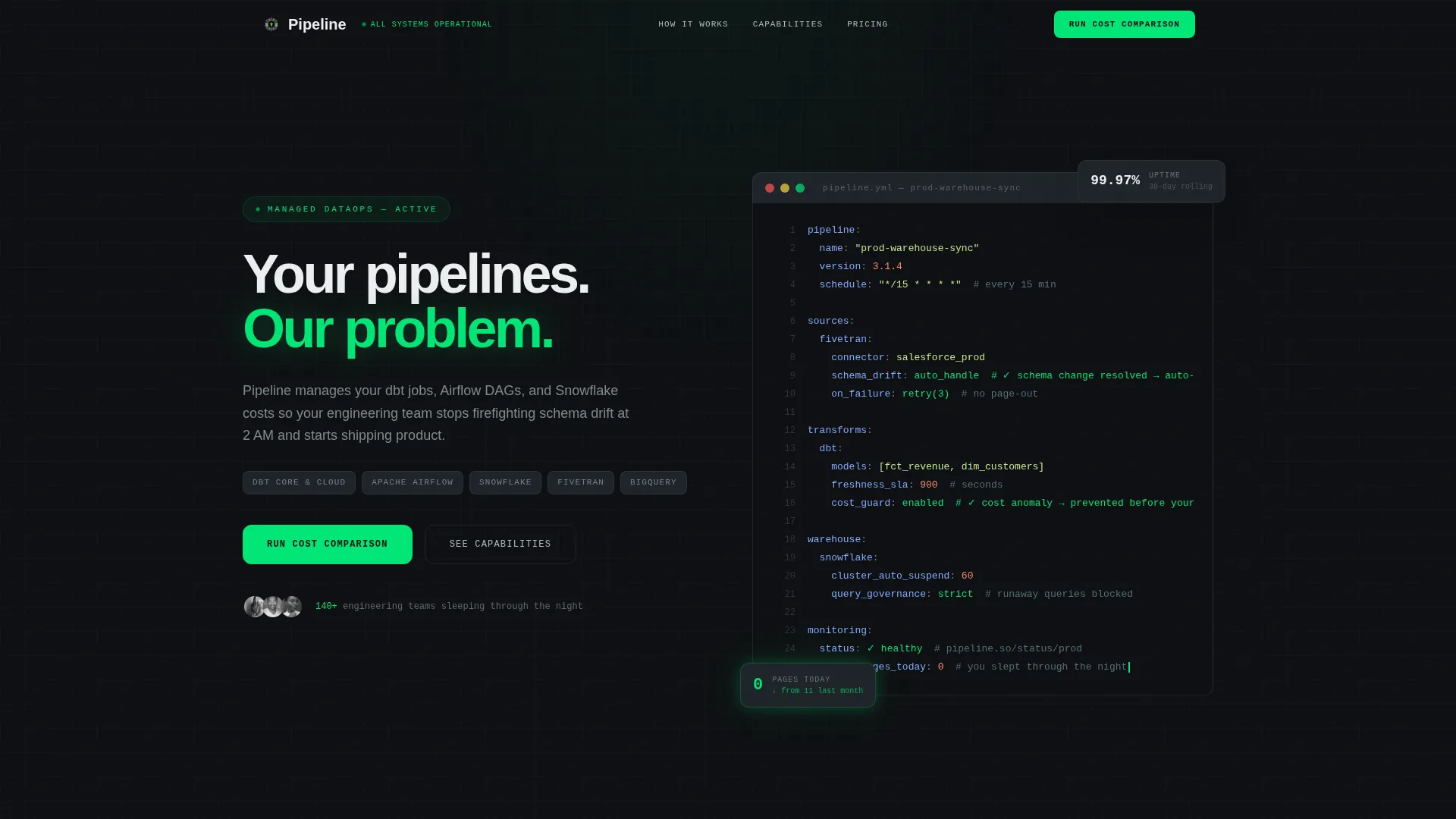
Live-Typed YAML Hero Block
The header renders a syntax-highlighted YAML pipeline configuration that types itself line by line on load. Inline comments animate from red warning states to green checkmarks, demonstrating the service's value before a single body sentence loads. The cursor blinks throughout, giving the section a genuine terminal feel.
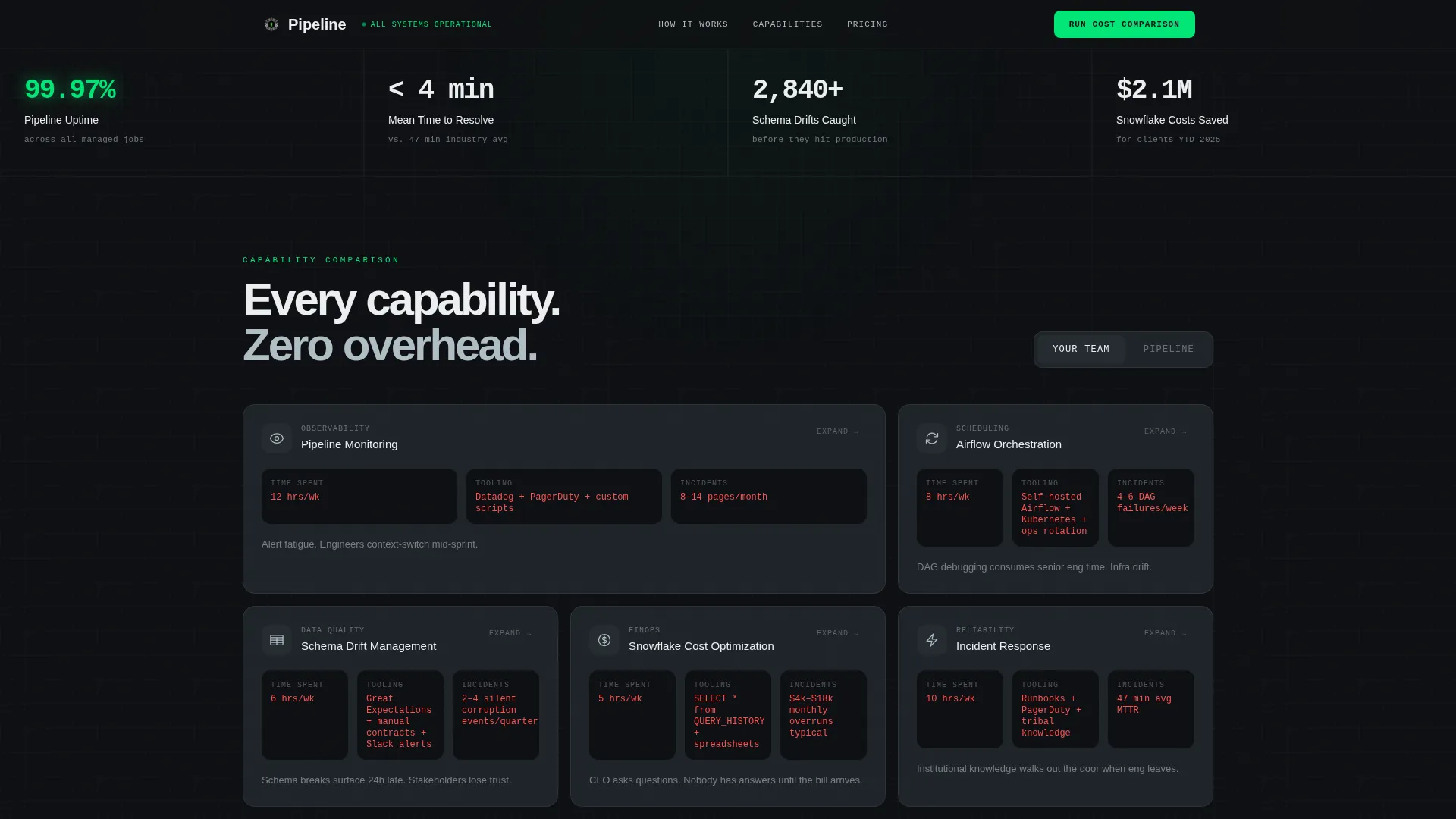
Bento Grid Comparison Matrix
A scrollable grid of capability tiles covers monitoring, orchestration, cost optimization, incident response, and migration. Visitors toggle between an in-house column and a managed-service column to compare staffing hours, tool count, and incident resolution time. Each tile expands on click into a micro-case-study view with real metric placeholders.
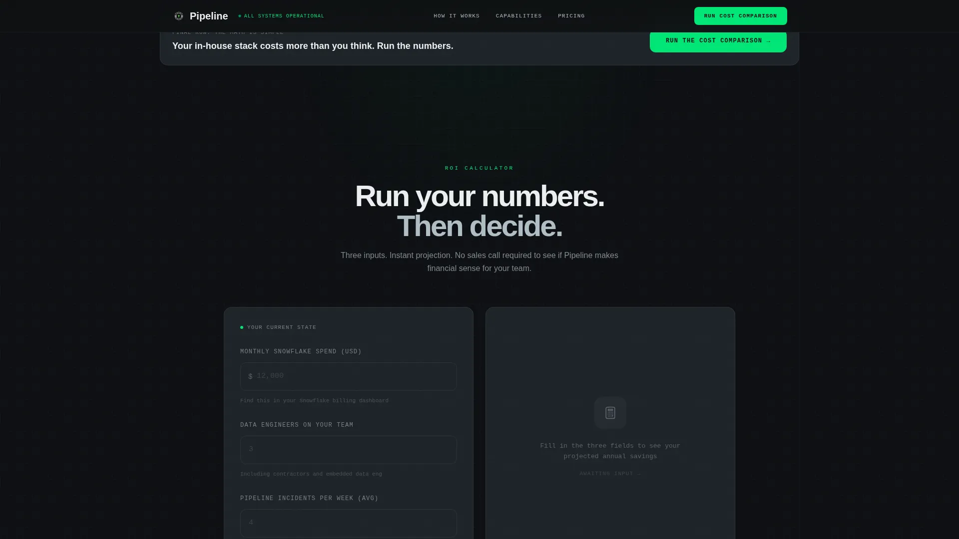
Interactive ROI Calculator
A three-field calculator accepts current monthly cloud spend, number of data engineers on staff, and average incidents per week. It instantly returns a projected savings range based on those inputs. The result resolves into a secondary call to action with a Calendly embed for direct booking.
Sticky Header with Primary Call to Action
The navigation bar stays fixed at the top of the page throughout scroll. The primary call to action, labeled "Run the Cost Comparison," sits inside the sticky header so it is always one click away regardless of scroll depth.
Operational Stats Bar
A four-metric statistics bar sits below the hero and anchors credibility early. The placeholders are designed for live reliability figures, giving the page a dashboard-level authority that a pure text layout cannot match.
Page sections overview
| Section | Purpose |
|---|---|
| YAML Hero Block | Open with animated code proof |
| Operational Stats Bar | Establish reliability with metrics |
| Bento Feature Matrix | Drive comparison and expand detail |
| ROI Calculator | Quantify savings and trigger booking |
| Testimonials Section | Reinforce with specific social proof |
| Minimal Dev Footer | Close with clean navigation |
Design & branding system
The visual language is built around a carbon fiber color system that feels like the inside of a server rack at 2 AM. Every color decision reduces visual noise so the live-status signals read instantly.
- Background layers use deep cockpit black (#0D0F12) and woven graphite (#1E2328); bento card surfaces lift off the background at the graphite value
- Status green (#00E676) activates only on live indicators and interactive elements; cool aluminum (#B0BEC5) carries all secondary text and icon strokes
- Typography pairs JetBrains Mono for all code and hero contexts with DM Sans for body copy and interface labels
Mobile & speed optimization
The template is designed desktop-first, reflecting how VP Engineering buyers evaluate tools during work hours. Interactive sections use a React server and client component split to keep initial load lean.
- Static sections are built as server components; the YAML animation, comparison toggle, and calculator are isolated as client components
- GSAP handles the typing sequence and scroll-triggered reveals without blocking the main thread on initial paint
How this template helps you convert
The conversion architecture is sequential and psychological. Each section makes the visitor more certain before they reach the call to action.
- The YAML hero establishes technical credibility immediately, so the visitor trusts the product before reading a word of marketing copy.
- The comparison matrix makes the in-house cost feel progressively heavier with each row, until the managed-service column feels like the obvious choice.
- The ROI calculator asks the visitor to input their own numbers, so by the time the booking prompt appears, they have already done the math and convinced themselves.
Other information about this template
This template is well-suited for agencies or founders building a go-to-market presence in the DataOps managed service space. A few additional details worth noting before you build with it.
- The layout is a single landing page, not a multi-page site; all sections exist within one scrollable flow
- The footer follows a GitHub developer minimal pattern, keeping the close of the page clean and code-native
- Animation intensity is high by design; teams with lower animation preferences can adjust GSAP timelines directly in the component files
- The template is localized for English, United States Dollar pricing, and United States date formats out of the box
Theme
Directory & Discovery
Creative direction
Feature Matrix
Color system
Carbon Fiber
Style
Bento Grid
Direction
Comparison/Versus
Page Sections
Live-typed YAML Hero Animation
Toggleable Bento Comparison Matrix
Three-field ROI Calculator
Sticky Navigation with Persistent Call to Action
Operational Stats Bar
Component-split Performance Architecture
Related questions
Is this template suitable for a solo founder launching a DataOps service?
Can I update the color palette to match a different brand identity?
Does the ROI calculator need a backend or external service to work?
How hard is it to replace the booking embed with a different scheduling tool?
Is this a single landing page or a multi-page site template?



