AutoML Newsletter Landing Page Template
Pipeline is a dashboard-style landing page template built for an automated machine learning newsletter and community. It pairs a Tech Glass visual identity with a data-grid layout to attract ML engineers, product managers, and data science leads. The template uses a Feature Tab Switcher header, sortable benchmark tables, and a friction-free email capture bar to turn curious visitors into weekly subscribers.
by Rocket studio
Quick summary
Pipeline is a single-page, dashboard-style landing page template designed for an automated machine learning newsletter. It uses a deep graphite and atmosphere blue color system to feel like a real analytics tool. The layout guides data professionals from a compelling header through escalating proof sections straight to a low-friction subscribe action.
Who this template is for
This template is built for people who publish technical content for data-driven audiences. If you run a newsletter, community, or resource hub targeting professionals who build with machine learning, this layout speaks their language visually and structurally.
- ML engineers and data science leads who evaluate automated machine learning frameworks in their day-to-day work
- Product managers who translate model performance into product and roadmap decisions
- Newsletter creators or community builders serving a technically fluent, data-professional audience
What problem this template solves
Most newsletter landing pages rely on generic promises and stock imagery. That approach fails when your audience can immediately sense that the page does not understand their work. Pipeline solves this by presenting your content as evidence, not a pitch.
- Visitors arrive skeptical and leave only if the content does not prove its value, so the template leads with actual benchmarks and newsletter excerpts instead of abstract copy
- A persistent low-friction subscribe bar removes signup obstacles without interrupting the reading experience
- The Industry Report layout creates a sense of escalating credibility, matching how a technical reader evaluates a source before trusting it
What you get with this template
You get a fully structured landing page that looks and behaves like a monitoring dashboard, designed to convert data professionals who need to trust a source before subscribing to it.
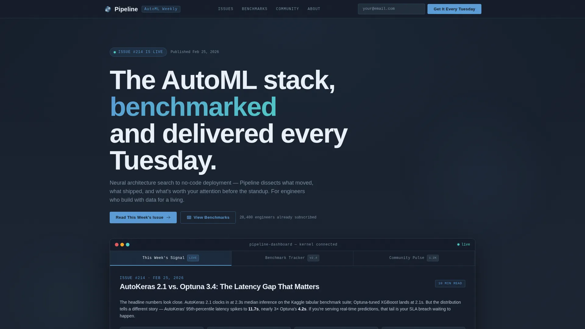
- A Feature Tab Switcher header with three interactive panes: a newsletter excerpt view, a benchmark comparison grid, and a community discussion preview
- A multi-section scrolling layout including macro trend stat cards, a sortable framework comparison table, curated past-edition excerpts, and a social proof section with subscriber counts and company logos
- A persistent top bar carrying a secondary call-to-action with a single email field and a primary click-through button linking to the latest free issue
Feature list
This section covers the core built-in capabilities that make Pipeline work as a high-converting landing page for an automated machine learning newsletter.
Feature Tab Switcher Header
The header contains three clickable tabs inside a simulated dashboard frame. Tab one shows a rendered newsletter excerpt with highlighted metric callouts. Tab two displays a benchmark comparison grid of automated machine learning platforms ranked by latency, F1 score, and deployment complexity. Tab three surfaces a community thread preview with upvote counts and contributor avatars. Content snaps in with a glass-panel transition on each tab switch.
Macro Trend Stat Cards
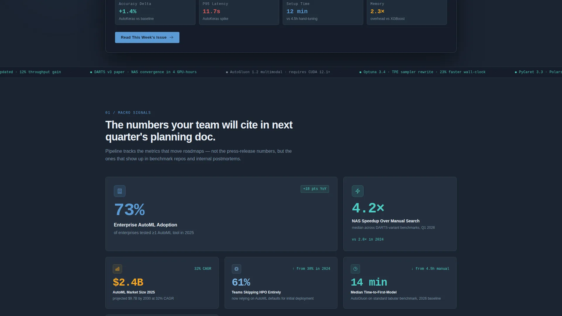
The first scroll section features large-format stat callout cards. Each card presents a bold numerical claim drawn from the newsletter's editorial angle, such as enterprise adoption rates for automated machine learning tools. These cards establish authority immediately and give first-time visitors a reason to keep reading.
Sortable Benchmark Data Grid
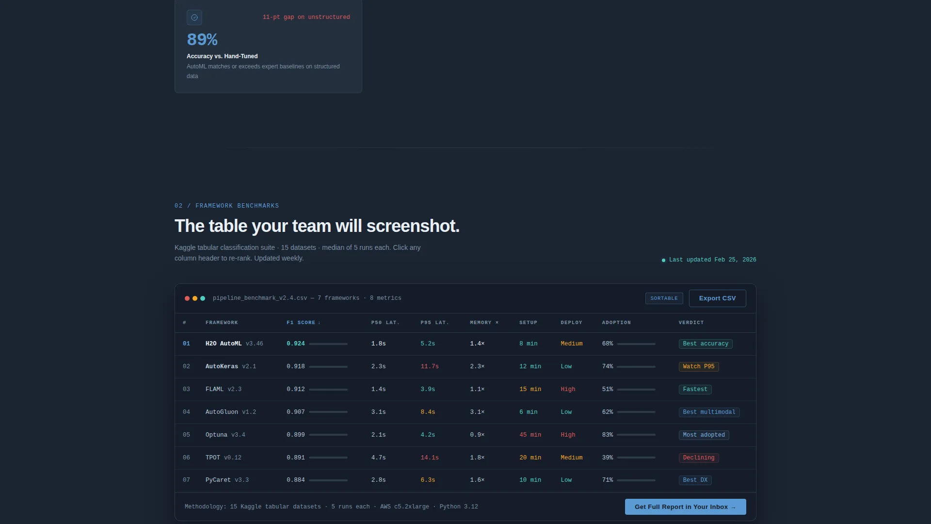
A framework comparison table sits in its own dedicated section. It is styled to look like a real benchmark table, with sortable columns covering latency, F1 score, and deployment complexity. The grid functions as inline proof of editorial depth and gives technically minded visitors a reason to screenshot and share the page.
Curated Past-Edition Excerpts
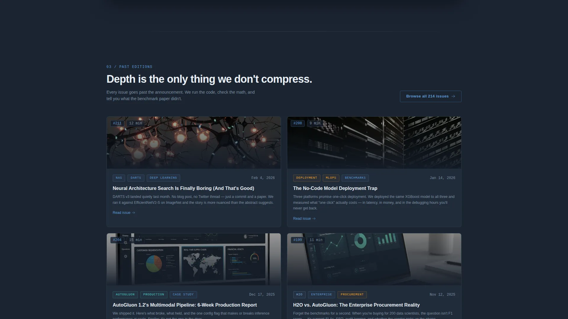
A content preview section surfaces selected excerpts from previous newsletter editions. Each excerpt carries a read-time badge and topic tags, demonstrating the range and specificity of the content without requiring the visitor to subscribe first.
Community Social Proof Strip
A dedicated section surfaces subscriber count figures, company logos of organizations where readers work, and a rotating testimonial strip. This section answers the implicit question every new visitor asks: who else already reads this?
Persistent Low-Friction Subscribe Bar
A sticky top bar carries the secondary call-to-action throughout the entire page scroll. It requires only an email address, with no name or company fields. The primary call-to-action, "Read This Week's Issue," links directly to the latest free edition so visitors can experience the content before committing to subscribe.
Page sections overview
| Section | Purpose |
|---|---|
| Feature Tab Switcher | Showcases newsletter, benchmarks, and community in one header |
| Macro Trend Cards | Establishes authority with bold industry stat callouts |
| Benchmark Data Grid | Proves editorial depth with a sortable framework comparison table |
| Past Edition Excerpts | Demonstrates content quality with tagged, timed newsletter previews |
| Community Proof Section | Builds trust through subscriber counts, logos, and testimonials |
| Persistent Subscribe Bar | Captures email with a single-field, always-visible call-to-action |
Design & branding system
The visual identity follows a Tech Glass theme built on a Slate and Sky color system. Every color and spacing decision is designed to feel like a real analytics dashboard, not a generic marketing page.
- Deep graphite slate (#1B2432) forms the primary background, mid-tone steel (#3D4F5F) surfaces card panels and grid borders, atmosphere blue (#5B9BD5) marks interactive elements and data highlights, and cloud white (#EAF0F7) carries all body typography
- Accent blue appears only on hover states, active tabs, and live metric indicators, keeping the eye focused on interactive moments without visual noise
- Steel cards create layered depth so page sections appear to float at different altitudes, reinforcing the glass-walled server room aesthetic described in the brief
Mobile & speed optimization
The template is structured to stay readable and functional on smaller screens without sacrificing the dashboard density that makes it compelling on desktop.
- The data grid and tab switcher components are designed to reflow cleanly so benchmark tables and newsletter excerpts remain usable on mobile viewports
- Section stacking follows a logical reading order so the escalating proof structure, from stat cards to excerpts to social proof, remains intact on all screen sizes
- The persistent subscribe bar is designed to stay accessible at the top of the viewport across device sizes, keeping the low-friction email capture in place throughout the scroll
How this template helps you convert
Every structural decision in this template is made to reduce hesitation and increase the likelihood that a qualified visitor takes action. The conversion logic follows a deliberate sequence.
- The Feature Tab Switcher header lets visitors self-select into the content type most relevant to them, whether that is benchmark data, editorial insight, or community activity, before they have scrolled at all.
- The escalating section order, moving from broad stat cards to specific framework comparisons to curated excerpts to community proof, progressively increases visitor confidence in the newsletter's editorial value.
- The primary call-to-action links to a free issue rather than a subscribe form, removing the final objection by letting the content sell itself before any commitment is required.
Other information about this template
This template sits at the intersection of data-professional publishing and high-credibility content marketing. A few additional details worth knowing before you build with it.
- The template is categorized under Technology, specifically within the AutoML Technology subcategory, making it a focused fit for newsletters covering automated machine learning, neural architecture search, no-code model deployment, and related topics
- The Industry Report creative direction means the scroll experience is paced like a research brief, each section escalates in specificity and assumes a reader who is actively evaluating sources
- The Dashboard and Data Grid template style is intentional for the audience: ML engineers and data science leads respond to layouts that feel native to the tools they already use
- The Click-Through landing page direction prioritizes a free-issue read before a subscribe action, which is a deliberate trust-building strategy suited to a skeptical, technically literate audience
Theme
Tech Glass
Creative direction
Industry Report
Color system
Slate & Sky
Style
Dashboard/Data Grid
Direction
Click-Through
Page Sections
Feature Tab Switcher Header
Sortable Benchmark Data Grid
Macro Trend Stat Cards
Curated Past-edition Excerpts
Community Social Proof Section
Persistent Low-friction Subscribe Bar
Related questions
Who is this template designed for?
Can I customize the benchmark grid with my own data?
Does the tab switcher header require coding to set up?
What makes this layout different from a standard newsletter landing page?
Is the subscribe bar always visible while scrolling?



