IT Services & Consulting Comparison Website Template
Pipeline is a split-screen landing page template built for data engineering consultancies. It pairs a dark Dashboard Pro aesthetic with a compelling before-and-after comparison structure, animated metrics, dual conversion paths, and a persistent call-to-action bar. The result is a page that speaks directly to engineering leaders who are tired of broken pipelines and overdue migrations.
by Rocket studio
Quick summary
Pipeline is a single-page landing page template designed for data engineering consultancies. It uses a 50/50 split-screen layout, a dark Slate and Sky color system, and an Industry Report creative direction to present hard comparisons backed by specific numbers. Every section builds a case from operational pain to financial impact, earning the visitor's click before they ever reach the form.
Who this template is for
This template is built for consultancies and independent practitioners who help engineering teams fix broken data infrastructure. It speaks the language of the people who actually feel the cost of pipeline failure every day.
- Data engineering consultancies targeting VP-level engineering leaders and analytics managers at mid-market companies
- Practitioners helping teams migrate between data warehouses or reduce orchestration complexity
- Consultants positioning against the "do it in-house" option and needing a page that makes the cost of delay tangible
What problem this template solves
Most consultancy landing pages describe services in vague, generic terms. They fail to connect with a technical buyer who has already spent two quarters trying to solve the problem internally. This template closes that gap.
- It replaces abstract service descriptions with a structured, data-driven comparison that mirrors how engineering leaders already think
- It gives buyers a way to see their own situation reflected in the numbers before they are asked to commit to a conversation
- It removes the friction of a long contact form by leading with low-friction technical context before requesting identity
What you get with this template
You get a fully structured landing page layout that guides a skeptical technical buyer from recognition to conversion. Every section, visual, and form element is defined in the brief and ready to build from.
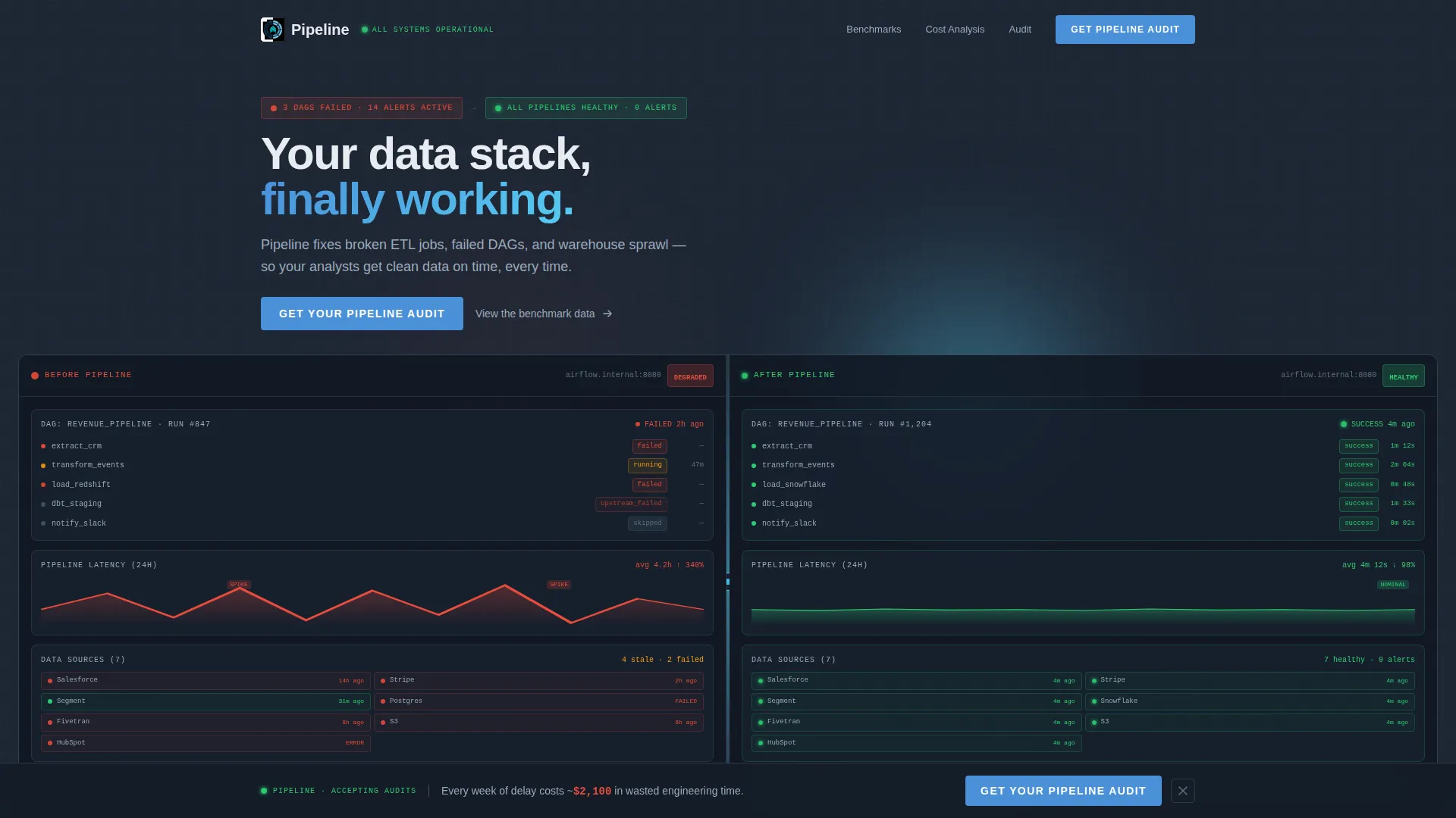
- A split-screen header that contrasts a chaotic "before" dashboard state with a resolved "after" state, using pure user interface rather than stock photography
- Three comparison sections covering pipeline recovery time, infrastructure cost breakdowns, and time-to-insight metrics, each with animated counters or bar charts that build on scroll
- Two conversion paths: a primary audit request form with a technical-context-first field order, and a secondary PDF benchmark report gate that captures email only
Feature list
This template includes a focused set of components, each serving a specific role in the buyer's journey from problem recognition to conversion.
Split-Screen Header with Live Dashboard Aesthetic
The header divides the viewport into two equal halves. The left side shows a "before" state with red alert badges, failed orchestration task states, erratic latency graphs, and scattered data-source logos. The right side resolves those same elements into calm greens and blues with a flattened latency line and a uniform heartbeat pattern. A thin animated divider pulses between the two halves.
Animated Benchmark Comparison Sections
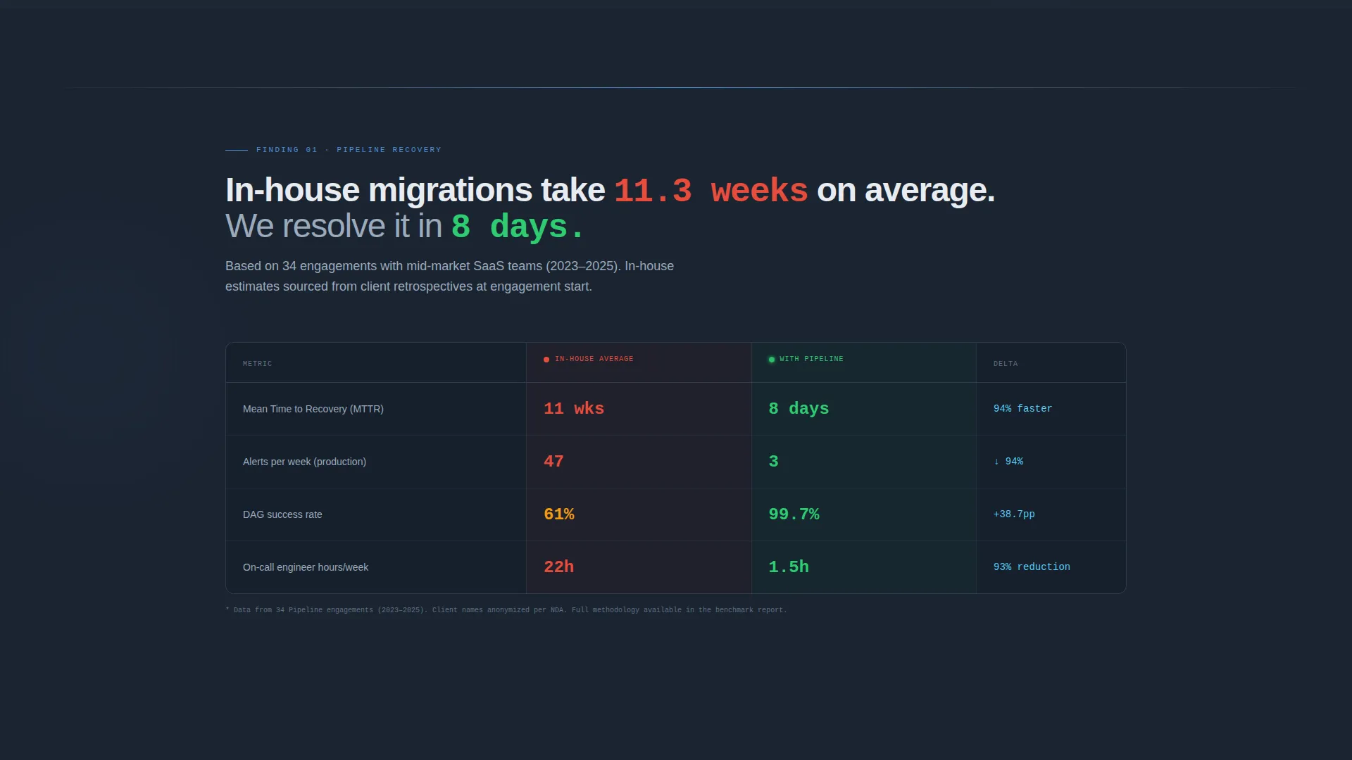
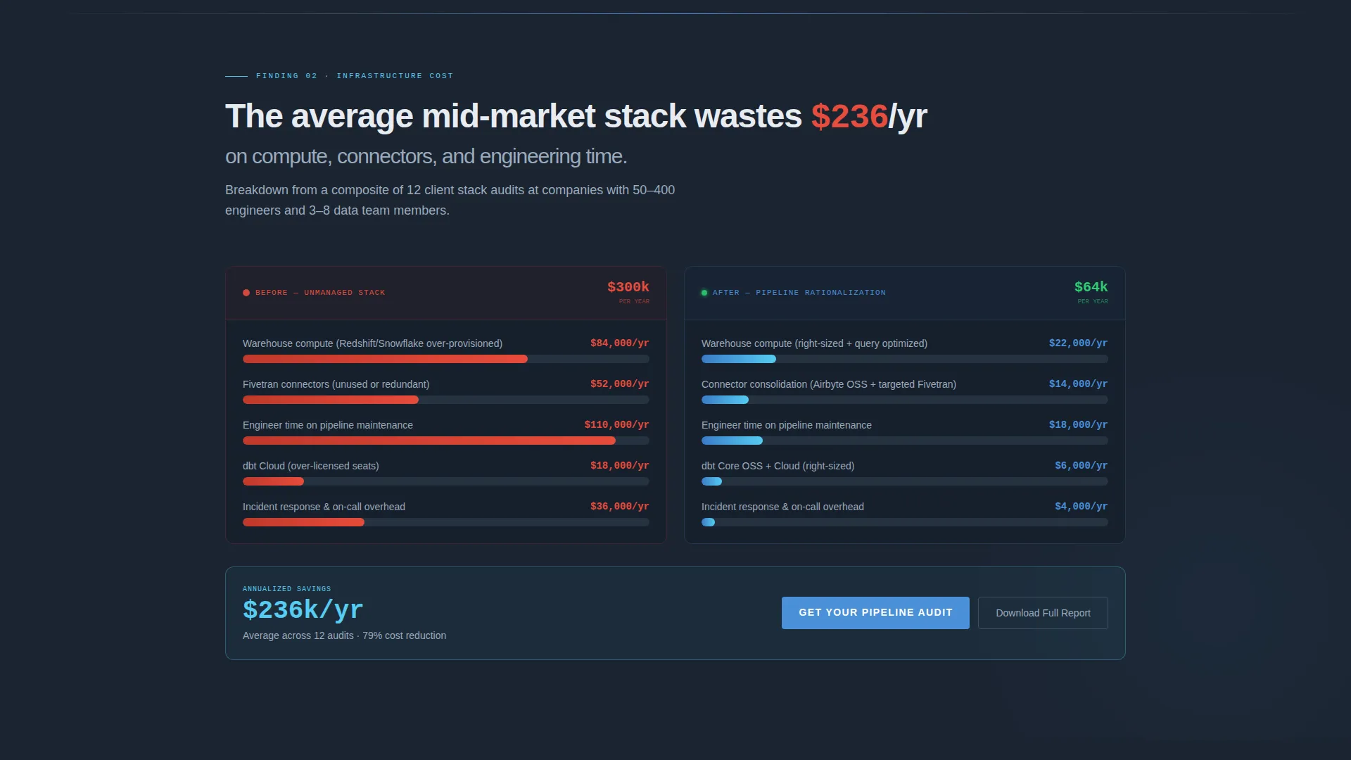
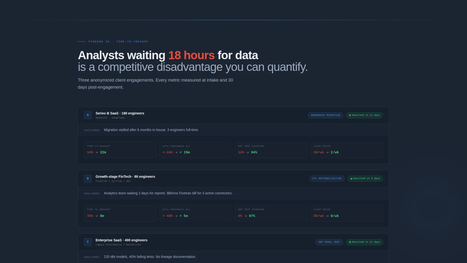
Three scrollable sections present hard comparisons structured like an analyst report. Section one uses animated counters to compare pipeline recovery time. Section two uses horizontal bar charts that build as they enter the viewport to show infrastructure cost before and after rationalization. Section three presents time-to-insight metrics drawn from anonymized client engagements.
Technical-Context-First Audit Form
The primary conversion form leads with a dropdown for current data warehouse platform, followed by a range slider for number of production pipelines, and then a work email field. This field order reduces friction by asking for technical context before identity, making it easier for a cautious engineering buyer to engage.
Persistent Bottom Conversion Bar
After the visitor scrolls past 40 percent of the page, a fixed bottom bar appears anchoring the primary call to action. This keeps the "Get Your Pipeline Audit" prompt visible throughout the comparison sections without interrupting the reading flow.
Secondary PDF Benchmark Gate
A secondary conversion path offers a downloadable benchmark report for visitors who are not ready to book a conversation. This path captures email only, removing the barrier for buyers who want to evaluate before committing.
Pure user interface Visual Language
The template uses no stock photography. All visuals are rendered as interface components: task state indicators, latency graphs, sync-time displays, and metric cards. This approach builds immediate credibility with a senior technical audience who can recognize the patterns in their own infrastructure.
Page sections overview
| Section | Purpose |
|---|---|
| Split-screen header | Show before-and-after pipeline states side by side |
| Recovery time comparison | Contrast in-house versus consultancy resolution speed |
| Infrastructure cost breakdown | Display rationalized cost savings with animated bar charts |
| Time-to-insight metrics | Present anonymized client engagement outcomes |
| Midpoint audit call to action | Capture pipeline audit requests after cost comparison |
| Benchmark report gate | Offer PDF download for email-only secondary conversion |
| Persistent bottom bar | Keep primary call to action visible after 40 percent scroll depth |
Design & branding system
The visual identity follows a Dashboard Pro theme built on a Slate and Sky color system. The palette is dark enough for extended reading, with blue accents that direct the eye to the most important information on the page.
- Backgrounds use deep terminal slate (#1B2432), section dividers use cool gunmetal (#3D4F5F), and body text is rendered in softened white (#E8ECF1) for comfortable extended reading
- Altitude blue (#4A90D9) is used for primary interactive surfaces, while bright signal cyan (#56CCF2) is reserved for hover states and metric highlights
- The overall aesthetic deliberately echoes a well-configured monitoring dashboard, giving technically fluent visitors an immediate sense of familiarity and reliability
Mobile & speed optimization
The layout is designed with responsive behavior in mind so the split-screen structure translates clearly across screen sizes. The comparison sections remain scannable whether the visitor is at a desk early in the morning or reviewing on a mobile device between meetings.
- The 50/50 split-screen header stacks vertically on smaller viewports so both the "before" and "after" states remain fully legible
- Animated counters and scroll-triggered bar charts are structured to engage without overwhelming smaller screens
How this template helps you convert
The page is engineered to move a skeptical, time-pressured technical buyer toward action by showing them the cost of inaction before asking for anything in return.
- Each scrollable comparison section raises the stakes progressively, moving from operational pain to financial impact to competitive disadvantage, so the visitor arrives at the form already persuaded by their own data context.
- The technical-context-first form field order and the secondary PDF gate together cover two distinct buyer readiness levels, capturing both the visitor ready to talk and the one who needs one more reason to trust.
Other information about this template
This template is part of the Technology category, sitting within the IT Services and Consulting subcategory with a specific focus on the data engineering consulting niche. It is a strong fit for practitioners helping clients work through migrations involving platforms such as Snowflake, Redshift, BigQuery, or Databricks, or those rationalizing orchestration tooling such as Airflow or transformation layers such as dbt. The Intersection Match Score for this template is 13, reflecting a tight alignment between the creative direction and the target niche.
- The Industry Report creative direction positions the page as a credible, research-backed resource rather than a typical service brochure
- The Comparison/Versus landing page direction is specifically designed to address buyers who are already deep into evaluating in-house versus external engagement options
- The Dashboard Pro theme and Slate and Sky color system give the page instant visual recognition with a data-infrastructure-literate audience
Theme
Dashboard Pro
Creative direction
Industry Report
Color system
Slate & Sky
Style
Split Screen (50/50)
Direction
Comparison/Versus
Page Sections
Split-screen Before-and-after Header
Animated Benchmark Comparison Sections
Technical-context-first Audit Form
Persistent Bottom Conversion Bar
Secondary PDF Benchmark Gate
Pure User Interface Visual Language
Related questions
Who is this landing page template designed for?
Can I customize the comparison metrics and chart data?
What are the two conversion paths included in this template?
Does the template use stock photography?
How does the persistent bottom bar work?



