DataOps Technology Portfolio Website Template
Pipeline is a bold brutalist DataOps consulting landing page template built for data engineering teams. It opens with a live DAG analyzer tool, moves through brutalist before-and-after case study blocks, and closes with a three-step free audit form. The design uses forge-black backgrounds, electric green accents, and heavy monospace type to signal technical credibility instantly.
by Rocket studio
Quick summary
Pipeline is a single-page DataOps consulting template designed around one idea: deliver diagnostic value before asking for anything. It opens on a split-screen hero with a live DAG input tool, then walks visitors through proof-heavy case studies and a focused free audit form. The aesthetic is bold brutalist, terminal dark, industrially spare, and built for VP and CTO-level buyers who trust numbers over narratives.
Who this template is for
This template is built for data engineering consultancies and DataOps service teams that sell to technical and executive buyers at mid-market companies. If your clients are the people debugging pipelines at 2 a.m., this page speaks their language.
- Analytics engineers and data platform teams offering pipeline consulting services
- DataOps agencies targeting VP Data and CTO decision-makers at mid-market SaaS companies
- Independent data infrastructure consultants who need a credibility-first, tool-led landing page
What problem this template solves
Most consulting landing pages lead with credentials. Technical buyers scroll past them. This template flips the sequence: it leads with a working diagnostic tool, then backs it up with measurable proof. The result is a page that earns attention before it asks for a conversion.
- Visitors arrive frustrated and skeptical; a tool-first layout gives them immediate value and reduces resistance
- Generic consulting pages struggle to communicate technical depth; the brutalist metric-block design signals precision and seriousness
- Weak conversion paths bury the call to action; a sticky audit bar keeps the primary offer visible throughout the entire scroll
What you get with this template
You get a fully structured, single-page layout with every section pre-built and ready to customize. The design system is complete, the interactivity map is defined, and the conversion flow is already sequenced from tool engagement through to form submission.
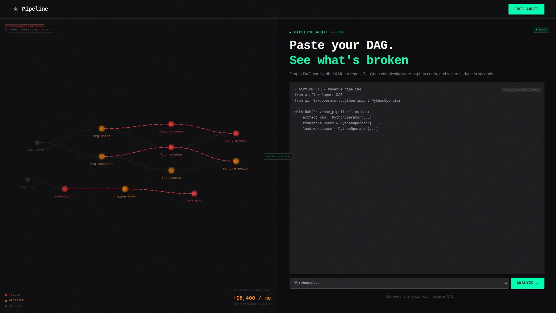
- A split-screen hero with an animated dependency graph on the left and a live DAG analyzer panel on the right
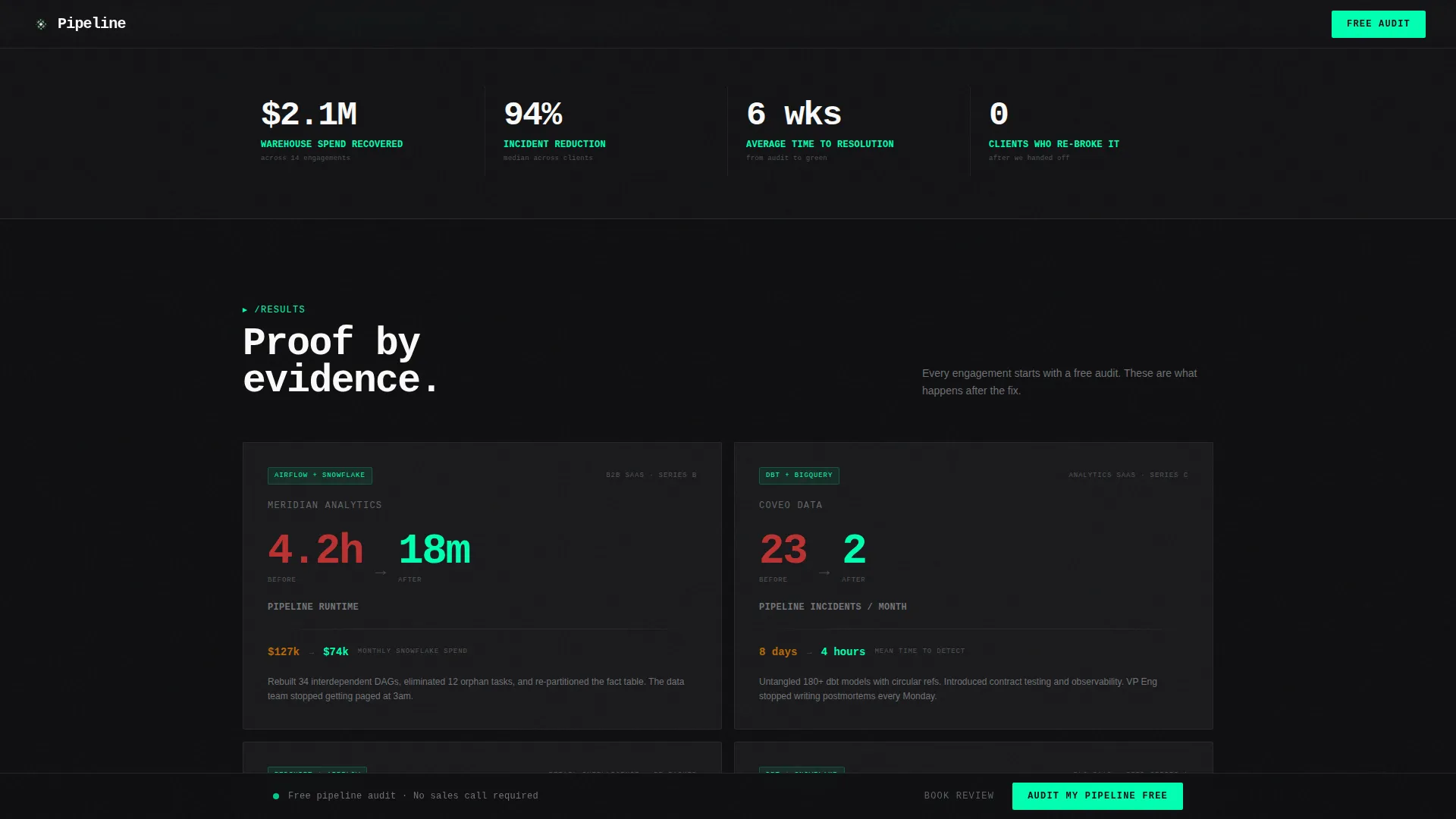
- A brutalist case study grid with four before-and-after metric blocks showing pipeline runtime, incident counts, and cost reduction figures
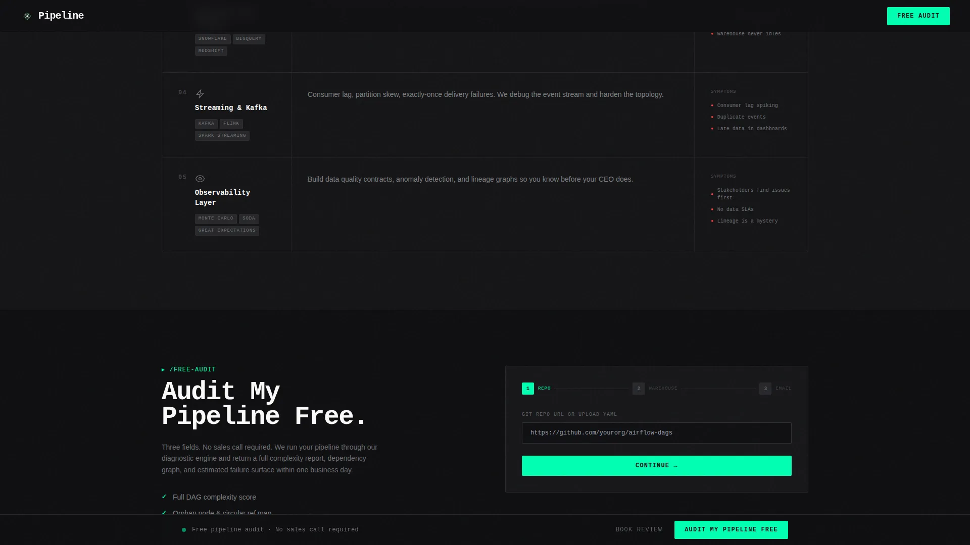
- A three-step audit form collecting repository URL, warehouse type, and work email, plus a secondary "Book a Pipeline Review" path
Feature list
This section covers the core functional and design capabilities built into the Pipeline template.
Split-Screen Hero with Live DAG Analyzer
The hero divides the viewport 50/50. The left panel shows an animated dependency graph with pulsing amber and red nodes representing pipeline chaos. The right panel holds a live input field with an electric green glowing border where visitors paste a DAG config or connect a repository. The right panel then populates with a real-time complexity score, dependency depth, orphan node count, and estimated failure surface.
Brutalist Before-and-After Case Study Grid
Four case study cards are laid out in a brutalist grid. Each card is a steel-gray block with enormous condensed numbers showing measurable outcomes: pipeline runtime reduced from 4.2 hours to 18 minutes, monthly incidents cut from 23 to 2, and warehouse spend reduced by 41%. The format is pure proof-by-evidence with no padding copy.
Scrolling Marquee Trust Strip
A marquee section runs between the hero and the case study grid. It displays scrolling performance metrics and client-tier indicators, keeping social proof in motion and maintaining momentum as visitors transition from tool interaction to evidence review.
Services Bento Grid
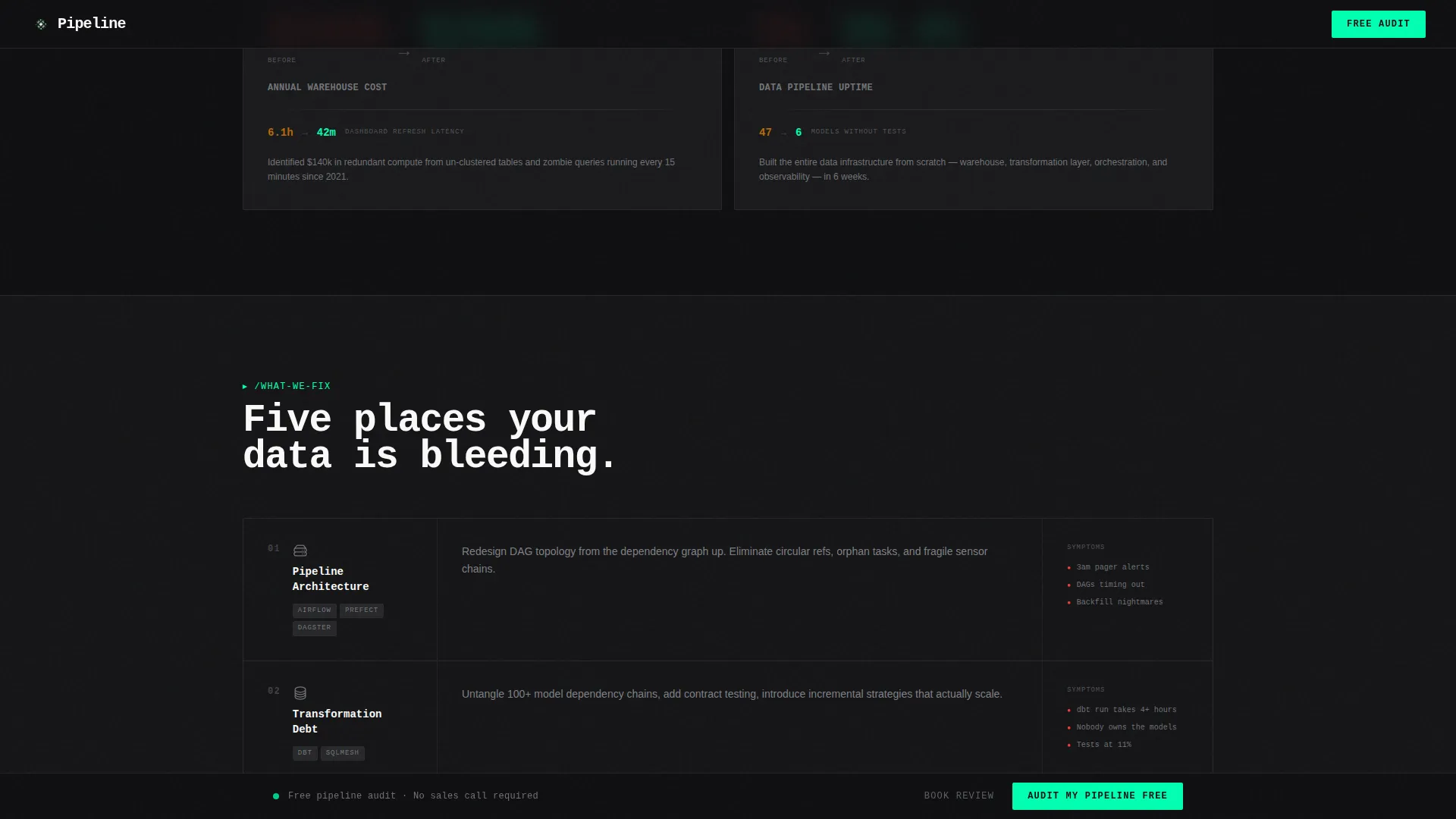
A structured bento-style section outlines the specific infrastructure areas the consulting team addresses. Each cell in the grid covers a distinct data tooling category, giving technical visitors a fast read on scope and specialization.
Sticky Free Audit Call-to-Action Bar
After the first scroll, a sticky bottom bar appears anchored to the viewport. It carries the primary call to action throughout the page. The bar disappears only when the visitor reaches the audit form section, preventing drop-off between sections.
Three-Step Sequenced Audit Form
The audit form reveals three fields in sequence: a Git repository URL or uploaded YAML file, a primary warehouse selection from a dropdown, and a work email address. The stepped reveal reduces form friction and keeps the ask proportional to the value already delivered by the tool.
Page sections overview
| Section | Purpose |
|---|---|
| Split-Screen Hero | Tool-first entry point with animated chaos graph and live DAG input panel |
| Marquee Trust Strip | Scrolling metrics and client-tier signals to build immediate credibility |
| Case Study Grid | Four before-and-after metric blocks proving measurable consulting outcomes |
| Services Bento Grid | Structured cells covering each data infrastructure category the team addresses |
| Audit Form and Call to Action | Three-step form plus secondary "Book a Pipeline Review" conversion path |
| Footer | Linear pattern footer with standard navigation and contact anchors |
Design & branding system
The design language is bold brutalist: industrial, unornamented, and built to feel like a lights-off data center rather than a polished SaaS marketing site. Every visual decision is intentional and load-bearing.
- Color system uses four values: forge-black (#0E0E10) for backgrounds, mill-scale gray (#2A2A2E) as section separators, brushed chromium (#B0B3B8) for body text and labels, and electric green (#00FFB2) reserved strictly for interactive states, live data indicators, and calls to action
- Typography pairs JetBrains Mono for the hero headline, accents, and terminal-style elements with DM Sans for body copy and form labels
- Electric green appears sparingly so that every time it fires, on a button, a border glow, or a cascading checkmark, it feels earned and attention-commanding
Mobile & speed optimization
The template is designed desktop-first, reflecting the primary user persona of VP and CTO buyers working on laptops during late-night debugging sessions. The animation and interactivity layer is architecturally separated for performance.
- Static structural sections use server-rendered components to keep the initial page load lean
- Client-side components handle animations including pulsing graph nodes, cascading green checkmarks, reveal text, the marquee strip, and the sticky call-to-action bar
- The split-screen hero and DAG analyzer panel are interactive client components isolated so they do not block the rendering of surrounding static content
How this template helps you convert
The conversion architecture is built around a single principle: the tool earns the click before the form ever asks for an email. Each section increases the perceived cost of leaving.
- The hero tool delivers a real diagnostic output before any form field appears, so visitors experience value and invest attention before they are asked to identify themselves
- The case study grid quantifies outcomes in enormous type on steel-gray cards, making the consulting engagement feel concrete and the free audit feel low-risk by comparison
- The sticky call-to-action bar and the sequenced three-step form keep the primary conversion path visible and friction-low across the entire page scroll
Other information about this template
This template is a strong fit for DataOps consulting teams looking to differentiate on technical depth and quantified proof rather than brand storytelling. A few additional details worth noting before you customize and deploy.
- The template is built in the Split Screen (50/50) format and is classified under the Technology and DataOps Technology categories
- Animation intensity is set to high across the template, covering pulsing graph nodes, cascading green checkmarks, marquee motion, reveal text, and the sticky bar entrance
- The Freemium and Trial landing page direction means the primary conversion goal is a no-cost free audit lead, with the paid engagement introduced only through the secondary "Book a Pipeline Review" call to action
- The page is localized for English-language audiences using USD and US date formatting conventions
- Data infrastructure tooling categories covered in the services bento section include Airflow, dbt (data build tool), warehouse platforms, streaming infrastructure, and related orchestration layers
Theme
Bold Brutalist
Creative direction
Calculator/Tool First
Color system
Monochrome Steel
Style
Split Screen (50/50)
Direction
Freemium/Trial
Page Sections
Split-screen Hero with DAG Analyzer
Brutalist Before-and-after Case Study Grid
Sticky Free Audit Call-to-action Bar
Three-step Sequenced Audit Form
Scrolling Marquee Trust Strip
Services Bento Grid with Infrastructure Categories
Related questions
Who is the intended visitor for this landing page?
Does the template include the actual DAG analysis logic?
Can I replace the case study numbers with my own client metrics?
Is this template suitable for a solo data consultant or only for agencies?
What happens after a visitor submits the free audit form?



