Cloud & DevOps Specialist Professional Website Template
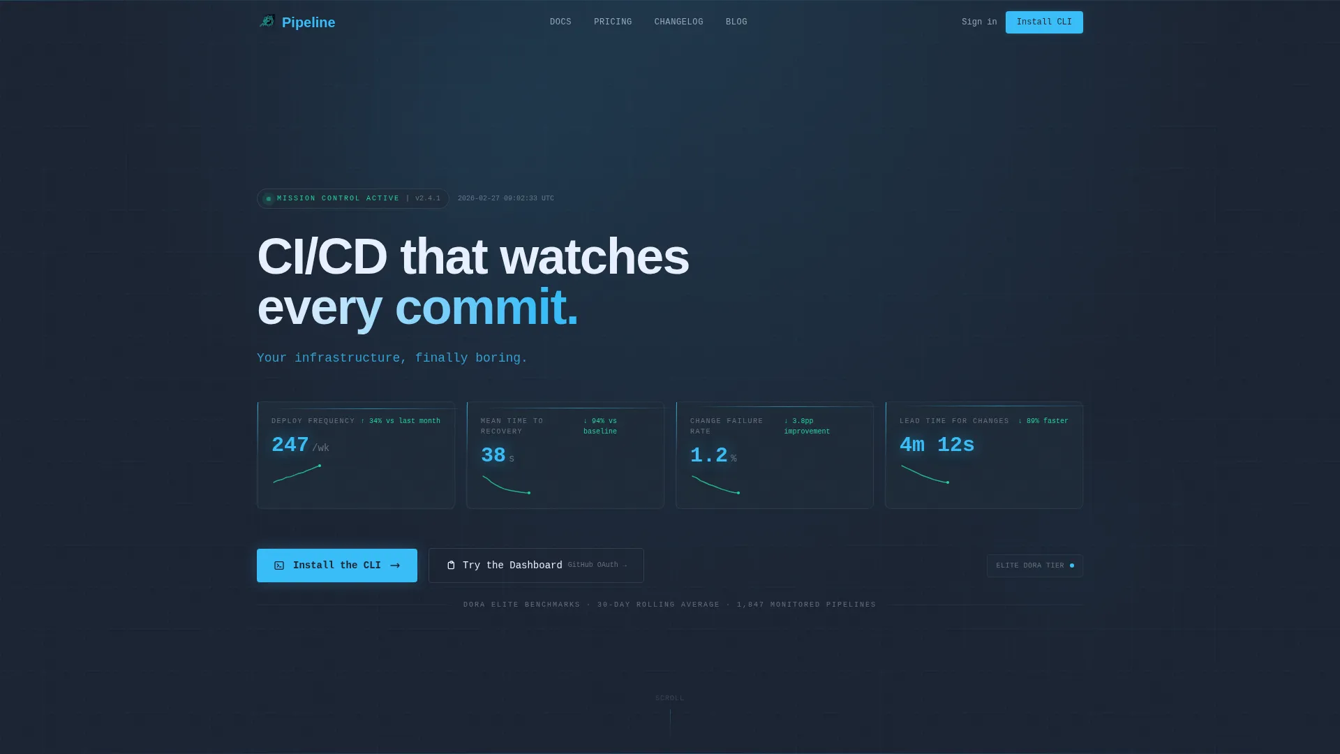
Pipeline is a scroll reveal landing page template built for CI/CD and DevOps automation platforms. It opens with a live-style DORA metrics dashboard, then progressively reveals capability layers through animated schematic cards. The design uses a deep terminal slate and cyan color system to feel like a real operations center, driving visitors toward a CLI install or browser sandbox trial.
by Rocket studio
Quick summary
Pipeline is a single-page, scroll-driven landing page template for CI/CD and DevOps automation tools. It leads with glowing DORA metrics, unfolds feature layers one section at a time, and closes with a one-click CLI install command. The visual language is dark, data-dense, and precise, aimed squarely at platform engineers and DevOps leads.
Who this template is for
This template was built for technical product teams who need to earn trust fast. It speaks the language of engineers before it asks anything of them.
- Platform engineers and DevOps leads who manage multiple pipeline tools and want to present a single, consolidated solution
- Startup CTOs who handle their own site reliability duties and need a credible, conversion-focused product page
- Developer tool founders launching a CI/CD or DevOps automation product to a technically demanding audience
What problem this template solves
Most DevOps product pages drown visitors in marketing copy. Engineers tune that out immediately. This template leads with the numbers engineers care about and builds trust before the pitch begins.
- Fragmented toolchains and mixed-signal messaging make it hard to communicate the value of a unified CI/CD platform
- Generic SaaS landing page designs feel wrong for infrastructure tools, eroding credibility before the scroll even starts
- No clear install path or sandbox trial means high-intent visitors leave without taking any action
What you get with this template
You get a complete, production-ready landing page built around a scrolling reveal structure. Every section serves a specific job in the conversion flow, from first impression to final install.
- A stats-led hero section with four glowing DORA metrics and micro-sparklines that establish credibility in under three seconds
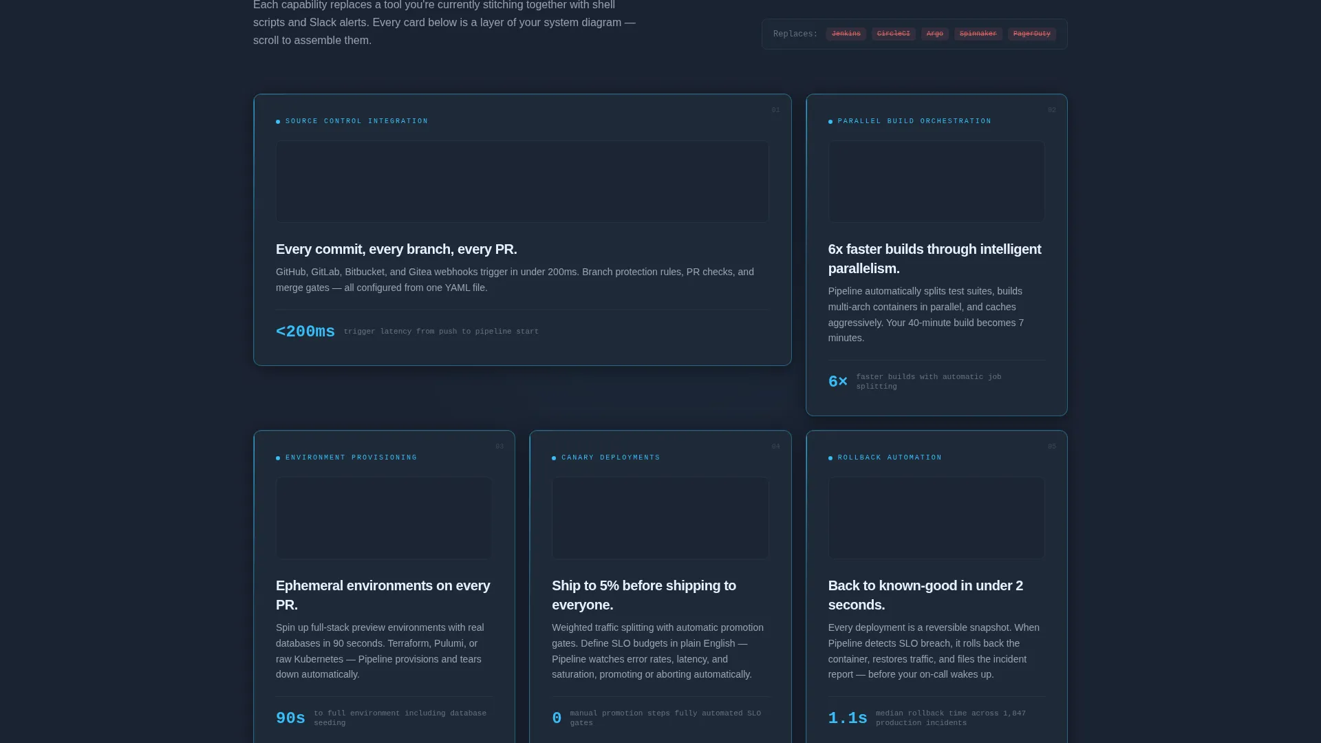
- Five progressive feature reveal cards that each assemble from wireframe to full-color as they enter the viewport
- A dual-path call-to-action block with a one-click terminal install command and a secondary browser sandbox link
Feature list
This template includes six core design and layout capabilities, each derived directly from the brief.
Live Metrics Hero Dashboard
The header section renders four real DORA metrics as glowing cyan numerals on a deep terminal slate background. Deployment frequency (247 deploys per week), mean time to recovery (38 seconds), change failure rate (1.2 percent), and lead time (4 minutes 12 seconds) appear alongside individual micro-sparklines covering the last 30 days. A single monospaced tagline fades in beneath the data.
Scroll Reveal Feature Matrix
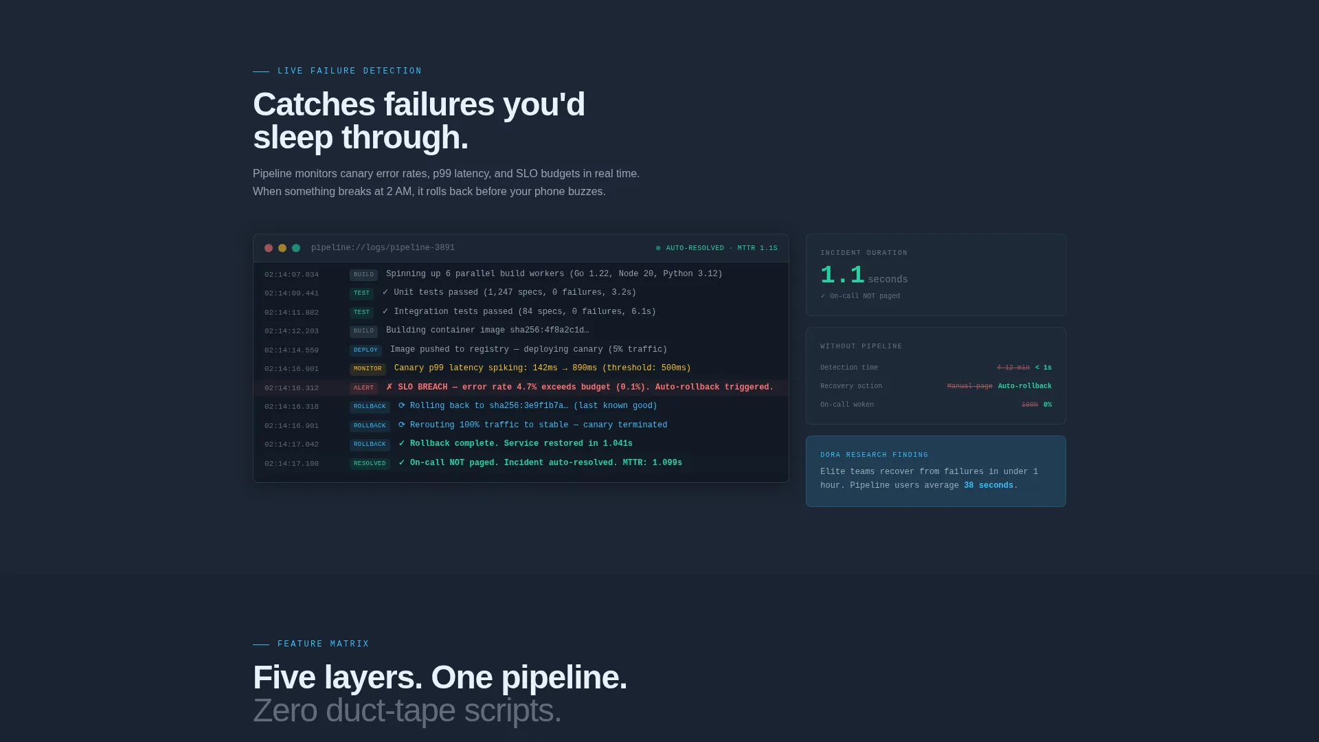
Each of the five core capabilities enters the viewport as a schematic card that visually assembles itself from a wireframe outline into a fully rendered, full-color component. The capabilities covered are source control triggers, parallel build orchestration, environment provisioning, canary deploys, and rollback automation. Each card is paired with one real metric or benchmark to reinforce the technical claim.
Platform-Aware CLI Install Block
The primary call-to-action block features a one-click copy-to-clipboard terminal command for installing the CLI. Three platform toggle pills let visitors switch between macOS, Linux, and Docker install variants. The secondary call to action links to a browser-based sandbox that requires only a GitHub OAuth login.
Data Command Visual Theme
The color system uses deep terminal slate (#1B2332) for all backgrounds, mid-gray (#3D4F5F) for structural surfaces, clear-sky cyan (#38BDF8) for live-state accents and interactive elements, and pale horizon white (#E8F0FE) for text and data labels. The palette is designed to feel like a pre-dawn airport control tower, not a standard SaaS marketing page.
Monospaced Typography System
All headline numerics and key data labels use monospaced type to reinforce the terminal aesthetic. This keeps the data-heavy hero readable and visually consistent with the engineering context. The tagline and supporting copy use clean sans-serif for contrast and legibility.
Progressive Scroll Architecture
The page is structured as a linear scroll journey. Each section is revealed in sequence, building the case for the product layer by layer. This structure mirrors the experience of reading a system architecture diagram, where each layer adds context and deepens the argument for switching to a single unified tool.
Page sections overview
| Section | Purpose |
|---|---|
| Hero Metrics Dashboard | Open with four glowing DORA metrics and a monospaced tagline to establish immediate credibility |
| Source Control Triggers | Reveal the first capability card showing commit-level pipeline activation |
| Parallel Build Orchestration | Show concurrent build handling as a schematic card with a supporting benchmark |
| Environment Provisioning | Demonstrate automated environment setup as the third progressive reveal layer |
| Canary Deploy Card | Introduce staged deployment capability with a real-world metric |
| Rollback Automation Card | Close the feature matrix with automated rollback and recovery data |
| CLI Install Block | Drive the primary conversion action with a copyable terminal command and platform toggles |
| Sandbox Trial Path | Offer the secondary path to a browser-based sandbox via GitHub OAuth |
Design & branding system
The visual identity is built around a Data Command theme. Every design decision reinforces the feeling of a live, functioning operations center rather than a promotional webpage.
- Color palette: deep terminal slate (#1B2332) for backgrounds, mid-gray (#3D4F5F) for card surfaces, clear-sky cyan (#38BDF8) for active and interactive states, and pale horizon white (#E8F0FE) for all readable text and data labels
- Typography: monospaced numerics for metrics and data readouts, clean sans-serif for body copy, with no photography or mascots anywhere in the layout
- Cyan is used sparingly and purposefully, pulsing only where an element is live, actionable, or represents a real system state
Mobile & speed optimization
The scroll reveal structure and data-dense layout are designed to remain legible and functional at smaller viewport sizes. The template keeps visual weight manageable without sacrificing the dark, technical aesthetic.
- Schematic feature cards reflow cleanly into a single-column stack on smaller screens, preserving the progressive reveal narrative
- The CLI install block and platform toggle pills are sized for touch interaction, so mobile visitors can copy the install command without friction
How this template helps you convert
The page is structured so that every scroll down adds evidence. By the time a visitor reaches the install block, the case for acting has already been made five times over.
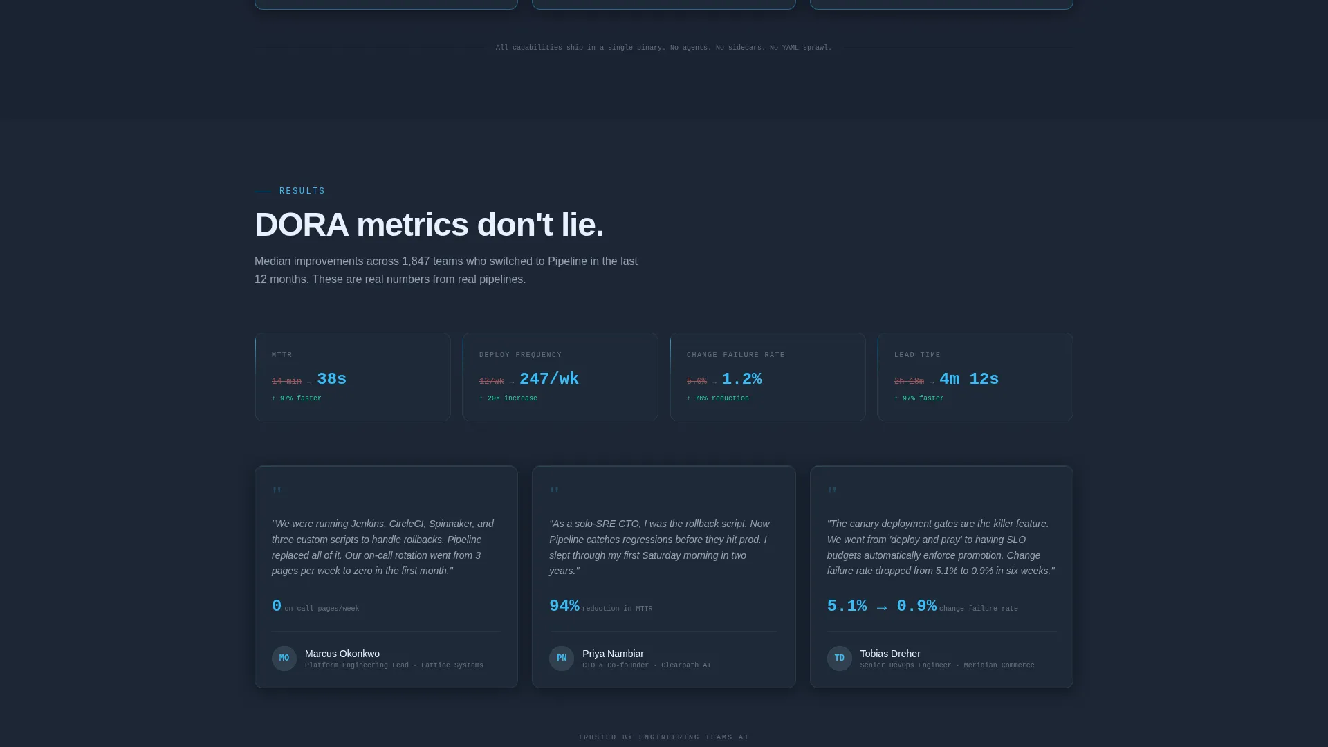
- The hero dashboard leads with four industry-standard DORA metrics that signal product maturity before a single marketing claim is made, building trust immediately with the most skeptical audience segment
- Each feature card in the scroll sequence pairs a capability with a specific benchmark, so the value of each layer is shown rather than described, reducing the need for visitors to take anything on faith
- The dual-path conversion block removes hesitation by offering both a one-second CLI install and a no-commitment browser sandbox, meeting engineers at whichever level of readiness they arrive with
Other information about this template
This template is a strong fit for any team building or marketing a DevOps automation product, continuous integration platform, or deployment pipeline tool. It is equally useful as a product launch page or an upgrade page targeting teams currently using fragmented toolchains.
- The Slate and Sky color system and Data Command theme are fully customizable, so teams can adapt the palette to match their own brand while keeping the operational control tower aesthetic
- The template is delivered as a complete single-page layout with all scroll reveal interactions and component states included, requiring no additional animation libraries to be sourced separately
- Teams using continuous delivery platforms, infrastructure-as-code workflows, or container orchestration tools will find the schematic card format a natural fit for communicating technical depth without lengthy prose
Theme
Data Command
Creative direction
Feature Matrix
Color system
Slate & Sky
Style
Scroll Reveal (Progressive)
Direction
App Download
Page Sections
Live DORA Metrics Hero Dashboard
Progressive Scroll Feature Reveal
One-click CLI Install Block
Browser Sandbox Secondary Path
Data Command Color System
Monospaced Terminal Typography
Related questions
Who is this landing page template designed for?
Can I customize the DORA metrics and benchmark numbers in the hero section?
Does the scroll reveal animation work on mobile devices?
What does the dual-path call-to-action block include?
Is this template suitable for a product that is still in early access or beta?



