Pipeline - Powerful DevSecOps Landing Page Template
Pipeline is a modular, card-grid landing page template built for DevSecOps managed services. It features an interactive dashboard header, stats-first scroll animations, and a click-through layout designed to move engineering leaders into a technical assessment flow. The AI Iridescent color system and Dynamic Motion theme make every metric feel urgent and alive.
by Rocket studio
Quick summary
Pipeline is a single-page, card-grid landing page template purpose-built for DevSecOps managed services. It opens with a live-styled vulnerability scan mockup, guides visitors through animated metric cards, and closes every scroll beat with a clear call to action. The design is dark, luminous, and motion-driven, built to earn trust from technical buyers fast.
Who this template is for
This template is built for security-forward engineering teams and the services that support them. It speaks directly to technical decision-makers who evaluate vendors on proof, not promises.
- VP Engineering leads at Series B-to-D startups shipping multiple deploys per day
- Platform teams at mid-market software-as-a-service companies overwhelmed by unresolved vulnerability alerts
- Chief Technology Officers facing an imminent compliance audit with no clear remediation plan
What problem this template solves
Manual vulnerability triage is slow, and most landing pages for security services look like slide decks. Technical buyers skip pages that lead with words instead of evidence. This template solves the credibility gap between a managed service and the engineers who need to trust it immediately.
- Generic service pages fail to communicate speed and precision to engineering audiences
- Visitors leave before they understand the risk reduction a managed pipeline service delivers
- No standard template connects real scan metrics to a low-friction conversion path
What you get with this template
You get a complete, conversion-focused landing page layout built around modular card components. Every section is self-contained and purposeful, from the animated header through to the persistent call-to-action button.
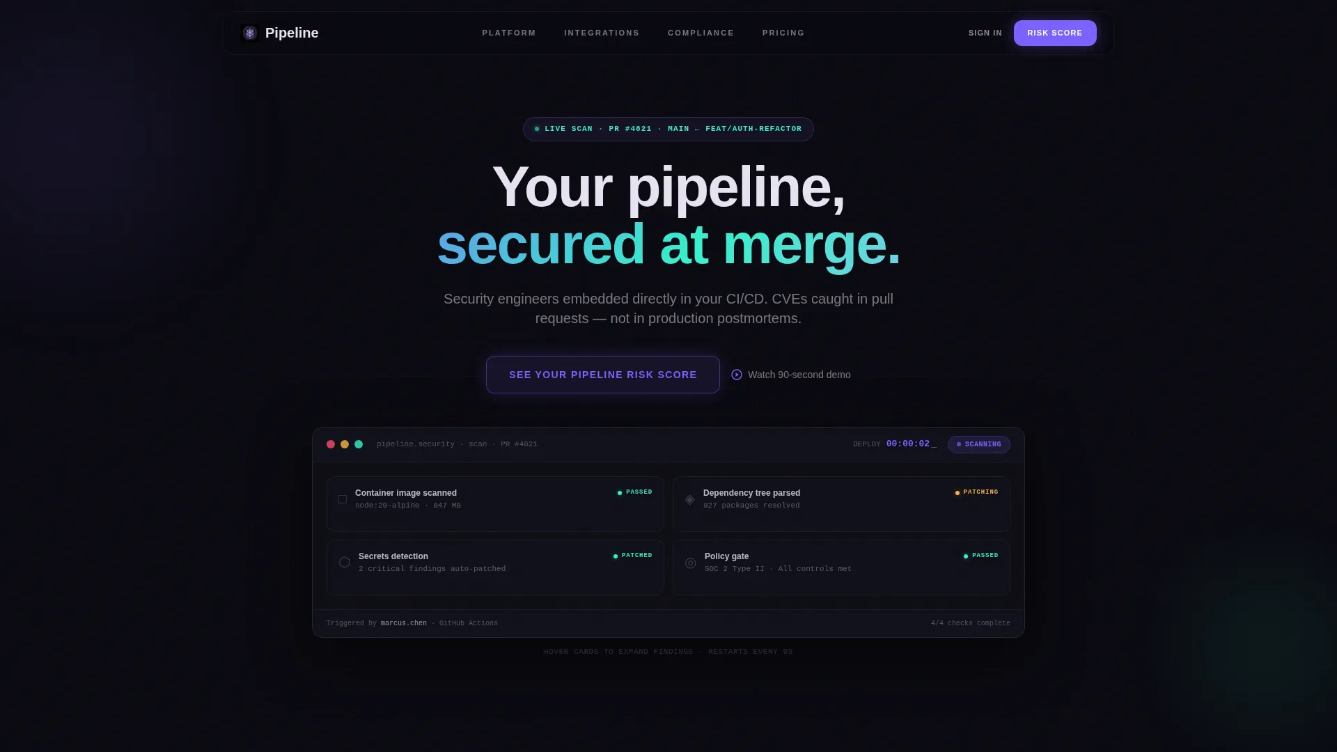
- An interactive header mockup showing a real-time vulnerability scan in animated progress
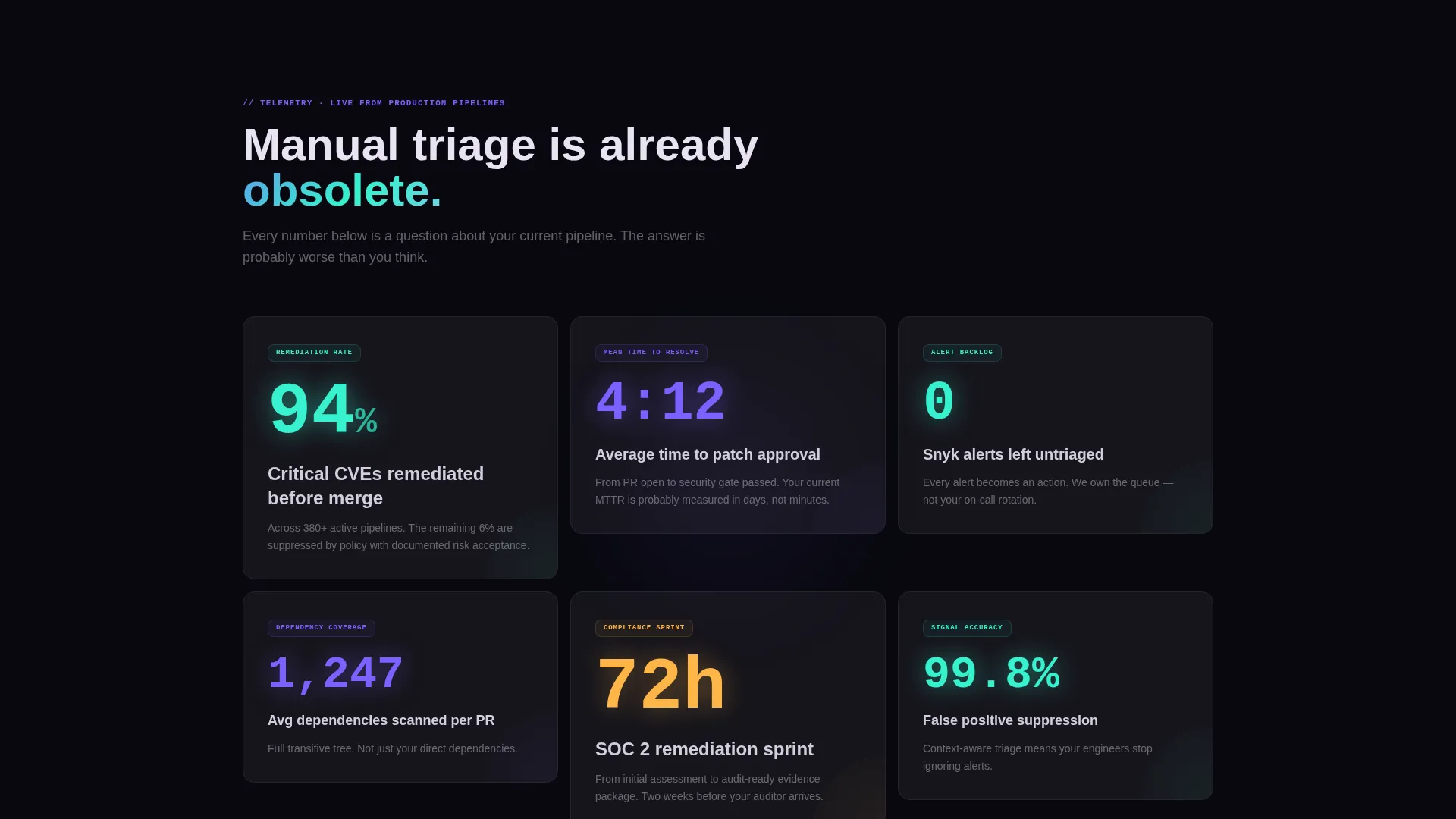
- A stats-first card grid that surfaces critical findings, remediation rates, and deploy approval counts
- A persistent floating call-to-action button that reappears after the second card row for continuous conversion pressure
Feature list
This template packs several distinct capabilities into one cohesive layout. Each feature is grounded in the brief and designed to serve a technical buyer audience.
Animated Dashboard Header
The header renders a live-styled scan in motion. Cards populate sequentially: container image scanned, dependency tree parsed, secrets detected, policy gate passed. Counts animate upward, such as 1,247 dependencies checked, 3 critical findings auto-patched, and deploy approved in 00:04:12. Visitors can hover individual cards to expand detail panes.
Stats-First Scroll Animation
Every scroll tick lands on a metric card before its explanation. Numbers appear first, large and iridescent-highlighted, then supporting context fades in beneath. This pacing mimics a live dashboard refresh and keeps technical visitors engaged longer than standard text-first layouts.
Modular Card Grid Layout
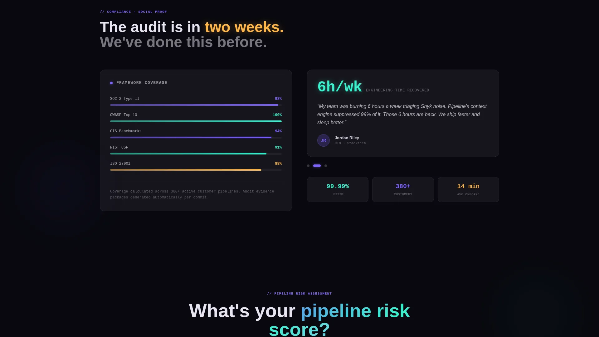
The page is built on a self-contained card grid. Cards rearrange as the visitor scrolls, moving from vulnerability statistics to response-time benchmarks to compliance coverage modules. Each card builds a cumulative case without requiring the visitor to read the page linearly.
Persistent Floating Call-to-Action
The primary call-to-action, "See Your Pipeline Risk Score," appears first as a ghost button inside the interactive header. It then resurfaces as a persistent floating button after the second card row. This dual placement ensures the conversion prompt is always visible without interrupting content flow.
Click-Through Assessment Flow
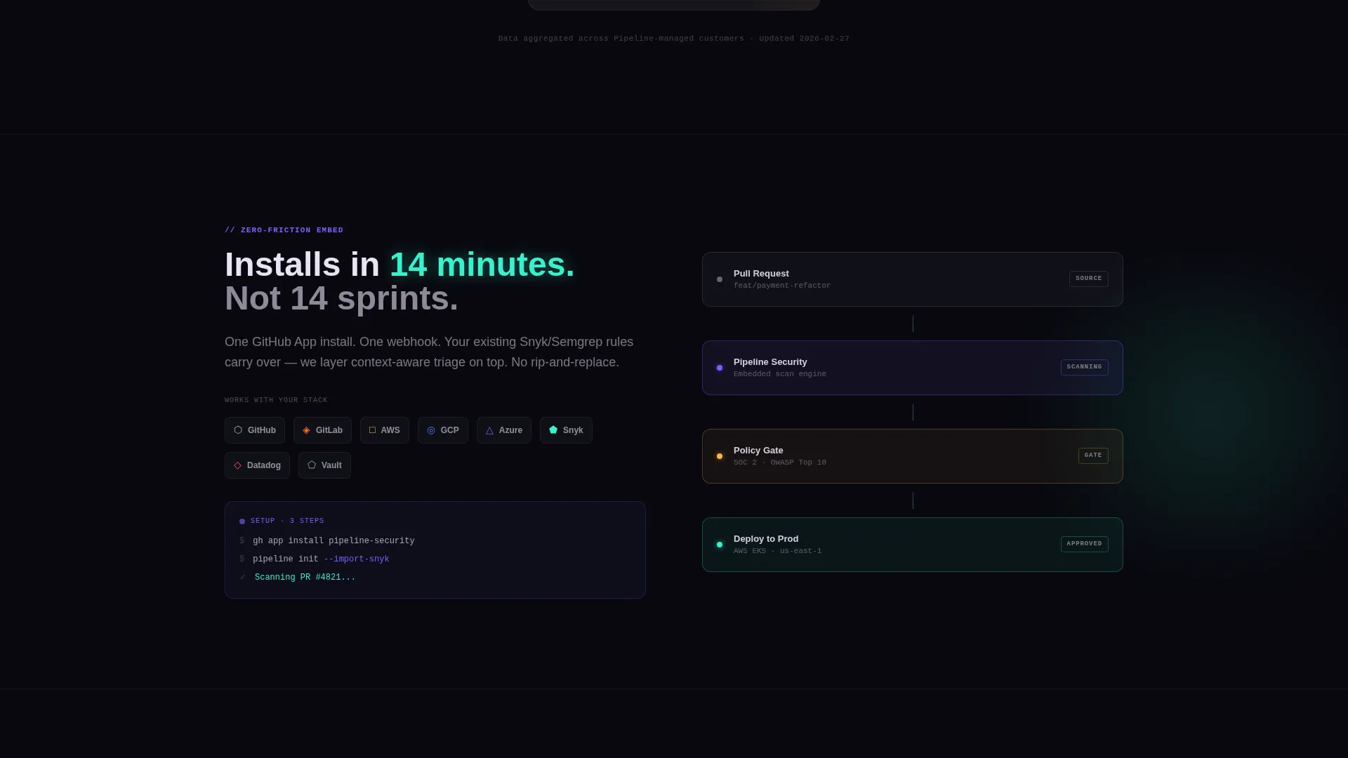
There is no on-page form. The call-to-action click leads to a short intake that asks about cloud stack, deploy frequency, and current static and dynamic application security testing tooling. The intake is framed as configuring a scan, not filling out a sales form, which reduces friction for technical visitors.
Motion Easing on Every Card Entrance
Every card entrance uses motion easing. The effect makes the page feel like a dashboard refreshing with new telemetry rather than a static marketing page. The Dynamic Motion theme applies micro-animations consistently so nothing feels decorative without purpose.
Page sections overview
| Section | Purpose |
|---|---|
| Interactive Header | Animated scan dashboard with hover-expandable cards and primary call-to-action ghost button |
| Vulnerability Stats Row | First card grid row surfacing critical CVE remediation rates and finding counts |
| Response Time Benchmarks | Card modules showing deploy approval times and mean time to remediation metrics |
| Compliance Coverage Map | Grid section visualizing policy gate coverage and audit-readiness signals |
| Persistent Floating Button | Sticky call-to-action that reappears after the second card row and follows the visitor |
| Assessment Entry Point | Click-through destination framed as a scan configuration intake, not a sales form |
Design & branding system
The visual identity follows a Dynamic Motion theme built on the AI Iridescent color system. Color appears only when something meaningful happens, keeping the dark base clean and letting data highlights carry full visual weight.
- Void black (#09090F) as the primary background, shimmer teal (#36F1CD) for success states and metric callouts, and holographic violet (#7B61FF) for primary actions and data highlights
- Pearl wash (#E8E3F3) applied to card surfaces and secondary text for readable contrast against the dark base
- Micro-animations on every card entrance and element pulse, creating the sensation of a live deployment monitor rather than a static layout
Mobile & speed optimization
The modular card grid is designed to reflow cleanly across screen sizes. Motion and animation elements are purposeful rather than heavy, keeping the experience usable on smaller viewports.
- Card grid columns collapse to a single-column stack on mobile without losing the sequential stats-first reveal order
- Floating call-to-action button repositions to a bottom-anchored position on smaller screens for consistent thumb-zone accessibility
- Hover-expandable detail panes on the dashboard header adapt to tap interactions on touch devices
How this template helps you convert
This template is engineered around a single conversion goal: moving a skeptical technical buyer from first impression to assessment intake with minimal friction.
- The stats-first card grid does persuasion work before any copy is read, letting numbers build the case that manual triage is already obsolete.
- The call-to-action placement strategy, ghost button in the header followed by a persistent floating button, ensures the offer is visible at every stage of the scroll without feeling intrusive.
- The click-through framing positions the intake as a technical tool, configuring a scan rather than submitting a lead form, which aligns with how engineering buyers prefer to engage.
Other information about this template
This template is built specifically for the DevSecOps managed service niche and its particular buyer psychology. A few additional details worth noting before you deploy it.
- The template is categorized under Technology and the DevSecOps Technology subcategory, making it relevant for services that embed security directly into continuous integration and continuous delivery pipelines
- The card grid style and click-through landing page direction are a strong fit for services where trust must be established quickly with a technical audience
- The intersection match score of 13 reflects a tight alignment between the template style, theme, and niche, meaning less customization is needed to make it feel native to the space
- The AI Iridescent palette and Dynamic Motion theme work together to communicate precision and real-time awareness, two qualities that matter most to engineering teams evaluating a security partner
Theme
Dynamic Motion
Creative direction
Stats-First Impact
Color system
AI Iridescent
Style
Card Grid (Modular)
Direction
Click-Through
Page Sections
Animated Live-scan Dashboard Header
Stats-first Card Grid with Scroll Reveals
Persistent Floating Call-to-action Button
Click-through Assessment Entry Flow
Dynamic Motion Card Entrance Animations
AI Iridescent Color System
Related questions
Who is this landing page template designed for?
Does this template include a contact form?
Can I customize the animated metric numbers in the dashboard header?
Is the modular card grid flexible enough for different service tiers?
What makes this template different from a generic software-as-a-service landing page?



