Real Estate Marketing Automation Landing Page
Pipeline is a card grid landing page template built for real estate marketing automation platforms. It targets mid-size brokerages with twenty to eighty agents and team leads buried in disconnected tools. The Data Command theme, Teal Catalyst color system, and Spec Sheet creative direction give every section a sharp, dashboard-like authority that earns trust before a visitor reads a single word.
by Rocket studio
Quick summary
Pipeline is a single-page landing page template designed for real estate marketing automation platforms. It unifies listing data, drip campaigns, and showing feedback into one visual nerve center. The modular card grid layout, dark Data Command theme, and Comparison/Versus conversion structure make it ideal for platforms selling to mid-size brokerages ready to leave fragmented workflows behind.
Who this template is for
This template speaks directly to the people running real estate operations at scale. It is built for platforms whose buyers feel the daily cost of tool sprawl and manual workarounds.
- Mid-size brokerages managing twenty to eighty agents who need a single operational hub
- Team leads exporting data from multiple CRM tools and losing time on manual follow-ups
- Marketing coordinators building property flyers late at night because brand assets are scattered
What problem this template solves
Real estate teams waste hours toggling between disconnected platforms to complete tasks that should take minutes. The template frames this pain sharply and positions the platform as the solution with confidence.
- Agents sending follow-ups across seven tabs instead of one unified workflow
- Marketing teams hand-building flyers without centralized brand kit access
- Team leads who cannot see pipeline forecasts, split attribution, or compliance status in one place
What you get with this template
This template delivers a complete, conversion-ready landing page structure built around real estate marketing automation. Every section is purposeful, and the visual hierarchy guides visitors from proof to understanding to action.
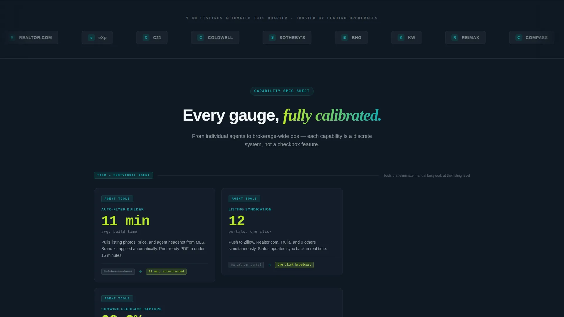
- A Logo Bar header with a scrolling strip of brokerage and MLS partner logos and a live stat above it
- A modular card grid that escalates from individual-agent tools to team intelligence to brokerage-wide operations
- A sticky Comparison/Versus toggle at the midpoint with a dynamic spec table and a gated primary call to action form
Feature list
This template packages six tightly scoped capabilities into a single landing page. Each one is grounded in the source brief and designed to do specific conversion work.
Scrolling Logo Bar Header
The header opens with a clean horizontal strip of brokerage and MLS partner logos scrolling in a slow infinite loop against the midnight dashboard background. A single proof stat sits above the loop, letting brand recognition do the trust-building before a visitor reads any body copy.
Escalating Card Grid Layout
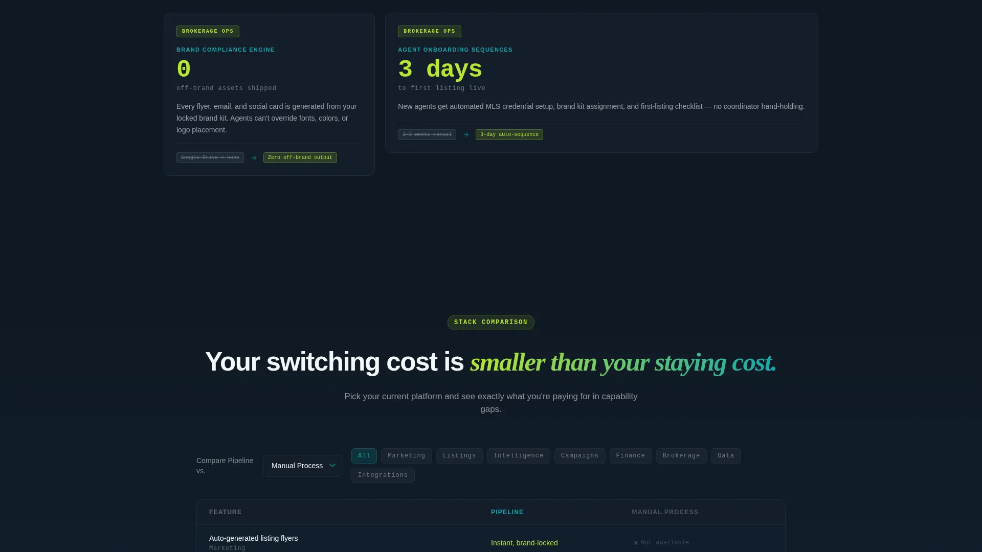
The modular card grid is organized into three altitude tiers. The first tier covers individual-agent tools such as auto-flyers and listing syndication. The second tier introduces team-level intelligence including pipeline forecasting and split attribution. The third tier addresses brokerage-wide operations like brand compliance and onboarding sequences.
Spec Sheet Card Design
Each card in the grid is styled like a technical data sheet. The feature name appears in bold teal, a single performance metric displays in oversized chartreuse type, two sentences of plain explanation follow, and a muted comparison badge shows the old workflow versus the Pipeline approach side by side.
Sticky Comparison Toggle
A sticky side-by-side toggle appears at the midpoint of the page. Visitors can select their current platform from a dropdown and watch a spec table populate dynamically with feature checks, speed benchmarks, and integration counts. This component is the page's primary conversion anchor.
Dual call to action Architecture
The primary call to action, "Run Your Brokerage Comparison," gates behind a two-field form asking for work email and current platform. A secondary path, "See the Spec Sheet," offers a PDF one-pager download with no form required, creating a lower-friction entry point that supports retargeting.
Teal Catalyst Color System
The color palette is built around four roles: deep operational teal for brand anchoring, midnight dashboard for card backgrounds and section dividers, crisp interface white for typography and breathing room, and reactive chartreuse that activates on hover states, toggles, and highlighted metrics.
Page sections overview
| Section | Purpose |
|---|---|
| Logo Bar Header | Builds ecosystem trust with partner logos and a single adoption stat |
| Proof Stat Strip | Anchors credibility before body copy begins |
| Agent-Level Card Row | Introduces individual automation tools like auto-flyers and listing syndication |
| Team Intelligence Row | Presents pipeline forecasting and split attribution capabilities |
| Brokerage Ops Row | Covers brand compliance and onboarding sequence features |
| Comparison Toggle | Lets visitors benchmark the platform against their current stack |
| Spec Table | Dynamically displays feature checks and speed benchmarks by platform |
| Primary call to action Form | Gates the comparison with a two-field work email and platform form |
| Secondary call to action Path | Offers a no-form PDF download to capture low-friction interest |
Design & branding system
The visual identity follows a Data Command theme that feels like a Bloomberg terminal rebuilt for clarity. The palette is dark and information-dense without being hostile, and the chartreuse accent creates a sense of live activity across the grid.
- Deep operational teal (#0D7377) as the primary brand anchor for feature titles and structural elements
- Midnight dashboard (#0F1923) for card backgrounds and section dividers, creating depth without clutter
- Reactive chartreuse (#B8E62E) firing on hover states, metric highlights, toggle activations, and "winning" comparison indicators
Mobile & speed optimization
The card grid layout is modular by design, which means it adapts well to narrower viewports without restructuring the content hierarchy. The dark palette and image-light layout also support faster perceived load times.
- Modular card structure allows the grid to reflow naturally across screen sizes without breaking the tier sequence
- No hero image or heavy illustration in the header keeps the initial load lean and immediate
- The sticky comparison toggle is designed to remain functional and readable at tablet and mobile widths
How this template helps you convert
The page is engineered around a Comparison/Versus conversion strategy. Every design decision works to make the visitor's switching cost feel smaller than their cost of staying with fragmented tools.
- The Logo Bar and proof stat open with third-party credibility, reducing skepticism before the first scroll
- The escalating card grid moves visitors from personal pain to organizational vision, building a wider case for the platform at every tier
- The sticky comparison toggle with the gated call to action form captures high-intent visitors at peak conviction, while the no-form PDF path captures everyone else
Other information about this template
This template is built for the Real Estate Software and SaaS category under the broader Technology vertical. It fits platforms competing in a crowded market where buyers routinely compare options before committing.
- The template style is Card Grid (Modular), making individual sections easy to reorder, remove, or extend without breaking the overall layout
- The Spec Sheet creative direction gives each card a data-forward authority that resonates with analytically minded brokerage decision-makers
- The Comparison/Versus landing page direction is well-suited to platforms positioning against tools like Follow Up Boss, kvCORE, and BoomTown, where feature-level differentiation drives the buying decision
- The header concept (Logo Bar) requires real partner logo assets and a current adoption metric to execute as designed
- The "See the Spec Sheet" secondary call to action assumes a PDF asset is prepared and linked before the page goes live


Theme
Data Command
Creative direction
Spec Sheet
Color system
Teal Catalyst
Style
Card Grid (Modular)
Direction
Comparison/Versus
Page Sections
Scrolling Logo Bar with Proof Stat
Three-tier Escalating Card Grid
Spec Sheet Card Format
Sticky Comparison Toggle and Spec Table
Dual Call to Action Conversion Path
Teal Catalyst Visual System
Related questions
What type of business is this template designed for?
Can the card grid sections be reordered or removed?
What assets do I need before launching this page?
Does the comparison toggle require developer setup?
Is the two-field form connected to a CRM or email tool?



