Consulting Firm 404 Error Navigation Recovery Website Template
Pivot is a consulting firm 404 error landing page built as a modular card grid. It transforms broken-link dead ends into structured navigation moments. A dramatic browser-chrome header, a comparison-style destination grid, and friction-free "Go Direct" calls to action turn lost visitors into routed ones, with a secondary email capture for anyone who still can't find what they need.
by Rocket studio
Quick summary
Pivot is a single-page 404 error landing page designed specifically for consulting firms. It uses a modular card grid layout to route lost visitors toward the content they were already looking for. The page treats the error moment as a strategic touchpoint, confident, structured, and conversion-aware, rather than an apology.
Who this template is for
This template is built for consulting firms that serve sophisticated, time-sensitive audiences. It suits teams that have restructured their websites, retired old URLs, or run active outreach campaigns that link to pages that may shift over time.
- Strategic consulting firms whose clients include C-suite executives and procurement teams
- Boutique or mid-size consultancies that need a professional fallback when URLs break or sitemaps change
- In-house web teams looking for a polished, ready-to-deploy 404 solution that matches a premium brand identity
What problem this template solves
Broken URLs are silent client-exit moments. When a partner emails a deck link or a case study URL appears in an RFP, one dead page can push a high-value visitor straight to a competitor. Standard 404 pages offer nothing, just a number and a home-page link.
- Eliminates the confusion that sends C-suite visitors bouncing before they find the content they came for
- Replaces generic error pages with a structured, intent-mapped recovery experience
- Reduces friction for procurement officers and analysts who are already vetting the firm under time pressure
What you get with this template
Pivot delivers a fully designed, single-page 404 layout with every section mapped to a specific recovery task. Each component is purposeful, and nothing is decorative without a reason.
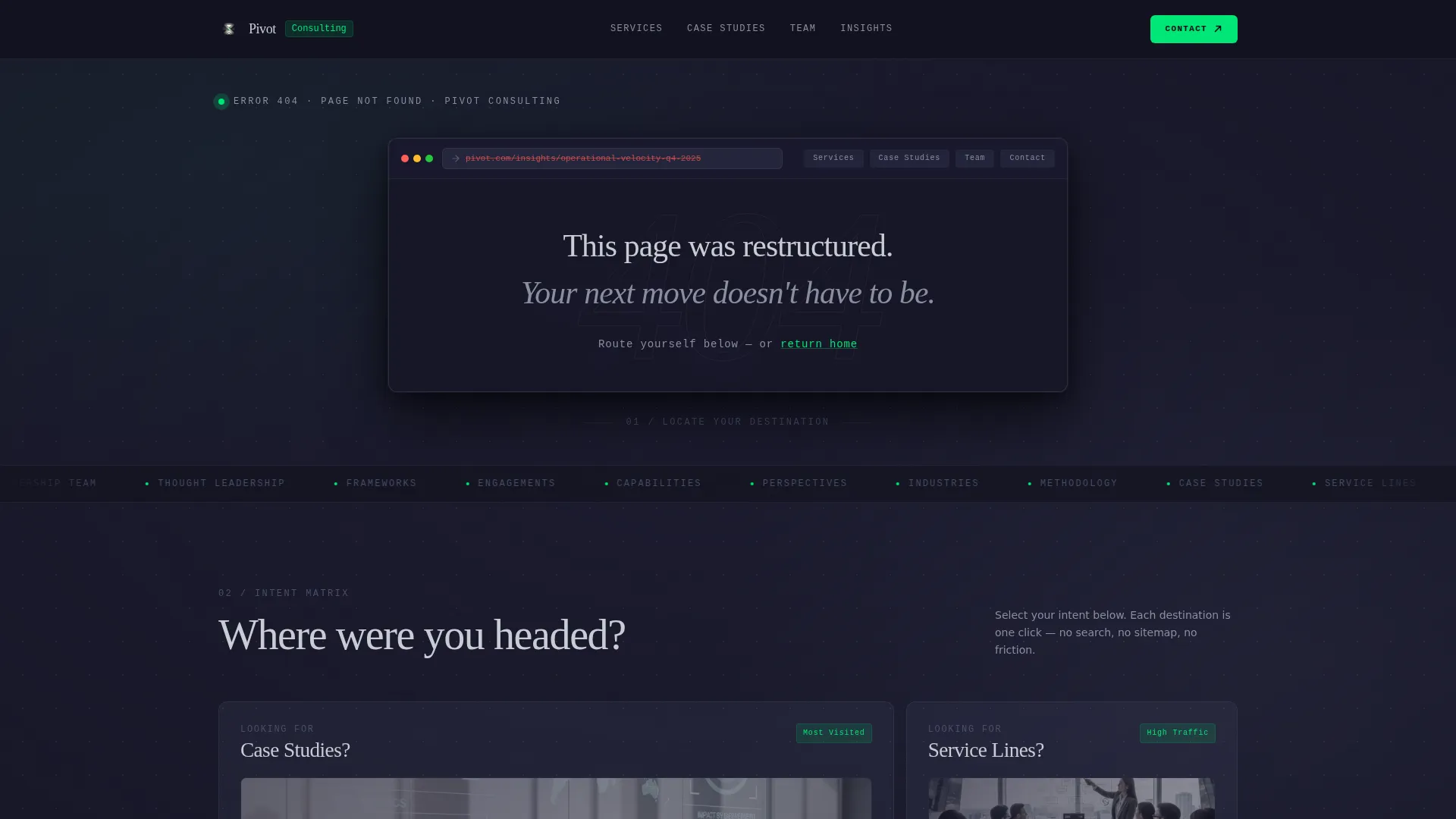
- A browser-chrome header mockup showing the broken URL alongside a full-bleed typographic 404 display and a reassuring subheading
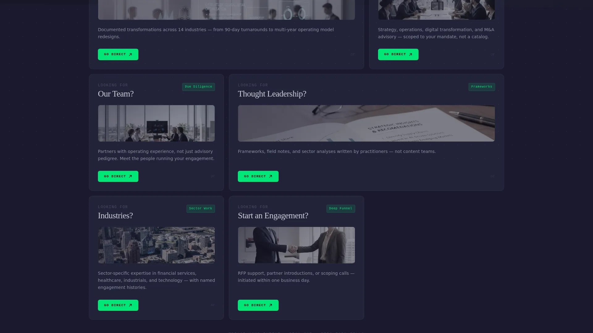
- A modular card grid with four destination cards organized by visitor intent, each with a value hook, a thumbnail preview, and a green-lit directional arrow
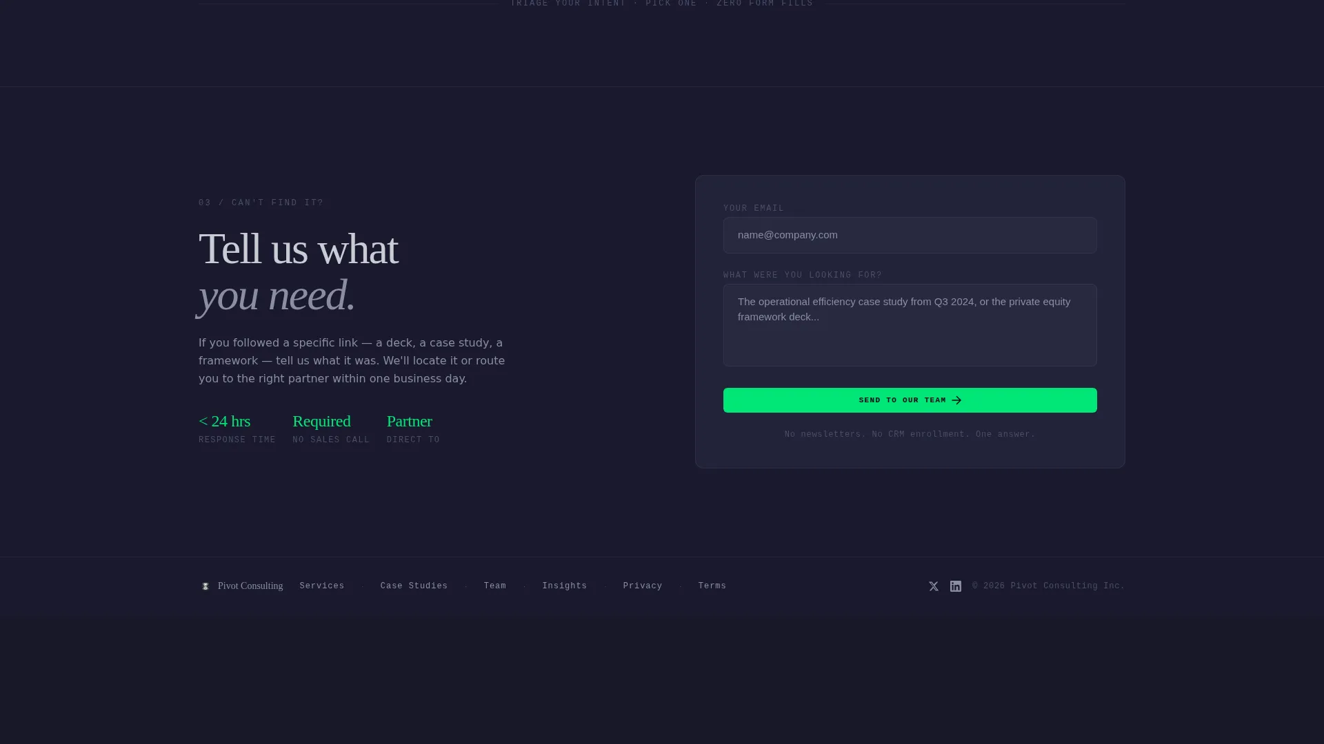
- A bottom-anchored secondary conversion section with a single-field email input and a "Send to Our Team" submit button
Feature list
A paragraph introduces the features below. Each component in Pivot was designed to do one job precisely, in the same way a well-run consulting engagement eliminates ambiguity at every handoff.
Browser Chrome Header Mockup
The header renders as a pixel-perfect browser window showing the broken URL in the address bar, the firm's navigation still visible above it. A geometric sans-serif "404" in the thinnest available weight bleeds off the viewport edges, oversized by design, not by accident.
Modular Destination Card Grid
Four cards occupy the main body of the page, each representing a likely visitor intent: case studies, team profiles, service lines, and thought leadership. The layout mimics a Kanban board, fast to scan, decisive to act on, with cards escalating from highest-traffic destinations at the top to deeper conversion pages at the bottom.
Intent-Mapped Comparison Layout
Rather than a traditional sitemap list, the grid presents each destination as a "versus" option. Visitors self-select their intent and are routed directly, no menus to open, no search bar to use.
Friction-Free "Go Direct" calls to action
Every card carries a single primary call to action labeled "Go Direct" in electric catalyst green. No forms, no modal pop-ups, no extra steps. Each action is a single click to the intended destination.
Anchored Email Capture Form
A secondary conversion path sits fixed at the bottom of the page. A single-field input asks "Can't find it? Tell us what you need" and routes the submission to the firm's team. It serves visitors who cannot self-triage without adding bulk to the primary layout.
Carbon Fiber Visual System
The entire page runs on a four-tone color system: graphite black backgrounds, titanium card surfaces, aluminum body text, and catalyst green reserved exclusively for interactive states. Every highlight is earned by function.
Page sections overview
| Section | Purpose |
|---|---|
| Browser Chrome Header | Displays the broken URL and the oversized 404 typographic treatment with a reassuring subheading |
| Destination Card Grid | Routes visitors by intent across four modular cards covering key site areas |
| Card Value Hooks | Delivers a one-sentence reason to click within each destination card |
| Thumbnail Previews | Gives each card a visual anchor so visitors recognize the content type at a glance |
| "Go Direct" calls to action | Provides a single green-lit action button per card for zero-friction navigation |
| Email Capture Footer | Captures visitors who cannot self-route via a minimal single-field contact prompt |
Design & branding system
The visual identity follows a Carbon Fiber palette built around four tones. Nothing is stylistic for its own sake, every color choice has a structural role in guiding the eye and signaling interactivity.
- Background surfaces use woven graphite black (#1A1A2E); card surfaces lift in titanium mid-gray (#4A4E69); body text runs in machined aluminum (#C9CCD5)
- Electric catalyst green (#00E676) appears only on interactive elements such as call to action buttons and directional arrows, making every clickable element feel intentional and distinct
- Typography uses a geometric sans-serif rendered at extreme weights, ultra-thin for the large 404 display, clean and readable for card body copy
Mobile & speed optimization
The card grid layout is inherently well-suited to vertical scrolling on smaller screens. Cards stack cleanly, text remains legible at standard mobile viewport sizes, and the email capture footer stays accessible at the bottom of the flow.
- The modular grid structure adapts from a multi-column desktop layout to a single-column mobile stack without losing the intent-triage logic
- The single-field email form at the bottom requires minimal interaction on touch devices, reducing drop-off at the secondary conversion step
How this template helps you convert
Pivot is built around one idea: a firm that handles a broken link as deliberately as it handles a client engagement earns more trust than one that apologizes. Every design decision moves a lost visitor toward a next step rather than an exit.
- The escalating card order prioritizes the most-visited destinations first, meaning the majority of visitors find their intended content within the first two cards they see
- The "Go Direct" call to action on every card removes all intermediate steps, so a C-suite visitor who arrived from a partner email can reach a case study or service page in one click
- The anchored email capture form gives procurement officers and analysts a direct escalation path when no card matches their specific need, keeping the conversation open
Other information about this template
Pivot was built under the Startup Velocity theme using the Carbon Fiber color system. The template style is a Card Grid (Modular) layout, and the creative direction follows a Feature Matrix approach organized as a Comparison/Versus structure. The header concept is a Product Screenshot rendering. These design decisions make Pivot a strong fit for technology-sector consulting firms that want their digital presence to reflect the same rigor they deliver to clients.
- Template style: Card Grid (Modular) with Comparison/Versus directional flow
- Theme: Startup Velocity with a Carbon Fiber color system
- Suitable for consulting firm website templates in the technology category, particularly firms that need a high-converting 404 error page

Theme
Startup Velocity
Creative direction
Feature Matrix
Color system
Carbon Fiber
Style
Card Grid (Modular)
Direction
Comparison/Versus
Page Sections
Browser Chrome Header Mockup
Modular Destination Card Grid
Intent-mapped Comparison Layout
Friction-free Go Direct Ctas
Anchored Email Capture Form
Carbon Fiber Visual System
Related questions
Can I customize the four destination cards to match my firm's actual site structure?
Does the email capture field require any backend setup to process submissions?
Is the 'Go Direct' button label editable?
Who is the primary audience this page is designed for?
Can this template serve as a permanent 404 page rather than a temporary placeholder?



