Event Planning Digital Presence Complete Professional Website Template
Planbook is a scroll-reveal landing page template built for event planning knowledge base products. It leads with a live-style dashboard hero, animates real stats as the visitor scrolls, and drives toward an app download. The Acid Digital color system, void black, electric chartreuse, UV violet, and interface white, makes every data point feel urgent and every call to action impossible to miss.
by Rocket studio
Quick summary
Planbook is a single-page, scroll-reveal landing page template designed to showcase an event planning knowledge base app. It opens with a live-dashboard hero, builds trust through animated stats and real data, then pins a persistent download call to action as the visitor scrolls deeper. Every section is structured to show the tool working before asking for the download.
Who this template is for
This template is built for teams and creators who sell or promote operational tools for the events industry. It fits anyone who needs to turn a dense, data-rich product into a compelling, high-trust landing page experience.
- Independent event coordinators who manage multiple clients and need a page that communicates real operational depth
- In-house corporate planners and venue managers who want a professional digital presence for their planning tools or staff onboarding resources
- Developers and designers building or marketing an event planning app, knowledge base, or checklist platform
What problem this template solves
Most landing pages for planning tools either look too simple to be trusted or too cluttered to be scanned. Visitors bounce before the value registers. Planbook solves this by leading with data density first and explanation second, so the product earns credibility before asking for any commitment.
- No more generic hero images that fail to communicate what the tool actually does
- No more flat layouts that bury the most convincing proof points below the fold
- No more weak calls to action that appear before the visitor has seen the product in action
What you get with this template
You get a fully structured, single-page scroll-reveal landing page with a clear visual hierarchy and a conversion path designed around progressive trust-building. Every section has a defined job and reveals a deeper layer of the product as the visitor scrolls.
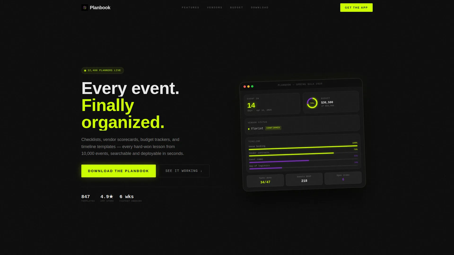
- A live-style dashboard hero showing a real event countdown, budget donut chart, vendor confirmation ticker, and Gantt-style timeline
- Animated scroll-reveal sections with stat counters, vendor scoring visuals, and a budget simulator slider
- A pinned app download call to action with paired store badges that appears after the third scroll reveal and stays fixed to the viewport
Feature list
This template ships with a set of purpose-built sections and interaction patterns. Each one is grounded in the source brief and built to serve the event planning knowledge base use case.
Live Dashboard Hero Section
The header renders a pixel-perfect app screen showing a real mid-project event state: a 14-day countdown, a budget donut chart at 73% allocated, a vendor confirmation ticker with live-status labels, and a color-coded Gantt timeline. The dashboard is angled inside a device frame with a subtle parallax float. No stock photography and no illustration are used.
Stats-First Scroll Reveals
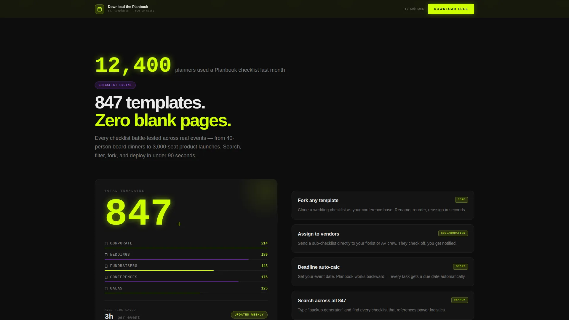
Each section leads with a headline number before the feature description appears. A counter animates from zero to 847 templates in the checklist section. Social proof stats such as "12,400 planners used this checklist last month" fade in before the supporting copy. The rhythm across every reveal is: number, proof, then explanation.
Vendor Scoring Matrix Section
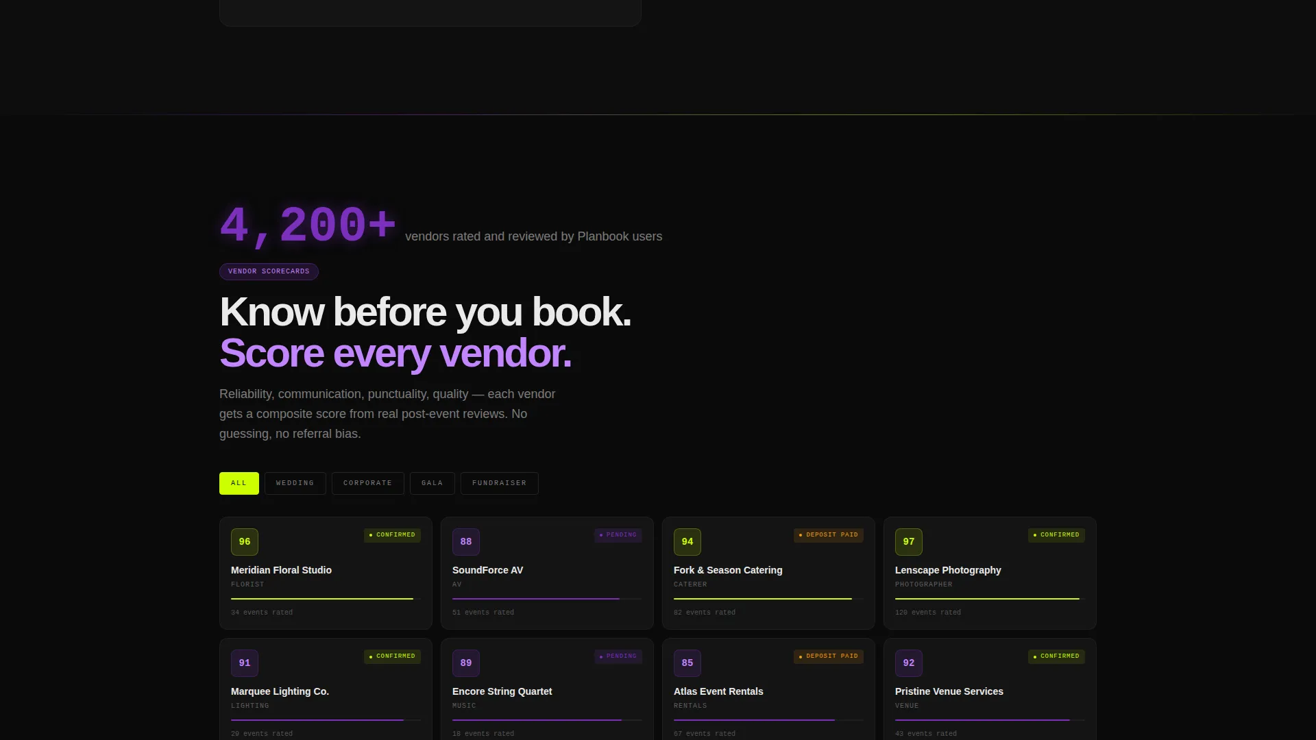
A dedicated section presents the vendor scoring matrix with live filter toggles visible in the layout. The visual communicates that the tool is interactive and decision-ready, not a static document or blog resource.
Budget Simulator Section
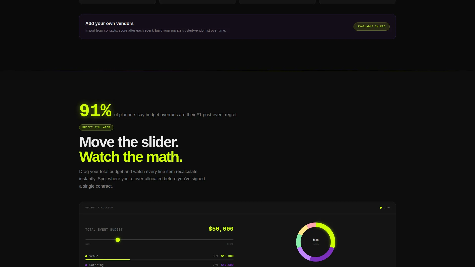
A slider component lets visitors see dollar reallocation in real time as a pie chart reshapes on interaction. This section makes the budgeting tool tangible before the visitor commits to downloading the app.
Pinned App Download Call to Action
After the third scroll reveal, the primary call to action pins to the bottom of the viewport. It reads "Download the Planbook" and carries paired App Store and Google Play badges. A secondary path offers "Try the Web Demo" for desktop visitors who prefer to explore the dashboard before downloading.
Acid Digital Color System
Electric chartreuse (#CCFF00) dominates calls to action, progress bars, and stat counters. UV violet (#7B2FBE) marks section transitions and category tags. Interface white (#EAEAEA) carries body text and card surfaces that appear to float above the void black (#0D0D0D) background. Every interactive hover state flares chartreuse.
Page sections overview
| Section | Purpose |
|---|---|
| Dashboard Hero | Opens with a live mid-project app preview in a device frame with parallax float |
| Checklist Engine | Animates a counter to 847 templates and introduces the checklist feature set |
| Vendor Scoring Matrix | Shows the vendor filter and scoring tool with live toggle visuals |
| Budget Simulator | Demonstrates real-time dollar reallocation via slider and reshaping pie chart |
| Stats Proof Band | Delivers social proof numbers before feature explanations in each reveal |
| Pinned Download call to action | Fixes the app download call to action to the viewport after the third reveal |
| Web Demo Path | Offers a secondary desktop entry point via "Try the Web Demo" |
Design & branding system
The Acid Digital color system gives this template a high-energy, data-forward visual identity. It reads like a production manager's control screen at event day, not a lifestyle blog or a brochure.
- Void black (#0D0D0D) as the base background creates maximum contrast so every data point and color accent reads clearly
- Electric chartreuse (#CCFF00) on all calls to action, counters, and hover states creates a consistent visual cue for interaction
- UV violet (#7B2FBE) on section transitions and category tags provides rhythm and hierarchy without competing with the primary accent
Mobile & speed optimization
The layout is built with a scroll-reveal structure that performs across screen sizes. The progressive reveal approach means content loads into view intentionally, keeping the experience focused on one section at a time.
- Device frame in the hero section scales responsively so the dashboard preview remains legible on smaller screens
- Pinned call to action at the viewport bottom is designed to work across mobile and desktop without obscuring content
- Section-by-section reveal pacing keeps the page digestible on touch devices where vertical scrolling is the primary navigation mode
How this template helps you convert
The entire page is sequenced to build trust through visible data before asking for any action. By the time a visitor reaches the pinned call to action, they have already watched the app work across multiple sections.
- The live dashboard hero establishes immediate credibility by showing a real, mid-project event state rather than a generic illustration or tagline
- Each scroll reveal introduces a new feature with a stat or social proof number first, so the product's scale and usage are established before the description asks for belief
- The pinned "Download the Planbook" call to action with store badges appears only after the visitor has seen three full feature reveals, reducing friction by earning the ask
Other information about this template
This template is categorized under Technology with a subcategory focus on event planning digital presence. It is purpose-built for the event planning knowledge base niche and carries a high intersection match between its template style, creative direction, and landing page goal.
- Template style: Scroll Reveal (Progressive), meaning each section animates into view as the visitor scrolls rather than loading all at once
- Theme: Dashboard Pro, a design system built around data visualization components and operational user interface patterns
- Creative direction: Stats-First Impact, where every section opens with a number or metric before the supporting copy appears
- Landing page direction: App Download, with the primary conversion goal being paired App Store and Google Play installs
- The Intersection Match Score for this template is 13, indicating strong alignment between niche, creative direction, and conversion goal
Theme
Dashboard Pro
Creative direction
Stats-First Impact
Color system
Acid Digital
Style
Scroll Reveal (Progressive)
Direction
App Download
Page Sections
Live Dashboard Hero with Device Frame
Animated Stats-first Scroll Reveals
Interactive Budget Simulator Section
Vendor Scoring Matrix with Filter Toggles
Pinned App Download Call to Action
Acid Digital Color System
Related questions
What kind of product is this template designed to promote?
Can I use this template if my product is web-only and has no app?
What makes a scroll-reveal structure effective for a data-dense planning tool?
Does the template come with placeholder data or real-looking demo content?
Who is the target visitor for a landing page built with this template?



