Event Planning Digital Presence Advanced Professional Website Template
Plannerhub is a hub-and-spoke landing page template built for event planning community forums. It combines a Tech Glass visual identity with stats-first credibility, a product screenshot hero, and a freemium conversion flow. Visitors explore real threads, see live member counts, and move toward a free trial without friction or a credit card required.
by Rocket studio
Quick summary
Plannerhub is a single-page forum landing page template designed for event planning communities. It opens with animated stat counters, a full-width product screenshot hero, and anchor navigation leading to four core spoke sections. The freemium conversion model lets visitors browse real content before any sign-up gate appears.
Who this template is for
This template is built for community builders and platform founders who serve working event professionals. It speaks directly to the people in the threads, not just the people selling the platform.
- Independent wedding coordinators managing multiple weekends at once
- Corporate event managers planning large-scale gatherings on tight budgets
- Festival producers and independent planners who need fast, peer-sourced answers
What problem this template solves
Event planners work in high-pressure windows where a wrong vendor call or a missed permit detail can unravel months of work. Generic forum templates do not signal professional credibility or move visitors toward sign-up. This template solves both problems at once.
- Visitors arrive skeptical and leave before seeing value, so the stats-first layout proves community volume before asking for anything
- Planners need to feel the forum is active and peer-level, not promotional, so the product screenshot hero shows real thread language instead of stock imagery
- A weak conversion path wastes organic traffic, so the freemium flow and delayed sticky banner earn trust before the gate appears
What you get with this template
You get a fully structured, single-page forum landing page with anchor navigation connecting every spoke section to the main header. Every section is pre-built and ready to populate with your community data.
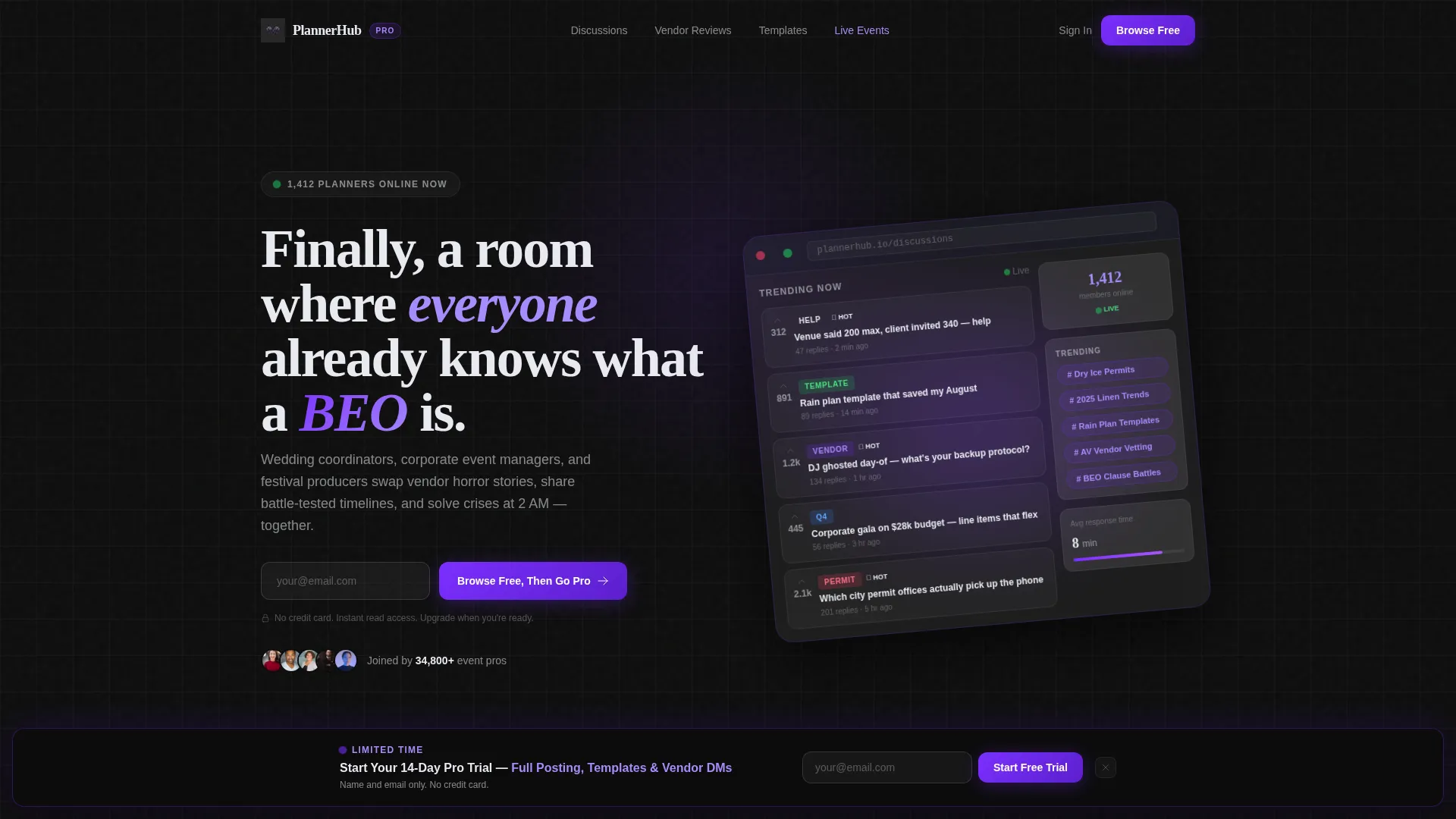
- A hero section with a tilted product screenshot card, animated stat counters, and a primary call-to-action field
- Four anchor-linked spoke sections covering Discussions, Vendor Reviews, Templates Library, and Live Events
- A delayed sticky banner that unlocks after 30 seconds of scrolling, offering a 14-day pro trial with name and email only
Feature list
This template delivers a tightly scoped set of components, each serving the stats-first, freemium conversion model described in the brief.
Animated Stat Counter Hero
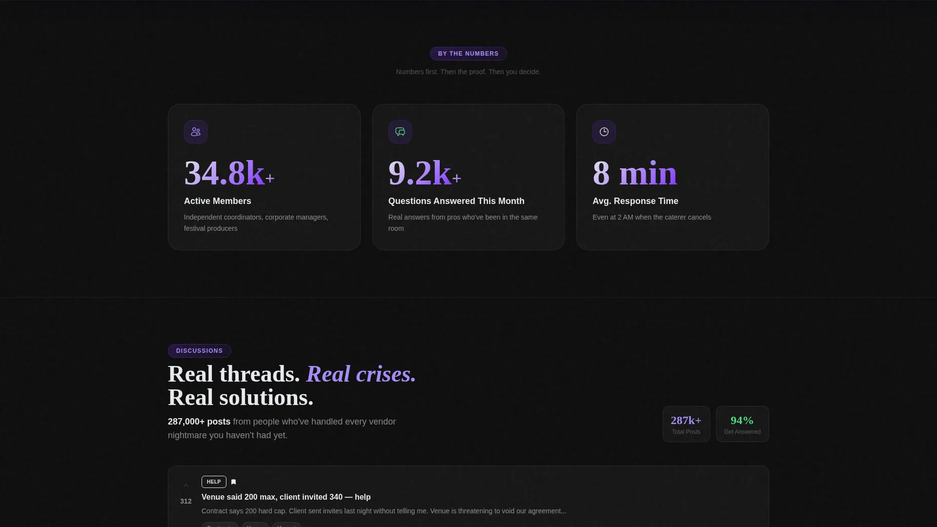
Three large stat counters animate on page entry, displaying active members, questions answered this month, and average response time in minutes. The numbers build immediate credibility before any content section loads.
Product Screenshot Header Card
A full-width forum screenshot sits on a frosted-glass card tilted five degrees, floating over the carbon background. It shows real-looking thread titles, visible upvote counts, a trending topics sidebar, and a live member-online counter to make the product the hero.
Hub and Spoke Anchor Navigation
A sticky anchor navigation bar links directly to each spoke section: Discussions, Vendor Reviews, Templates Library, and Live Events. Each section leads with its own data point before showing content previews.
Freemium Sign-Up Flow
The primary call-to-action uses a single email field with instant read-only forum access. No credit card is required, and the copy is pre-written as "Browse Free, Then Go Pro" to reduce commitment anxiety at first touch.
Delayed Sticky Conversion Banner
A secondary sticky banner appears after 30 seconds of scroll time. It offers a 14-day pro trial requiring only a name and email, giving planners who are already engaged a low-friction upgrade path.
Data-Led Spoke Sections
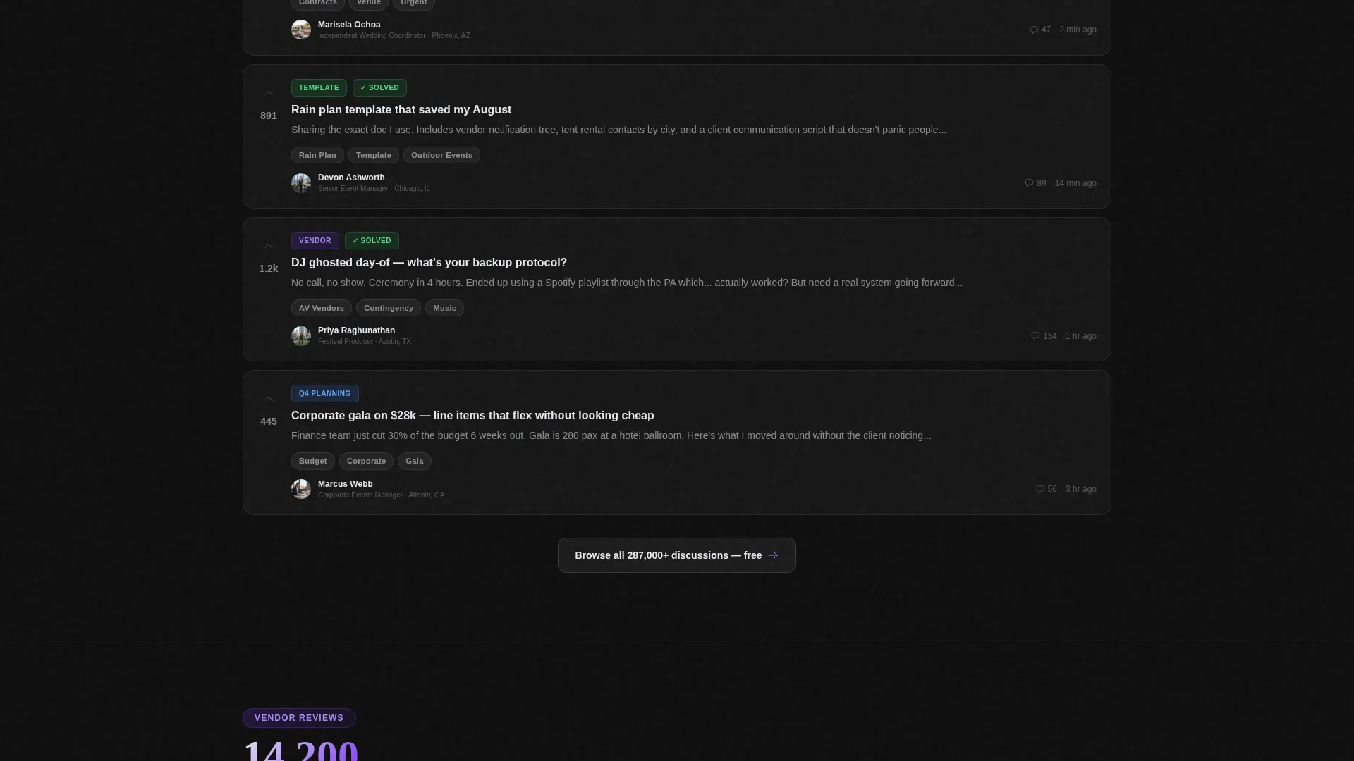
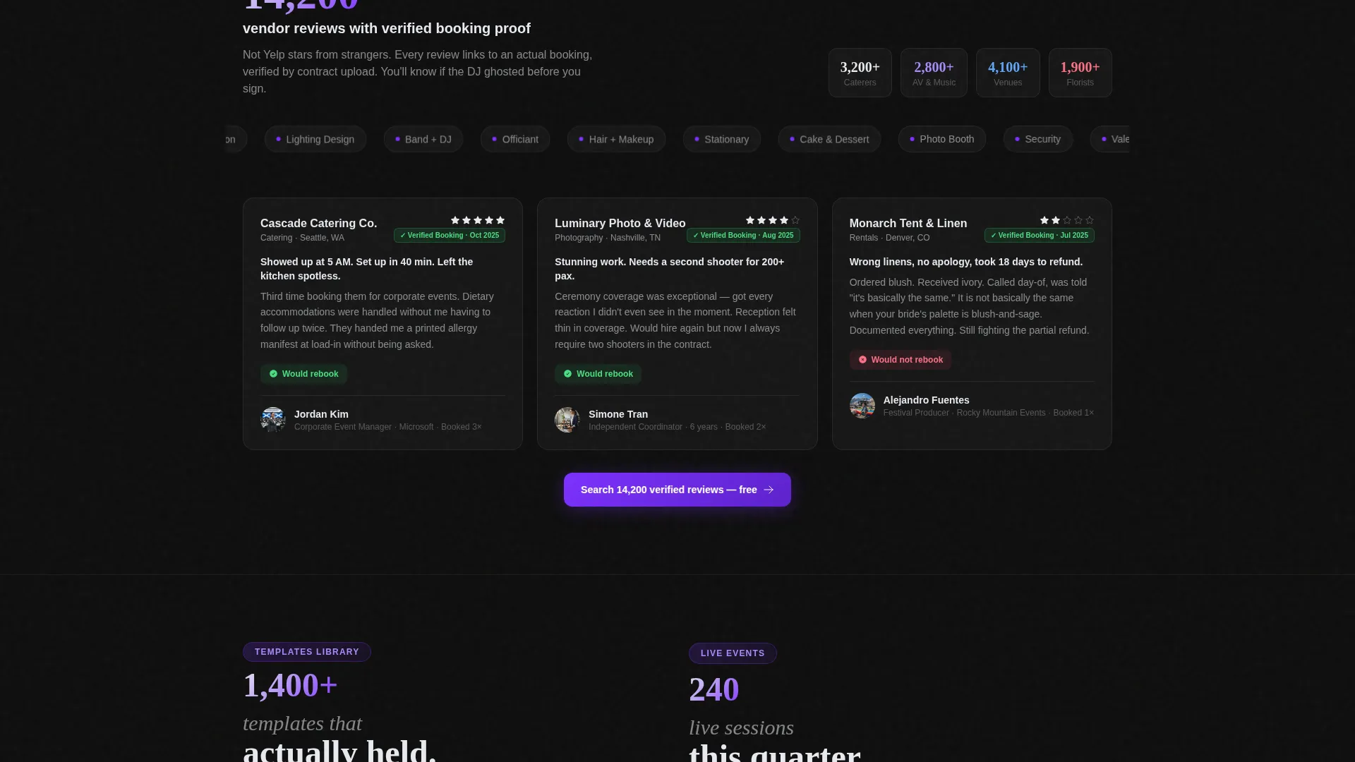
Each of the four spoke sections opens with a prominent data point before any testimonial or content preview loads. The rhythm follows number, then proof, then preview, which builds trust through demonstrated volume rather than marketing copy alone.
Page sections overview
| Section | Purpose |
|---|---|
| Hero Header | Anchors stats, screenshot, and primary sign-up field |
| Anchor Navigation Bar | Links visitors to each of the four spoke sections |
| Discussions Spoke | Showcases active thread previews with a lead data point |
| Vendor Reviews Spoke | Leads with verified review count before testimonial content |
| Templates Library Spoke | Highlights available planner templates with a usage stat |
| Live Events Spoke | Displays upcoming or active community events with data |
| Sticky Trial Banner | Delivers the 14-day pro trial offer after scroll engagement |
Design & branding system
The visual identity follows a Tech Glass theme built on a Carbon Fiber color system. The palette reads dark, lightweight, and engineered, with color appearing only where interaction is needed.
- Core colors: deep carbon black (#0D0D0D), woven graphite (#1A1A2E), frosted glass panel (#E8EAF0 at 60% opacity), and electric violet (#7B2FFF) for interactive anchors and notification pings
- The frosted-glass card treatment tilts the product screenshot five degrees with a soft violet glow bleeding from behind it on the carbon background
- Electric violet is used with restraint, reserved for call-to-action buttons, anchor links, and active state indicators so every interactive element is immediately obvious
Mobile & speed optimization
The layout is designed to stay readable and functional at smaller viewport sizes. The hub-and-spoke structure scales naturally because each section is self-contained and anchor-linked.
- The sticky anchor navigation collapses cleanly on smaller screens so users can still jump between spoke sections without losing context
- Stat counters and the product screenshot card are sized to remain legible on mobile without requiring horizontal scrolling
- The delayed sticky banner is timed to scroll behavior rather than a fixed timer, keeping the experience usable on both fast and slow readers
How this template helps you convert
The conversion architecture earns trust before it asks for anything. Visitors move through a deliberate sequence that reduces hesitation at every step.
- The animated stat counters hit immediately on scroll entry, establishing community size and responsiveness before a single piece of forum content is visible
- The primary freemium call-to-action offers read-only access with just an email address, removing the card-required barrier that causes most community landing pages to lose sign-ups
- The delayed sticky banner captures engaged visitors who scrolled past the hero but did not convert, offering the 14-day pro trial at the exact moment their interest is highest
Other information about this template
This template is built specifically for the event planning community forum niche, where credibility and peer recognition matter more than polished marketing copy. A few additional details worth noting:
- The thread language in the product screenshot, including references to a Banquet Event Order (BEO), rain-plan templates, and venue capacity conflicts, is pre-written to resonate with working event professionals immediately
- The trending topics sidebar in the screenshot header references real planning pain points such as dry ice permits and linen trends, reinforcing that the community is active and current
- The template style is hub and spoke with anchor navigation, meaning each spoke section is a distinct content zone but all remain part of the same single-page layout
- The overall tone is engineered to feel like a peer group chat for professionals, not a promotional brochure, which reduces bounce from skeptical first-time visitors
- This template is well-suited for communities built on platforms like Mighty Networks, Circle, or similar community software where a standalone landing page is needed to drive sign-ups separately from the forum itself
Theme
Tech Glass
Creative direction
Stats-First Impact
Color system
Carbon Fiber
Style
Hub & Spoke (Anchor Nav)
Direction
Freemium/Trial
Page Sections
Animated Stat Counter Hero
Product Screenshot Header Card
Hub and Spoke Anchor Navigation
Freemium Primary Sign-up Flow
Delayed Sticky Trial Banner
Data-led Spoke Sections
Related questions
Does this template require a credit card to show the sign-up flow?
Can I update the stat counter numbers to reflect my real community data?
What are the four spoke sections included in the anchor navigation?
Is this template a good fit for a forum that is still growing its member base?
How does the delayed sticky banner appear during the user session?



