Paint & Coatings Vertical SaaS Pricing Website Template
Plantcommand is a split-screen landing page template built for paint and coatings analytics dashboards. It opens with a live coating-cost estimator, then walks visitors through a Problem-to-Solution scroll arc that replaces spreadsheet chaos with real-time data clarity. The Monochrome Steel palette and Data Command theme make every metric readable at a glance, from batch yield to delta-E scores.
by Rocket studio
Quick summary
Plantcommand is a single-page, split-screen landing page template designed for paint and coatings analytics software. It leads with a functional cost estimator, follows with a scrolling problem-to-solution arc, and closes with a comparison-driven call to action. Every section earns visitor trust before asking for a sign-up.
Who this template is for
This template is built for teams selling or promoting vertical software aimed at the industrial coatings industry. It speaks the language of production floors and laboratory environments equally well.
- Plant managers running multi-shift spray lines who need batch yield and film thickness data at a glance
- Research and development chemists reformulating products to meet tighter environmental and VOC compliance standards
- Procurement directors benchmarking resin costs across multiple suppliers whose pricing is buried in specification sheets
What problem this template solves
Coatings operations teams are often stuck managing quality control through spreadsheets, handwritten batch logs, and side-by-side PDF supplier quotes. That fragmentation creates regulatory risk and margin erosion that a standard SaaS landing page template cannot address with authority.
- Spreadsheet-driven quality control tracking that obscures real-time production problems
- Fragmented supplier data that makes cost normalization slow and error-prone
- Visual spot-check processes for color matching that lack the precision of automated delta-E tracking
What you get with this template
You get a fully structured, single-page layout that mirrors the working logic of a coatings analytics dashboard. The design, copy architecture, and interactive concepts are all calibrated to convert technically sophisticated buyers.
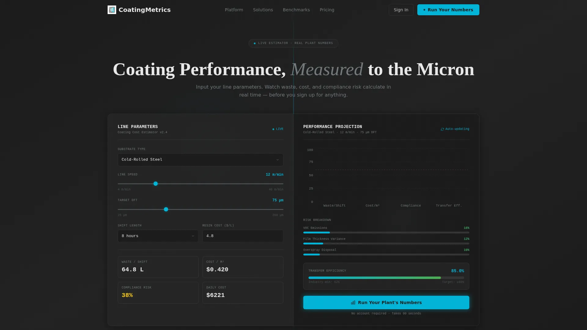
- A live calculator header where visitors input substrate type, line speed, and target dry film thickness to instantly see projected waste-per-shift, cost-per-square-meter, and compliance risk scores
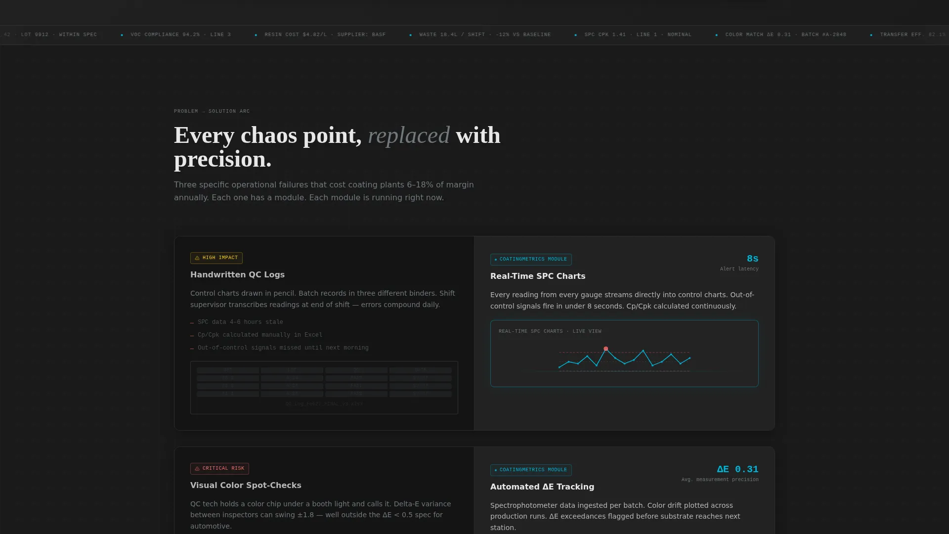
- A scrolling Problem-to-Solution arc that moves from a dim, cluttered left panel representing spreadsheet chaos to progressively brighter, data-rich right panels showing dashboard modules
- A Comparison/Versus conversion model with a primary call to action ("Run Your Plant's Numbers") and a secondary benchmarking overlay ("See How You Compare")
Feature list
This template is built around functional interaction concepts that prove the product's value before visitors reach a sign-up form.
Live Coating-Cost Estimator Header
The header splits 50/50. The left side holds input fields for substrate type, line speed, and target dry film thickness (DFT). The right side renders a live comparison chart showing waste-per-shift, cost-per-square-meter, and compliance risk scores. Numbers animate as inputs change, making the product feel real from the first second.
Scrolling Problem-to-Solution Arc
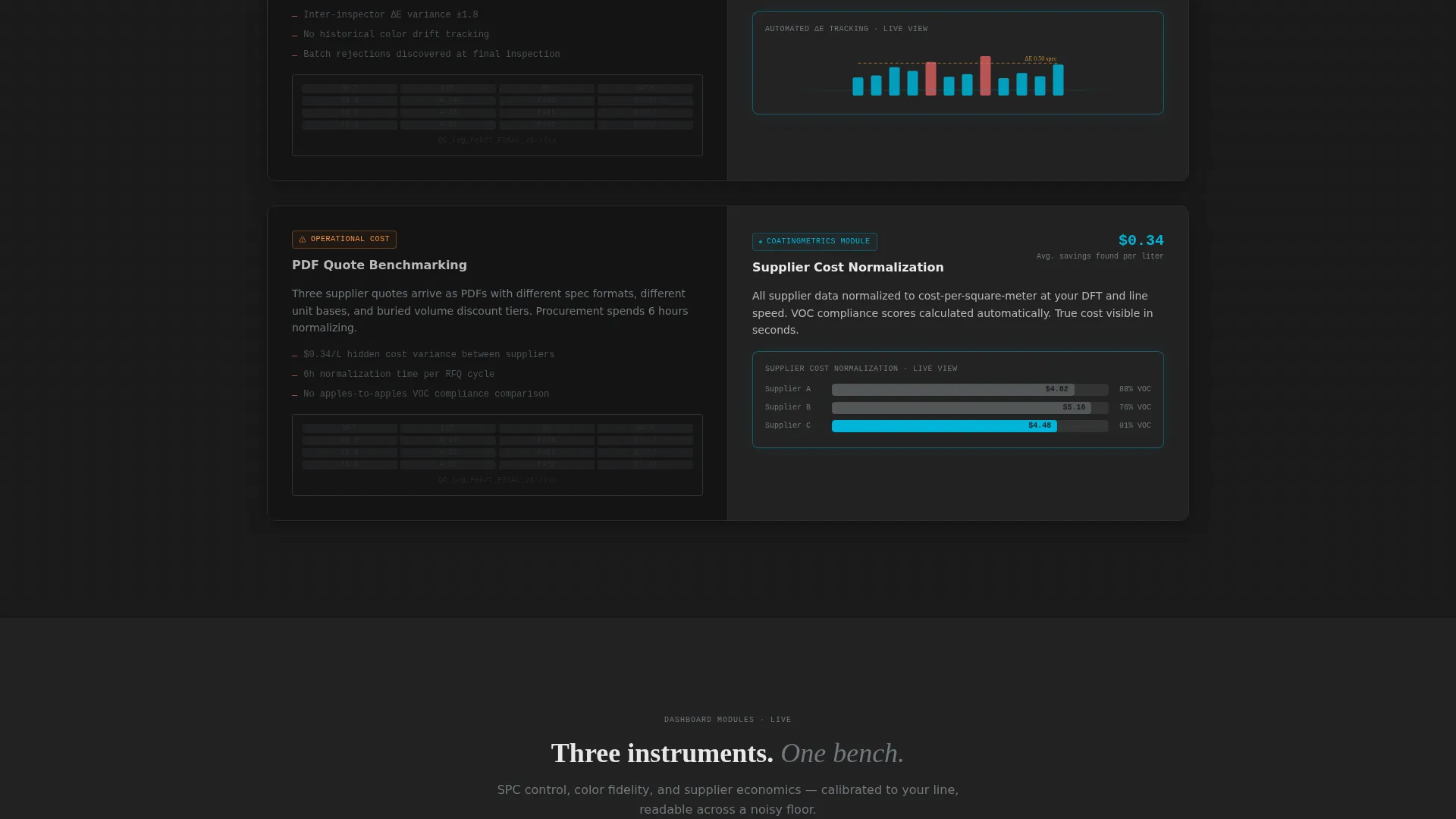
Below the fold, each scroll section pairs a dim, cluttered pain panel on the left with a bright, organized dashboard module on the right. The arc escalates from operational annoyance through regulatory risk to margin erosion, ending at a full-width, fully lit dashboard screenshot that feels like a natural conclusion.
Comparison/Versus Conversion Model
The primary call to action links back to the expanded header estimator, which now captures email, facility type, and number of coating lines. A persistent secondary call to action triggers a benchmarking overlay showing anonymized industry averages alongside the visitor's own inputs.
Monochrome Steel Visual System
The color system uses cold-rolled steel, deep graphite, titanium white, and signal cyan in a strict hierarchy. Graphite dominates backgrounds, steel handles secondary text and dividers, titanium white frames data cards and chart canvases, and cyan fires only on interactive states, live data pulses, and call-to-action elements.
Dashboard Module Sections
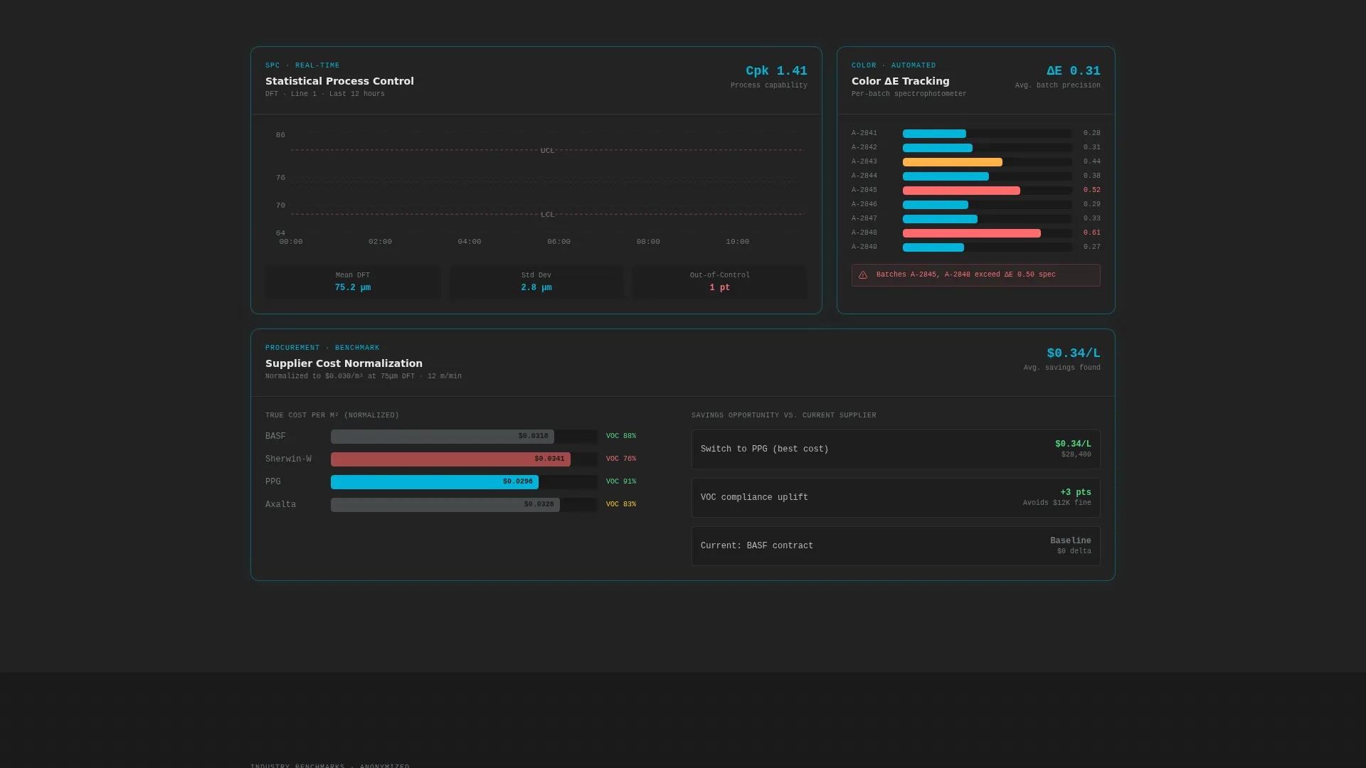
Each solution panel in the scroll arc introduces a specific dashboard module: real-time statistical process control (SPC) charts, automated delta-E color tracking, and supplier cost normalization. Each module replaces one named chaos point with a visually clear, data-driven alternative.
Data Command Theme
The overall theme is clinical and unambiguous. The layout is designed to feel like a perfectly organized lab bench, with every element calibrated for readability across a noisy production floor environment.
Page sections overview
| Section | Purpose |
|---|---|
| Estimator Header | Live cost calculator split 50/50 across substrate inputs and animated output chart |
| Pain State Panel | Dim, cluttered left panel showing spreadsheet-driven QC chaos and manual batch logs |
| SPC Chart Module | Right panel introducing real-time statistical process control charts to replace handwritten logs |
| Delta-E Tracking | Automated color-match tracking module replacing manual visual spot-checks |
| Supplier Cost Normalizer | Dashboard panel replacing side-by-side PDF supplier quote comparisons |
| Full Dashboard Reveal | Full-width, fully lit dashboard screenshot as the arc's final and inevitable payoff |
| Primary call to action Section | "Run Your Plant's Numbers" with expanded estimator capturing email and facility details |
| Benchmarking Overlay | Secondary call to action triggering anonymized industry average comparisons against visitor inputs |
Design & branding system
The Monochrome Steel palette is built for industrial readability. It draws its visual logic from a coating thickness gauge's LCD display glowing under fluorescent plant lighting: clinical, high-contrast, and built to be read at a glance.
- Four-color hierarchy: deep graphite (#2B2B2B) for backgrounds, cold-rolled steel (#71797E) for secondary text and dividers, titanium white (#E8E8E8) for data cards and chart canvases, and signal cyan (#00B4D8) reserved strictly for interactive states, live data pulses, and call-to-action elements
- The Data Command theme enforces a "nothing wasted" layout principle, where every element has a clear role and decorative noise is removed
Mobile & speed optimization
The split-screen layout is designed with the structural discipline that supports responsive adaptation. The 50/50 column structure and minimal decorative overhead keep the template lean and fast to load.
- The strict color hierarchy and low decorative overhead reduce render complexity on smaller viewports
- The estimator and scroll-arc sections are structured to stack cleanly on narrow screens without losing the problem-to-solution narrative flow
How this template helps you convert
This template earns the click by proving the product's intelligence before asking for anything. The conversion architecture is layered deliberately from top to bottom.
- The live estimator at the top delivers immediate, personalized output using the visitor's own numbers, establishing trust and demonstrating product value before a single form field is completed.
- The scrolling arc escalates urgency naturally, moving from operational annoyance to regulatory risk to margin erosion, so that by the time visitors reach the call to action, the dashboard has already answered a question they arrived with.
Other information about this template
Plantcommand sits within the Paint and Coatings Vertical SaaS category under the broader Technology segment. It is designed as a high-specificity tool for industrial analytics software marketing pages, not a generic SaaS template.
- The template style is Split Screen (50/50), the theme is Data Command, the color system is Monochrome Steel, the header concept is Calculator/Estimator, the creative direction is Problem-to-Solution Arc, and the landing-page direction is Comparison/Versus
- The intersection match score of 13 reflects a tightly targeted niche alignment between the coatings analytics use case and the chosen design and conversion approach
- This template is suitable for teams building product-led growth pages where showing the tool working is more persuasive than describing it in bullet points
Theme
Data Command
Creative direction
Problem→Solution Arc
Color system
Monochrome Steel
Style
Split Screen (50/50)
Direction
Comparison/Versus
Page Sections
Live Coating-cost Estimator
Scrolling Problem-to-solution Arc
Comparison/versus Conversion Model
Monochrome Steel Color System
Dashboard Module Panels
Related questions
Who is the primary audience for this template?
What makes this landing page different from a generic SaaS template?
Can I customize the estimator inputs and output chart fields?
How does the benchmarking overlay work?
Is the Monochrome Steel color system easy to adapt to a different brand palette?



