Playlist - Searchable Shopify Landing Page Template
Playlist is a dashboard-style landing page template built for Shopify video tutorial libraries. It features a filterable content grid, frosted glass header panels, and a dark monochrome identity with electric mint accents. Designed for first-time store owners, freelance developers, and agency teams, it turns a deep tutorial catalog into a browsable, proof-first experience that converts before it asks for anything.
by Rocket studio
Quick summary
Playlist is a single-page, dashboard-style template for Shopify video tutorial series. It organizes screen-recorded lessons into a filterable grid, uses a dark monochrome identity with electric mint accents, and drives freemium signups by letting visitors browse, filter, and preview real content before hitting a registration gate.
Who this template is for
This template is built for anyone publishing structured Shopify education at scale. The visual language and grid layout speak directly to technically minded audiences who want to find answers fast and trust the source before committing.
- First-time Shopify store owners who need clear, organized guidance without wading through scattered video platforms
- Freelance developers who want a trusted quick-reference resource they can share with new clients during onboarding
- Agency teams standardizing how junior developers learn theme building, checkout configuration, and Liquid templating
What problem this template solves
Most tutorial libraries feel like a dumped folder of files. There is no clear sense of depth, no easy way to find the right lesson for your current skill level, and no reason to sign up before you have seen whether the content is actually useful. Visitors leave before they convert.
- Unstructured video collections make it hard to find the right lesson at the right moment
- No preview access means visitors must commit before they trust the content
- Generic page layouts fail to communicate the breadth and organization of a professional tutorial library
What you get with this template
You get a fully designed, single-page dashboard layout built specifically for a searchable Shopify tutorial library. Every section has a clear job, from the frosted glass header that signals category depth to the filterable grid that proves content volume before asking for an email address.
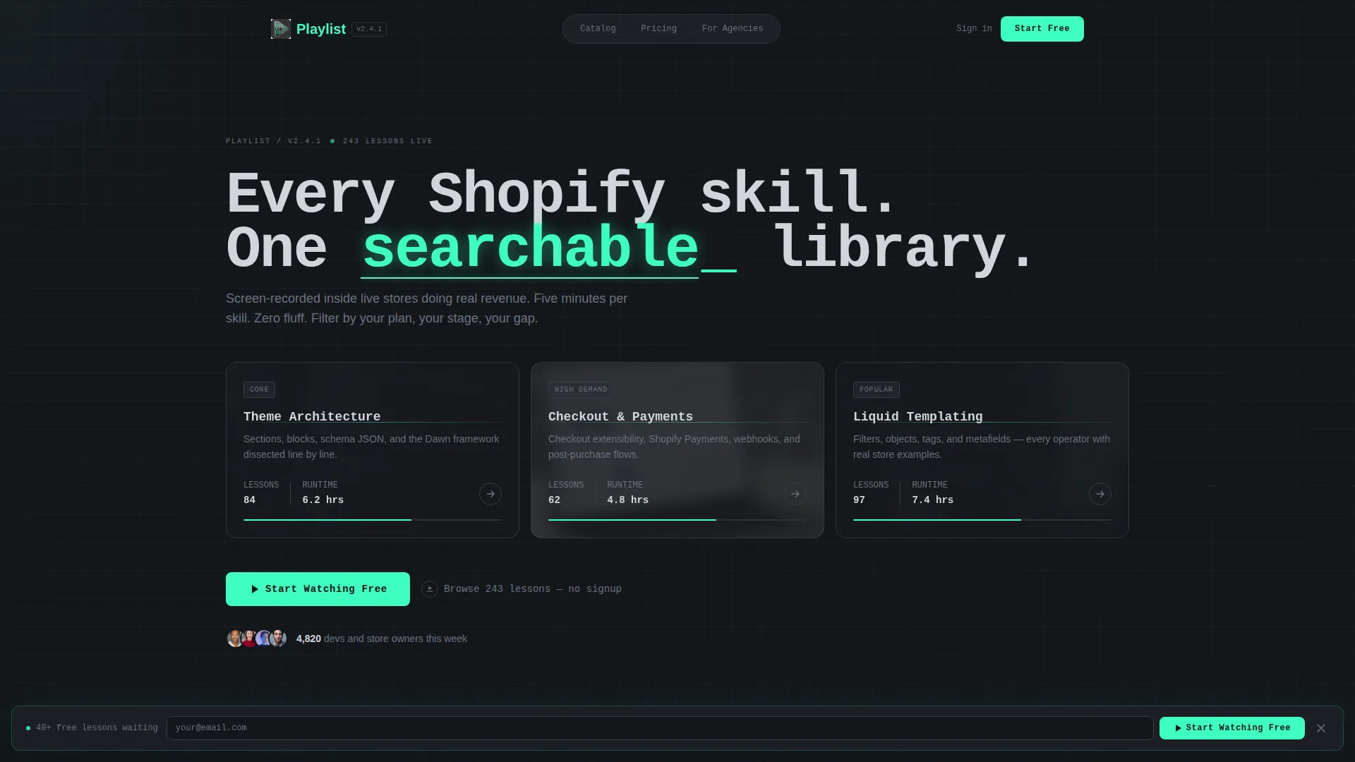
- A Dark Glass Panels header with three frosted category cards and blurred video thumbnail backgrounds
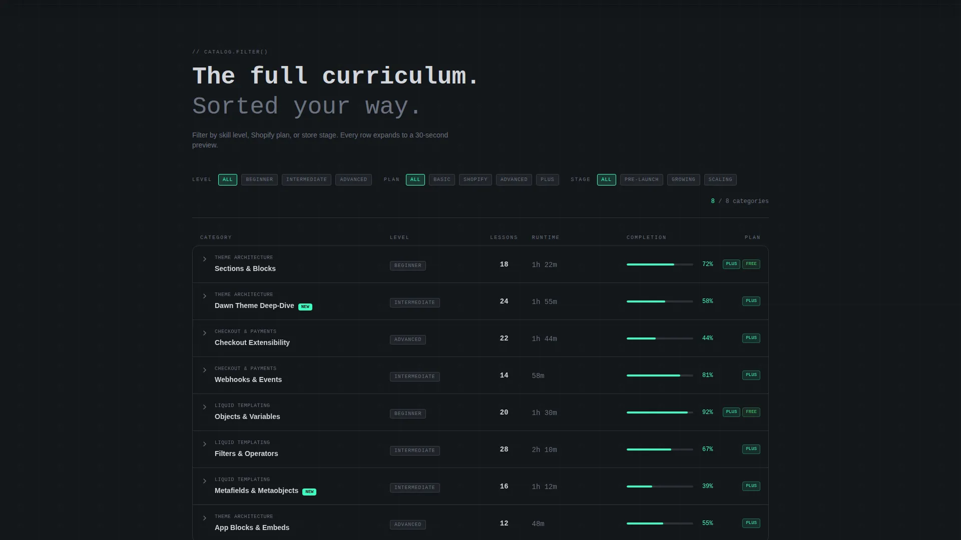
- A Feature Matrix content grid with filterable rows, lesson counts, runtime columns, and electric mint completion bars
- A sticky freemium conversion bar with a minimal signup form and a secondary viral sharing path
Feature list
This template bundles several purpose-built design and layout components. Each one is grounded in the source brief and serves a specific role in the page experience.
Frosted Glass Category Header
Three translucent panel cards float against a near-black background, each labeled with a tutorial category such as "Theme Architecture," "Checkout and Payments," and "Liquid Templating." Blurred video thumbnails pulse gently behind the glass, suggesting live content without triggering autoplay.
Filterable Tutorial Grid
The core of the page is a living spreadsheet layout. Rows group tutorials by skill level, store stage, and Shopify plan compatibility, while columns display lesson count, total runtime, and a completion-percentage bar in electric mint. Visitors can filter the grid to narrow from broad categories down to granular skill tags.
Expandable Row Previews
Every grid row is clickable and expands to show a thirty-second clip preview. This transforms passive scrolling into active browsing and lets visitors evaluate content depth before reaching the signup gate.
Sticky Freemium Conversion Bar
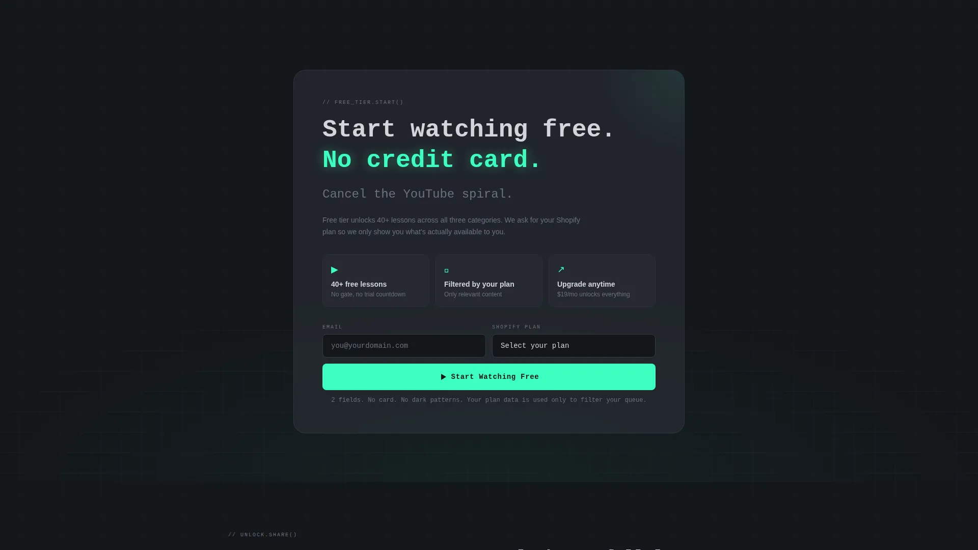
A slim bar pins to the bottom of the viewport after the visitor scrolls past two grid sections. It carries the primary call to action and a lightweight form asking only for email address and current Shopify plan tier, reducing friction while pre-qualifying leads.
Viral Sharing Unlock Path
A secondary conversion path lets visitors unlock one full tutorial by sharing the page. This creates a low-friction viral loop that extends reach without requiring paid promotion or a second signup flow.
Monospaced Oversized Typography
Headlines use tight, monospaced type set at an oversized scale. The hero headline sits in brushed chrome above the panels, and the word "searchable" carries an electric mint underline styled like a blinking cursor, reinforcing the IDE-inspired visual identity.
Page sections overview
| Section | Purpose |
|---|---|
| Glass Panel Header | Introduces tutorial categories with frosted card visuals and blurred thumbnail backgrounds |
| Hero Headline Block | Delivers the core value statement above the category panels in oversized monospaced type |
| Primary Filter Grid | Groups tutorials by skill level, store stage, and plan compatibility in a scrollable data grid |
| Expandable Row Previews | Lets visitors click any row to watch a thirty-second clip before committing to sign up |
| Sticky Conversion Bar | Pins a freemium call to action to the bottom viewport after two grid sections have scrolled past |
| Viral Unlock Prompt | Offers one free full tutorial in exchange for a page share, creating a referral loop |
Design & branding system
The visual identity follows a Directory and Discovery theme built on a Monochrome Steel color system. The palette feels like a dark-mode code editor at golden hour: industrial and focused, with life appearing only where attention needs to land.
- Core colors are deep gunmetal (#1B1F24) for backgrounds, brushed chrome (#A8B0B9) for body text and secondary labels, and panel divider charcoal (#2C3038) for grid row separators
- Electric mint (#3DFFC0) is used exclusively for progress bars, active filter states, call-to-action buttons, and the hero underline accent, keeping every high-intent element immediately visible
- Typography is tight and monospaced throughout, reinforcing the toolbox-and-IDE character of the layout
Mobile & speed optimization
The dashboard grid layout is designed to translate cleanly from wide desktop viewports to smaller screens. The data-grid structure collapses gracefully so key information stays accessible without horizontal scrolling.
- Grid rows reflow to a stacked card format on narrow viewports, preserving filter and preview functionality
- The sticky conversion bar remains anchored at the bottom on all screen sizes, keeping the primary call to action in reach throughout the scroll
- Blurred thumbnail backgrounds and frosted glass panel effects are handled through CSS, keeping the visual richness lightweight
How this template helps you convert
The page is structured around a proof-first philosophy: visitors earn the right to be asked for their email only after they have already experienced the value of the library. Every layout decision supports this sequence.
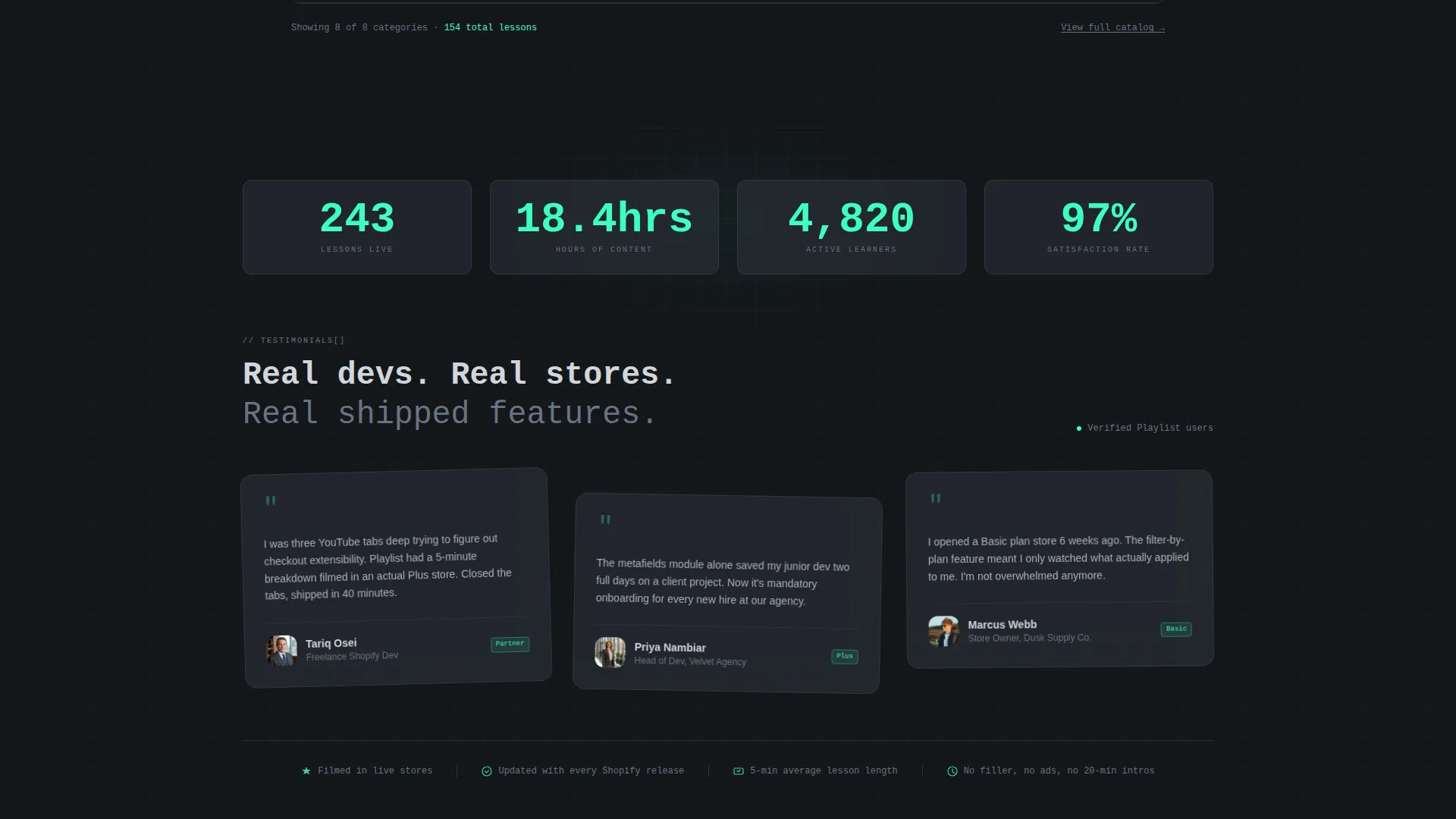
- The filterable grid lets visitors self-select by skill level and store stage before any gate appears, building personal relevance and trust in the catalog depth.
- Expandable row previews deliver a taste of real content inside the scroll, so the decision to sign up feels like a natural next step rather than a cold ask.
- The sticky freemium bar appears only after meaningful engagement, and the viral unlock path gives non-subscribers an additional low-friction route to full content.
Other information about this template
This template is designed specifically for the Shopify ecosystem, making it well suited for creators and educators building resources around the Shopify platform. The niche context shapes every design decision, from the category labels to the plan-tier qualification field in the signup form.
- The template style is Dashboard and Data Grid, meaning the layout borrows visual conventions from tools developers already trust, such as code editors and admin panels
- The Directory and Discovery theme makes it suitable for any content library that benefits from structured browsing, not just video tutorials
- The intersection of Shopify documentation and freemium conversion strategy is relatively rare as a purpose-built template style, giving publishers a strong visual differentiation point
- Template color tokens are defined with hex values, making it straightforward for a developer or designer to apply a brand palette swap while keeping the layout structure intact
Theme
Directory & Discovery
Creative direction
Feature Matrix
Color system
Monochrome Steel
Style
Dashboard/Data Grid
Direction
Freemium/Trial
Page Sections
Frosted Glass Category Header
Filterable Tutorial Data Grid
Expandable Clip Previews
Sticky Freemium Conversion Bar
Viral Tutorial Unlock Path
Monospaced Ide-style Typography
Related questions
Who is this template designed for?
Can visitors access content before signing up?
What does the signup form ask for?
How does the sticky conversion bar behave?
Can this template be adapted for other content topics?



