Complete Software & SaaS Privacy Policy & Terms Website Template
Pledge is a split-screen landing page template built for donation management platforms. It pairs an interactive live-data preview with a feature matrix layout, letting nonprofit development directors, foundation program officers, and university advancement teams instantly see how the platform handles recurring gifts, grant compliance, and multi-campaign tracking, all in one focused, motion-driven view.
by Rocket studio
Quick summary
Pledge is a single-page template designed for donation management software. It opens with a live, animated dashboard preview and steps visitors through each platform capability in a left-right feature matrix rhythm. The page targets nonprofit fundraising professionals who need to see complex donor data clearly before they commit to a demo.
Who this template is for
This template was built for organizations that manage serious donation volume and need a landing page that proves their platform can handle it. If your audience lives in spreadsheets and reporting deadlines, this layout speaks their language from the first scroll.
- Development directors at mid-size nonprofits who reconcile multiple donation streams manually
- Foundation program officers tracking grant disbursement compliance across funding cycles
- University advancement teams running multi-year, seven-figure fundraising campaigns
What problem this template solves
Donation management platforms are hard to explain quickly. Visitors arrive skeptical, and a static screenshot rarely shows how live data feels in motion. This template solves that gap by making the product experience tangible before anyone signs up.
- Scattered donation data feels overwhelming in screenshots, so the interactive header lets visitors experience a breathing, real-time dashboard without leaving the page
- Long feature lists lose readers fast, so the zigzag feature matrix breaks complex capabilities into digestible, alternating sections
- Generic contact forms convert poorly, so the closing form qualifies leads by organization size and donation volume from the start
What you get with this template
You get a complete, structured landing page built around a single conversion goal: turning fundraising professionals into qualified demo leads. Every section has a clear job, and every motion detail reinforces platform credibility.
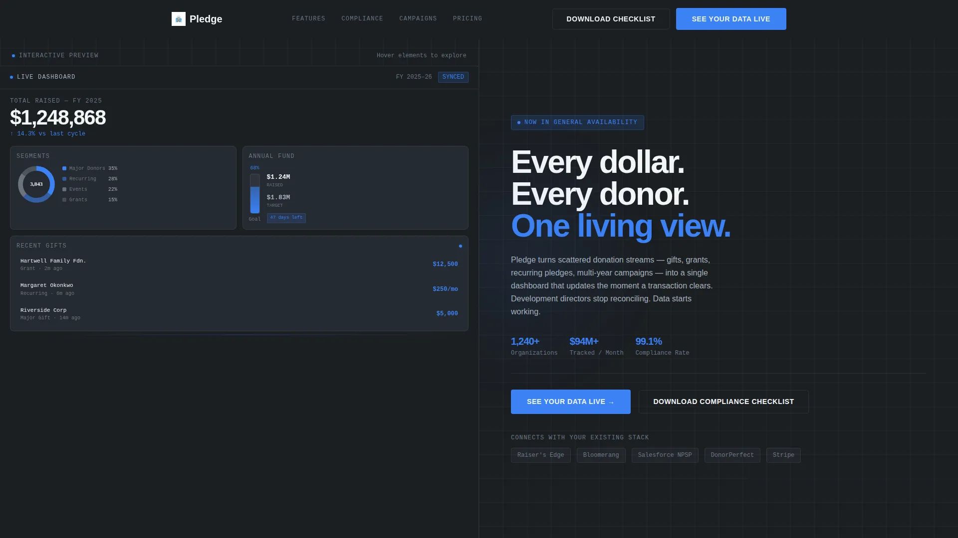
- A split-screen interactive header with a miniature live dashboard showing donation totals, a donor donut chart, and a campaign thermometer that fills in real time
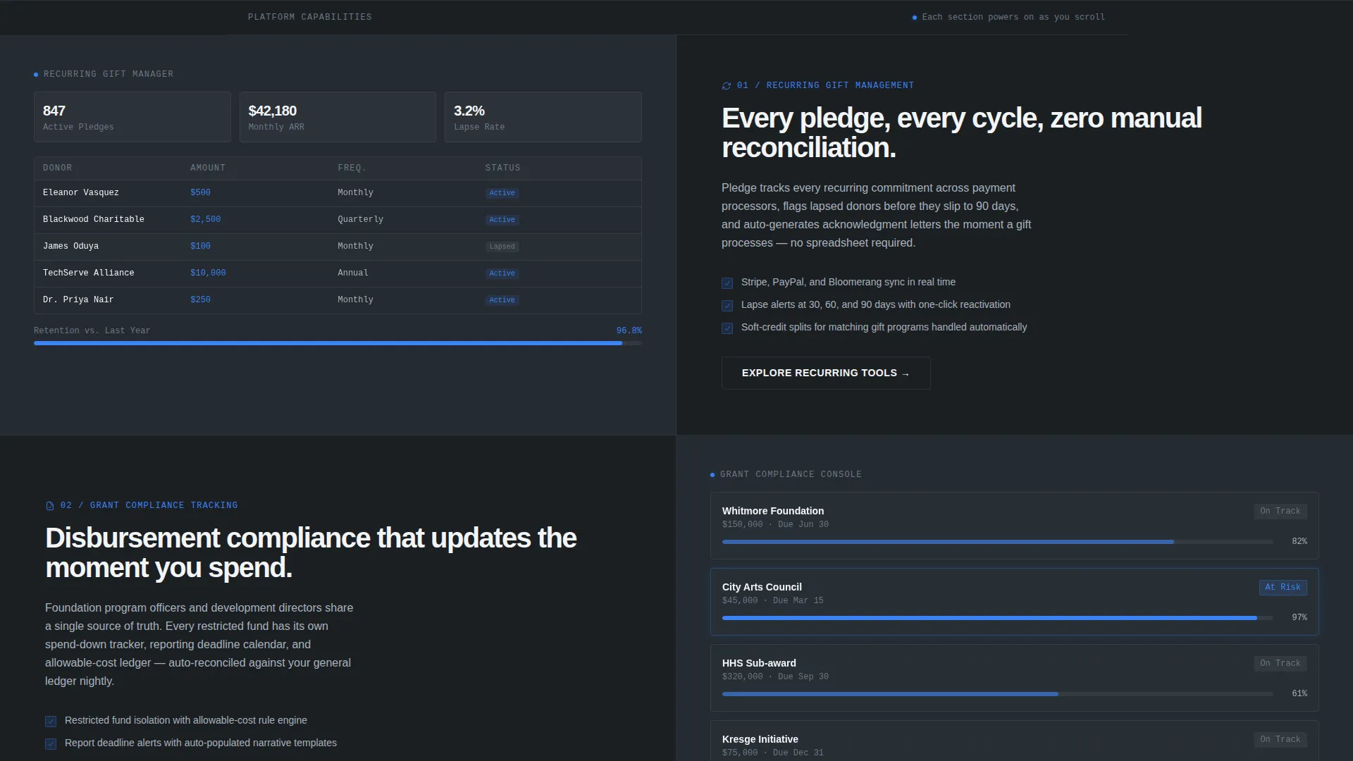
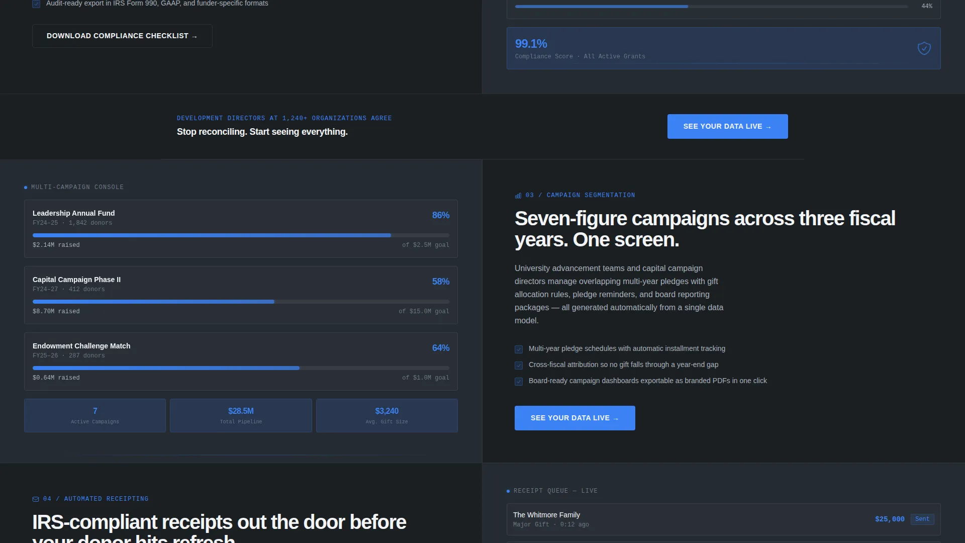
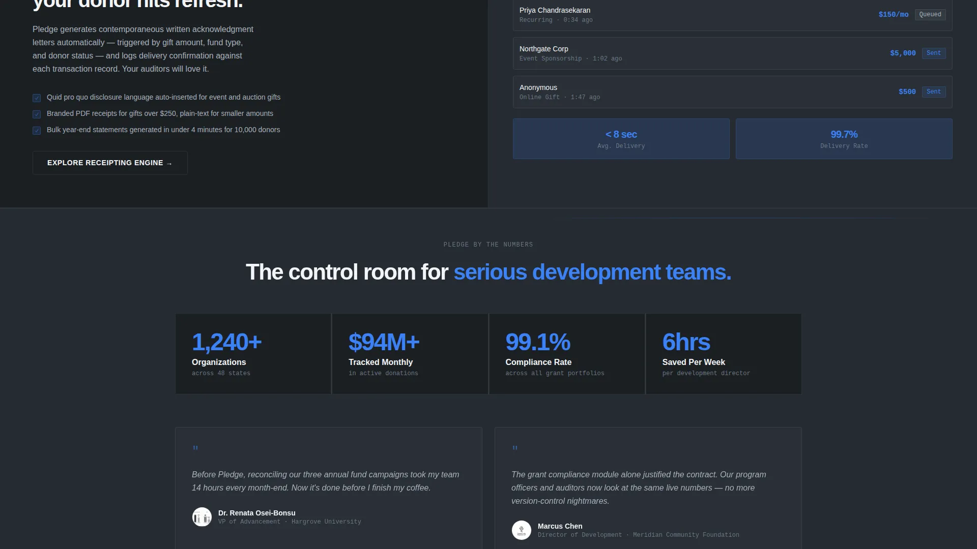
- A scrolling feature matrix with alternating left-right panels covering recurring gift management, grant compliance tracking, campaign segmentation, and automated receipting
- Two conversion paths: a primary "See Your Data Live" call to action and a secondary gated PDF download of a compliance checklist
Feature list
This template includes purpose-built sections and interaction patterns drawn directly from the platform brief. Each feature earns its place by solving a specific friction point for fundraising professionals.
Interactive Dashboard Header
The left half of the header renders a miniature, functioning dashboard. Donation totals tick upward, a donor segment donut chart shifts in real time, and a campaign thermometer fills on load. Visitors can hover elements to trigger tooltips, making the platform feel alive before they interact with any form.
Zigzag Feature Matrix Layout
Each platform capability gets its own full-width split panel. Capability copy sits on one side, and a corresponding dashboard view sits on the other. Left-right placement alternates on each scroll section, creating a visual rhythm that keeps readers moving forward without feeling repetitive.
Scroll-Triggered Motion Effects
Charts animate as each section enters the viewport. Progress bars fill on appearance, and donor count tickers spin up from zero. This scroll-enter behavior makes every feature section feel like a system powering on, reinforcing the platform's real-time positioning without requiring a live backend.
Dual Conversion Path Design
The page offers two ways to convert. The primary path drives demo requests through the "See Your Data Live" call to action, placed first as a ghost button in the header and repeated as a solid electric-blue button after every third feature section. The secondary path captures leads through a gated compliance checklist PDF download.
Qualified Lead Capture Form
The closing form collects three fields: organization name, work email, and annual donation volume selected from a dropdown. The volume dropdown segments leads into four ranges (under $500K, $500K to $2M, $2M to $10M, and $10M+), giving sales teams immediate context before the first conversation.
Monochrome Steel Visual System
The entire page uses a machined, precision aesthetic built on deep gunmetal, brushed aluminum, and bright interface white. A single electric-blue accent is reserved strictly for interactive states, live data indicators, and primary call-to-action buttons so every blue element signals something meaningful.
Page sections overview
| Section | Purpose |
|---|---|
| Interactive Dashboard Header | Show live donation data and deliver the headline in a split-screen layout |
| Ghost Button call to action | Give first-time visitors an immediate, low-commitment path to a demo |
| Recurring Gift Panel | Demonstrate how the platform handles ongoing pledge management |
| Grant Compliance Panel | Show grant disbursement tracking and reporting capability |
| Campaign Segmentation Panel | Illustrate multi-segment, multi-year campaign visibility |
| Automated Receipting Panel | Prove the platform handles donor acknowledgment workflows |
| Mid-Page Solid call to action | Repeat the primary conversion prompt after feature escalation |
| Compliance Checklist Offer | Capture leads not yet ready for a demo via gated PDF download |
| Closing Lead Form | Qualify visitors by organization name, volume range, and work email |
Design & branding system
The visual identity follows a Dynamic Motion theme expressed through a Monochrome Steel color system. Every color decision is deliberate: warmth is removed entirely so that the single electric-blue accent carries full weight when it appears.
- Core palette: deep gunmetal (#1B1F23) for backgrounds, brushed aluminum (#A8B2BD) for secondary text and surfaces, and bright interface white (#F4F5F7) for content areas
- Electric blue (#3B82F6) appears only on interactive hover states, live data points, and primary call-to-action elements
- Typography uses tight, heavy sans-serif for headlines to reinforce the precision-instrument aesthetic established by the color system
Mobile & speed optimization
The split-screen layout stacks cleanly for smaller viewports, keeping the dashboard preview and feature panels readable on any screen size. Motion effects are designed with subtle easing so the animated elements feel controlled rather than heavy.
- The 50/50 split panels reflow to single-column stacking on mobile without losing the alternating feature rhythm
- Scroll-triggered animations use easing curves that feel purposeful and measured, matching the precision tone of the overall design
How this template helps you convert
Every layout decision in this template is built around moving a skeptical, data-focused professional from curiosity to a qualified conversation. The page never asks for trust without first earning it through visible, working detail.
- The interactive dashboard header lets visitors experience the platform's core value before reading a single feature description, reducing early bounce by grounding the promise in something visual and tangible.
- Repeating the solid call-to-action button after every third feature section keeps the conversion prompt present throughout the scroll journey without overwhelming readers who are still evaluating.
- The compliance checklist secondary offer captures leads at every intent level, including visitors who are researching reporting requirements and are not yet ready to request a demo.
Other information about this template
This template sits at the intersection of nonprofit technology and software-as-a-service product marketing. It is designed for teams who need a high-trust, high-specificity page rather than a generic software landing page.
- The page is categorized under Technology, Software and SaaS, and is purpose-built for the donation management platform niche
- The Dynamic Motion theme and Feature Matrix creative direction are paired specifically to make data-product capabilities feel real and tested rather than theoretical
- The template style is Split Screen (50/50), which suits platforms where showing the product interface alongside the benefit copy is the most persuasive presentation format
- Lead generation is the single defined goal of this layout, and both conversion paths (demo request and gated PDF) are designed to serve that goal at different stages of buyer readiness
Theme
Dynamic Motion
Creative direction
Feature Matrix
Color system
Monochrome Steel
Style
Split Screen (50/50)
Direction
Lead Generation
Page Sections
Interactive Live Dashboard Header
Alternating Feature Matrix Layout
Scroll-triggered Data Animations
Dual Conversion Path Structure
Qualified Lead Capture Form
Monochrome Steel Color System
Related questions
Who is this landing page template designed for?
Can I customize the dashboard preview in the header?
Does the page support two different calls to action at the same time?
What does the lead capture form collect?
Can I add or remove feature panels in the matrix section?



