Advanced Restaurant Software Pricing & Packages Website Template
Pledge is a restaurant donor management landing page template built for platforms that turn in-house generosity into tax-ready records. It features a live API code snippet header, an interactive savings calculator, and a three-tier comparison table. The design uses a Dynamic Motion theme with the Teal Catalyst color system, optimized for freemium and trial conversions.
by Rocket studio
Quick summary
Pledge is a single-page comparison table template for a restaurant donor management platform. It opens with an animated API code snippet, flows into an interactive savings calculator, and closes with a three-tier plan comparison. The goal is simple: show restaurant operators and nonprofit directors exactly what they gain before asking for a sign-up.
Who this template is for
This template is built for platforms serving the restaurant and hospitality giving space. It speaks directly to the people who feel the pain of untracked donations most acutely.
- Restaurant group CFOs reconciling six-figure annual giving across multiple locations
- Independent restaurant owners who donate regularly but struggle at tax time
- Nonprofit development directors who need documented proof of partner contributions
What problem this template solves
Restaurants donate constantly. Comp'd meals, charity night tickets, and silent auction items leave the kitchen without a paper trail. Come tax season, that generosity is nearly impossible to reconstruct accurately.
- Donation records scattered across spreadsheets, napkins, or nothing at all
- No standardized receipt or Internal Revenue Service classification at the point of giving
- Nonprofit partners unable to verify what restaurant donors actually delivered
What you get with this template
This template gives you a complete, single-page conversion flow that educates, qualifies, and converts visitors without friction. Every section earns the next click.
- An animated API code snippet header that establishes technical credibility immediately
- An interactive savings calculator that personalizes the value pitch before any plan comparison
- A three-column comparison table covering Free, Pro, and Group tiers with micro-animated row interactions
Feature list
This template brings together several purposeful components. Each one serves a clear role in moving a visitor from curious to committed.
Animated API Code Snippet Header
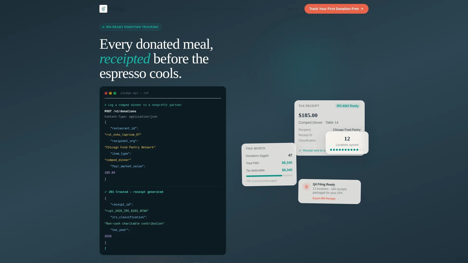
The header displays a syntax-highlighted POST request to /v1/donations with a JSON body that includes restaurant ID, recipient organization, item type, and fair market value. The response returns a generated tax receipt ID and an Internal Revenue Service classification. Each line populates sequentially with a teal cursor blink, simulating a live terminal session.
Interactive Savings Calculator
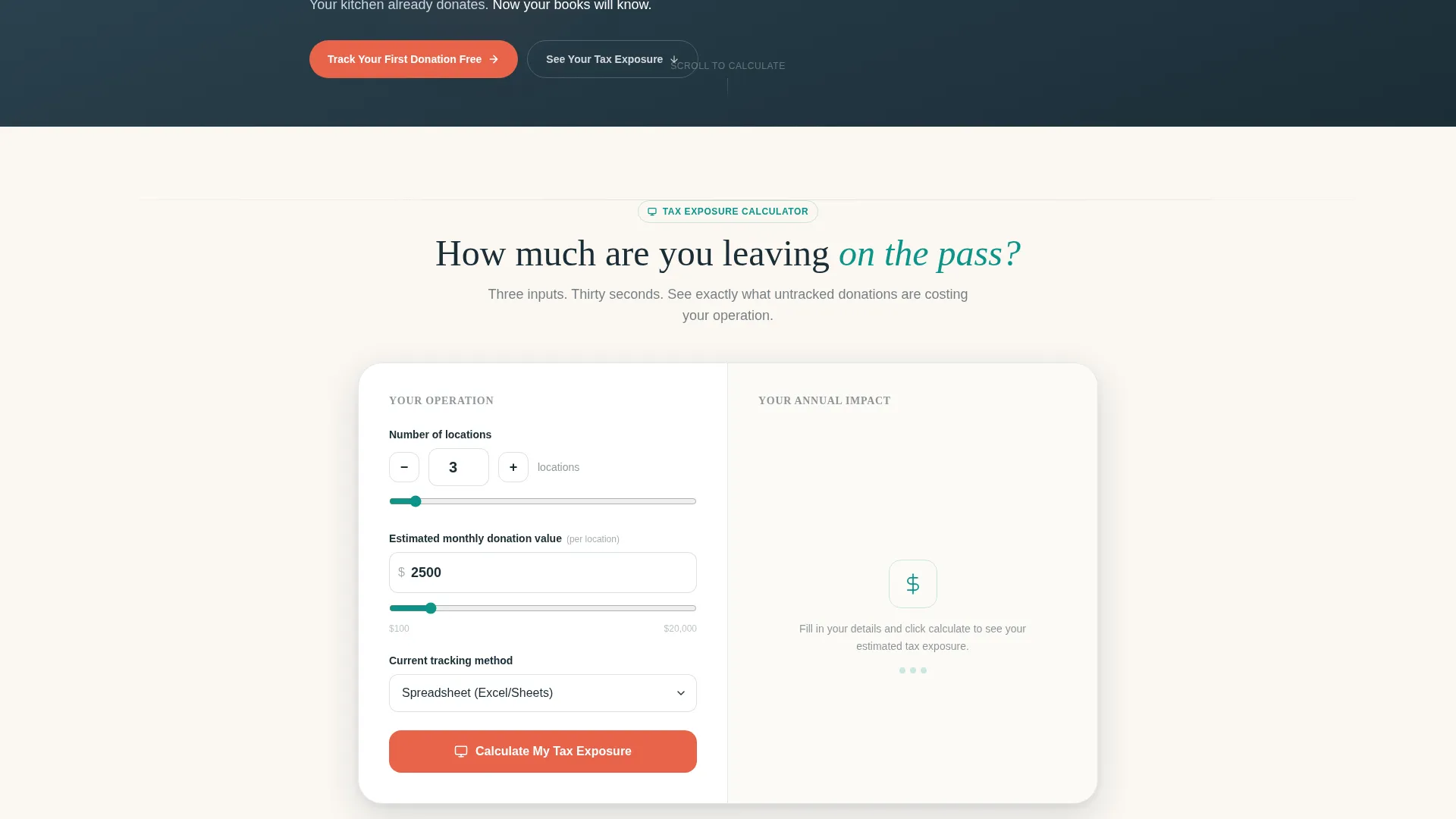
The calculator sits immediately below the header and asks three inputs: number of locations, estimated monthly donation value, and current tracking method selected from a dropdown. The output fields animate into place, showing annual tax recovery, hours saved on reconciliation, and audit risk reduction. Numbers roll in like a ticket printer, making the value feel immediate and personal.
Three-Tier Comparison Table
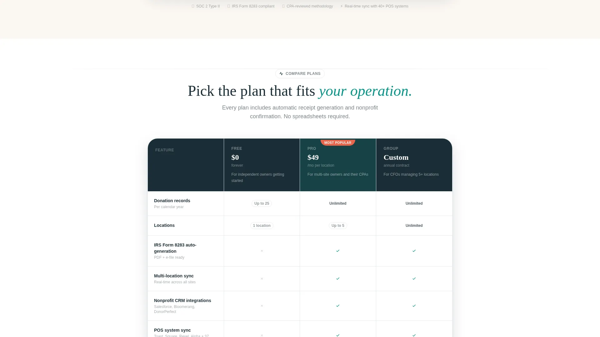
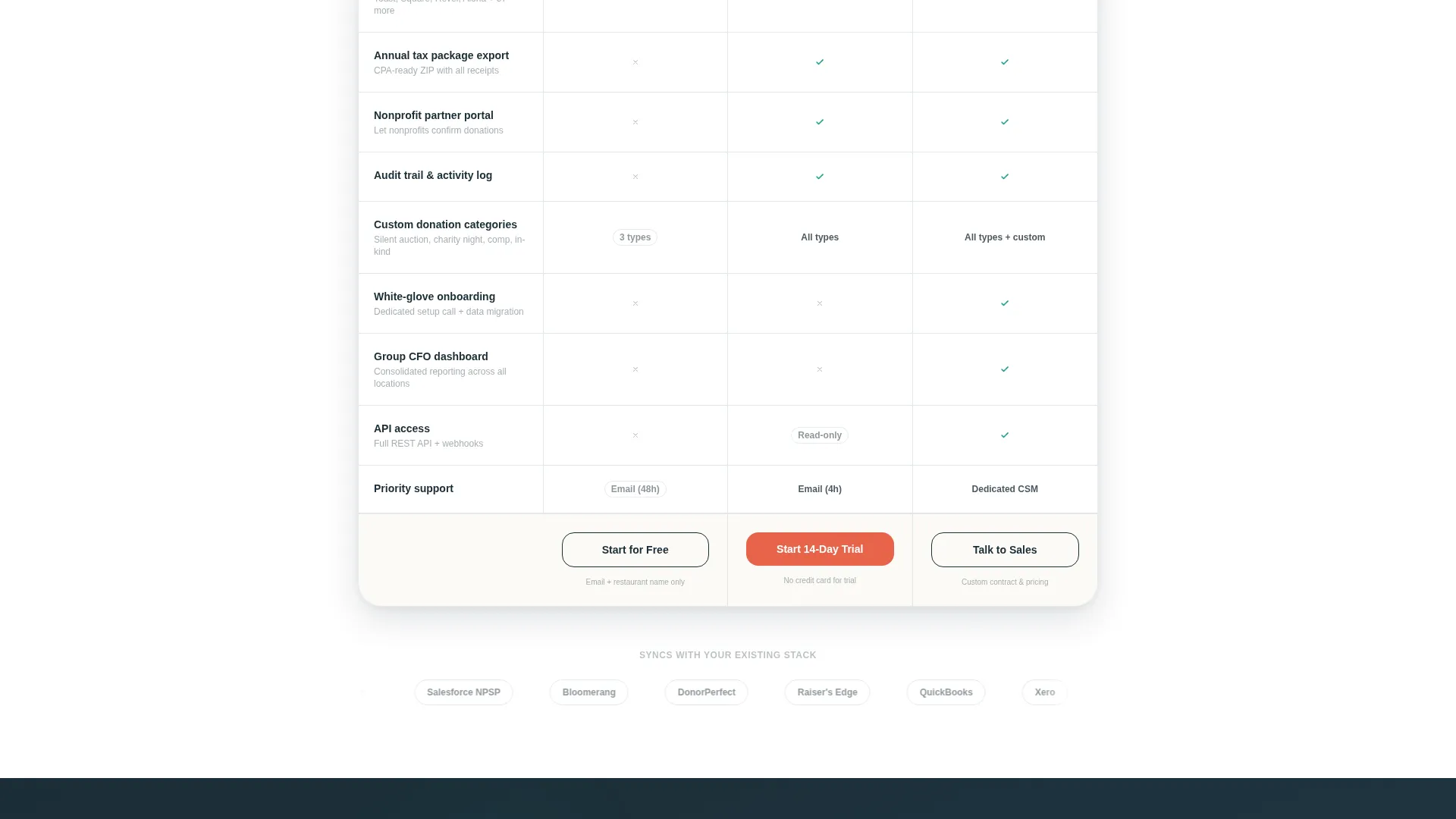
The comparison table contrasts Pledge Free, Pledge Pro, and Pledge Group across rows covering donation tracking limits, multi-location sync, nonprofit CRM integrations, Internal Revenue Service form auto-generation, and white-glove onboarding. Checkmarks stamp in on scroll. Limit indicators shake subtly when a tier caps out, keeping the competitive read kinetic and honest.
Pinned Freemium call to action Flow
The primary call to action, "Track Your First Donation Free," appears in three places: pinned after the calculator result, inside each comparison column, and at the page's final section. This repetition keeps the conversion path visible without feeling aggressive.
Secondary Re-engagement Loop
A secondary call to action, "See Your Tax Exposure," loops visitors who scroll past the calculator back to the tool. The tool does the persuading before the sign-up form appears, reducing drop-off from visitors who are not yet ready to commit.
Tiered Sign-Up Forms
The free tier form requires only an email address and restaurant name. The Pro trial form adds location count and current point-of-sale system via dropdown. Both forms are scoped to collect only what each tier genuinely needs, reducing friction at the point of conversion.
Page sections overview
| Section | Purpose |
|---|---|
| API Code Header | Establishes technical credibility with animated donation API call |
| Savings Calculator | Personalizes tax recovery and reconciliation value before plan comparison |
| Comparison Table | Contrasts Free, Pro, and Group tiers across key feature rows |
| Pinned call to action Strip | Keeps the primary free-tier sign-up action visible after calculator output |
| Final call to action Section | Closes the page with a repeated conversion prompt and re-engagement link |
Design & branding system
The template uses the Teal Catalyst color system inside a Dynamic Motion visual theme. The palette is drawn from a working restaurant kitchen at peak service.
- Deep kitchen slate (#1B2D36) anchors the navigation bar and all major headers
- Active teal (#0D9488) drives interactive states, data visualizations, and the animated calculator output
- Warm linen (#FAF7F2) breathes across card and content surfaces for readability
- Seared coral (#E8634A) is reserved strictly for call-to-action buttons and alert states, never used decoratively
Mobile & speed optimization
The Dynamic Motion theme is built to stay fluid on smaller screens without losing its animated character. Calculator inputs, the comparison table, and the code snippet all adapt to narrower viewports.
- The comparison table is designed for horizontal scroll or stacked column display on mobile
- Calculator input fields and dropdowns are sized for comfortable touch interaction
- Motion sequences are paced to feel responsive rather than slow, keeping the experience energetic on any device
How this template helps you convert
The page is structured so that the value case is made before a single form field appears. Every section builds trust and qualifies intent progressively.
- The API code snippet opens with technical authority, signaling that this is a real platform built for real data workflows, not a spreadsheet dressed up as software.
- The savings calculator turns abstract benefits into personal numbers, giving each visitor a specific reason to move forward before they see any pricing or plan comparison.
- The comparison table and pinned call-to-action strip close the loop, making it easy to start on the free tier with minimal commitment while keeping Pro and Group upgrades visible.
Other information about this template
This template is categorized under Technology and Restaurant Software, sitting at the intersection of restaurant donor management. It is a strong fit for platforms targeting both independent operators and multi-location restaurant groups simultaneously.
- The template style is a Comparison Table landing page, ideal for freemium and trial conversion flows
- The header concept is a Code Snippet, which positions the platform as API-native and developer-friendly
- The creative direction is Calculator/Tool First, meaning the interactive tool precedes any hard sales pitch
- The Dynamic Motion theme and Teal Catalyst color system are designed to work cohesively across all interactive states on the page
Theme
Dynamic Motion
Creative direction
Calculator/Tool First
Color system
Teal Catalyst
Style
Comparison Table
Direction
Freemium/Trial
Page Sections
Animated API Code Snippet Header
Interactive Savings Calculator
Three-tier Comparison Table
Pinned Freemium Call-to-action
Secondary Re-engagement Loop
Tiered Sign-up Forms
Related questions
Who are the primary users of this template?
What tiers does the comparison table cover?
How does the savings calculator work?
What does the free tier sign-up require?
Can this template support multi-location restaurant groups?



