Healthcare Software Expert Professional Website Template
Pledge is a healthcare donor management landing page template built for hospital development offices. It leads with a live-style API code snippet, then walks visitors through structured comparison tables that pit Pledge against spreadsheets, legacy tools, and generic platforms. The result is a confident, spec-sheet-driven page that earns the app download one row at a time.
by Rocket studio
Quick summary
Pledge is a single-page template designed for a healthcare donor management platform. It opens with a syntax-highlighted API code block, then flows into side-by-side comparison tables covering the features that matter most to hospital development teams. Every design choice builds toward one clear action: downloading the app.
Who this template is for
This template speaks directly to professionals running fundraising operations inside health systems and hospital foundations. It is built for people who already understand the complexity of donor management and need a page that matches that fluency.
- Hospital foundation directors managing gala events and grateful-patient programs
- Children's hospital gift officers cultivating major donors across multiple site visits
- Health system Vice Presidents of philanthropy preparing board-ready ROI reports
What problem this template solves
Development offices often rely on a patchwork of spreadsheets, legacy customer relationship management tools, and generic fundraising platforms that were never designed for healthcare. The result is duplicated data entry, missed stewardship touchpoints, and reports that take days to assemble. This template makes the case that all of that can stop.
- Fragmented donor records spread across tools that do not talk to each other
- Compliance and reporting workflows that eat hours every quarter
- Comparison shopping visitors who need proof, not promises, before they download
What you get with this template
You get a fully structured comparison table landing page ready to represent a healthcare donor management platform. The layout is purposeful and data-forward, guiding visitors from technical credibility to competitive proof to a clear download action.
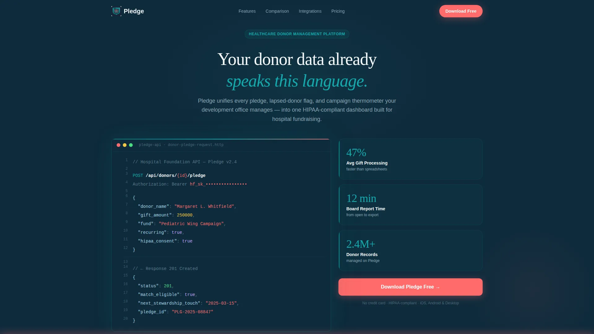
- A Code Snippet header with a live-style API call rendered in syntax-highlighted monospaced type
- Multi-row comparison tables contrasting the platform against spreadsheets, legacy tools, and generic software
- Stat callout cards, a persistent coral call-to-action bar, and a download modal with platform toggle and organization-size selector
Feature list
This section covers the core template components described in the brief.
Syntax-Highlighted API Header
The header opens with a styled POST request showing a real-looking donor pledge payload. Fields include donor name, a gift amount, a fund designation, and a recurring flag. The response block returns a status code, a matching eligibility flag, and a next stewardship date. This immediately signals technical credibility to development officers and their technology partners.
Side-by-Side Comparison Tables
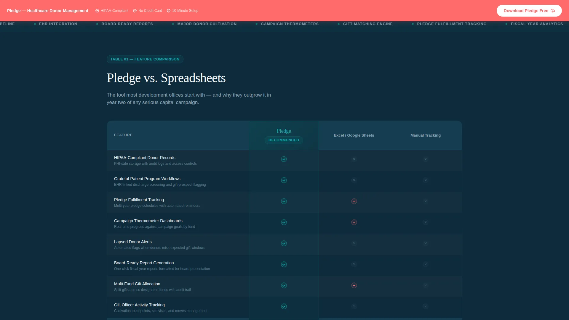
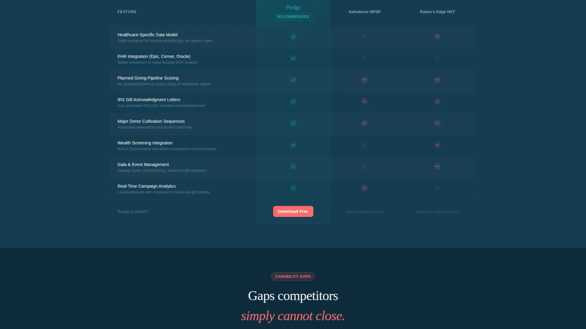
The core of the page is a set of structured tables that measure the platform against spreadsheets, legacy customer relationship management systems, and generic fundraising tools. Rows focus on healthcare-specific criteria: compliant donor record handling, grateful-patient program workflows, planned-giving pipeline tracking, board-ready reporting, and electronic health record integration depth. Teal checkmarks stack for the platform while competitor columns show coral dashes and gray blanks.
Scroll-Triggered Row Animations
Each table row reveals on scroll with a micro-animation, keeping the experience dynamic without distracting from the data. The progressive reveal reinforces the escalating narrative, moving from feature parity to capability gaps that competitors cannot close.
Single-Stat Callout Cards
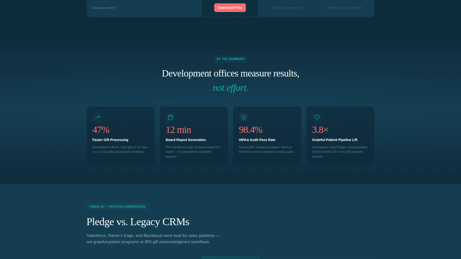
Between comparison table sections, bold callout cards break the visual rhythm. Cards surface specific performance claims like faster gift processing times and rapid board report generation. These prevent the page from feeling like a flat data grid and sustain scroll momentum.
Persistent App Download Bar
Once a visitor scrolls past the first comparison table, a coral-colored bar pins to the bottom of the viewport. It stays visible through the rest of the scroll, carrying the primary call to action at all times. Secondary placements appear after each table section for readers who convert earlier.
Download Modal with Platform Options
Tapping the call to action opens a modal with three components: a platform toggle for iOS, Android, and Desktop; a work email field; and a dropdown for organization size. There is no credit card requirement. The modal keeps the conversion step minimal and friction-free.
Page sections overview
| Section | Purpose |
|---|---|
| API Code Header | Establish technical credibility with a live-style donor pledge request |
| Headline Block | Anchor the value proposition above the code snippet |
| Comparison Table One | Compare core donor record and compliance features row by row |
| Stat Callout Card | Break scroll rhythm with a specific performance figure |
| Comparison Table Two | Highlight planned-giving and reporting capability gaps |
| Stat Callout Card | Reinforce platform speed with a board report generation claim |
| Comparison Table Three | Close with EHR integration depth and workflow automation rows |
| Persistent call to action Bar | Keep the download action visible after the first table |
| Download Modal | Capture platform choice, work email, and organization size |
Design & branding system
The template uses a Teal Catalyst color system built around four purposeful roles. Each color carries a specific job, and nothing overlaps. The overall feeling is a modern hospital lobby: calm, structured, and alive where it counts.
- Deep clinical teal (#0D7377) anchors navigation, section dividers, and syntax-highlighted keywords
- Midnight scrub navy (#0F2B3C) grounds comparison table backgrounds and the header code block
- Catalyst white (#F4F7F9) fills open space and table cells, giving data room to breathe
- Signal coral (#FF6B6B) appears only on call-to-action buttons, the persistent bar, and alert badges
Mobile & speed optimization
The template is built with the compact, scrollable nature of a comparison-table layout in mind. The persistent call-to-action bar is designed for thumb reach, and the download modal keeps form fields to a minimum so mobile visitors convert without friction.
- Comparison tables are structured for horizontal readability on smaller viewports
- The modal's three-field form keeps the conversion path short on any screen size
How this template helps you convert
Every structural decision in this template moves a skeptical development professional closer to the download. The page earns trust before it asks for anything.
- The API code header creates immediate technical credibility, telling technical evaluators and digitally fluent directors that this platform speaks their language before a single marketing claim is made.
- The stacked comparison tables shift the conversation from "what does this do" to "what does this do that nothing else can," building a case that becomes harder to argue with as the visitor scrolls deeper.
- The persistent coral bar and low-friction modal remove every obstacle at the moment of decision, so the visitor who is finally convinced does not have to search for a way to act.
Other information about this template
This template is part of the Startup Velocity theme family and pairs the Teal Catalyst color system with a Spec Sheet creative direction. The combination is well-suited to technical healthcare software products that need to earn trust through data before driving action.
- The template style is Comparison Table, optimized for side-by-side feature evaluation across multiple competitor categories
- The header concept is Code Snippet, a format that resonates with technically minded buyers in healthcare technology procurement
- The landing page direction targets App Download, keeping the entire scroll focused on a single low-friction conversion action
- This template can support healthcare donor management platforms that serve hospital foundations, children's hospitals, and multi-site health systems
Theme
Startup Velocity
Creative direction
Spec Sheet
Color system
Teal Catalyst
Style
Comparison Table
Direction
App Download
Page Sections
Syntax-highlighted API Code Header
Side-by-side Comparison Tables
Scroll-triggered Row Animations
Single-stat Callout Cards
Persistent App Download Bar
Low-friction Download Modal
Related questions
What type of platform is this template designed for?
Does the template require a credit card to download?
Can the comparison table rows be customized for different competitor categories?
Who is the primary audience this landing page targets?
What makes the code snippet header effective for this audience?



