Pluginvault - Brutalist Shopify Landing Page Template
Pluginvault is a brutalist-styled split-screen landing page template built for a Shopify plugin and extension directory. It organizes plugins by the problem they solve, not by category. The design pairs a live code snippet header with a working storefront preview, interactive filter rails, and brutalist slab calls to action that push visitors straight into the directory.
by Rocket studio
Quick summary
Pluginvault is a single-page, problem-first Shopify plugin directory landing page. It uses a bold brutalist visual identity with a 50/50 split-screen layout, live code snippet header, and a fully interactive filtering experience. Every section is designed to prove depth fast and move visitors toward browsing the directory without a form or email gate in the way.
Who this template is for
This template is built for anyone who needs to present a curated Shopify plugin or extension directory to a technically minded audience. It speaks directly to people who value speed, clarity, and real proof over polished marketing language.
- Solo Shopify merchants who work long hours and need a fast path to the right plugin
- Agency developers managing multiple client stores who need reliable, pre-vetted extension recommendations
- Operations managers at direct-to-consumer brands who have a specific workflow problem to solve before a deadline
What problem this template solves
Finding the right Shopify plugin is frustrating when every directory organizes tools by category instead of by the problem you actually have. Merchants and developers waste time reading descriptions that never answer the real question: does this fix my broken checkout or not?
- Directories that bury solutions inside vague category buckets slow down decision-making
- Landing pages that rely on passive scrolling fail technically curious visitors who want to explore
- Plugin listings without real code previews or compatibility signals force users to click away before committing
What you get with this template
You get a fully structured, single-page landing page layout with every section pre-built and ready to customize. The template delivers a raw, high-energy visual system alongside an interactive browsing experience that communicates trust through specificity.
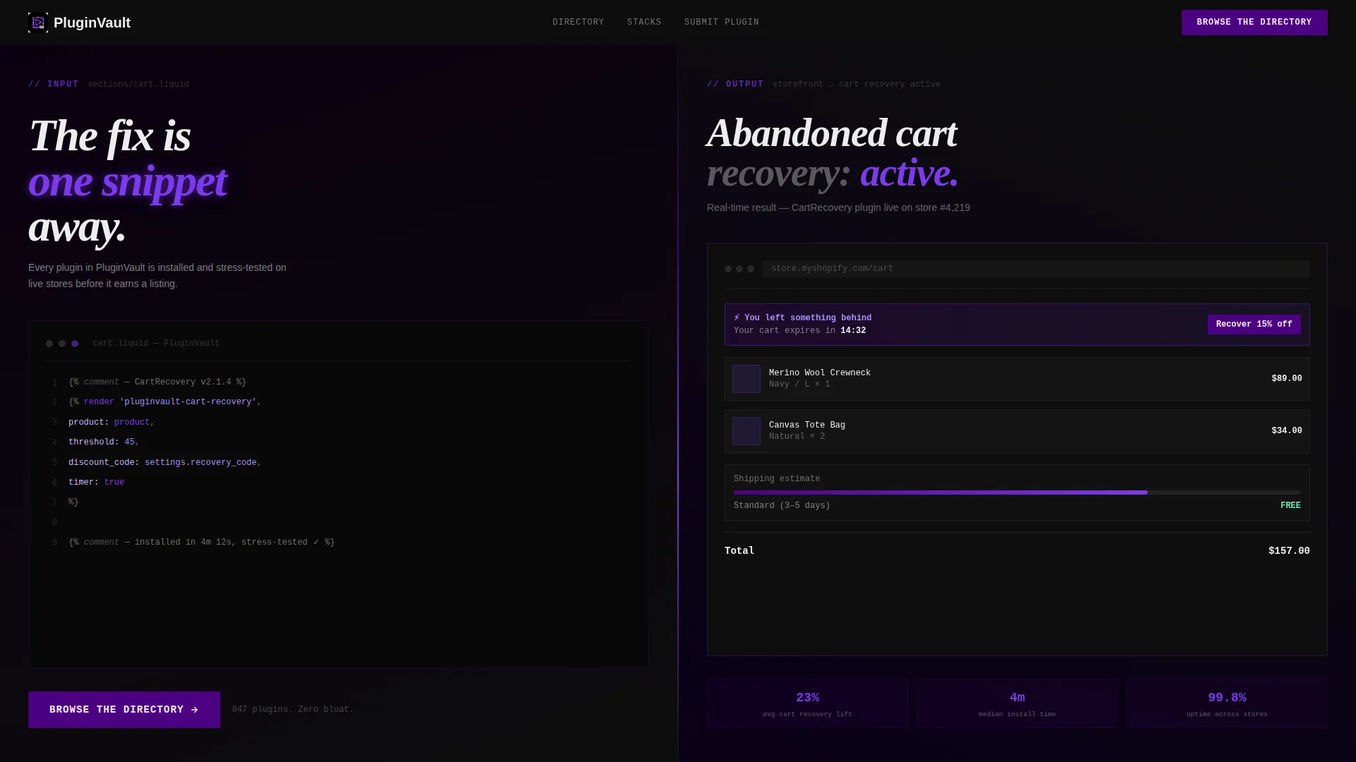
- A split-screen header pairing a live Liquid code snippet on the left with an animated storefront preview on the right
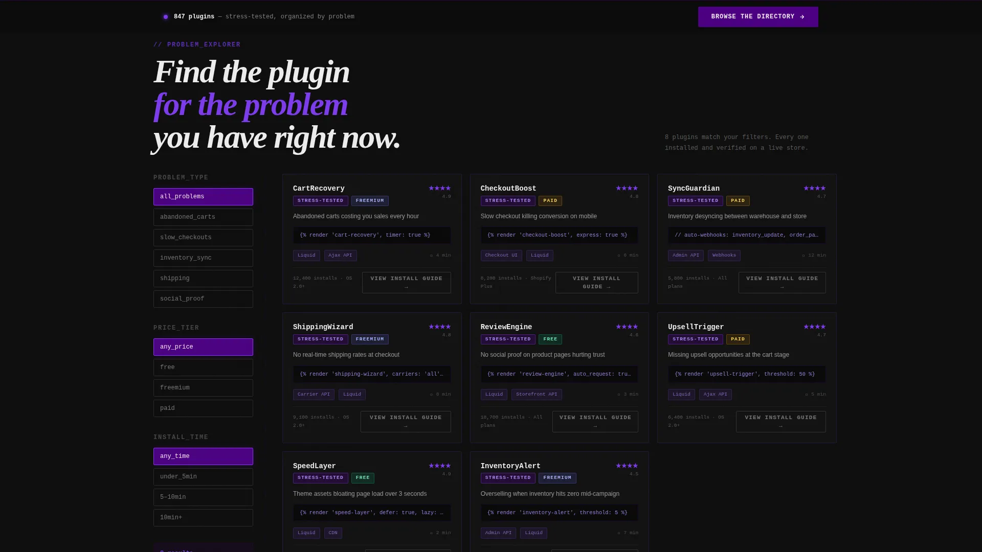
- A persistent filter rail on the left panel that live-swaps plugin cards by problem type, tech stack, price tier, and install time
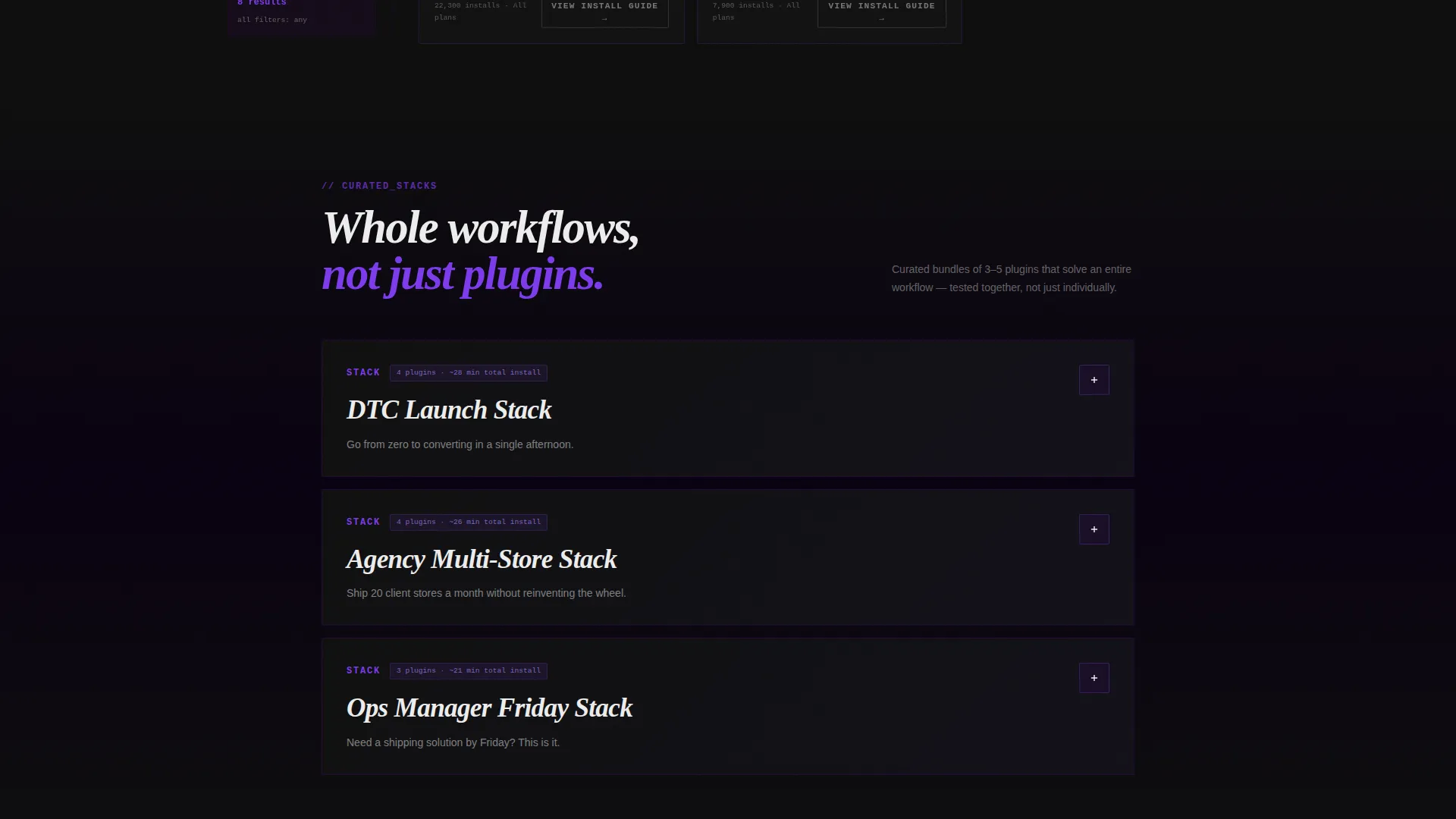
- Curated stack sections that bundle three to five plugins per workflow, each expandable into a full split-screen breakdown
Feature list
This template includes the following built-in design and interaction features derived directly from the creative brief.
Split-Screen 50/50 Header Layout
The header divides the viewport into two equal halves. The left side renders a monospaced Liquid template tag with a blinking cursor mid-line. The right side shows a working checkout result with a shipping estimator animating in real time. A hard vertical rule pulses once on load, separating input from output.
Live Code Snippet Panel
The left header panel uses syntax highlighting in electric indigo and high-voltage violet against a void black background. The effect is a terminal window mid-execution, giving technically minded visitors instant credibility signals without a single word of marketing copy.
Interactive Filter Rail
Past the header, the left panel becomes a persistent filter interface. Visitors can narrow plugin cards by problem type, tech stack, price tier, and install time. The right panel updates live as filters change, keeping the experience fast and exploratory rather than linear.
Plugin Card Design
Each plugin card displays a code snippet preview, a one-line problem statement, and a compatibility badge. A secondary call-to-action button reading "View Install Guide" sits on every card, routing visitors deeper into the directory.
Curated Stack Sections
Deeper in the page, pre-built stacks group three to five plugins that together solve a complete workflow. Each stack is expandable into a split-screen breakdown so visitors can inspect every component before deciding.
Sticky Bottom call to action Bar
After the first scroll interaction, a brutalist slab button bar locks to the bottom of the viewport. The primary call-to-action reads "Browse the Directory" in electric indigo. It stays visible as visitors explore, removing friction at the moment of intent.
Page sections overview
| Section | Purpose |
|---|---|
| Split-Screen Header | Pairs live code with animated storefront preview |
| Filter Rail Panel | Lets visitors narrow plugins by problem and stack |
| Plugin Card Grid | Displays pre-vetted plugin listings with code previews |
| Curated Stack Section | Groups plugins into full workflow solutions |
| Stack Expanded View | Split-screen breakdown of each stack's components |
| Sticky call to action Bar | Anchors the primary directory call to action after first scroll |
Design & branding system
The visual identity is Bold Brutalist with an Electric Indigo color system. Every design decision reinforces the feeling of a terminal window running at full power: raw, direct, and precise.
- Color palette: void black (#0D0D0D) for all backgrounds, electric indigo (#4B0082) for left panel floods and hover states, high-voltage violet (#7C3AED) for active elements and selection rings, and raw terminal white (#EDEDED) for all typography and code blocks
- Typography uses monospaced fonts in code panels and hard-cut sans-serif for body text, with no anti-aliased softness to maintain the raw industrial tone
- Interactive states are deliberate: indigo owns the hover layer, violet fires on click and scroll-triggered moments, and the vertical rule pulse on load is the only decorative animation
Mobile & speed optimization
The template layout prioritizes visual clarity and interaction performance on every screen size. The brutalist grid translates well to narrower viewports because the design already relies on hard edges and high-contrast rather than delicate spacing.
- The 50/50 split-screen collapses gracefully on mobile, stacking the code panel above the storefront preview so neither panel loses legibility
- Filter rail functionality is preserved on smaller screens, keeping the interactive explorer experience intact for mobile visitors
- No stock imagery or illustration assets are included, which keeps the visual layer lean and fast to render
How this template helps you convert
This template earns the click before it asks for one. Every design and content decision is built to prove the directory has depth, so visitors feel confident enough to browse without needing persuasion.
- The live code snippet header signals credibility to developers and technical merchants in the first three seconds, before any body copy loads
- The interactive filter rail turns passive visitors into active explorers, building investment in the directory as they narrow down results that match their actual problem
- The sticky "Browse the Directory" call to action appears only after the first scroll, timing the ask to a moment when the visitor has already seen enough to be curious
Other information about this template
This template sits inside the Documentation and Support category, specifically within the Shopify Documentation subcategory. It is purpose-built for a Shopify plugin and extension directory niche where trust and specificity are the primary conversion drivers.
- The template style is Split Screen (50/50), the theme is Bold Brutalist, and the creative direction is Interactive Explorer
- The header concept is a live Code Snippet, and the landing page direction is Click-Through with no form or email gate required
- The color system is Electric Indigo, using a four-value palette of void black, electric indigo, high-voltage violet, and raw terminal white throughout
Theme
Bold Brutalist
Creative direction
Interactive Explorer
Color system
Electric Indigo
Style
Split Screen (50/50)
Direction
Click-Through
Page Sections
Split-screen 50/50 Header
Live Code Snippet with Syntax Highlighting
Interactive Filter Rail
Plugin Cards with Code Previews
Curated Workflow Stack Sections
Sticky Browse Call to Action Bar
Related questions
Is this template suitable for a large plugin catalog?
Does this template require a form or email opt-in to convert visitors?
Can someone without deep coding experience customize this template?
What makes this different from a standard plugin listing page?
Where does the sticky call to action bar appear and when does it show?



