Public Speaking Course Landing Page Template
Podium is a single-column landing page template built for a twelve-week public speaking online course. It combines a cinematic stage-lit header, a three-question personalization quiz, and a focused lead-generation flow. The design uses a Corporate Precision visual system to position the course with authority, calm, and immediate relevance to every visitor's specific speaking challenge.
by Rocket studio
Quick summary
Podium is a single-column landing page template designed for a twelve-week public speaking online course. A stage-photography header, an interactive diagnostic quiz, and a persistent call-to-action bar work together to move visitors from self-identified problem to course enrollment. Every visual and structural decision reinforces professional credibility.
Who this template is for
This template speaks directly to course creators, coaches, and training providers who need to convert confident professionals into paying students. It is built for offers that require trust before a form fill, not impulse purchases.
- Mid-career managers preparing for high-stakes all-hands presentations
- Consultants and founders whose credibility lives or dies in the first ninety seconds of a pitch
- Online course creators in the professional development and public speaking space
What problem this template solves
Most course landing pages list features and hope visitors self-select. That approach fails when the audience is skeptical, time-pressured, and already convinced they have a problem. Podium solves the trust deficit before the call to action ever appears.
- Visitors arrive unsure if the course is relevant to their specific speaking weakness
- Generic pages cannot reorder content to match individual pain points in real time
- A standard opt-in form feels like a gate; Podium makes it feel like a natural next step
What you get with this template
You get a fully structured, single-column landing page that guides visitors through a clear narrative arc. The layout moves from cinematic authority to personal diagnosis to social proof to enrollment, without a single dead-end scroll.
- A stage-photography hero section with a fade-in headline and a pulsing module preview
- A three-question diagnostic quiz that dynamically reorders testimonials, curriculum highlights, and student clips
- A dual-placement lead-generation form and a persistent bottom call-to-action bar
Feature list
This template packages six distinct design and interaction systems into one cohesive page. Each feature is purpose-built for the professional education market.
Cinematic Stage Hero
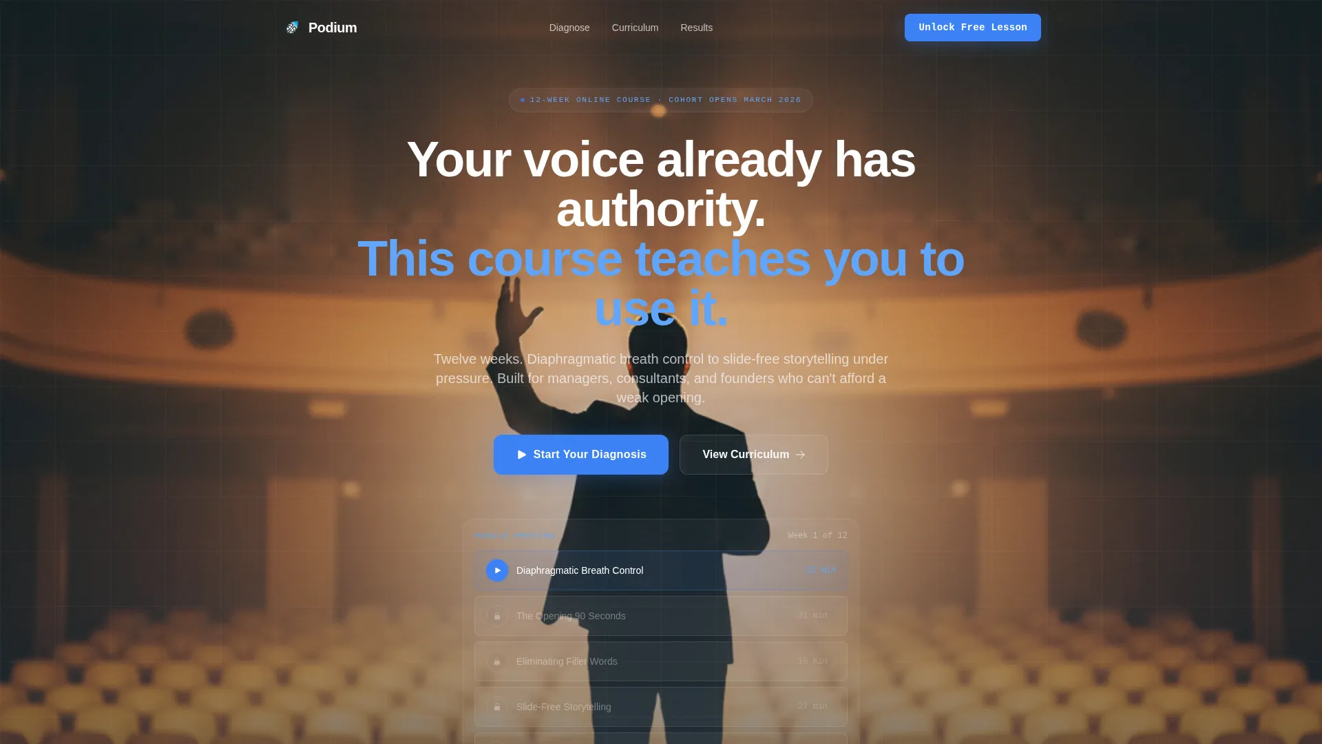
The header section presents a single speaker silhouetted against a softly lit stage, shot from the audience's perspective at a slight upward angle. A fade-in headline reads: "Your voice already has authority. This course teaches you to use it." Below the headline, a compact module preview shows Lesson 1 unlocked with a pulsing play button, surrounded by locked lessons that create immediate curiosity.
Three-Question Personalization Quiz
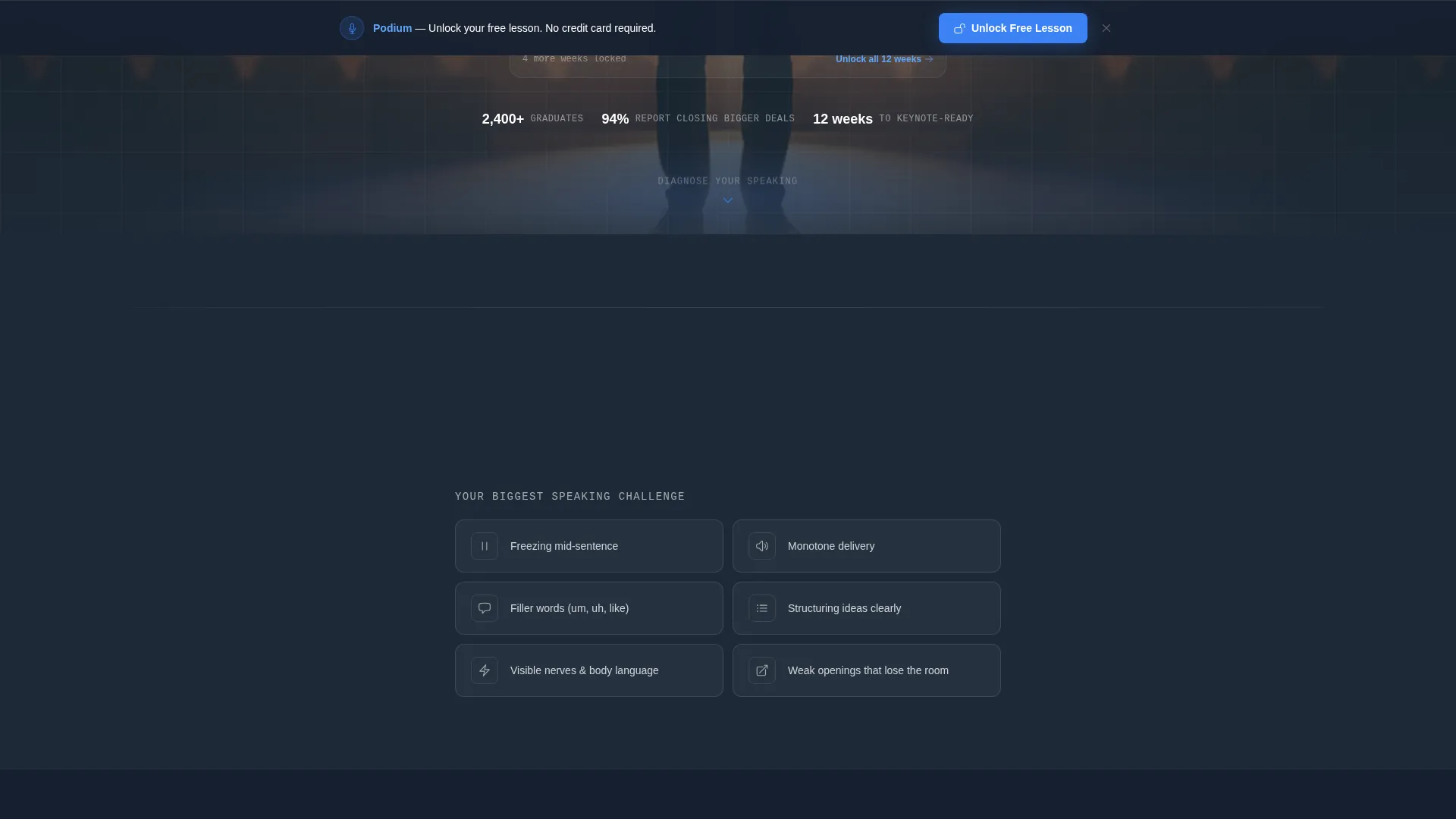
Immediately below the hero, visitors answer three diagnostic questions covering their biggest speaking challenge, their typical audience size, and the stakes level of their presentations. The quiz reorders page content dynamically so every section below feels written for that specific visitor. Options include freezing mid-sentence, monotone delivery, excessive filler words, and difficulty structuring ideas under pressure.
Dynamic Content Reordering
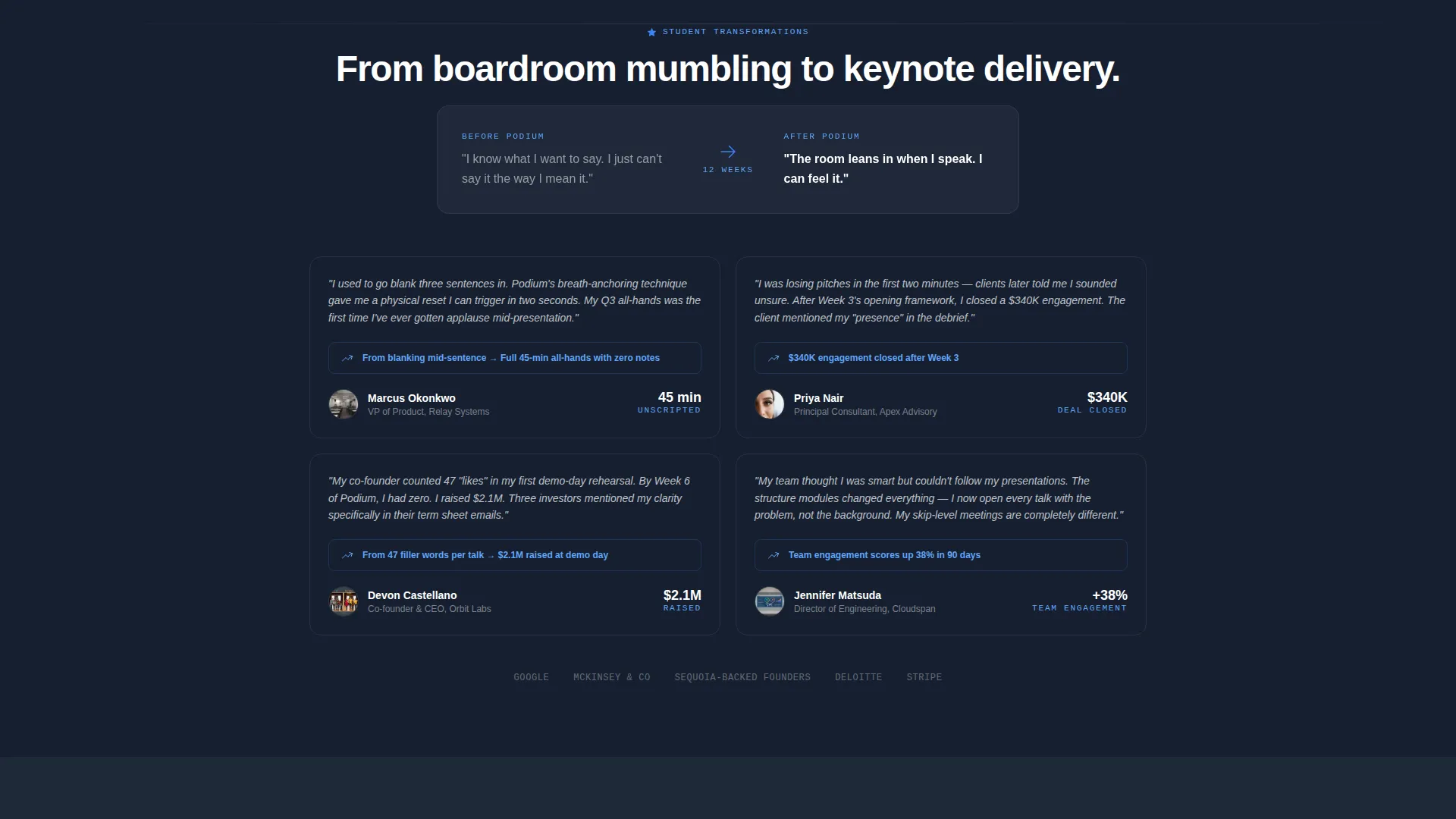
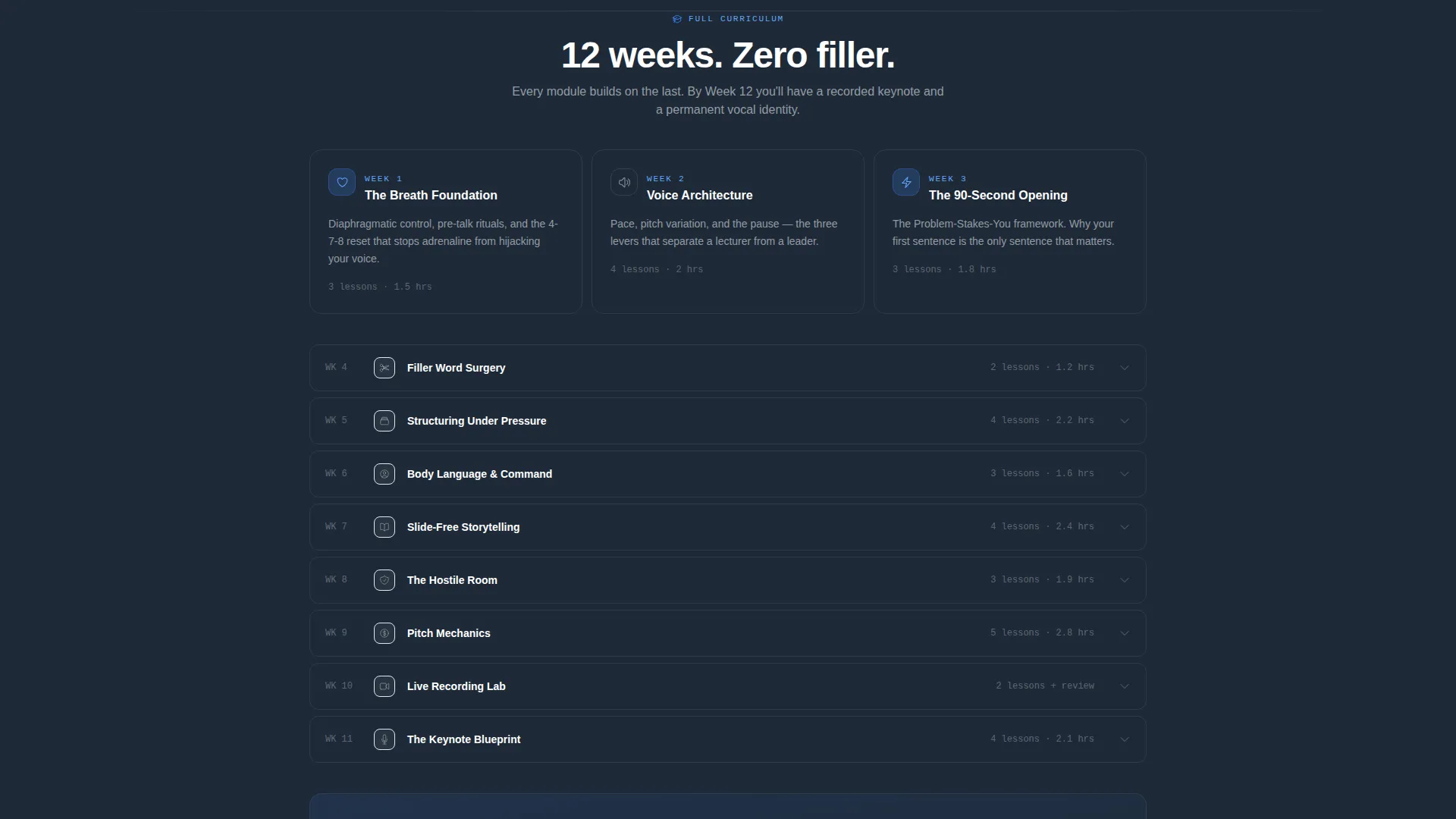
Once the quiz is complete, testimonials, curriculum highlights, and before-and-after student clips rearrange to mirror the visitor's self-identified weakness. The scroll experience shifts from a generic course pitch to a personalized diagnosis-to-transformation narrative. Each section escalates naturally: diagnosis, then proof, then curriculum, then the moment of decision.
Dual-Placement Lead Generation
The primary call to action, "Unlock Your Free Lesson," appears twice on the page. It shows first inside the quiz results panel, while the visitor's investment in self-reflection is highest. It reappears as a persistent bottom bar once the visitor scrolls past the diagnostic section, keeping the invitation visible throughout the rest of the page.
Minimal Friction Opt-In Form
The lead capture form asks only for a first name and work email. An optional company size dropdown provides segmentation data for follow-up without adding friction to the core conversion. The form is positioned so that by the time visitors reach it, they have already spent roughly sixty seconds in active self-reflection.
Corporate Precision Visual System
The Slate and Sky color system uses deep charcoal slate for authority, open-sky blue on every interactive element, and clean cloud white for content panels. Slate dominates the top and bottom of the page to frame seriousness. Sky blue appears only where the visitor should act, making every button and progress indicator feel like a clear opening in a structured environment.
Page sections overview
| Section | Purpose |
|---|---|
| Stage hero header | Establishes authority with a cinematic speaker image and fade-in headline |
| Module preview strip | Shows Lesson 1 unlocked and hints at the curriculum depth ahead |
| Personalization quiz | Captures visitor pain point across three focused diagnostic questions |
| Quiz results panel | Displays personalized insight and presents the first call-to-action form |
| Dynamic testimonials | Reordered social proof matched to the visitor's self-identified challenge |
| Curriculum highlights | Course structure surfaced in the order most relevant to the visitor |
| Student transformation clips | Before-and-after evidence aligned to the diagnosed speaking weakness |
| Persistent bottom bar | Keeps "Unlock Your Free Lesson" visible after the quiz section scrolls away |
Design & branding system
The Corporate Precision theme combines authority with approachability. Colors, spacing, and interactive accents are assigned specific roles so nothing on the page competes for attention.
- Deep charcoal slate (#1E2A38) anchors the hero and footer sections, creating a stage-like frame
- Open-sky blue (#3B82F6) appears exclusively on buttons, play buttons, and progress indicators to direct action
- Cloud white (#F8FAFC) fills content panels and creates visual breathing room between sections
Mobile & speed optimization
The single-column layout is inherently mobile-friendly. Content stacks in a logical reading order without requiring horizontal scrolling or complex grid adjustments.
- The quiz interaction, module preview, and persistent bottom bar are all designed for touch-first behavior
- The minimal form fields reduce friction on small screens where typing is slower and patience is shorter
How this template helps you convert
Podium is engineered around one insight: commitment before the ask drives higher conversion than incentive alone. The layout builds that commitment deliberately.
- The quiz creates sixty seconds of personal investment before any form appears, making the email exchange feel earned rather than extracted
- The dual-placement call to action ensures the primary offer is always within reach, whether the visitor is a fast scanner or a thorough reader
Other information about this template
This template is part of the Single Column Flow family, designed for offers where a focused, distraction-free narrative outperforms multi-column or tabbed layouts. It suits professional development courses, coaching programs, and skill-based online learning offers where credibility and personalization are the primary conversion levers.
- Template style: Single Column Flow with a Corporate Precision theme
- Header concept: Free Trial invitation presented as a live stage scene
- Creative direction: Quiz and Personalize, with dynamic content reordering based on quiz responses
- Landing page direction: Lead Generation, optimized for first-name and work email capture
Theme
Corporate Precision
Creative direction
Quiz & Personalize
Color system
Slate & Sky
Style
Single Column Flow
Direction
Lead Generation
Page Sections
Cinematic Stage Hero with Fade-in Headline
Three-question Personalization Quiz
Dynamic Content Reordering
Dual-placement Call to Action
Minimal Friction Lead Capture Form
Corporate Precision Color System
Related questions
Can I change the quiz questions to match my own course topic?
Does the page work if I remove the quiz and just use the lead-generation form?
What does the opt-in form collect from visitors?
Can I adapt this template for a different type of online course?
Where does the call-to-action button appear on the page?



