Interactive Acceptableuse Landing Page Template
This split-screen landing page template is built for apps that turn complex acceptable use policies into interactive, readable documents. It combines a live policy preview, AI clause generation, version diffing, and an embeddable widget into a spec-sheet layout. Ideal for SaaS founders, compliance officers, and community managers who need policy pages that work before launch day.
by Rocket studio
Quick summary
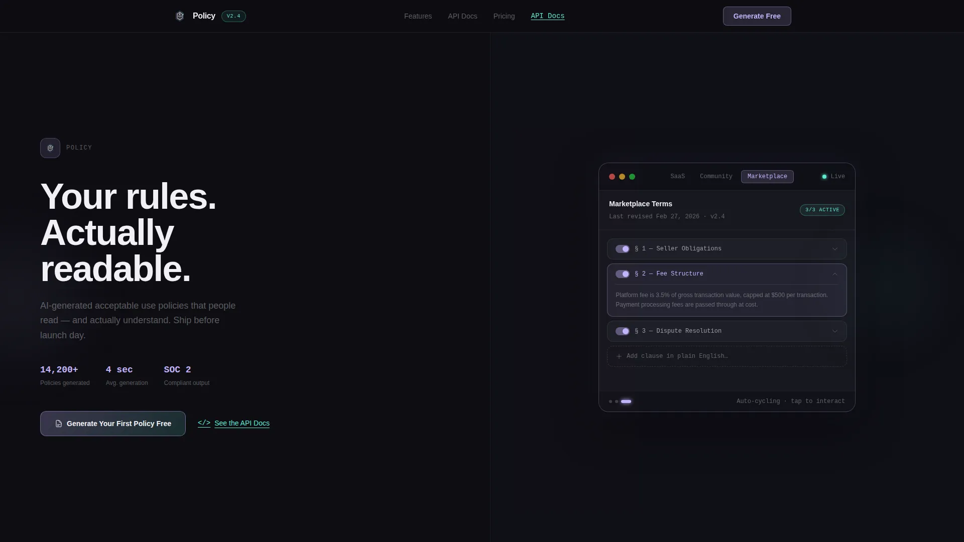
This single-page template presents an acceptable use policy app through a 50/50 split-screen layout. The left panel drives downloads with a clear headline and primary call to action. The right panel runs a live, interactive policy preview inside a glass-morphism device frame. Every section below the fold follows a spec-sheet cadence, pairing a technical feature card with a working demo.
Who this template is for
This template speaks directly to people who build, manage, or enforce digital rules at scale. It is designed for product teams and policy owners who need a credible, interactive policy page ready before they go live.
- SaaS founders who need a compliant acceptable use policy page before their version-one product ships
- Compliance officers at mid-size companies who are tired of recycling outdated legal templates
- Community managers governing large online communities who need rules that can flex as their platform grows
What problem this template solves
Dense legal language in acceptable use policies drives most visitors away without reading a single clause. Standard static policy pages offer no engagement, no context, and no way for visitors to understand what the rules actually mean. This template replaces that experience with an interactive format that builds trust through clarity.
- Visitors tap and explore real policy clauses instead of scrolling past walls of text
- Founders get a launch-ready policy page without waiting for a legal team to finish drafts
- Compliance teams can present version differences visually, so stakeholders understand what changed and why
What you get with this template
You get a fully structured, single landing page designed around one goal: earning an app download by letting the product demonstrate itself first. The layout pairs persuasion with proof at every scroll position.
- A 50/50 split-screen header with an interactive policy preview that auto-cycles through three policy templates every four seconds
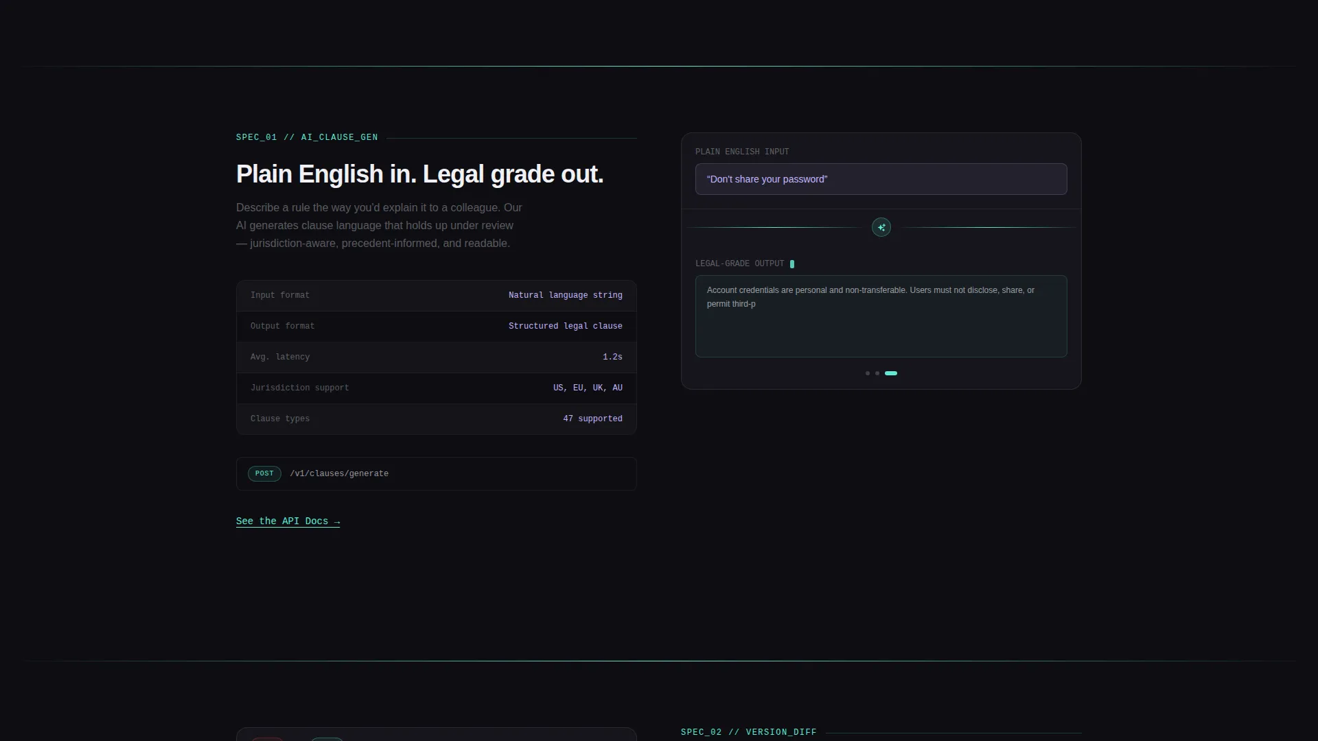
- Spec-sheet feature sections below the fold, each pairing a written capability card with a live running demo
- A primary call-to-action button in the header and a sticky bottom bar that appears after the second section, both pointing to a platform selector with a single email field
Feature list
This template is built around a small set of high-impact capabilities drawn directly from the brief. Each one is presented as a working demonstration rather than a passive claim.
Live Interactive Policy Preview
A functioning policy document renders inside a glass-morphism device frame on the right half of the split screen. Visitors can tap clause cards to expand them, reorder them, or toggle them on and off. The preview auto-cycles through three policy formats, including a SaaS platform policy, a creator community policy, and a marketplace policy, changing clause content every four seconds.
AI Clause Generation Display
One spec card shows the AI clause generation feature running in real time. A visitor types a plain-English rule into the left panel input, and the right panel outputs legal-grade language instantly. This makes the core value of the product tangible before any commitment is asked.
Version Diffing Visualization
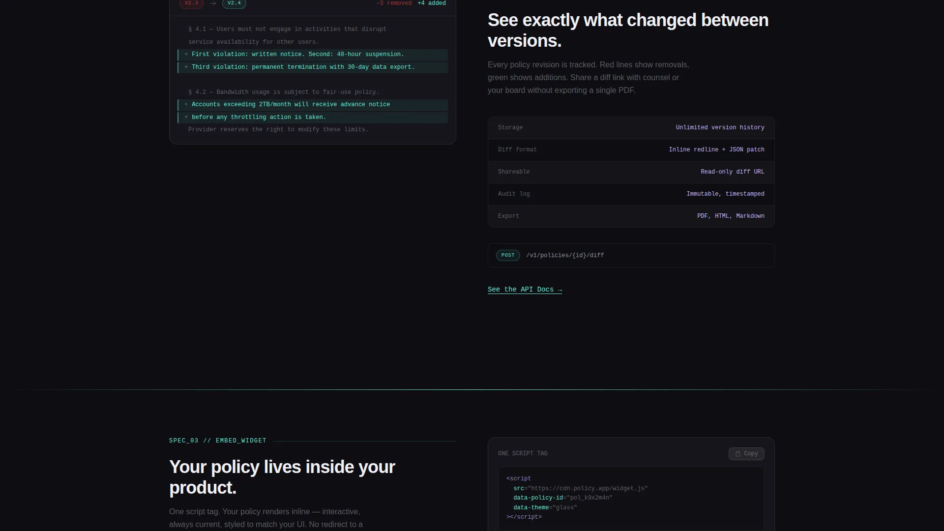
A dedicated spec card presents the version diffing capability. It shows a redline comparison between two policy versions, for example version 2.3 and version 2.4, so visitors can see exactly what changed. This feature is especially relevant for compliance officers who need an audit trail.
Embeddable Widget Demonstration
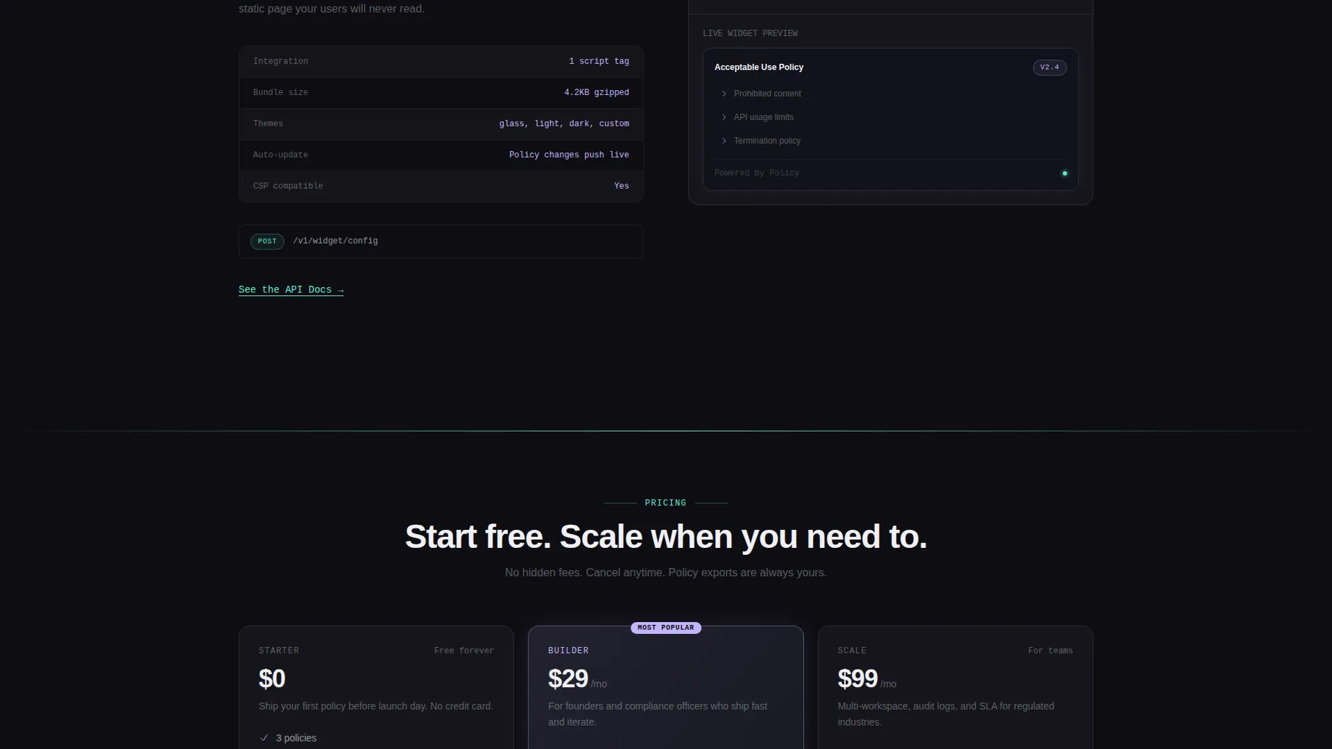
The embeddable widget spec card explains that a single script tag is all it takes to place a live policy inside an existing product. The right panel shows the widget running. This speaks directly to developers who want minimal integration overhead.
Sticky Download Call to Action
A sticky bottom bar appears after the visitor scrolls past the second section. Tapping it opens a platform selector showing iOS, Android, and Web App options. A single email field sends a download link, keeping the conversion path short and low-friction.
Page sections overview
| Section | Purpose |
|---|---|
| Split-screen header | Pair headline and primary call to action with live interactive policy preview |
| AI clause card | Demonstrate plain-English to legal-language conversion in real time |
| Version diff card | Show redline comparison between two policy versions |
| Widget embed card | Explain one-script-tag integration with a live running demo |
| Sticky download bar | Provide persistent, low-friction conversion point after second section |
Design & branding system
The visual identity uses a Tech Glass theme built on an AI Iridescent color system. The palette reads like a prism held against a dark mirror: mostly deep obsidian, then sudden ribbons of spectral color that shift as the visitor scrolls.
- Background stays deep obsidian (#0D0D12); glass-morphism cards float above at 12% white opacity with a 1-pixel iridescent border that cycles between holographic lilac (#C4B5FD) and refracted teal (#5EEAD4) on scroll
- Text is frosted white (#F0F0F5); interactive elements pulse with holographic lilac on hover and active states, giving the page a notification-like energy without being distracting
- Section dividers and progress indicators use refracted teal, creating clear visual rhythm as visitors move through the spec-sheet layout
Mobile & speed optimization
The split-screen layout is structured to translate cleanly across screen sizes. The spec-sheet cadence keeps each section self-contained, which naturally supports responsive stacking on smaller displays.
- Each spec card is a discrete unit, so mobile layouts can stack the left panel above the right panel without losing the feature-plus-demo relationship
- The sticky bottom bar is positioned to stay visible on mobile without obscuring primary content, keeping the download path accessible at every scroll position
- Interactive clause cards in the header preview are tap-friendly by design, matching the touch-first behavior described in the brief
How this template helps you convert
The conversion strategy in this template is built on earned trust rather than emotional pressure. The product demonstrates itself before it asks for anything.
- The interactive header preview lets visitors tap real policy clauses and watch the product work before they ever see a call-to-action button, removing skepticism at the top of the page.
- Each spec-sheet section below the fold adds a new layer of evidence, showing AI clause generation, version diffing, and embeddable widget functionality as live demos rather than marketing claims, so confidence builds through accumulated proof.
- The sticky bottom bar and platform selector reduce the final conversion step to a single email field, making the transition from convinced visitor to app downloader as frictionless as possible.
Other information about this template
This template sits within the Documentation and Support category, specifically the Policy and Legal Documentation subcategory. It is purpose-built for the acceptable use policy niche and addresses the full range of users in that space.
- The secondary call to action, "See the API Docs," appears as an underlined text link beneath each spec card, creating a developer-track conversion path alongside the primary download flow
- The headline "Your rules. Actually readable." is set with a subtle iridescent shimmer tracing the letterforms, reinforcing the brand tone at the first point of contact
- The template style is a 50/50 split screen with a Spec Sheet creative direction, an Interactive Preview header concept, and an App Download landing-page direction, making it a strong fit for policy tool products that need to prove their value visually
Theme
Tech Glass
Creative direction
Spec Sheet
Color system
AI Iridescent
Style
Split Screen (50/50)
Direction
App Download
Page Sections
Interactive Policy Preview Frame
AI Clause Generation Demo
Version Diffing Visualization
Embeddable Widget Spec Card
Sticky Download Bar
Spec Sheet Section Cadence
Related questions
Who is this landing page template designed for?
What does the interactive header preview actually do?
How does the conversion flow work?
Is this template suitable for showcasing a policy tool to enterprise buyers?
Can I use this template without a developer?



