Micro-SaaS & Developer Tools Reviews Website Template
Pomodoro is a bento grid landing page template built for focus-driven productivity apps. It puts a live dashboard preview front and center, surrounds it with metric-rich spec cards, and routes every visitor straight into a browser-based timer with a single click. The template suits any pomodoro timer or micro-SaaS tool that earns trust through data, not storytelling.
by Rocket studio
Quick summary
Pomodoro is a single-page bento grid template designed for focus timer apps and micro-SaaS tools. The hero cell displays a pixel-perfect dashboard preview mid-session. Below it, isolated spec cards each prove a single capability with a real metric attached. Two clear calls to action route visitors directly into the app with no form friction.
Who this template is for
This template is built for developers, indie makers, and product teams shipping a pomodoro timer or productivity tool. It speaks directly to buyers who want proof of function before they commit to signing up.
- Freelance developers who need a sharp, conversion-ready landing page for a focus timer app
- Graduate students, remote workers, and solo builders who want to showcase a self-serve productivity tool
- Micro-SaaS founders launching a browser-based timer with a free tier and optional paid plans
What problem this template solves
Most productivity app landing pages rely on lifestyle photography or vague benefit copy. Buyers who actually use focus tools want to see the product working, not a stock photo of someone at a laptop. This template solves that by putting the live dashboard in the hero and letting every card below it carry one specific proof point.
- Removes the credibility gap between marketing claims and visible product behavior
- Eliminates sign-up friction by sending clicks directly into a running timer session
- Replaces wall-of-text benefit sections with scannable, metric-backed spec cards
What you get with this template
You get a fully structured bento grid landing page ready to customize for any pomodoro timer or focus productivity app. Every cell in the grid is designed to stand alone, so visitors can scan in any order and still understand the value.
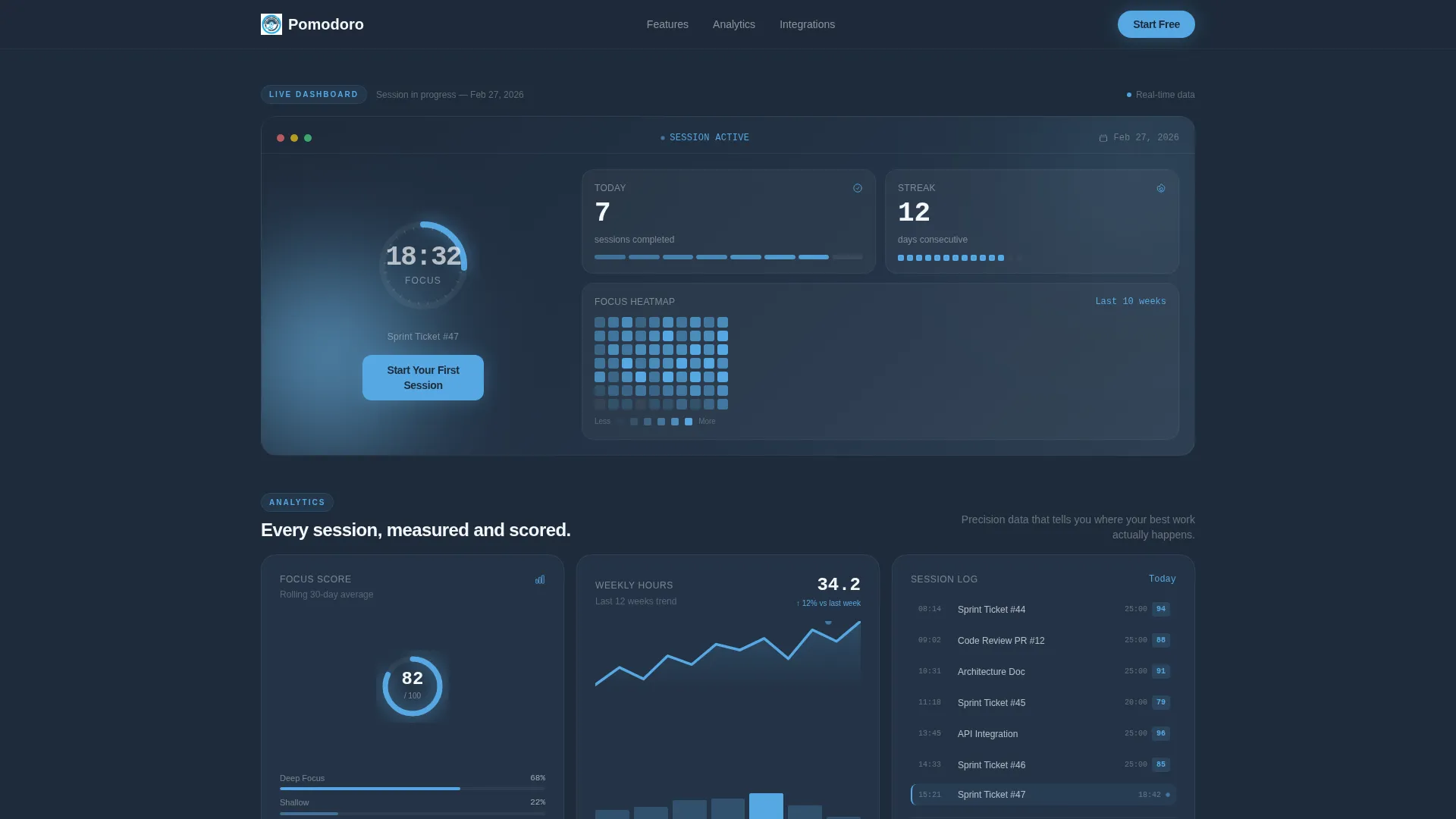
- A hero bento cell showing a live-style dashboard preview with countdown, progress ring, session count, streak, and focus heatmap
- A row of spec cards covering session analytics, interval customization, and integration icons for connected tools
- Two strategically placed calls to action and a secondary compare-plans text link anchoring the final row
Feature list
This section walks through the core capabilities built into the template layout.
Live Dashboard Hero Cell
The top bento cell fills with a pixel-perfect app screenshot showing a 18:42 countdown mid-session. A radial progress ring sits two-thirds filled in sky blue. Surrounding cards display completed sessions, a weekly streak counter, and a miniature focus heatmap styled like a contribution graph.
Metric-Driven Spec Cards
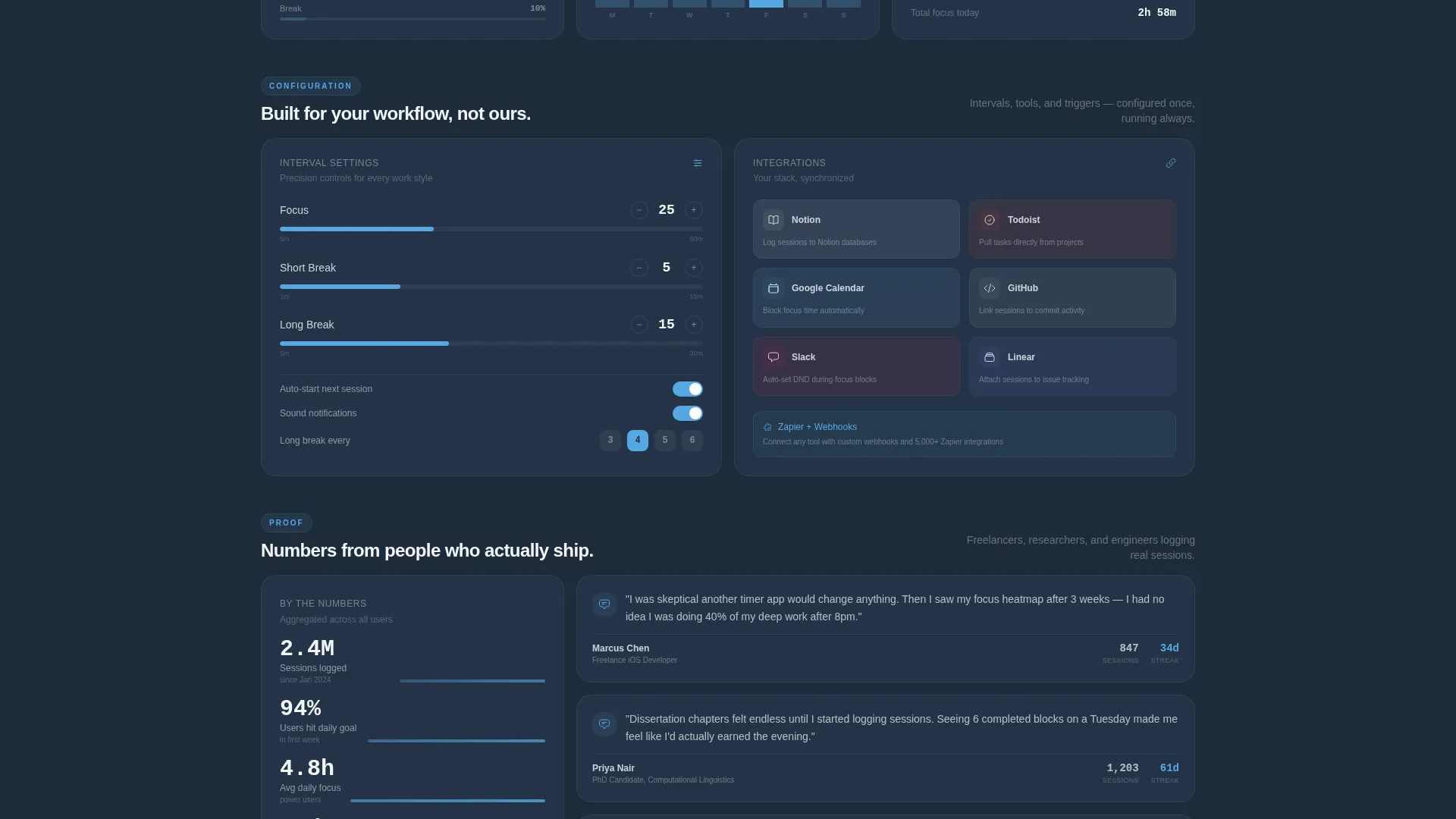
Each bento cell below the hero isolates one capability and pairs it with a real number or visual indicator. One card shows session analytics with a sparkline. Another breaks down customizable interval lengths. This spec-sheet cadence rewards scanning over reading.
Integration Icon Card
A dedicated bento cell displays integration icons for connected productivity tools. The layout makes compatibility visible at a glance without requiring explanatory copy.
Dual Call-to-Action Placement
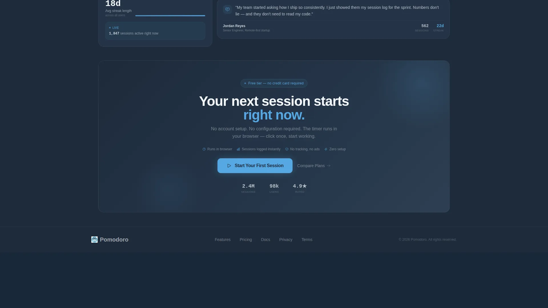
The primary call to action, "Start Your First Session," appears twice. First, it floats inside the header dashboard preview as part of the user interface itself. Second, it anchors the final bento row. A secondary text link reading "Compare Plans" sits beneath the closing call to action.
Frictionless Click-Through Flow
This template is configured as a click-through landing page. No form fields appear on the page. The primary action routes visitors directly into a browser-based timer running immediately on arrival.
Dashboard Pro Bento Grid Layout
The full page uses a bento grid structure with a Dashboard Pro theme. Cells vary in size to create visual rhythm. The layout rewards both quick scanners and detail-focused buyers without relying on narrative scroll flow.
Page sections overview
| Section | Purpose |
|---|---|
| Hero Dashboard Cell | Showcases the live timer mid-session with progress ring, session count, streak, and heatmap |
| Session Analytics Card | Displays focus session history with a sparkline visual |
| Interval Settings Card | Highlights customizable work and break interval lengths |
| Integrations Icon Card | Shows connected tool icons for compatible productivity platforms |
| Closing call to action Row | Anchors the page with the primary action button and secondary compare-plans link |
Design & branding system
The visual identity uses a Slate and Sky color system built around four precise values. Deep graphite slate forms all backgrounds, cool mid-gray lifts card surfaces, open-sky blue activates every live element, and crisp ice white handles typography and surface contrast. The overall feel is described as a clear morning seen through a rain-cleaned window.
- Background layers use deep graphite slate (#1E2A3A) and cool mid-gray (#3B4D61) to ground the interface
- Sky blue (#56A8E2) is reserved exclusively for timers in motion, progress rings, active states, and the primary action
- Card surfaces and body text use crisp ice white (#F4F7FA) for clean contrast against dark backgrounds
Mobile & speed optimization
The bento grid layout is structured to reflow cleanly across screen sizes. Cell sizing and spacing follow a system that maintains readability whether viewed on a desktop monitor or a mobile browser.
- Bento cells are sized and spaced to stack naturally on smaller viewports without breaking the visual hierarchy
- No stock photography or heavy illustration assets are used, keeping the hero cell lightweight by design
How this template helps you convert
The template earns the click before it asks for one. Every layout decision is built around reducing hesitation and increasing confidence in the product.
- The hero dashboard preview shows the app working in real time, so visitors see competence before they read a single benefit claim.
- The spec-card grid lets skeptical buyers scan individual proof points at their own pace, matching the way a spec-conscious buyer compares tools.
- The frictionless click-through flow removes every barrier between intent and action, sending the visitor into a live session the moment they click.
Other information about this template
This template sits within the Technology category under the Micro-SaaS and Developer Tools subcategory. It is optimized for the pomodoro timer app niche and carries an intersection match score of 13, indicating a tight alignment between template style, theme, and niche intent.
- The Dashboard Pro theme and Spec Sheet creative direction are matched to the bento grid template style in the intersection context
- The Slate and Sky color system is a named palette tied to the Dashboard Pro theme, not a generic dark mode
- The click-through landing page direction means this template is not designed for lead capture; its entire purpose is routing qualified visitors into the app

Theme
Dashboard Pro
Creative direction
Spec Sheet
Color system
Slate & Sky
Style
Bento Grid
Direction
Click-Through
Page Sections
Live Dashboard Hero Cell
Metric-driven Spec Cards
Integration Icon Card
Dual Call-to-action Placement
Frictionless Click-through Flow
Dashboard Pro Bento Grid Layout
Related questions
What type of app is this template designed for?
Does the page include any sign-up forms or lead capture fields?
What does the bento grid layout mean for page structure?
Can I customize the color palette for my own brand?
Is the dashboard in the hero cell a real screenshot or a placeholder?



