HVAC Digital Presence Maintenance Website Template
Portal is a bold brutalist landing page template built for HVAC contractors who need one place to manage dispatch, invoicing, and maintenance contracts. The bento grid layout is interactive, the visuals are raw and industrial, and the freemium signup flow asks for only three fields. It fits solo operators and multi-truck shops equally well.
by Rocket studio
Quick summary
Portal is a single-page brutalist landing page template designed for HVAC field service businesses. It combines an interactive bento grid, a scrolling logo bar, and a three-field freemium signup form into one unfussy, high-impact design. The template fits contractors who want a digital command center that reflects how they work: direct, organized, and built to take a beating.
Who this template is for
This template is built for the people who keep buildings heated and cooled for a living. It speaks their language from the first pixel. The design and architecture of the page reflect the raw, functional world of mechanical contracting rather than polished startup culture.
- HVAC shop owners running two to five trucks who are drowning in paper invoices and need a single dispatch and invoicing hub
- Operations managers at commercial mechanical firms juggling fifty or more preventive maintenance agreements across multiple commercial buildings
- One-van operators who quote jobs on a phone between crawlspace visits and need a mobile-ready landing page that loads without friction
What problem this template solves
Most SaaS landing pages look the same. They rely on soft gradients, stock photos of smiling teams, and long scroll journeys that bury the product behind decoration. For HVAC contractors, that approach feels dishonest and slow. The raw design communicates honesty by not hiding behind fancy aesthetics, suggesting the service is direct and straightforward.
- Contractors lack a landing page that speaks their trade vocabulary and shows the actual product before asking for a signup
- Shop owners need a page that works at desk on a wide monitor and on a phone at a job site, without a full redesign of their workflow
- Marketing teams at mechanical firms need a brutalist landing page that stands apart from the sea of cookie-cutter agency website templates
What you get with this template
You get a fully structured brutalist landing page with interactive components, a clear conversion flow, and a design system built around industrial visuals. Every section is laid out to reflect the contractor's day, from dispatch to invoice to end-of-month reporting. The template does not hide its building blocks behind polish.
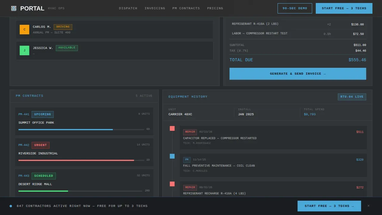
- An interactive bento grid with four clickable modules: a dispatch board, an invoice generator, a maintenance schedule, and an equipment history timeline
- A horizontal logo bar marquee at the top of the page, followed by tiered content rows that escalate from solo operator workflow up to enterprise reporting
- A sticky bottom bar and mid-page call-to-action block, both driving the same three-field freemium signup form with no credit card required
Feature list
The key features of this template reflect the source brief completely. Every component listed below is drawn directly from the project specification. There are no speculative additions.
Interactive Bento Grid Dashboard
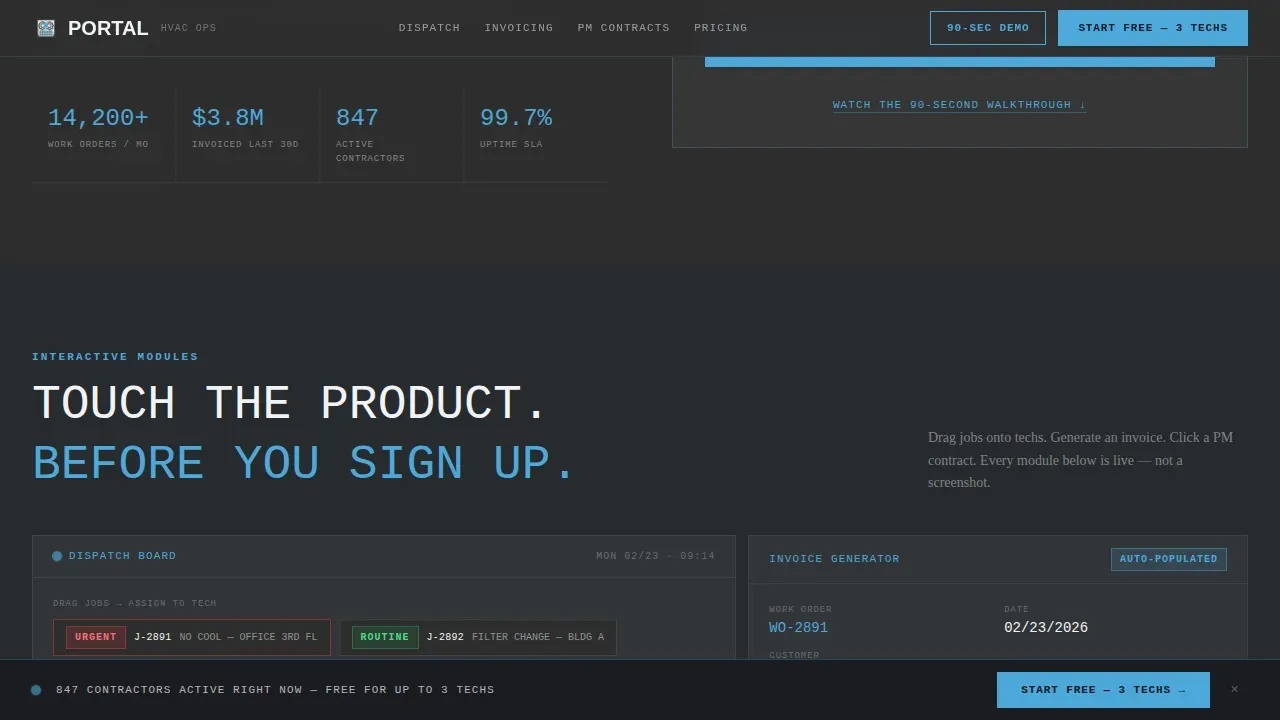
The bento grid is the heart of the landing page. It contains four distinct cards, each one a clickable module that expands, flips, or reveals a live-data preview on interaction. The dispatch board displays draggable technician avatars. The invoice generator auto-populates fields from a work order. The maintenance schedule uses color-coded urgency indicators. The equipment history timeline traces the full life of a single rooftop unit. Each row of the grid escalates in complexity, allowing visitors to find their own scale: solo operator, multi-truck fleet, or enterprise reporting.
Scrolling Logo Bar Header
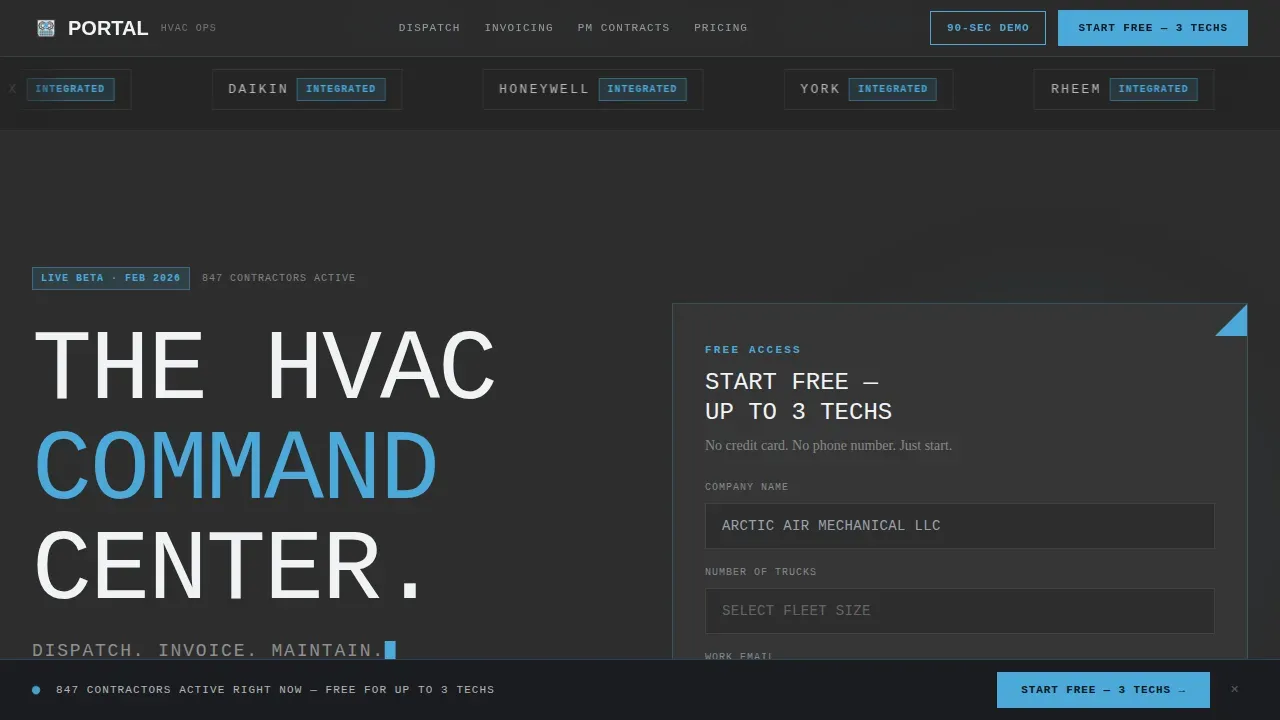
The header opens with a full-width marquee strip on a charcoal background, scrolling recognizable industry brand logos at a steady pace. Above the logos, a single line of brutalist all-caps text anchors the page. The logos are not purely decorative. They signal equipment familiarity, and a contractor's eye catches their preferred brand within the first two seconds. This creates instant relevance before any other content loads.
Three-Field Freemium Signup Form
The conversion form asks for only three inputs: company name, number of trucks via a dropdown, and email address. No credit card. No phone number. This minimal form design is deliberate. It lowers the barrier to entry and fits the honest, no-nonsense character of brutalism in web design. A secondary call-to-action button offers a ninety-second walkthrough video for visitors who want to learn more before committing.
Scale-Tiered Content Rows
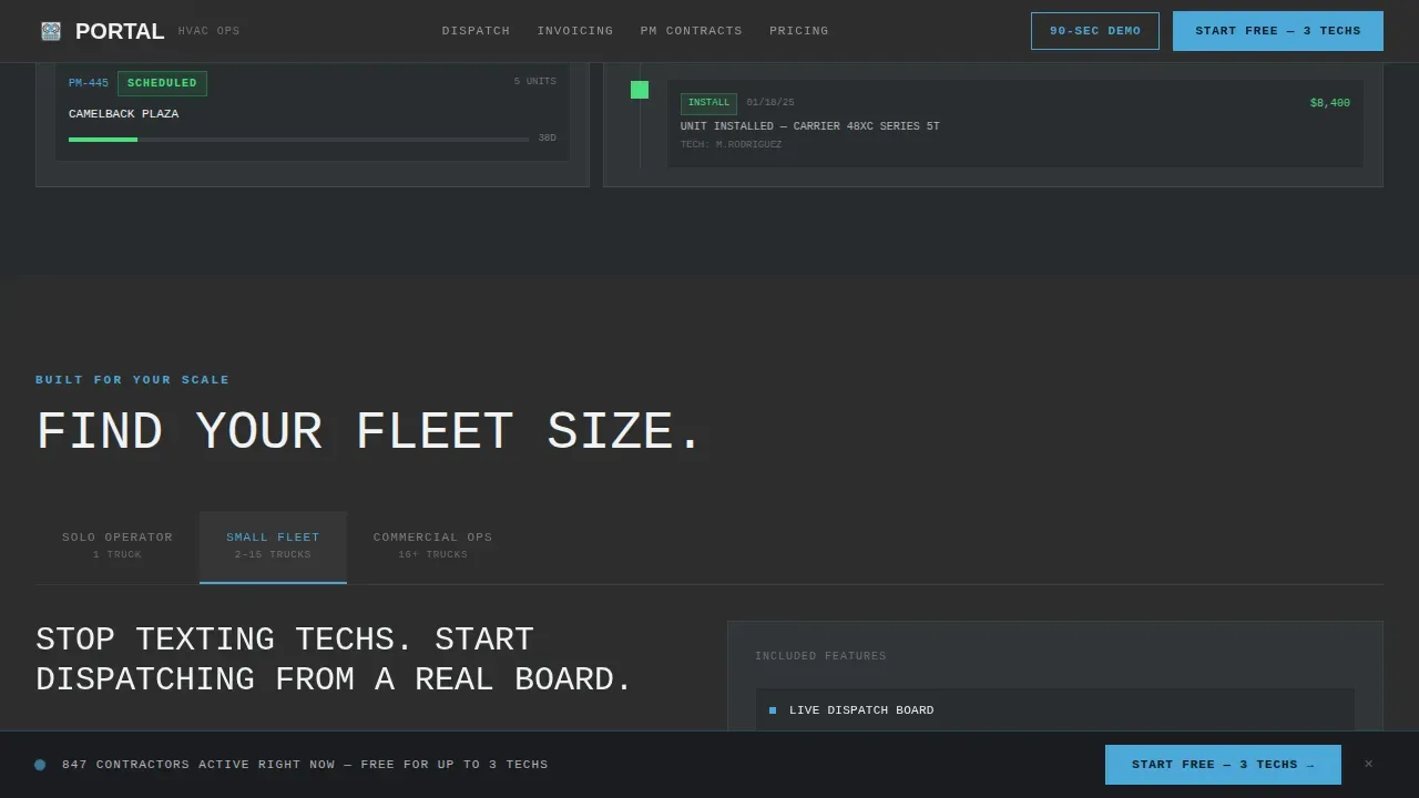
Below the bento grid, the page is structured in three tiers of content that escalate in scope. The first tier covers solo operator workflow. The second tier shows a multi-truck fleet view. The third tier presents enterprise reporting visuals. This structure means every type of HVAC contractor, regardless of fleet size, will find a section that fits their operation inside the page.
Sticky Bottom Conversion Bar
A persistent bottom bar stays in view as visitors scroll through the entire landing page. It repeats the primary call-to-action with the same three-field form and the same "Start Free" message. The bar is built to function as a constant, low-friction prompt without interrupting the reading experience.
Social Proof Section
The template includes a dedicated section for named contractor testimonials. Each testimonial block is designed to display truck counts, specific dollar amounts saved, and preventive maintenance agreement numbers. This specificity gives feedback a weight that generic quotes lack. The visuals in this section mirror the same raw, grid-based layout used across the rest of the page.
Page sections overview
| Section | Purpose |
|---|---|
| Logo Bar Header | Display brand marquee and brutalist headline |
| Interactive Bento Grid | Let visitors touch product modules live |
| Scale Tier Rows | Reflect solo, fleet, enterprise workflows |
| Social Proof Block | Show named contractor feedback with metrics |
| Pricing Call-to-Action | Drive freemium signup with three-field form |
| Sticky Bottom Bar | Keep conversion prompt visible during scroll |
| Footer Strip | Deliver linear single-row site navigation |
Design & branding system
The design draws its identity from the physical world of commercial HVAC work. The color system is called Slate and Sky. It uses poured-concrete charcoal as the primary background, exposed-duct gunmetal for card surfaces when depth is needed, and open-sky blue for every interactive element and hover state. The fourth color, compressor white, brings breathing room to card interiors. Together these colors reflect a palette that feels like standing on a commercial rooftop next to a row of rooftop units: all gray steel and galvanized metal until the sky opens up above you.
- Typography is set in JetBrains Mono and Manrope condensed. Headers are oversized, all-caps, and designed to be read instantly, resembling blueprints or industrial manuals rather than marketing copy.
- Cards use zero-radius edges and visible borders. Visible black outlines and thick borders around each user interface element mimic technical diagrams. There are no gradients, no subtle shadows, and no smooth decorative transitions. The result is a 2D, flat appearance that communicates function over decoration.
- The overall visual architecture channels the characteristic geometry of brutalist architecture, with blocky, often asymmetrical columns that may appear intentionally unfinished, like the raw concrete and exposed materials of a mid-century industrial building.
Mobile & speed optimization
The template is built desktop-first, reflecting the reality that most HVAC shop owners review dashboards from an office desk. Mobile support is layered in as a progressive enhancement for the one-van operator who pulls up the landing page on a phone between job sites. The design does not require a full redesign to function on smaller screens.
- The minimal CSS approach keeps the site lean. Stripping away heavy decorative graphics means the page can display essential tools without distraction, and the lack of heavy images supports faster initial load behavior.
- The bento grid adapts to a stacked single-column layout on narrow screens, preserving the key features and interaction logic of each module without sacrificing the brutalist visual identity.
How this template helps you convert
The conversion strategy is built into the structure of the landing page itself. By the time a visitor reaches the signup form, they have already interacted with a mock dispatch board and generated a mock invoice. The trial does not feel like starting something new. It feels like continuing something already in progress.
- The interactive bento grid lets visitors touch the product before signing up, building familiarity and trust through hands-on exploration rather than passive reading.
- The three-field form with no credit card requirement removes the friction that causes most SaaS landing page drop-offs, allowing contractors to start immediately.
- The ninety-second walkthrough video path captures email from visitors who are not ready to commit, creating a second conversion window without a hard sell.
Other information about this template
This template sits at the intersection of brutalist web design, field service management software design, and no-code development tooling. Understanding that context helps teams use it most effectively. Below are additional points of relevance for design studios, creative agency teams, and independent developers building with this template.
- Brutalism in digital design has a history rooted in the mid-twentieth century movement originally applied to physical buildings. In web design, it was originally adopted as a reaction against the overly polished, cookie-cutter look of mainstream commercial sites. Publications such as the Washington Post have covered the rise of brutalism as a web design trend, noting its association with transparency and directness. The best examples in the field share a common trait: every element serves a function, with minimal whitespace and no superfluous decoration.
- No-code platforms allow users to build applications without traditional programming skills. The principles of brutalism can be applied to no-code development to create unique and functional applications. No-code tools can facilitate the rapid development of applications that embody brutalist design principles, making this template a practical starting point for teams working without a full engineering hand in the build process.
- Vibe coding principles encourage developers to prioritize emotional connection and user interaction by utilizing bold design choices and minimalistic aesthetics. This template reflects those principles. It uses transparency and honesty in design, reflecting the raw materials and functionality of the application rather than hiding them behind a polished exterior.
- The bold brutalist aesthetic used here has appeared across successful agency website builds and design studio portfolios as one of the best examples of how brutalism can help brands stand out. Creative agency teams building for industrial or trade-focused brands will find the design language of this template easier to extend than a generic, gradient-heavy starting point.
- The template is localized for the United States market, using USD currency formatting and MM/DD/YYYY date display throughout the mock data inside the bento grid modules. This reflects the primary audience of domestic HVAC contractors and commercial mechanical firms operating in the USA.
- From a design development standpoint, the template uses JetBrains Mono and Manrope condensed as its type set. Both fonts are available under open licenses, which means teams can bring the same typography into extended builds without licensing costs. The white card surface color and the sky blue accent color are the two lightest points in the palette and serve as visual anchors that guide the user's eye toward interactive elements and calls-to-action.
Theme
Bold Brutalist
Creative direction
Interactive Explorer
Color system
Slate & Sky
Style
Bento Grid
Direction
Freemium/Trial
Page Sections
Interactive Bento Grid Modules
Scrolling Brand Logo Marquee
Three-field Freemium Signup Form
Scale-tiered Content Architecture
Sticky Bottom Conversion Bar
Named Contractor Social Proof Section
Related questions
Is this template suitable for a one-person HVAC operation?
Can the color system be updated to match a different brand?
Does editing the interactive bento grid require coding skills?
What does the freemium conversion flow include?
Can this brutalist landing page template be used for other trade businesses?



