Agriculture Client Portal Landing Page Template
Portal is a hub-and-spoke anchor-nav landing page template built for agriculture client portals. It uses a glassmorphic visual system over a dark field palette to present a head-to-head comparison of modern farm data management versus the old way. A live metrics header, spoke-by-spoke spec sheet, and a two-step audit modal work together to move row crop operators and agronomists toward signing up.
by Rocket studio
Quick summary
Portal is a single-page, anchor-nav landing page template designed for an agriculture client portal. It opens with an animated metrics wall, walks visitors through a side-by-side spec sheet comparing Portal against spreadsheets and phone calls, and closes each section with a persistent "Run Your Free Audit" call to action. The template is sharp, dark, and data-forward.
Who this template is for
This template is built for agriculture technology companies and digital platform providers that serve hands-on farm operations. If your product consolidates farm data into one login, this layout gives it the right stage.
- Mid-size row crop operations running between 2,000 and 10,000 acres that need one screen instead of six spreadsheets
- Seed representatives managing regional sales territories who track multiple grower accounts
- Grain elevator operators reconciling inbound loads against delivery contracts
What problem this template solves
Farm managers and agronomists lose hours every week switching between disconnected tools. Soil moisture lives in one app, input costs in another spreadsheet, and yield forecasts in an email chain. No single view ties them together, and the decision-making cost is real.
- Fragmented data tools create slow, error-prone decisions across planting, input, and harvest cycles
- Buyers cannot easily see the gap between their current workflow and a consolidated portal without a direct comparison
- Generic software landing pages fail to speak the language of row crop operators or grain elevator managers
What you get with this template
You get a fully structured, single-page landing page ready to customize for your agriculture portal product. Every section is purposeful, and the layout is built to escalate persuasion from first scroll to final click.
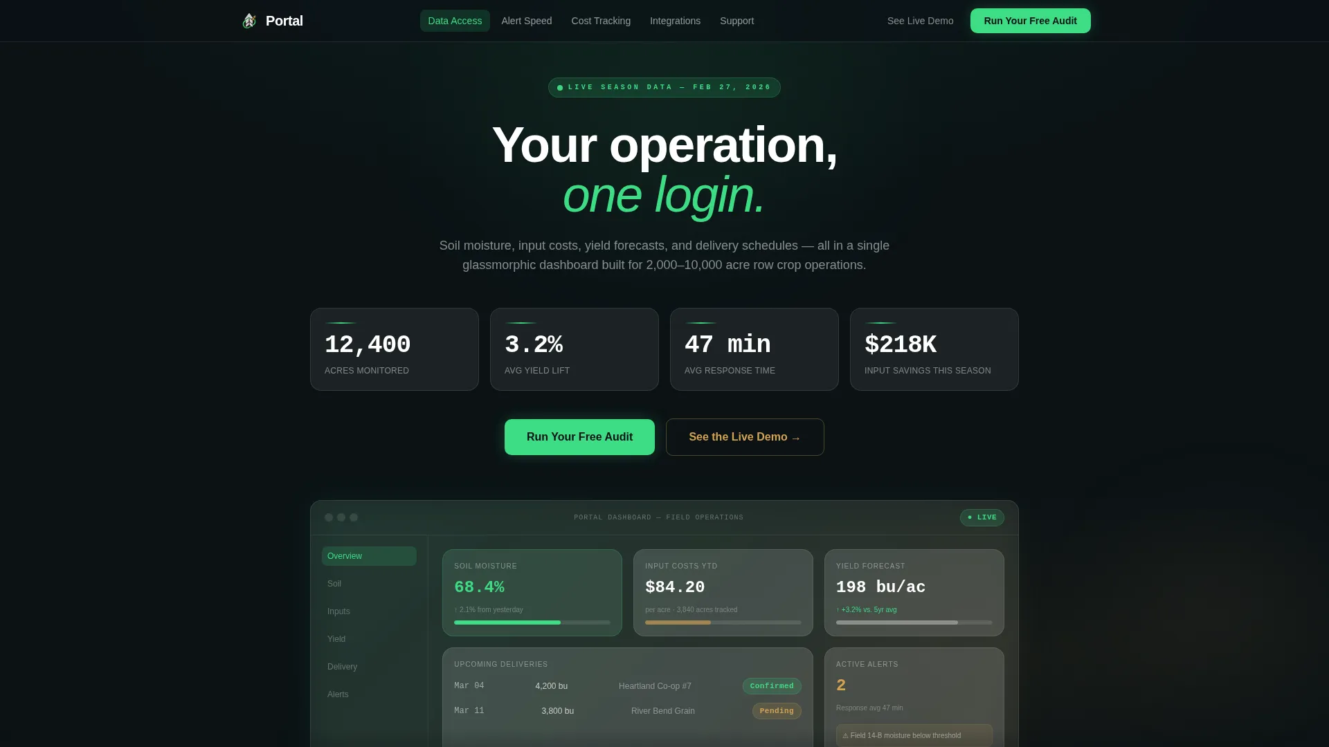
- A full-viewport glassmorphic header displaying four animated operational metrics with a single tagline beneath
- A hub-and-spoke anchor navigation bar with five labeled comparison categories that locks to the top on scroll
- Five spoke sections each containing a head-to-head spec table plus a repeated "Run Your Free Audit" call-to-action block
- A two-step glassmorphic audit modal that collects managed acres, primary crop, and current tools before a sales call
Feature list
This section covers the core built-in components that make Portal work as a conversion-ready agriculture landing page.
Animated Stats Header Wall
The header fills the full viewport with four live-style operational metrics: 12,400 acres monitored, 3.2 percent average yield lift, 47-minute average response time, and $218K in input savings tracked. Numbers animate upward on page load like a mission control ticker. Below the metrics, one line of copy reads: "Your operation, one login."
Sticky Anchor Navigation Bar
A navigation bar locks to the top of the page after the header scrolls out of view. Five spoke labels act as direct comparison category anchors: Data Access, Alert Speed, Cost Tracking, Integrations, and Support. The primary "Run Your Free Audit" call-to-action button sits pinned inside the bar at all times.
Head-to-Head Spec Sheet Sections
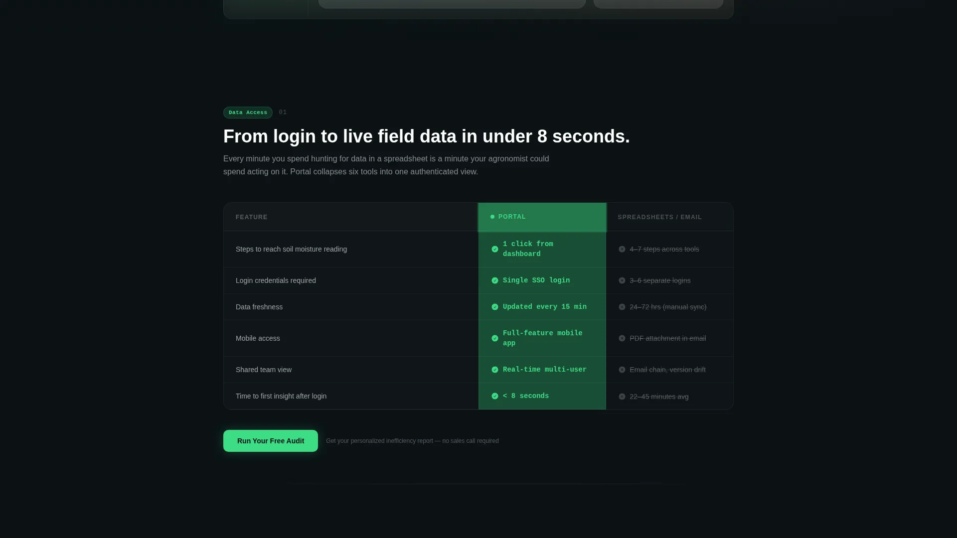
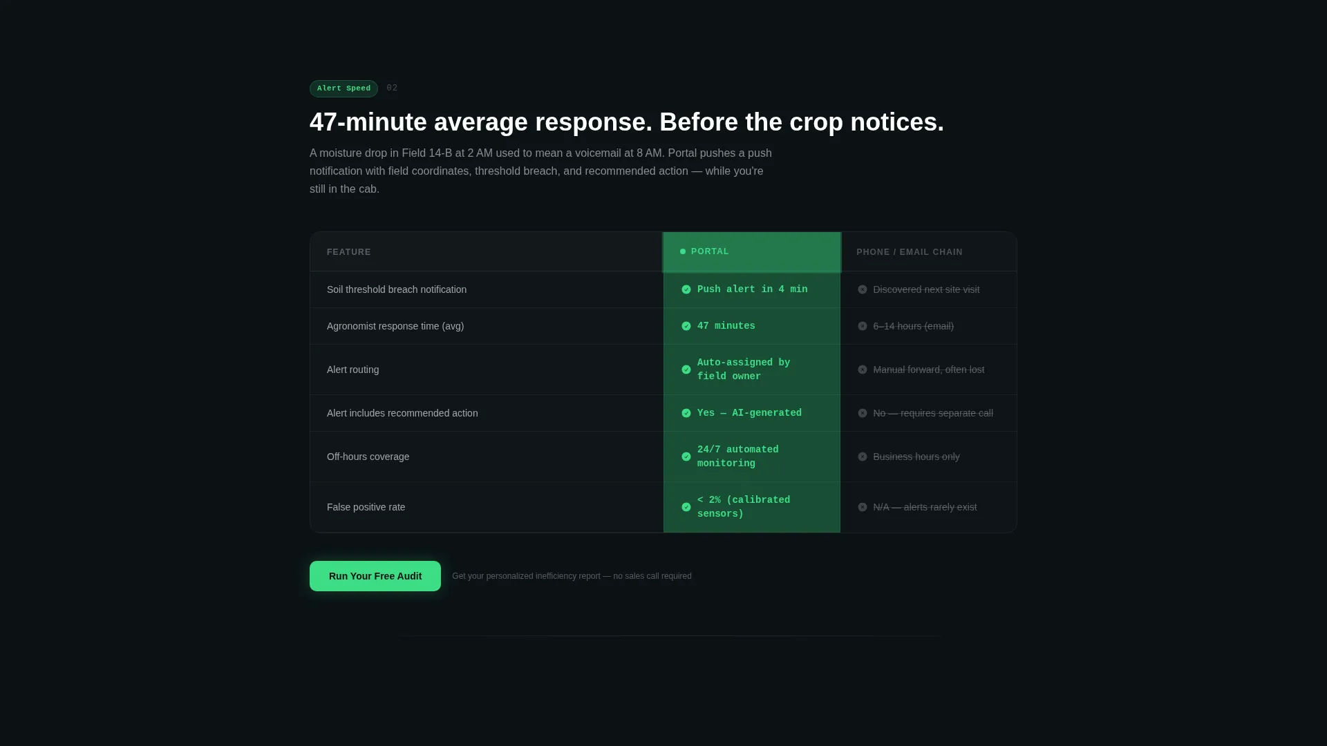
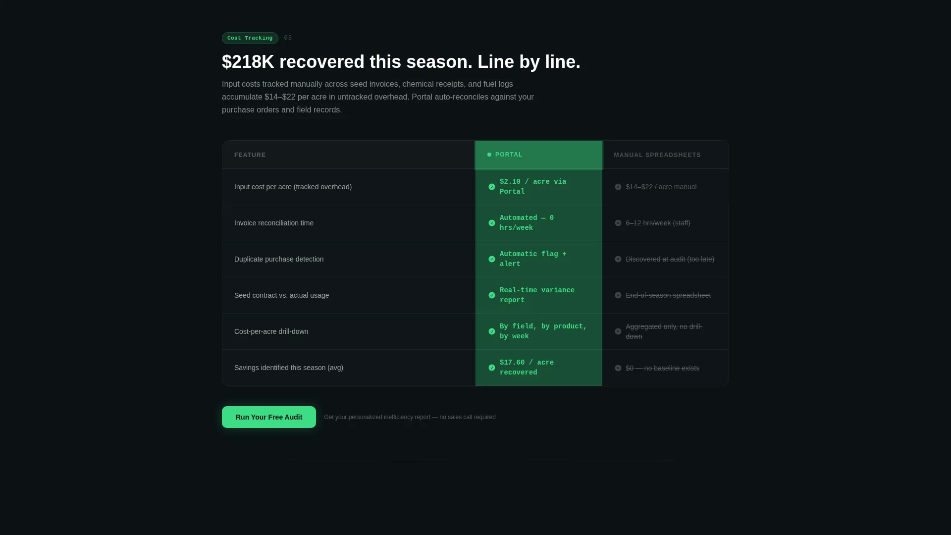
Each of the five spoke sections contains a comparison table with two glassmorphic card columns. Portal's column shows green check icons and precise latency numbers. The competing column, representing the old way of email chains and manual spreadsheets, grays out and displays friction metrics. Specificity escalates section by section, ending with a cost-per-acre management overhead comparison.
Two-Step Audit Modal
The primary call to action opens a modal with exactly two steps. Step one asks for total managed acres and primary crop type. Step two presents checkboxes for current tools: spreadsheet, agronomist reports, co-op portal, or other. The modal closes with a promise of a personalized inefficiency report estimating hours and dollars recovered.
Live Demo Secondary Path
A secondary call-to-action link labeled "See the Live Demo" sits alongside each primary audit prompt. It links to a recorded walkthrough, giving visitors a low-commitment way to experience the portal before filling out the audit form.
Glassmorphic Card Design System
Every data card, comparison column, and modal panel uses a translucent card white layered over a deep field black background. Active states and data highlights use living chlorophyll green. Secondary accents use soft soil amber. The result is a heads-up display aesthetic that reads as modern and precise without feeling clinical.
Page sections overview
| Section | Purpose |
|---|---|
| Metrics Header Wall | Anchors credibility with four animated operational stats and the core tagline |
| Sticky Anchor Nav | Lets visitors jump to any comparison spoke and always surfaces the primary call to action |
| Data Access Spoke | Compares login steps and data freshness between Portal and legacy tools |
| Alert Speed Spoke | Shows response time in hours versus days against email and phone alternatives |
| Cost Tracking Spoke | Contrasts input cost visibility with manual spreadsheet workflows |
| Integrations Spoke | Details connected data sources versus disconnected tool switching |
| Support Spoke | Compares structured support response against ad-hoc phone calls |
| Audit Modal | Two-step form collecting farm scale and current tools for a personalized report |
| Live Demo call to action | Secondary path offering a recorded portal walkthrough |
Design & branding system
Portal uses a Glassmorphic color system built around four tightly defined values. The aesthetic channels Startup Velocity, meaning the visual language feels fast, data-dense, and purpose-built rather than decorative.
- Deep field black (#0B1215) forms the base layer; translucent card white (#FFFFFFB3) creates frosted glass panels floating above it
- Living chlorophyll green (#3DDC84) drives active states, data highlights, and Portal's winning column indicators
- Soft soil amber (#D4A24E) handles secondary accents, adding warmth without breaking the dark, backlit tone
Mobile & speed optimization
The template is structured with a responsive layout so the anchor nav, comparison tables, and modal all reflow cleanly on smaller screens. The glassmorphic panels are CSS-based, keeping the visual effect lightweight.
- Comparison tables collapse into vertically stacked card pairs on narrow viewports so no data is cut off
- The sticky anchor nav condenses to a compact bar on mobile, keeping the "Run Your Free Audit" button always visible
- The two-step modal is touch-friendly, with large checkbox targets and clearly labeled step indicators
How this template helps you convert
Portal is built around a Comparison/Versus conversion strategy. Every scroll step widens the perceived gap between the old way and the new portal, making the decision feel inevitable rather than forced.
- The animated metrics header establishes immediate, specific credibility before a visitor reads a single word of body copy, anchoring the value of the product in real operational numbers
- The escalating spec sheet structure means each spoke section compounds the case, so by the time a visitor reaches the final cost-per-acre row, the audit offer feels like a logical next step rather than a sales pitch
- The two-step audit modal personalizes the value proposition before a sales call, giving visitors a concrete estimated return on switching, which lowers resistance and raises intent
Other information about this template
Portal is categorized under Technology with a subcategory of Agriculture Digital Presence. It is a strong fit for companies building in the agriculture client portal niche who want a template that speaks directly to operational buyers rather than generic enterprise audiences.
- The template style is Hub and Spoke with anchor navigation, making it easy to expand or contract the number of comparison spokes to match your product's feature set
- The creative direction is Spec Sheet, meaning the persuasion logic is built on factual, side-by-side evidence rather than aspirational marketing language
- The theme is Startup Velocity, which suits early-to-growth-stage agriculture technology companies that need to look credible and modern quickly
- The header concept is Stats and Metrics, a proven format for data-heavy products where showing real numbers builds more trust than describing them
Theme
Startup Velocity
Creative direction
Spec Sheet
Color system
Glassmorphic
Style
Hub & Spoke (Anchor Nav)
Direction
Comparison/Versus
Page Sections
Animated Metrics Header Wall
Sticky Hub-and-spoke Anchor Nav
Escalating Head-to-head Spec Tables
Two-step Audit Conversion Modal
Live Demo Secondary Call to Action
Related questions
Can I change the number of comparison spoke sections?
What does the Run Your Free Audit modal collect?
Can I replace the animated metrics in the header?
Is this template suitable for agriculture software products outside row crop farming?
What is the secondary call-to-action path in this template?



