Cannabis Software & SaaS Professional Website Template
Portal is a single-page comparison landing page built for cannabis software and SaaS brands. It positions your dispensary management platform against competitors using an animated comparison table, dark glass panel header, and a floating call-to-action bar. The design runs on a deep dashboard color system that signals precision, speed, and operational confidence from the first scroll.
by Rocket studio
Quick summary
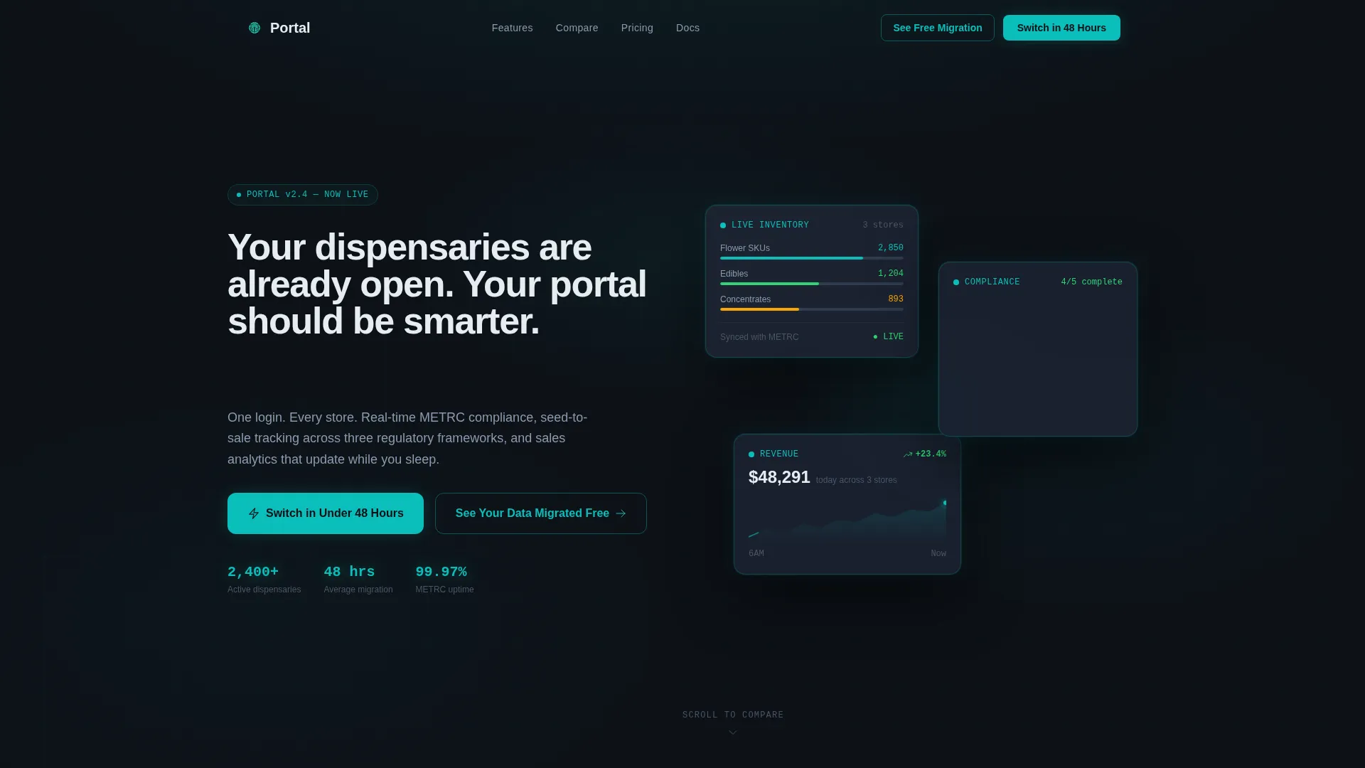
Portal is a conversion-focused comparison landing page template for cannabis software and SaaS products. It opens with three frosted user interface preview cards, drops visitors into a scroll-animated comparison table, and pins a low-friction call-to-action bar the moment differentiation peaks. The result is a page that earns the click before it asks for one.
Who this template is for
This template is built for cannabis technology companies and SaaS founders who need to convert informed, skeptical buyers. It speaks directly to the operators who already know the problem and are ready to compare solutions.
- Multi-state dispensary operators managing seed-to-sale tracking across several regulatory frameworks
- Single-location dispensary owners overwhelmed by compliance reporting workloads
- Delivery-only cannabis brands that need route optimization data alongside point-of-sale figures
What problem this template solves
Cannabis software buyers do not convert on features alone. They convert when they feel the weight of their current workflow and see a clear, side-by-side reason to switch. Generic landing pages cannot do that job.
- Operators arrive already comparing tools but leave without a clear winner because the page never shows the gap
- Compliance complexity and multi-state regulation make the stakes feel high, slowing decisions
- Most software pages bury the switching process, making low friction hard to believe
What you get with this template
You get a fully structured, single-page comparison layout designed around one conversion goal: making the case for your platform so clearly that switching feels like the obvious next step.
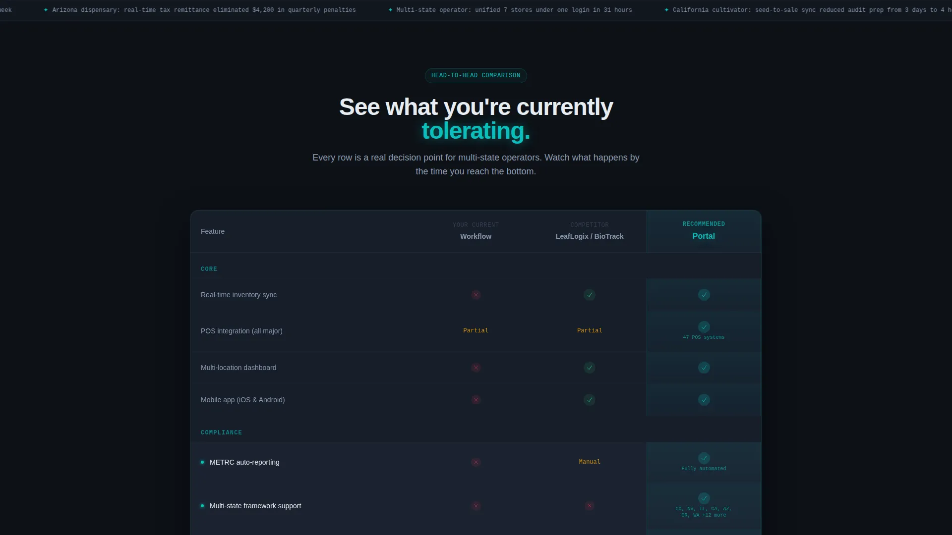
- A three-column animated comparison table with scroll-triggered row reveals and micro-pulse teal checkmarks
- A dark glass panel header with three floating user interface preview cards and a typewriter headline
- A pinned floating call-to-action bar and a short secondary lead-capture form with three fields
Feature list
This template packages several purposeful design and layout components. Each one is directly tied to how cannabis SaaS buyers evaluate and decide.
Animated Comparison Table
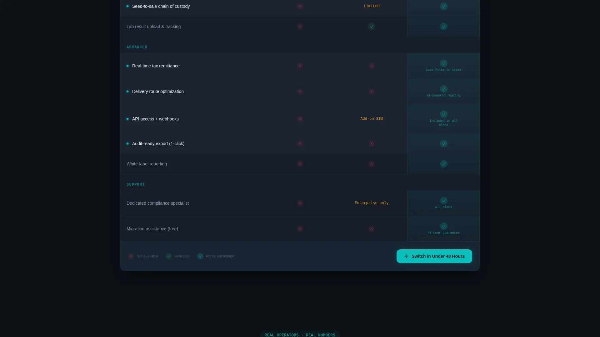
A three-column table pits your current workflow against two named competitors and your platform. Each row animates into view as the visitor scrolls, with teal checkmarks appearing with a micro-pulse effect. Coverage escalates row by row from basics like inventory sync to high-stakes items like multi-state compliance automation and API access.
Dark Glass Panel Header
Three frosted, semi-transparent user interface cards float against a pitch-black background. Each card previews a different portal view: live inventory counts, a compliance checklist with cascading green checkmarks, and a climbing sales graph with a teal trend line. A typewriter-style headline builds letter by letter above the panels.
Floating Call-to-Action Bar
A sticky bar reading "Switch in Under 48 Hours" appears once the visitor scrolls past the third table row. It surfaces at the exact moment the comparison gap becomes undeniable, reinforcing low friction without interrupting the reading flow.
Flip-Card Case Study Section
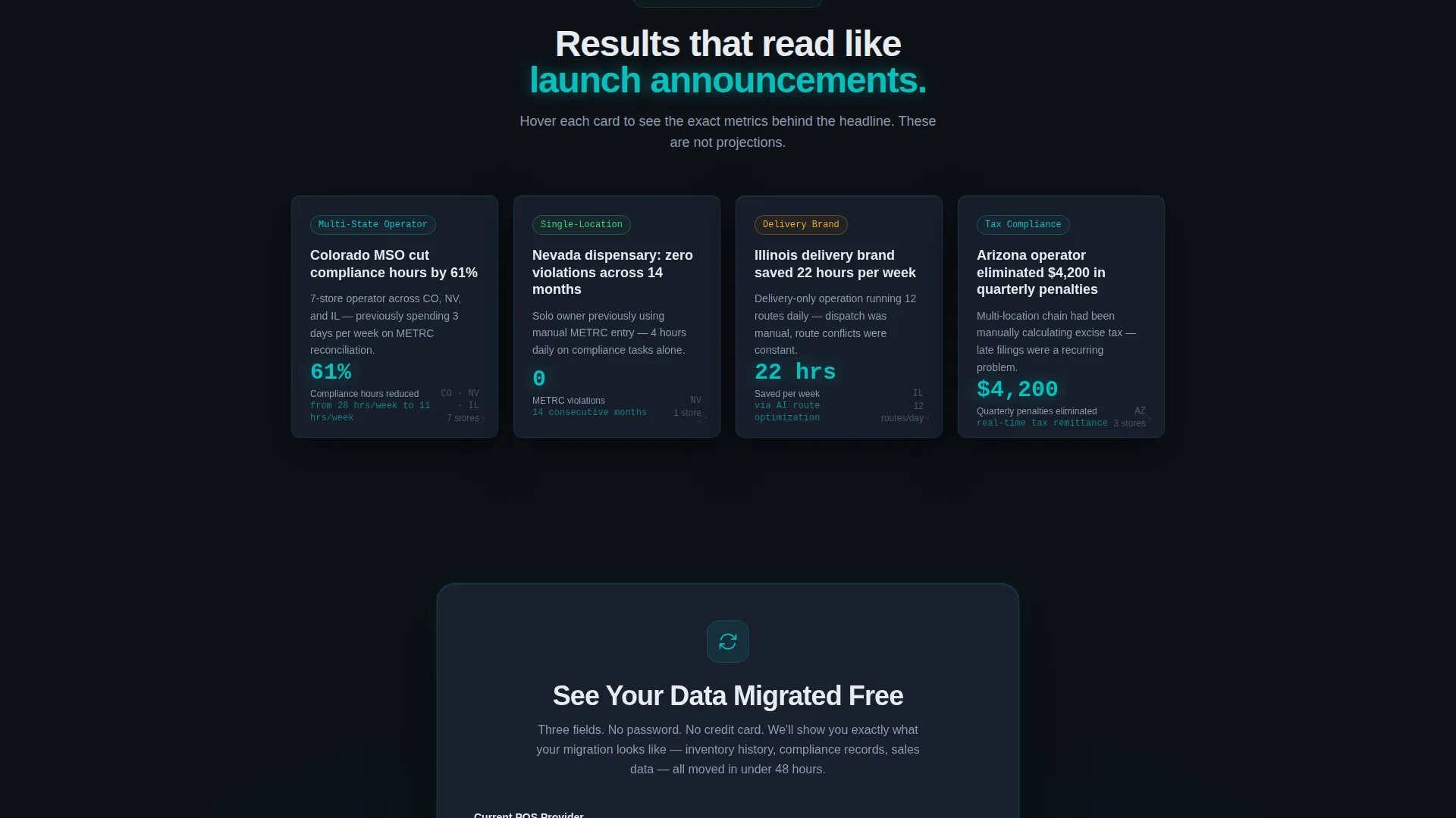
Short case-study cards sit below the comparison table and hit like launch announcements. Each card flips on hover to reveal a specific metric, such as a Colorado multi-state operator cutting compliance hours by 61 percent, grounding the platform's value in real operational outcomes.
Secondary Lead Capture Form
A lightweight form offers a "See Your Data Migrated Free" path. It asks for current point-of-sale provider, number of locations, and states of operation. Three fields, no password, no credit card requirement, designed to remove every barrier between intent and submission.
Page sections overview
| Section | Purpose |
|---|---|
| Dark Glass Header | Introduce portal value and set visual tone |
| Typewriter Headline | Anchor attention with animated brand message |
| Comparison Table | Show feature gap against competitors row by row |
| Floating call to action Bar | Capture high-intent clicks at peak differentiation |
| Case Study Cards | Validate claims with outcome-specific metrics |
| Migration Lead Form | Convert secondary intent with a three-field form |
Design & branding system
The visual identity follows a Startup Velocity theme built on the Teal Catalyst color system. Every color choice is functional: deep dashboard black frames data, teal signals activity, and signal white cuts through dark panels with zero ambiguity.
- Deep dashboard black (#0D1117) as the base background, slate graphite (#1C2333) for card surfaces, catalyst teal (#0ABFBC) for interactive and status elements, and signal white (#E6ECF1) for all primary typography
- Frosted glass card treatments with subtle edge lighting give user interface preview panels a live, data-lit quality
- The overall palette reads like a mission control screen at 2 AM: dark, focused, and every bright element signals something working
Mobile & speed optimization
The layout is designed to maintain its visual hierarchy and conversion logic across screen sizes. The comparison table and floating bar are central to the conversion flow, so both are built with responsive behavior in mind.
- The three-column comparison table collapses cleanly on smaller screens so row-by-row differentiation stays readable
- The floating call-to-action bar remains pinned and accessible on mobile viewports without obscuring table content
- Scroll-triggered animations are scoped to visible elements, keeping page performance stable as new rows load in
How this template helps you convert
The entire page is sequenced around a single conversion arc: build recognition, reveal the gap, reduce friction, and capture intent. Every section serves that arc in order.
- The glass panel header and typewriter headline create immediate product credibility before the visitor reads a single feature claim.
- The animated comparison table escalates stakes row by row, making the platform's advantages feel earned rather than asserted, and the floating call-to-action bar surfaces at exactly the moment the gap peaks.
- Flip-card case study metrics and the three-field migration form give both high-intent and research-stage visitors a clear next step without asking for a commitment they are not ready to make.
Other information about this template
Portal is categorized under Technology, specifically Cannabis Software and SaaS, and is designed for the cannabis customer portal niche. It is a strong fit for teams building or relaunching a dispensary management platform page.
- The template style is a Comparison Table layout with Launch Energy creative direction, meaning the page builds emotional and informational momentum from the first scroll to the final form
- The header concept, Dark Glass Panels, is a distinct visual pattern suited to software platforms that want to show the product in action before describing it in words
- The landing page direction is Comparison/Versus, making it purpose-built for competitive positioning rather than general awareness or lead generation campaigns
- This template works well alongside seed-to-sale tracking platforms, point-of-sale systems, and compliance reporting tools that need to communicate a clear switching rationale to operators already using a competing product
Theme
Startup Velocity
Creative direction
Launch Energy
Color system
Teal Catalyst
Style
Comparison Table
Direction
Comparison/Versus
Page Sections
Scroll-animated Comparison Table
Dark Glass Panel Header
Floating Conversion Bar
Flip-card Case Study Metrics
Three-field Lead Capture Form
Related questions
Who is this landing page template designed for?
Can I customize the comparison table rows for my own feature set?
What does the floating call-to-action bar do?
How does the secondary lead capture form work?
Is this template suitable for a single-product SaaS launch?



